I find I often have an affinity for those designers who also have architectural backgrounds. They frequently structure their spaces with distinctive defining elements and in many cases have a strong working knowledge of design history. This certainly holds true for Garrow Kedigian in his dramatic Kips Bay 2016 Show House space.
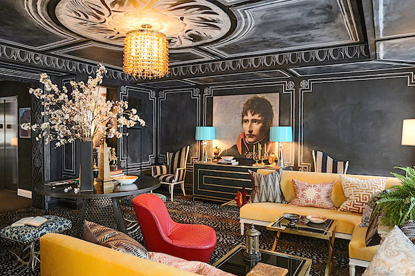 His Napoleon Lounge is an ode to the emperor, whose imperial style extended even to his temporary spaces during military campaigns. Think of Napoleon’s classic campaign chair with its stylish portability, his private railway car with its custom Braquenié carpet (see the original model in the Pierre Frey archives here) or the toile fabrics he commissioned to commemorate and spread the word about his victories in Egypt. Like great design of today, Napoleon looked to the past to elevate the present and as he hoped, the future. Ancient Egypt and imperial Rome were his muses for a new France.
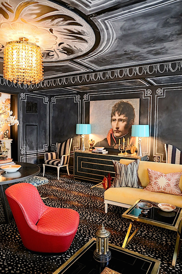
And while Napoleon may be Garrow’s muse, his room is totally of today. In a collaboration with artist Rajiv Surendra, as also seen in Garrow’s own Montreal apartment, the walls are decorated with chalk in classic empire style. Bridging past and present, the design references the noble napoleonic order in a contemporary way, while echoing the transient quality of campaign life with an ephemeral material. A reproduction of the heir to the Republic hangs over a classically modern custom cabinet by Keith Fritz with empire-like lines, above. And the lipstick red quilted Roche Bobois Badiane Chair is a chic modern version of a timeless technique.
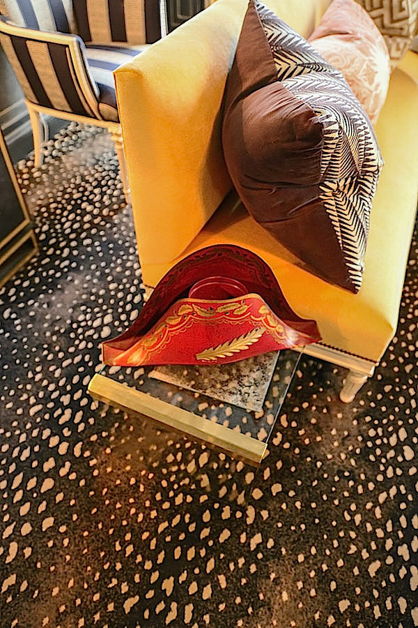
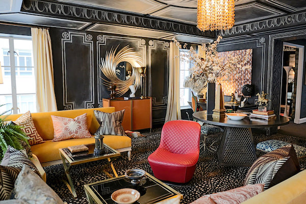 Garrow anchors the room with Stark‘s ageless Antelope rug upon which he has layered a curated cadre of pieces, as if collected on his own campaign. Balsamo Antiques‘ round entry table echoes Rajiv’s circular design above and the swirls of Christopher Guy‘s Camilla mirror contrasts with the pure couture lines of Brett Beldock’s Bob Bar in a stunning lacquered orange.
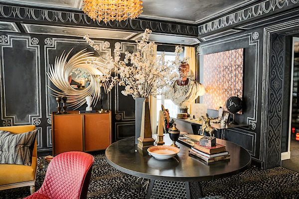
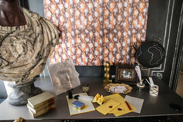
A bust of Caesar overlooks command central on Roche Bobois’ minimalistic Furtif Desk (fewer distractions for the emperor)
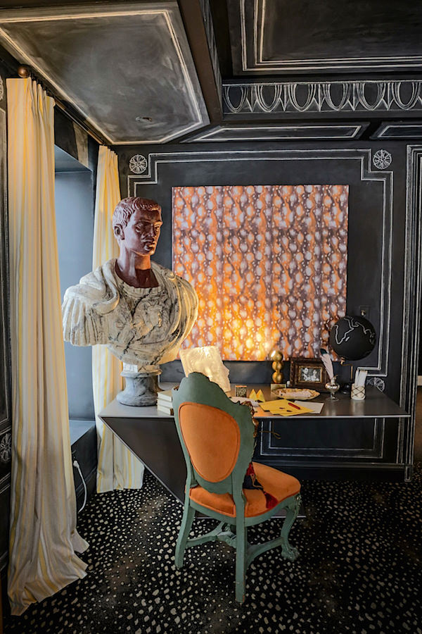 where missives to a modern day Josephine were no doubt being penned.
And a final nod to the emperor is seen in this clever cap-like find.
 all photos by Stacey Bewkes for Quintessence
Garrow finds inspiration in many unexpected places. To see the story behind his style, watch the making of and inspiration for his custom fabric collaboration with Peter Fasano.


 all photos by Stacey Bewkes for Quintessence

Such a great room! Now, I couldn’t live in it, but if you take piece by piece it is amazing. Of course, the chalk detail is brilliant, but that Tole Napoleon hat, the pillows and loved the portrait… were images to file away.
That ceiling!! Have always appreciated that “fifth” wall!! franki
I am in love with everything he does. His Instagram photos are to die for. The funny thing is though, his style and color use is the exact opposite what I am currently doing in my beach house whole house renovation…all white with dark floors, neutral creams, white, beiges with splashes of blue and white!!! Trying to figure out my affinity to his style.
Seeing your posts daily gives me so much energy to get my projects done, it also makes me want new ones,not that I need any help with that, my house mis an ongoing project, I’m very eclectic and constantly changing my mind hahaha
Incredible space, so creative!