Leave it to Domino Magazine to create the first-ever shoppable show house. At 15 William, a modern state of the art condominium in the heart of the burgeoning Financial District (FiDi), Domino paired four young interior designers on the rise with four popular furniture brands to create four stylish and livable apartments. Focusing on approachable looks at affordable price points, it is a fresh and unique take on a designer showhouse. And for true accessibility, featured items from each residence will be for sale on domino.com now and even more in the coming months. Join Susanna and me as we visit with the designers behind the scenes.
Dolores Suarez and Caroline Grant of Dekar Designs worked with Ballard Designs to create a warm and welcoming two-bedroom family home. Including eclectic picks from Ballard’s large collection of furniture and accessories and Zak and Fox textiles, the apartment features a unique and stylish take on tradition.
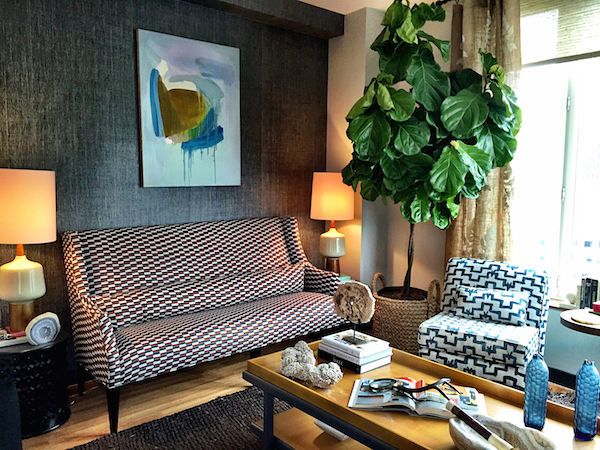
All designers used paints from sponsor Benjamin Moore to great advantage as in Dekar’s distinctive entry hall.
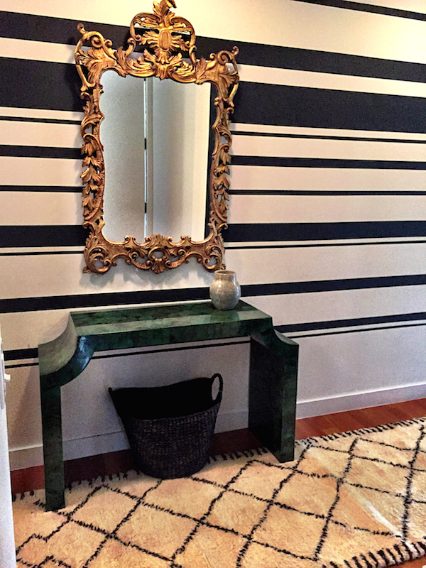
They designed the second bedroom in their apartment as an adorable nursery.
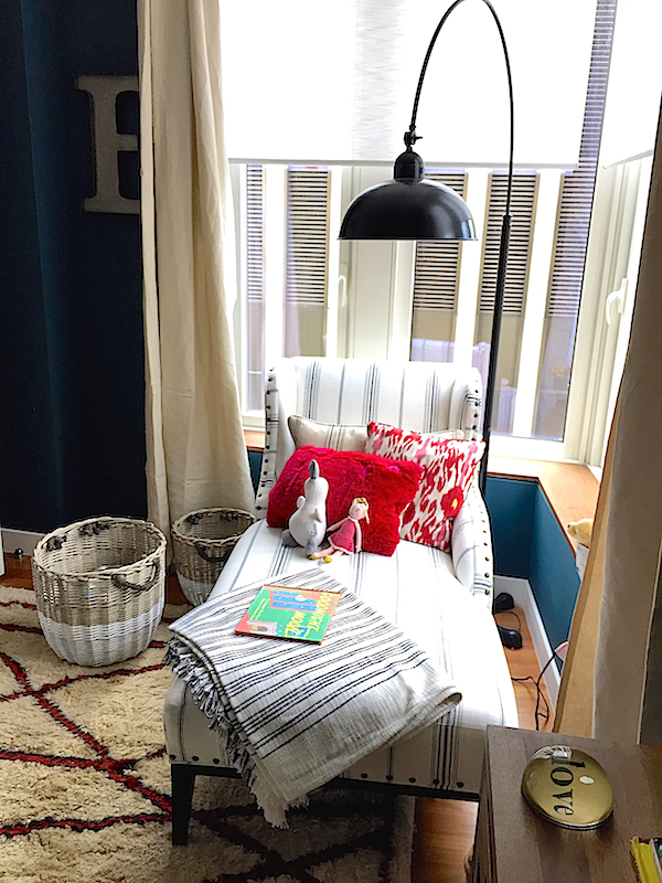 with fun yet sophisticated details for a child to grow into.
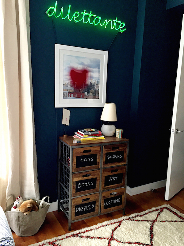 Partnering with Homeware, Antonino Buzzetta made the most of his small apartment with bold art, graphic pattern and a simplified color scheme
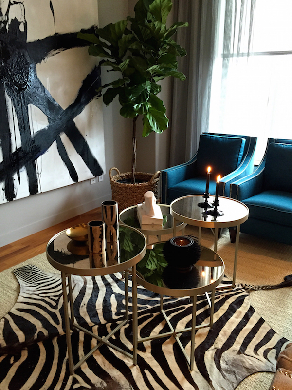
that unified the space.
 Small apartment living calls for multitasking furniture. In the kitchen/entry, Antonino cleverly transformed a dining table into a double duty kitchen island-cum-foyer table.
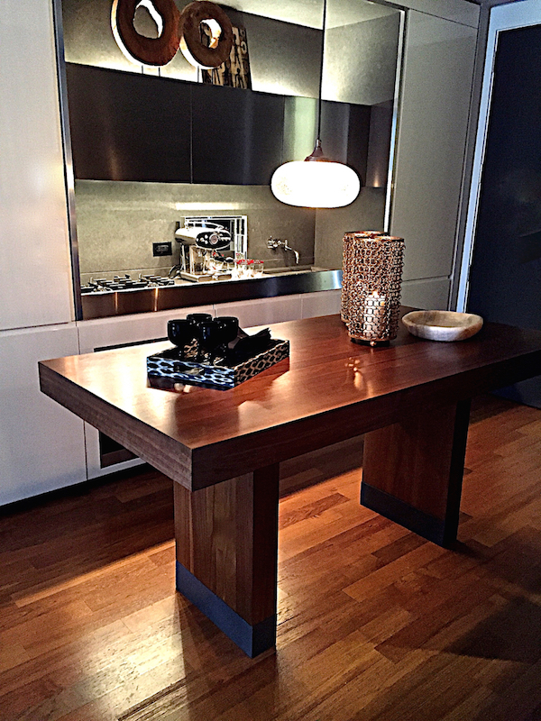 From hanging art to customizing furniture, John “Jack” Zuerlein (aka Handy Jack – handyjacknyc@gmail.com) was an essential member of the shophouse team, on call throughout the set-up to help the designers with all their needs. Below, he had just finished raising the table, above, to accommodate Antonino’s design.

Jenny J Norris took full advantage of Mitchell Gold + Bob Williams‘ wide ranging offerings to design a worldly bachelor pad. Loads of light with amazing views inspired her to keep the main living space clean and open. You get a glimpse of the sleek modern kitchens in the building which are furnished with sponsor Illy espresso machines and coffee.
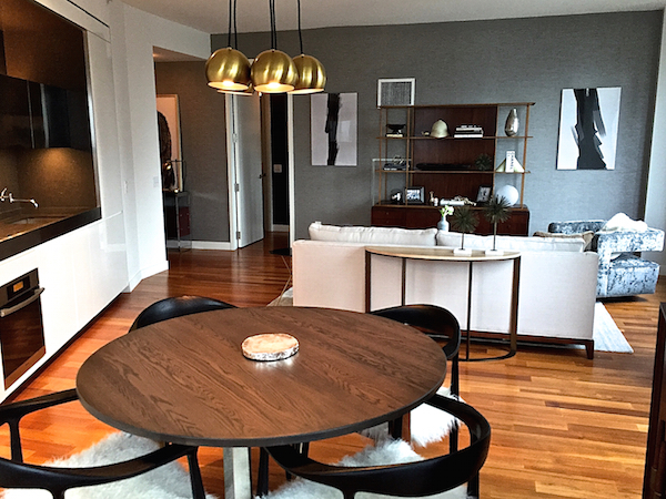 A sophisticated cool gray palette throughout connected the rooms, allowing the furniture and great selection of art photography, from Jenny and others, to shine.
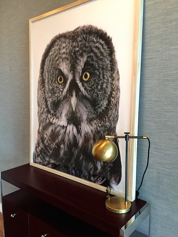
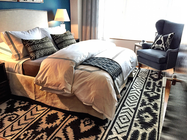
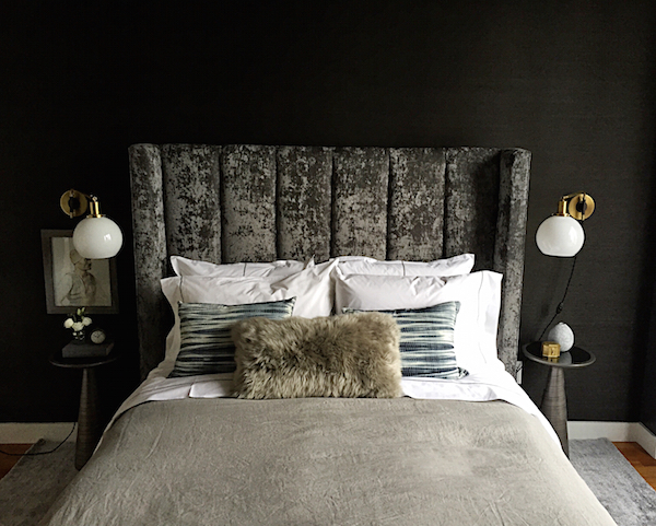
Jenny mentioned she’s been drawn to dark bedrooms lately and hers is a lush lair of mixed textures and layers.
 Jennifer Hunter and Georgie Hambright of J+G Design, partnered with Thomasville, designed an upbeat colorful apartment full of pattern and cheer. It would be impossible to be in a bad mood here! With such open views, it was handy that sponsor Hunter Douglas made custom window treatments for each apartment.
 photo Brittany Ambridge/domino
Tailored yet relaxed, the designers approached their apartment with an eclectic eye. Glam touches mix with simple shapes and accoutrements for a youthful and fresh flair.
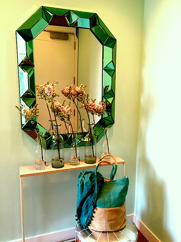
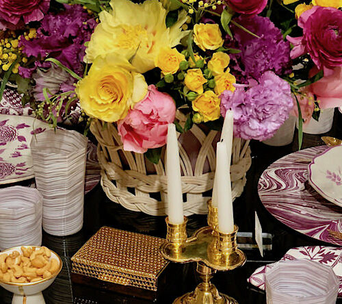
Thoughtful touches in pretty vignettes show how the details count.

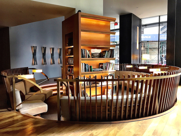
Open to the public through September (by emailing shophouse@elliman.com), the Domino Shop House will be featured in the magazine’s summer issue and on the website, where each apartment will be shown with a list of shoppable products. 15 William is a fully appointed building with amazing amenities from a rooftop lounge with catering kitchen to screening room, children’s playroom, fully-equipped fitness center, indoor lap pool, squash court, covered outdoor dog run and more. Susanna and I both remarked on the appealing lobby with (soon to be filled) library and reading area.
And for those who fall in love with an apartment and one of the designer’s visions, each is available to be purchased fully furnished.


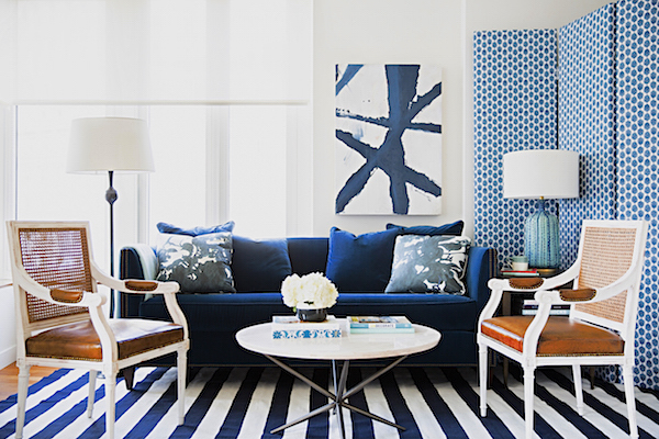 photo Brittany Ambridge/domino


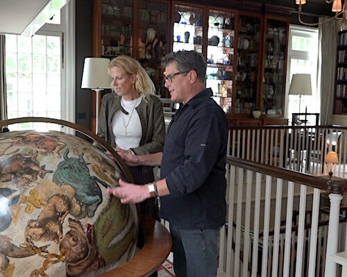

I admire Susanna’s ability to evaluate eclectic designs and interpret the integration of styles that are happening. I have no idea how to relax or rest in places with bold, in your face statements, but Susanna points out the textural elements (like the grasscloths) and where the warmth arises which is hard to see and feel through video. But I do wonder, can the youth of today actually relax next to that wild Zak and Cloth Fabric Ballard headboard?
Hi Stacey,
Great job as always on the video. This was a fun tour of these young and yet very grown-up apartments. Over-all, the last one was my fave. The living room is so fresh. And of course, I adore the Chinoiserie art in the bedroom. They look like they’re from Bungalow 5.
It’s funny, but I often find that the details are what make the space! I do tend to agree with Kristin, however. I have a problem with reverberating patterns. They can actually make me dizzy and a bit nauseous! I once had a client who had this issue in an acute way and there was a lot that had to be eliminated just because of that!
Stacey and Susanna, Love the video and how these designers transformed the contemporary spaces, adding warmth with fabrics and textures, and wonderful color palettes.
xoxo
Karena
The Arts by Karena
What a wonderful video and love the idea of these apartments being furnished to purchase individual items used…such a great concept!! Fun colors in the last apartment.
Where is the kids drawer from?
Hi!
I work with Dekar. If you are speaking of the drawers in the nursery they are from Ballard (Cambridge).
Xx
Such a great idea! Where is the last bed from…with the beautiful nailhead trim?
Each room is characterized by the different furnishing and decorations. And the bedroom for child is very lovely and cute and good for child’s growth. It’s really an excellent design!