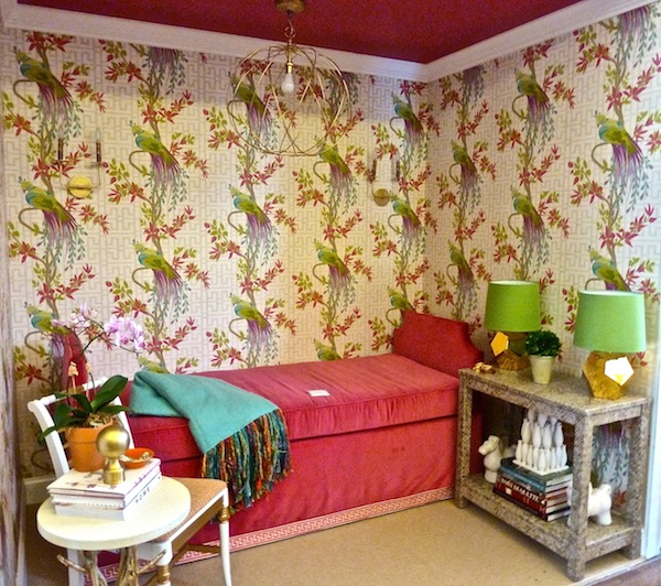
It’s a good thing designer and blogging friend Lisa Ehrlich is so organized. Due to a family emergency she couldn’t attend the showhouse on Friday, but her lovely space was in perfect order ahead of schedule. Depicting “A Young Lady Starting Out,” the 5’6″ x 8′ vignette “showcases a cultured young lady’s first NYC studio apartment.” I remember my first studio and I only wish it had been this pretty and polished!
As discussed, this year’s theme was “Design on a Shoestring” but as Lisa explained, “I am a firm believer that designing on a shoestring does not equate to purchasing disposable furniture, but rather making purposeful purchases.
Lisa generously shared her sources to illustrate how to accomplish this stylish mix. The striking look of the vignette is based on the fabulous Osborne & Little wallpaper. The upbeat colorful pattern grounds the space with feminine yet graphic appeal. The investment statement piece was the custom upholstered daybed by Diamint & Sons with Kravet fabric and Fabricut Greek key trim. Because the bed serves triple duty as bed, sofa and social media relaxation station, it was worth the price tag.
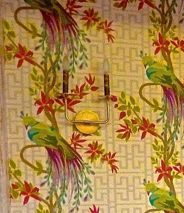
The double arm sconces from Remains Lighting were found at an antique/thrift store, where Lisa paid $50.00 for $2,000 worth of merchandise – “a perfect example of having an eye to spot quality offerings despite surroundings.” She then added Kaarskoker marbleized candle sleeves (hard to see in this shot) that she purchased on clearance for $1 – normally $24!
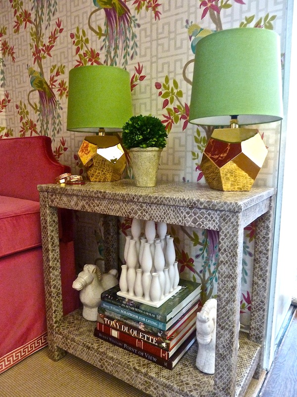
One of my favorite aspects of the room was this vignette, totally fitting for Lisa’s “client.” “She is in her late twenties, past the roommate stage, and desired an apartment that was a chic retreat from her fast paced city life. Her apartment needed to evoke a sense of style and sophistication, play to her fondness of pink, and feel like a jewel box of a home rather than a tiny white apartment.” The faux snakeskin console from Society Social was the perfect texture to balance the gold nugget lamps, an unexpected find from children’s online supplier Land of Nod.
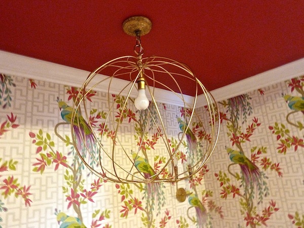
A lighter gold fixture from Ro Sham Beaux hung from the ceiling, adding a fun open geometric shape that didn’t compete with the busy paper.
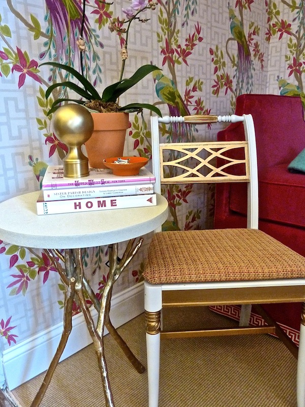
An antique chair from Hank’s Alley, a family owned antique shop in Tarrytown, NY was refinished and reupholstered with a subtle Brunschwig fabric on the seat for a fresh new look. It pairs perfectly with the modern Made Goods table from Lillian August and a fun grouping of accessories including a small Waylande Gregory tiger orange bowl from friend Sue De Chiara’s online shop Zhush.
Lisa did a great job of “achieving the “Design on a Shoestring” look by seamlessly blending many components of various pedigrees for a space that feels fabulous as opposed to frugal!” And she wanted to send special thanks to Jim Squiciari (contact: 203.482.6151) who “worked with determination to complete the installation of my ceiling, wallpaper, lighting, trim work, and carpeting despite Hurricane Sandy.”
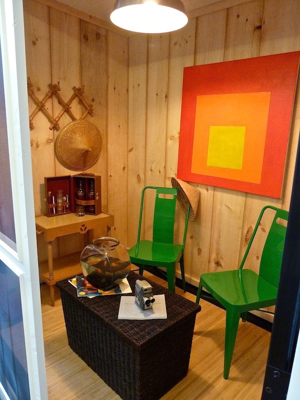
One of the most original vignettes was the charming screen porch by J.P. Franzen Architects, executed by Jack Franzen, Ann Franzen, Katrina Franzen and Jody Foote.
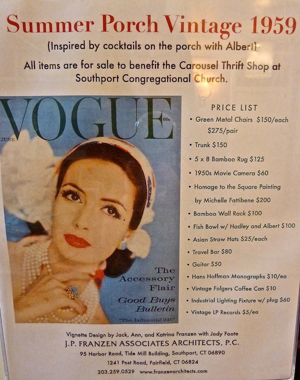
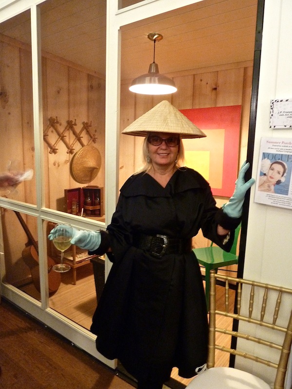
Inspired by a 1959 issue of Vogue that included a room by Albert Hadley, the team took the “Designing on a Shoestring” to heart. Every single item in their space was donated to the church thrift shop and was available for sale. Hadley’s featured project was the transformation of a traditional summer house rental into a more modern yet comfortable space. Using Japanese tatami mats, eye level artwork and a wicker hamper trunk for storage, the room was a timeless ode to livable style.
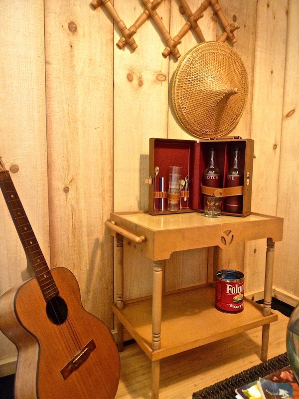
Wanting to recreate the essence of Hadley’s fresh approach, Ann Franzen posed the question, “What would Albert Do?” so she and Foote found re-purposed vintage items for the room. Green metal chairs, woven trunk, travel bar and “Homage to the Square Painting” by Michelle Fattibene are a few of the main feaures.
Goldfish Albert and Hadley were instant stars! And a bamboo wall rack and Asian straw hats made for an easy going summer scene. Even the Folgers coffee can is vintage!
And collaborator and show co-chair Jody Foote was dressed head to toe vintage to accompany her space.
Stop back again as we finish up looking at this marvelous showhouse!





I’m ready to “shop” back again! JUST LOOK at what one can do…I’m particularly liking that metallic gold twig table and gold sphere. Albert and Hadley are golden, too!! :) franki
Love the refinished antique chair with the gold accents!
Thank you so much for the great review of the show, my space and your perspective. Your posts are always, without fail, true journalism. Truly appreciate!!!
Wish I could have seen this in person, obsessed with Lisa’s room, would love to crawl into this chic spot right now! Love the little mention too, thanks ladies:)