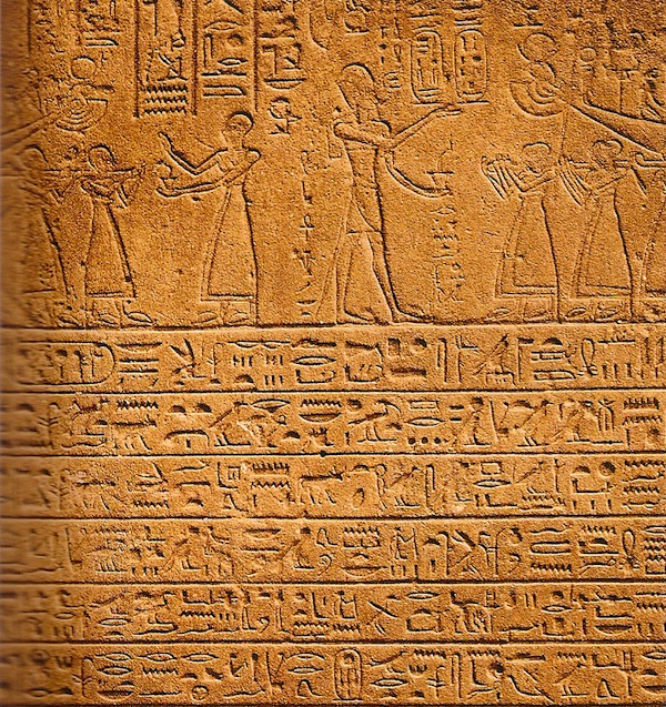
How often do you think about the connection between graphic design and architecture? My guess is not that frequently. And yet the two have been inexorably linked since the beginning of the built environment. Think of the Egyptian pyramids covered in hieroglyphics or the inscriptions in the stone of the Parthenon.
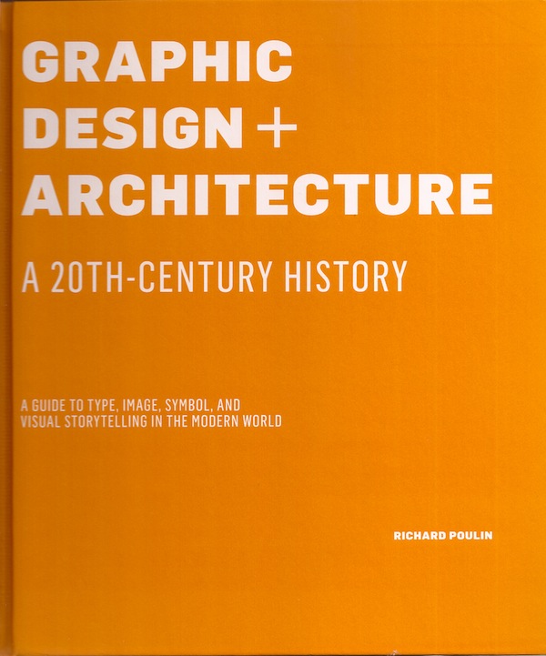
 A fascinating new book, Graphic Design + Architecture: A 20th Century History, by award winning multidisciplinary designer Richard Poulin examines the relationship between the two, investigating at how typography, image and symbolism coexist with and enhance the structures in the world around us. Looking at the the last hundred years, he shares a wealth of examples, connecting the dots between concepts, technological developments, designers and more. I met Richard in his office last month and had the pleasure of talking shop and hearing more about his latest publication.
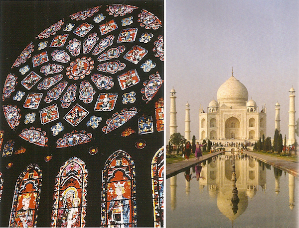
As architect James Stewart Polshek says in his introduction, “Buildings can tell stories.” They do this not only through their own form but also through a “synthesis of graphic design and architecture.” Starting from the beginning, Poulin traces iconic structures, telling their stories and illustrating their use of graphics. From the Cathedral at Chartres to the Basilica of Santa Maria Novella, to the Taj Mahal, all have integrated the written word in graphic form as a part of their design.
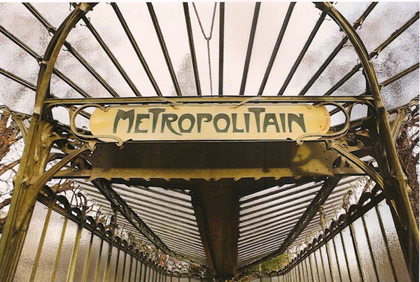
 Moving on to the modern age, the industrial revolution and discovery of electricity of course changed everything, offering even more opportunity for the incorporation of graphics. Take for example the Paris Metro. Architect Hector Guimard’s entrances for the Paris subways are classic symbols of the art nouveau movement, the typography an essential element of the architectural design.
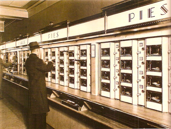
 I loved seeing the Horn & Hardart Automat featured. I remember begging my mother to go there – even at a young age, I was clearly influenced by the graphic styling of this iconic institution.
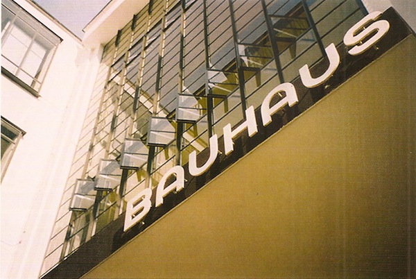
 Walter Gropius’ Bauhaus in the 1920’s and the related de Stijl movement, were instrumental in promoting a multidisciplinary approach to all visual arts. Without getting into a serious art history discourse, suffice it to say that Poulin makes a strong case for the important influence this movement had on modern graphic design and architecture.
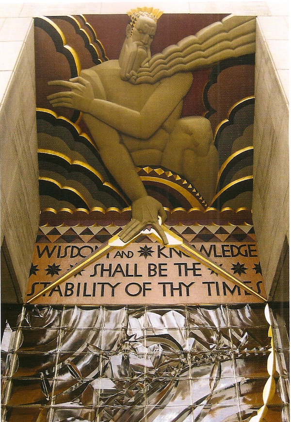
I worked in Rockefeller Center for years and never took for granted this amazing architectural masterpiece. Integrating the buildings with graphics, sculpture and an early example of urban planning, it is as iconic today as it was in 1929 when work commenced. I hope that people realize the significance of Edward Durrell Stone’s 30 Rock for more than its eponymous show!
Whether a ubiquitous well-known example of popular culture

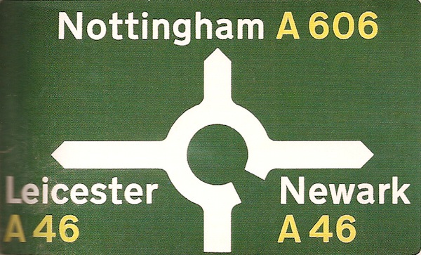
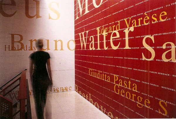
or a lesser known integral part of everyday life, such as Jock Kinneir and Margaret Calvert’s sign system for the British roadways, each case is presented and illustrated in digestible bites.
 Poulin and his firm are well represented in the volume. From the Brooklyn Botanic Garden Entrance to the Morgan Stanley World Headquarters Building Facade to the New York Public Library for the Performing Arts at Lincoln Center, Poulin has been transforming our environment and affecting our daily lives for the better.
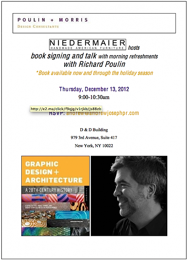
If you are in or near the city, Poulin will be speaking and signing books on Thursday (the 13th) in the Niedermaier showroom in the D&D Building from 9:00 – 10:30 am.
 But if you can’t attend, you can still enjoy his encyclopedic knowledge through his writings. If you have an interest in graphics, architecture or a history of our visual environment, this addictive read will be a perfect addition to your design library.




Great new book which looks to be very informative and touches upon a fresh topic! I can’t wait to get my copy!
You know…I STILL marvel at “Man’s Conquests,” by Sert in Rockefeller Center!! franki
What a fantastic book! I just finished a Graphic Design class, so would love to find this under my tree. Thanks for the recommendation!
What a fascinating book and it would be perfect for my mother! How fun to think that iconic signs have a history in typography… We kept thinking of the millions Chase Manhattan spent on redesigning their logo font!
xxoo
C + C
This is renewing the discourse in Graphic design and architecture