Design on a Dime is one of the most popular design events in the New York community. Benefiting Housing Works‘ programs for homeless and low-income New Yorkers living with and affected by HIV/AIDS, it attracts more than 50 top tier designers who create rooms with donated merchandise, which is then sold for 50- 70% off retail. Opening night is always a packed affair and Thursday evening was no exception. This spring’s vignettes were fabulous and judging by the lines at checkout, the evening was a huge success.
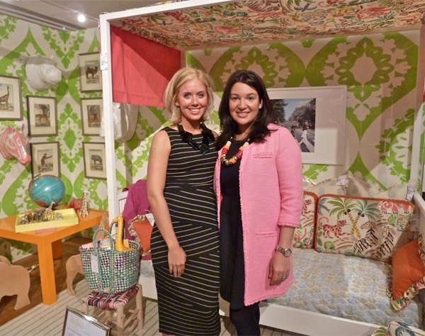
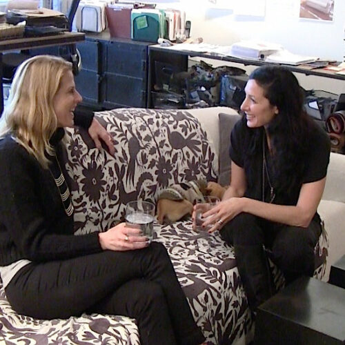
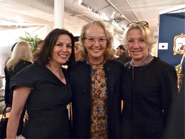 Media sponsors were the Hearst Design Group publications Elle Decor, House Beautiful and Veranda. Veranda editor-in-chief Dara Caponigro (left), Director of Decoration and Special Projects Editor Carolyn Englefield (right) and designer Alessandra Branca (middle) seemed to be enjoying the festivities.
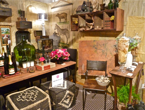
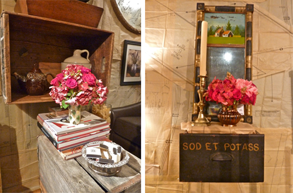
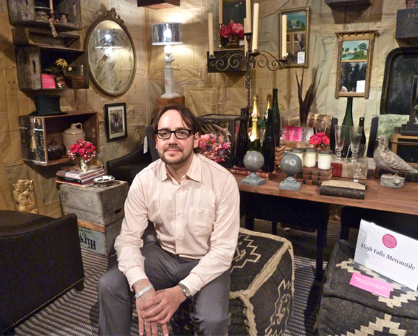 Larry Ruhl’s room for his store High Falls Mercantile was an amazing cabinet of curiosities. Incredibly layered with walls papered in vintage sewing patterns, I felt like I had crawled into the creative workings of Larry’s brain.
Deconstructed, there were chic miniature vignettes everywhere with beautiful florals – who knew he was so good with flowers? And clearly I wasn’t the only one who appreciated Larry’s handiwork – Charlotte Moss practically decimated the space with her purchases.
Design team Anne Maxwell Foster and Suysel dePedro Cunningham of Tilton Fenwick designed the most adorable child’s room.
Michael Loughlin of Talking Walls hand painted the walls in a lively graphic pattern with event sponsor Valspar‘s Chef White and Green Gecko.
The tailored day bed by Duc Duc was dressed with a charming Clarence House print repeated on the pillows and chair and coordinated with a Made in MA Merida rug. I would have loved an enveloping space like this growing up!
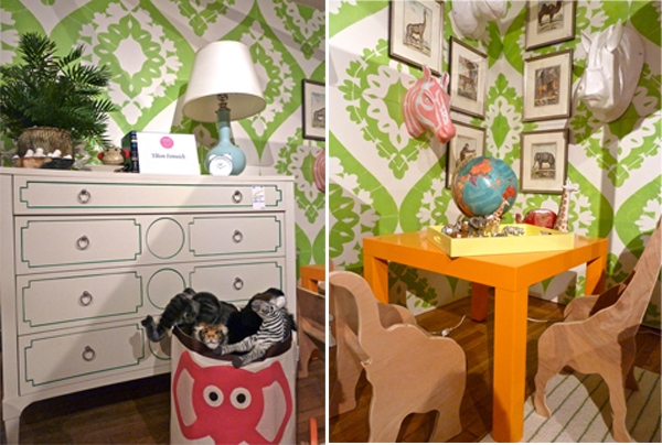 I actually tried to purchase the custom painted Artisan Curved Front Chest by Hickory Chair for my daughter but lost out to a faster bidder. Paloma’s Nest’s enchanting giraffe and elephant chairs went quickly as did almost everything in the room.
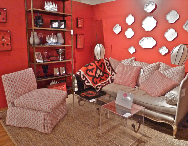
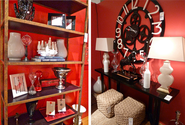
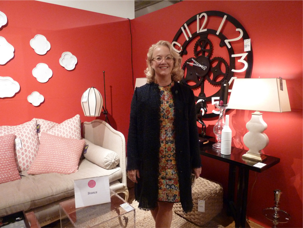 Alessandra Branca fits perfectly in her room for her eponymous firm Branca, which was outfitted in her signature red, black and white.
Every element was carefully coordinated to continue with the theme. I considered both the chic versatile lucite cubes and the classic etagere. Both pieces offer a sophisticated versatility which is space saving and style adaptable.
I was excited to see first time contributor and former HG Design Star winner Tyler Wisler‘s space and it did not disappoint. As you can see, this NY Design Guy (his twitter handle) possesses tons of personal style.
A fabulous amalgam of dark woods, jewel tones with industrial and western touches, his room yielded a rich and sophisticated design fusion. Anchored by Michele Varian‘s signature wallpaper and the Timothy Oulton Vintage Union Jack Bensington sofa, several other Oulton pieces, such as the Axel Coffee Table, Axel Single Bookcase and a pair of leather and chrome Mars chairs were added to the mix.
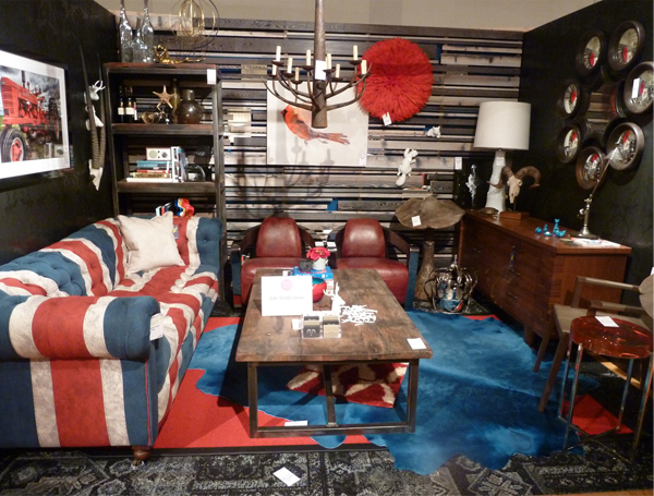 I know Todd McPhetridge‘s tractor photograph sold as I’m sure did many other design bargains in Tyler’s room. To see many of his other donations, visit Tyler’s Pinterest page he assembled for the event.
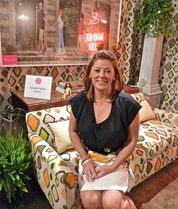
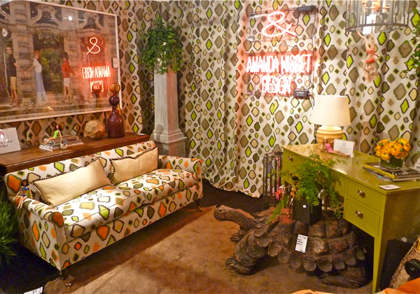
Amanda Nisbet‘s room was in keeping with her glamorous colorful aesthetic.
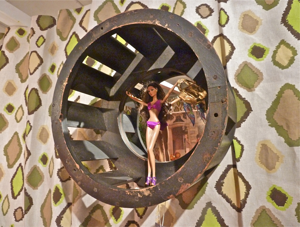
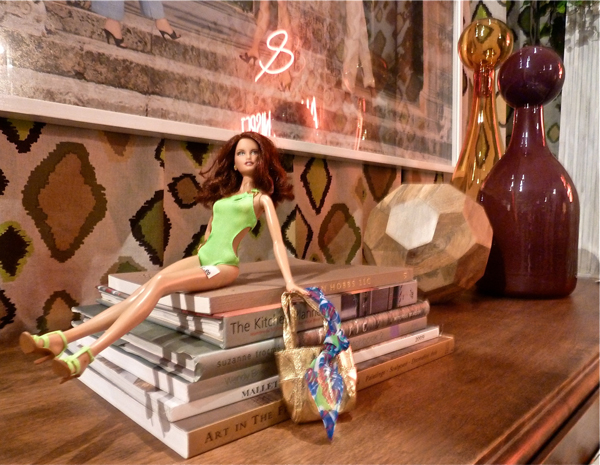
Her inclusion of neon art and Barbie references added to the whimsical appeal. The space was inspired by the green desk which coordinated perfectly with her new Francesa linen with a neutral sisal rug by Studio Four. I’m sure the Christopher Spitzmiller lamp was snapped up quickly.
I think the fact that Barbie looks so comfortable in her new home says it all!
 It’s a good thing my daughter wasn’t with me when I visited the Cullman & Kravis vignette. Ellie Cullman created an irresistible candy colored kaleidoscope dream.
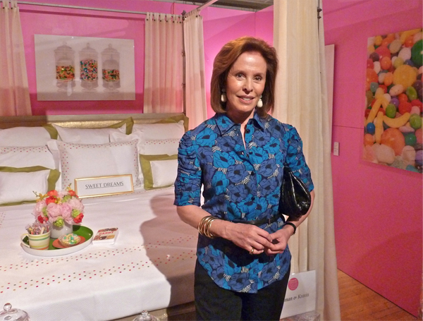 No sweet toothed girl could resist this pretty in pink vision with beautiful custom designed linens from E. Braun & Co. and fabulously fun photos of candy printed on plexiglass by artist Christian Jaillite.
Now if I could just teach her to make her bed in perfect Cullman & Kravis style, then perhaps a fabulous breakfast tray like this might come her way.
This charming vignette is worth noting for future Valentine’s Days and candy worthy occasions.
Be sure to stop back for more Design on a Dime inspiration!








I wish I had gone! So many fabulous finds and such smart rooms! Love your picks!
I wish I had gone, too!! Looks like such a fabulous evening with so much eye candy!
Thanks for including our kid’s room! Your pics are amazing and love that you linked everyone who so generously donated items and their time to such a great charity! XO S&A
Stacy some of my very favorite designers here! You cannot imagine how special it is to see the images; not being able to attend!
Adore Alessandra’s use of that luscious coral!
xoxo
Karena
Art by Karena
Amazing! Great to see good photos. Each designer truly brought something different to the plate.
What a wonderful cause. The HIV/AIDs funding has declined precipitously because people are living, but we all know that we must find a cure. I applaud all the designers that volunteer for this cause and keep the issue alive. Thanks for taking me along. Shall I move to NYC? It is so happening and you are at everything.
Best,
Liz
What a wonderful project and sounds like designer got a big discount and made donations. Sounds like a fun and worth while evening.
XX
Debra~
Everyone was at their best for this event! Wonderful vignette from Larry at The Mercantile and you can always be inspired by MPSmyth. This event makes so much sense for everyone. Thanks for the great photos and terrific post.
Thanks for sharing the images + links.
Lots was written on the web about this event but your review was very helpful.
Luv your blog!
~mmg
Hooray! This event is absolutely la creme de la creme and for such a truly important cause. For every one person that is living well with HIV/AIDS there are many that still fall through the cracks of our American health care. I hope this event raised a TON of money and will look forward to la suite…
Love that British sofa
Those “Barbies” cracked me up! Everyone has to have “whimsey” in their lives or it gets to be “just too much!” Great job! franki
What a wonderful cause and looks like lots of fun. The kids rooms are amazing -something for everyone!
So much ‘eye candy’ to see! Great photos Q!
xo Cathy
What a great event. I love the sheer creativity expressed in this room. It’s a great lesson. Trying to get out prizes this week, will you please send your mailing info to me, ebh@splendidmarket.com?
Thank you and congratulations! http://bit.ly/IwZwbn
Such fun to see all these fabulous rooms as we weren’t able to make the event – and so glad our little palm found a happy home in Suysel and Anne’s child’s room!
xxoo
WOW! Great coverage, next best thing to being there! on the one hand…wish I had gone, on the other…I think I would have gone broke, so much eye candy on sale for a great cause! wow!