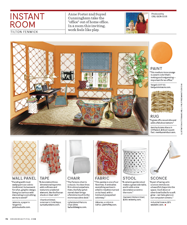
Many times, especially for city dwellers, it is difficult to devote an entire room to a dedicated work space. And then there are those of us who have managed to carve out an actual space but haven’t had the time or opportunity to make it into the creative haven we desire. So I was thrilled to get a peek at September’s House Beautiful Instant Room feature where the Tilton Fenwick girls, Anne Foster and Suysel Cunningham, presented a chic home office that hit the spot!! With their signature love of color, they created an inviting versatile room that can do double duty for fashionable work or play.
I’m sure it will come as no surprise to hear how much I adore the upbeat yet sophisticated orange (Benjamin Moore Tangelo) and blue color scheme. Anne and Suysel are expert mixmasters of the new traditional variety, starting with a classic design element, then updating and augmenting it for a modern current feel. It’s that seamless mix of old and new that results in such comfortable yet fresh and innovative spaces.
Anne and Suysel’s thought for their Instant Room was to design a woman’s home office, “a space all to her own for getting work done, enjoying a cup of coffee, reading the paper, keeping life organized and squeezing in time for some online shopping.” My kind of place!! I love how they even included Anne’s Westie Dallas to really make it feel like home.
 And note all the details like the little painting behind the laptop – “we like mixing in some art that’s formal and hung on wall and casual, like that one leaning against the wall.” The team was kind enough to answer a few questions about the space to give us a little insight into their process behind creating the room.
 Q: Did the inspiration for the room start with the fabulous paisley fabric? How did you decide where to incorporate it and where did you go from there.
TF: Our scheme did begin with the amazing multi-colored Pierre Frey fabric. We had quite a few variations and combinations – Pierre Frey on the walls, Pierre Frey on the Roman shade, Pierre Frey on the desk chair, as pillows, etc. We wanted it to be a statement in the room, but not overwhelm. Because these vintage Milo Baughman Swivel Chairs for Thayer Coggin have such clean lines, they can stand a big and bold print without being overpowered. It’s a great marriage of upholstery shape and textile pattern.
 Q: Scale is so important in this space. One of my favorite features on your blog is the S, M, L, XL. When do you start thinking about scale when you are designing a space?
TF: Thanks! When beginning any project our first step is furniture plan and scale is one of the most important components of that process. Currently, we are working on a corporate office space with overall dimensions of 9’ x 14’ as well as a downtown loft with a kitchen island 14’ long! We have to be constantly aware of scale and proportion, down to every inch.
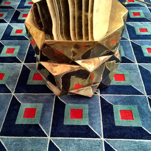
 Q: Let’s discuss texture and materials. I know you love this Merida Abaca rug for the quality and customizable options like the colored tape trim border. You mentioned how it adds texture but I also love that you included a Julian Chichester brass metal end table. Is that a conscious decision when you are designing or was it more just for the “look” – the warm metallic enhancing the exotic vibe?
TF: Mixing in materials is a conscious part of the selection process. With the statement wood desk, we like throwing in the brass side table for the material contrast as well as this particular table’s interesting shape.
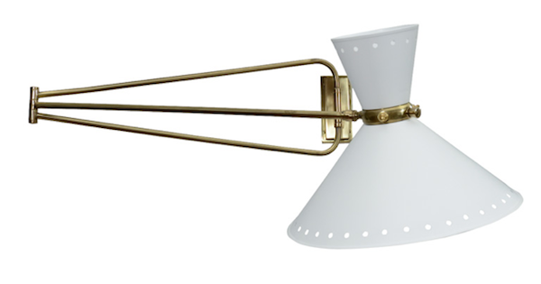 Q: Did you choose the sconces (another possible choice above – French 1960s Lunel Sconces from Pascal Boyer Gallery NYC on 1st Dibs) for looks or to allow more room on the desk or both? Do you always hard wire sconces or would you ever consider leaving the cord out to economize.
TF: Correct – the sconces we selected for both looks and function to maximize space on the desk. We do prefer to hardwire sconces but would still spec sconces if they worked for a space and a budget restricted hardwiring. Maybe the cords could be silk wrapped for a more finished look.
 Q: While this room is intended as a workspace, since it feels so un-officey, it clearly could be multifunctional – was that a consideration?
TF: Very much so! We imagined the space to be both a place for focused work but also a quiet retreat for the woman of the house to read a newspaper or enjoy a cup of coffee with a friend. It’s probably our experience working in New York City – where we are always working hard to make every space extremely efficient and multi-functional!
Q: How do you like to find and update your sources? You have such an eclectic mix here from the vintage chairs to the classic Pierre Frey to the Carolina Irving (Tamar) on the roman shades.
TF: While we have our tried and true sources, we are constantly searching and updating our arsenal. Going to High Point Market for the first time last spring was a very valuable experience for seeing tons of new products over a short period of time. We’ll be heading back this fall! We also look to our favorite blogs for sharing great new (and old) products and sources we may not have known about.
Thank you so much Anne and Suysel – I love your vision for this Instant Room – one of my favorite House Beautiful features!! If you’d like to learn more about this dynamic design duo, take a peek at our outing and video interview last year at Behind the Q.




My husband loves to remind me how I am all about “Instant gratification” and I love how these ladies instantly created that chic space. Beautiful!
pve
Love the room! Im sure its going to be a big hit! and I remember loving the Behind the Q with S&A then, and now even more ..
Fab post!!
Obsessed with Tilton Fenwick’s style and wish I could live in their instant room.
I love this space! I it were mine I would never want to leave!!
GORGEOUS!! One of my fave color combos and I love all the pattern/texture contrast! Wish my new ‘corporate office’ could be their next instant room … ladies, please ?!
Thanks so much for this sneak peek, Stacey! Love that you were able to flesh out so many of our thoughts and inspiration behind the room. Have a great time in Vegas! Can’t wait to see all your finds! XO S&A
fabulous vision as always TF! and great interview stacey! i want that desk – is it one of a kind?
Such a beautiful room (for one of my favorite pages in my favorite magazine) and I loved reading Anne and Suysel’s answers!
Tilton Fenwick is bringing sexy back to traditional. We love that, love this room and love Stacey’s delightful, smart coverage.
Anne & Suysel are a dynamic team who are putting their own mark on traditional!!! Great inside peek, Stacey!
What a fabulous space to have as one’s own… to be creative and to be organized! How we would love for these two to come update our studio space… And how fun for you to get the inside scoop!
xxoo
C + C
Great interview. The Pierre Frey fabric makes every element of the room come alive. Wonderful space. Thanks. Mary
As someone who has had to scoop her workspace out of a multy-purpose room, I really appreciated this post! Especially as they are such a talented team. I love their work. A lot to learn from here…merci!
You know, many just look at the photos and turn the page…ALL the work, time, thought that goes into these spaces is just…amazing. Thanks for ALL the efforts – great interview! franki
p.s. I SAVED the page!
Love the room and the mixtures. I also love how the team approaches a room- great interview!!
Such a beautiful space! Love the Q&A too! What a talented team!! That orange is just spectacular!!
http://www.donnaviningblog.com
Loved this sneak peak of the upcoming Instant Room feature. The walls, the flooring, draperies and furniture (those swivel chairs!) are fabulous. Not surprising from this uber-talented duo!
Great job, Anne, Suysel and Stacey! Glad to see TF in House Beautiful. Congratulations.