Mick De Giulio has been designing kitchens for over 40 years and his wealth of experience shows in his Kitchen of the Year. As De Giulio says, “I may call myself a kitchen designer, but what I really do is orchestrate and conduct the dreaming process.” And there are so many dream-worthy ideas to be gleaned from this space.
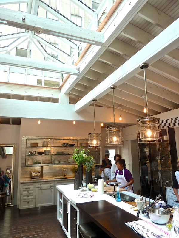 Upon entering, the immediate impression was of a bright and cheerful room, enhanced by a fabulous conservatory style skylight. And while essentially a white kitchen, there was a multitude of subtle color and material combinations at play.
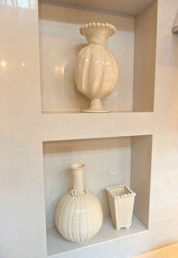 Even within the white palette were many variations, from the Glidden White on White walls to the KraftMaid Sedona Maple Dove White cabinetry to the Caesarstone Fair Lady Supremo countertop, all in tonal shades that De Giulio explained add layers and textures to the space. Frances Palmer‘s beautiful warm white ceramics offered textural artistry to the niches in the Caesarstone wall above the Whirlpool induction cooktop, evidently now the choice of most chefs.
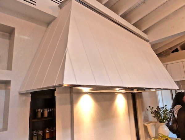
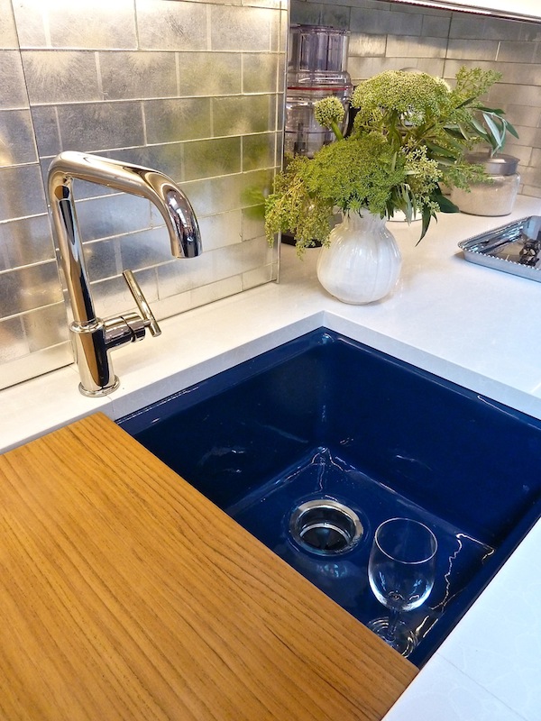
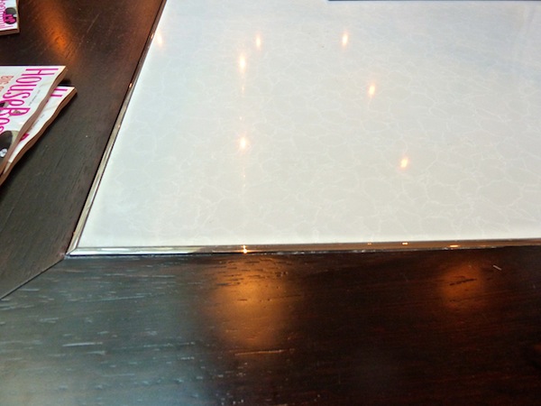 Bringing warmth to the large white island, De Giulio added an asymmetrical inset countertop of Cameroon Wenge Wood by Grothouse. The details in the kitchen are amazing and here you can see a perfect example where De Giulo added a thin rim of stainless, meticulously outlining the meeting of materials. See how exactingly the mitered corners are aligned. This trim, as seen in the hood below, and a zen-like balanced asymmetry are both themes repeated throughout the space.
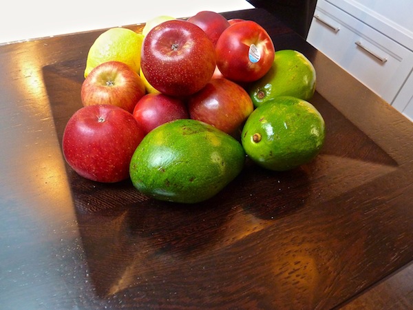
Within the wood counter was a clever custom feature I liked – a carved integrated fruit bowl, adding a pleasant break in the long island surface.
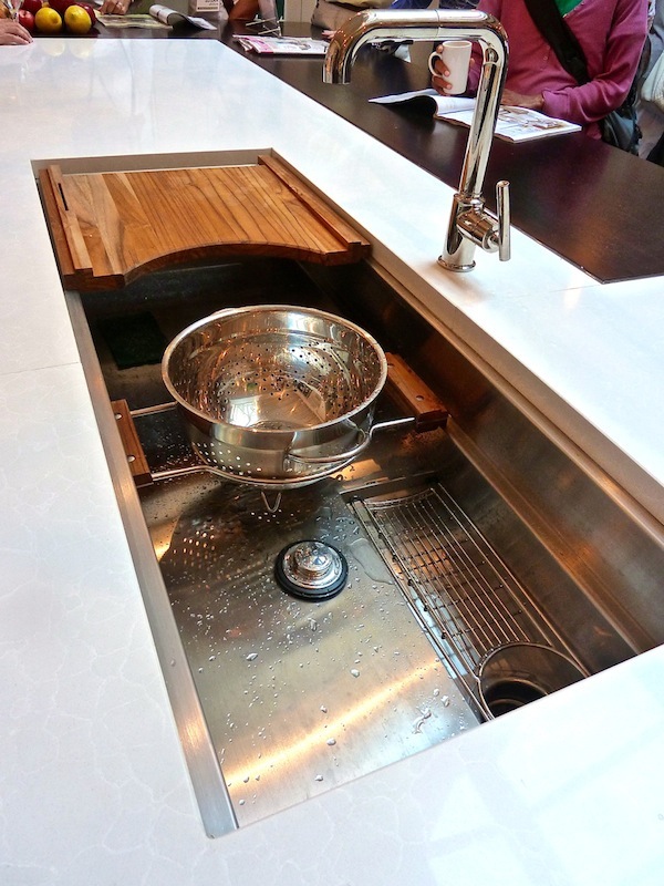
 One of my very favorite features in the kitchen was the new 45″ Multiere sink, which understandably won the 2011 Interior Design Best of Year award for best kitchen fitting or fixture. Designed by De Giulio for Kallista, it has so many useful bells and whistles hidden in its chic design. I think more sinks should have corner drains like this one. Not only does it allow for more available “floor” space but also for more efficient under-cabinet storage (where Kraftmaid introduced its CoreGuard sink base, providing a new engineered surface for easy cleaning and protection against water damage).
The sink includes a sliding colander holder, a flatware tray for rinsing cutlery and a handy reversible cutting board, also repositionable on a glide across the entire width. One side includes a knife holder with built in sharpening rod and the other a drain board which, as you can see fits perfectly with the colander.
As with all successful kitchen designs, De Giulio’s design combined form and function. One innovation was his “La Mattina,” the morning, a versatile wall space intended as a breakfast area.
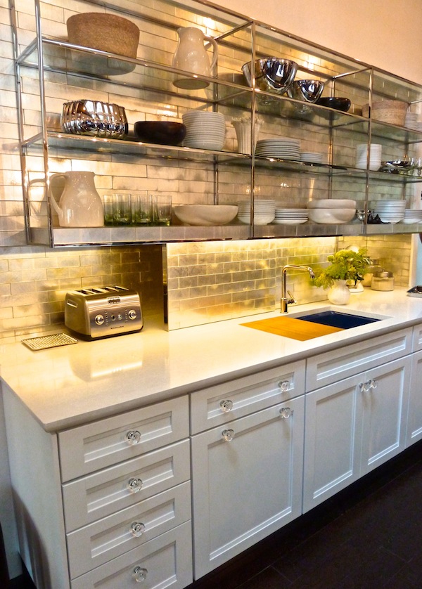
Repetition of the stainless piping now translated into seemingly floating glass shelving, (filled with contributions from The Container Store and Michael Aram) against the beautiful Ann Sacks Davlin tiles. Handmade with white goldleaf pressed between two pieces of glass, they have an amazing luminosity. And the partial wall slides to conceal appliances. Notice how he differentiated the cabinetry from the rest of the kitchen by using more decorative and glamorous hardware.
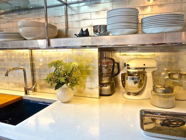 In the center, like a jewel in the space, was the Jonathan Adler for Kohler sink in a stunning Annapolis navy, the perfect counterpoint to the silver and white tonalities.
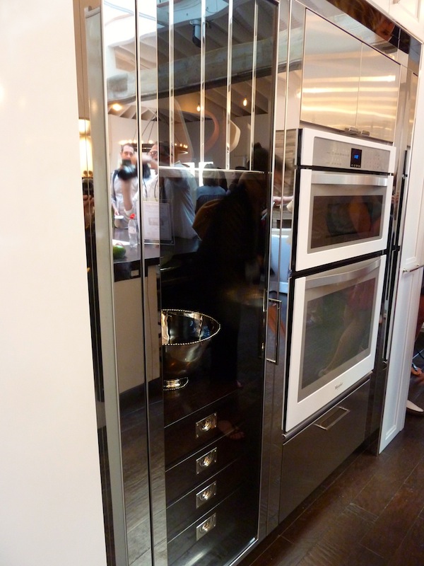
The opposite wall housed the appliances, the new white Ice series from Whirpool. A polished stainless rim encased each bank, echoing the thin piping elsewhere. I preferred the thinner piping but De Giulio felt that the wider trim amplified the sense of floating seen throughout.
There is still so much more inspiration from this kitchen to share. I hope you’ll join me again next time to take a look at more design details, all the unique storage as well as the adjoining butler’s pantry.



LOVE the sink, really!
Love seeing Frances’ elegant yet whimsical touch added to this glossy, glamorous kitchen! That tiered sink is fabulous and the placement of the drain is genius. Will have to make note of this for the kitchen redo next year! Happy Friday, Q!
xxoo
C + C
I just don’t know where to begin. The sink, how has there not been a side drain before. This is exactly the problem with just had with our little beach condo we recently revamped. We cannot fit a trash can underneath because the darn drain sits right in the middle – and space is tight. Ugh, genius. I love the cutting board fitting over the sink idea. I might have to have my husband fashion something for me.
The tiles, oh my heart went pitter patter – so nice, and the sliding door with the same tiles is so clever.
Can’t remember if I mentioned the pendant lights last time but I REALLY love them.
So enjoying these posts :)
I love everything about this kitchen! I saw it in my HB magazine but you’ve shown more details so thank you for that. So many great ideas I wish we could incorporate.
XX
Debra~
The La Mattina,” OMG!!! There is so much thought put into this FUNCTIONAL kitchen..it is absolutely BEAUTIFUL!!! franki
A girl can dream.
Thank you for sharing this, Stacey. Not only beautiful, but so functional.
Have a great weekend.
Teresa
xoxo
We are looking at a
little “refresh” for our
kitchen over the next
year and this post is
just PACKED with
great ideas to consider.
I really enjoyed it;
thank you!
Happy Friday,
xo Suzanne
Gorgeous all the way down to the accessories.. love Michael Aram. How clever to add the integrated fruit bowl! Beautiful, efficient shelving, the lighting fixtures are perfect.
Have a nice weekend
leslie
Definitely the stuff that dreams are made of. I love seeing all the little details, and counting all the different shades of white– and I have a severe case of sink envy. Thanks for such great coverage, Stacey. I won’t get to see the kitchen in person, but your descriptions and attention to detail make it come to life for me. Thank you!
I wouldn’t know where to look first…so many amazing ideas. That sliding colander in the sink…those gorgeous gold Ann Sacks tile. This is definitely a reflection of how we all want to live now. Hats off to Mick and the House Beautiful team.
Happy Weekend!
~ Elizabeth
Love the functionality of the kitchen and all the tiny details – dying over the sink. Of course, it’s a white kitchen so I love it :) Also, love that dip in the island for fruit. Genius.
This kitchen was definitely well planned! Love all the white and the fruit bowl built into the wood countertop is genius! Who wouldn’t love a large sink, much easier to clean your large pans, and love the accessories that come with it!
Have a great weekend.
http://www.donnaviningblog.com
We’re in the midst of planning a kitchen & this one, takes ideas to a whole new level. The glass and stainless shelves amongst the Ann Sacks tiles..simply amazing. The sinks, both of them, are the frosting on the cake. Thanks for the thrill Stacey!
I’m just obsessed with this kitchen. So many elements to love, but the open shelving adds such character…definitely a dream!!
looks great but was much happier with Tyler Florence last year. not sure why they always pick a week that seems to be the hottest of the whole summer, just not nice for viewing the kitchen. this is quite nice, but I am curious who they will have next year. So sad I missed when Jeff Lewis did it a few years back. Thanx for the post!!
Love it all and I really want that sink!
W.O.W! I’m breathless over the Ann Sacks tile. Mick De Guilio has been a genius for decades. I remember seeing my first DeG kitchen in Chicago back in the ’90’s…so glad he’s getting the press he deserves.
Thanks for sharing!
Loving your tour, especially since I couldn’t pay a personal visit this year!
Lynn
How nice this Kitchen decoration..!! I actually so pleased to get this. I think that it will be more helpful to us. Keep it up…
interior design
This kitchen was very well planned! Love all the white and the fruit bowl built into the wood countertop is ingenious! Who wouldn’t love a big sink, much easier to clean your large pans, and love the accessories that come with it!
Have a great weekend.
https://mymultimediatech.com