Like everything that comes out of the offices of Carrier and Company, their new book, Positively Chic Interiors, makes it all look so easy and effortless.
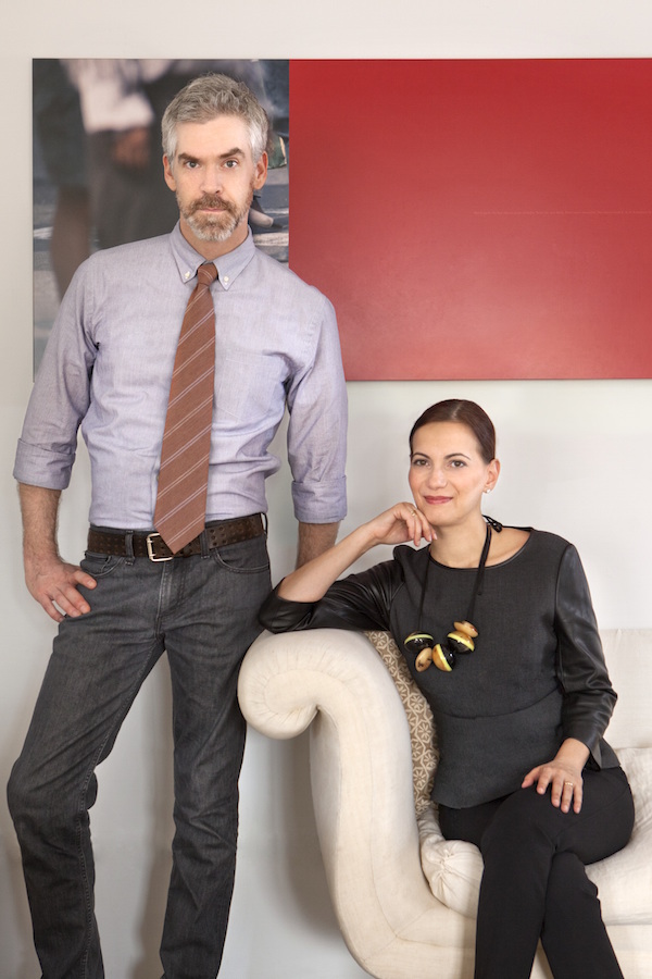
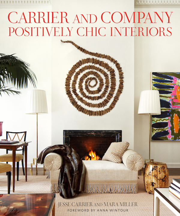 As with their projects, there is a crispness and clarity to the book design, with lush imagery yet room to breathe. Copy is intelligent yet approachable (with help from Judith Nasatir, effectively translating their voice), informative, inspiring yet personal with chapters that are logical, yet organized with a relaxed point of view. If we didn’t know better, we’d feel like the casually chic husband and wife team of Jesse Carrier and Mara Miller just breeze through life and work.
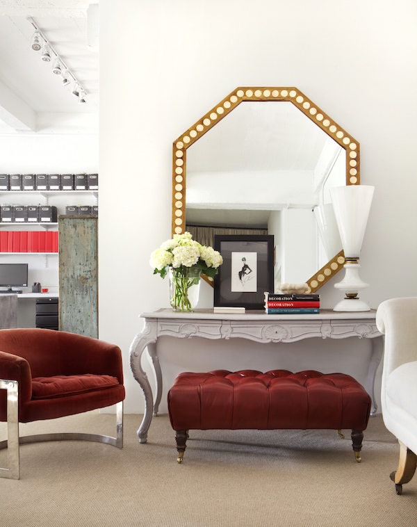
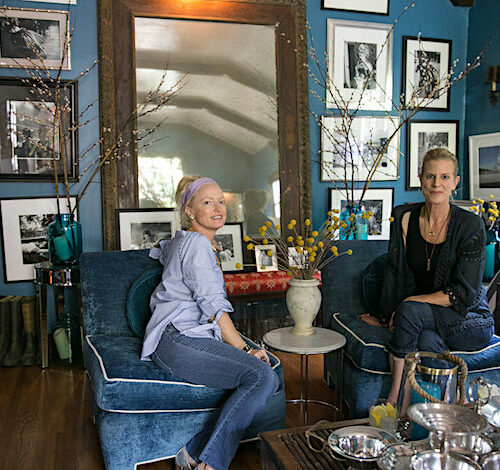
The image of their reception area gives hints of what’s to come – an eclectic, sophisticated and ultimately timeless mix. As they put it, “timelessness is the love child of modern and traditional.”
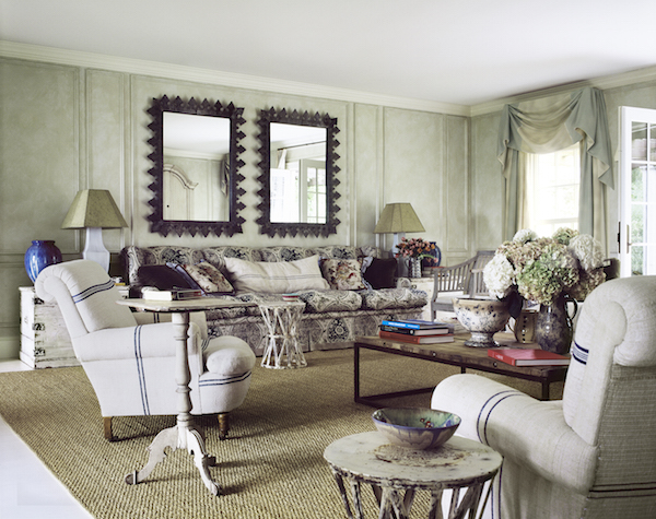
 In the chapter on timelessness in interiors, the duo start to explain how they arrive at “the mix.” For example, in Anna Wintour’s country house living room (not identified but recognizable), bold choices in scale and pattern offset quieter moments. Shiny white enameled floors sit under the rough rustic texture of sea grass and formal traditional curtains are of a contemporary fabric.
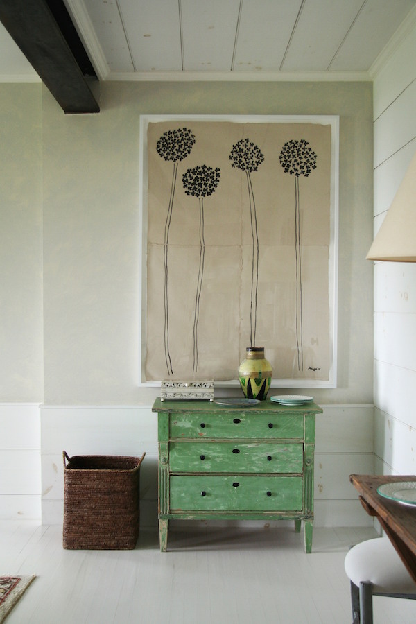
 It is the element of scale that lends the vingnette below an updated feel. An enormous Hugo Guinness painting seems to overwhelm the small Swedish painted chest – but it is exactly that surprising juxtaposition that makes it modern and chic.
When Catie and Don Maron (not identified but has been published) asked the team to design their Southampton house, their only request was for a “new version of an old American house.” By “honoring-and updating-the tradition of blue and white,” Carrier and Company created a wordly yet relaxed take on the theme.
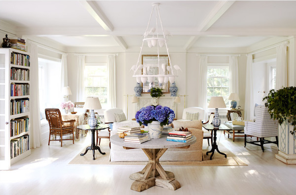
In the country chic dining room, a traditional blue and white scheme is continued from other rooms through accessories.
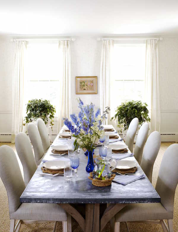
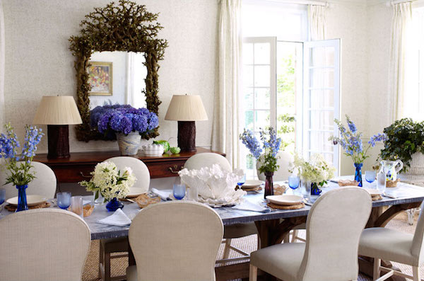 And a weathered zinc top table and plants in antique stands reference the adjoining garden, all executed with a comfortable and light-filled touch.
In describing the melding of styles, possessions and points of view often required in a project, Jesse and Mara explain that the goal is the “perfectly imperfect,” where unrelated components are combined for visual compatibility. It allows for change and flexibility. “The mix is very forgiving. Life does not have to be perfect. Furnishings and possessions do not have to be perfect. But you can still live beautifully.” Amen! Below, a contemporary Eskayel paper on the walls serves as a backdrop for the clients’ historic maps and favorite photographs with a “mix of disparate forms, textures, and materials unified through color and artisanal quality.”
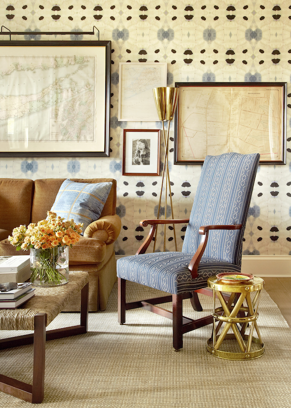
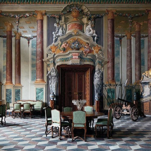
If I were in school, I would have been highlighting lines from the chapter on Tailored Refinement where the designers explain how all their projects, regardless of style, are rooted in classic design principles. This is something I strongly believe in – that a knowledge of at least the basics of the history of design, architecture and decorative arts is indispensable in creating not only beautiful but livable and harmonious interiors. It teaches you how to “see and know proper form, proportion, scale, elevation, plan and composition. … it is the essential visual language that must learned, absorbed and mastered before graduating to abstraction and beyond.”
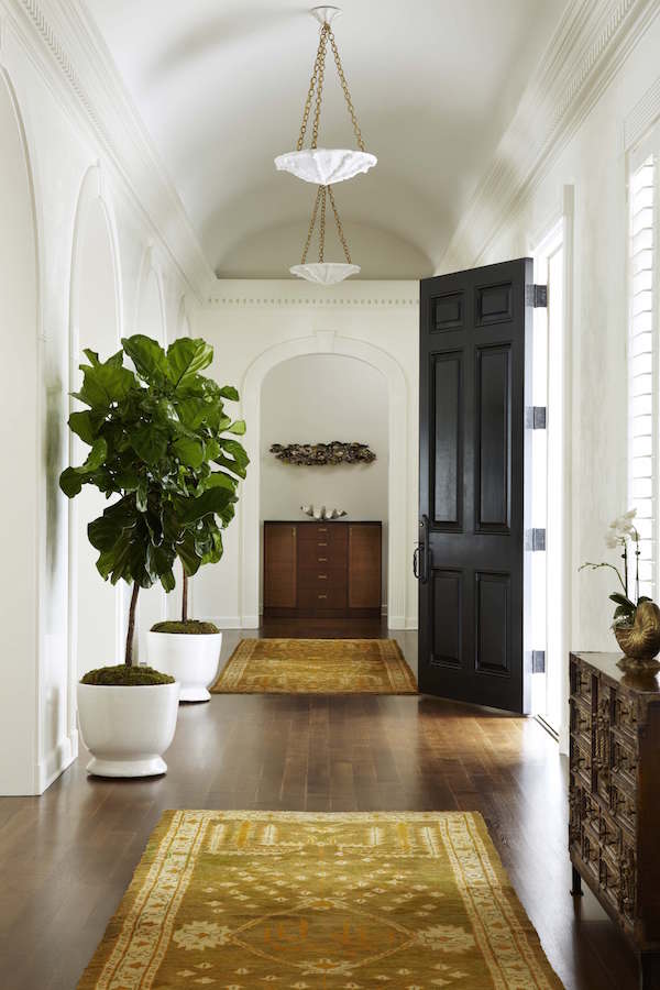
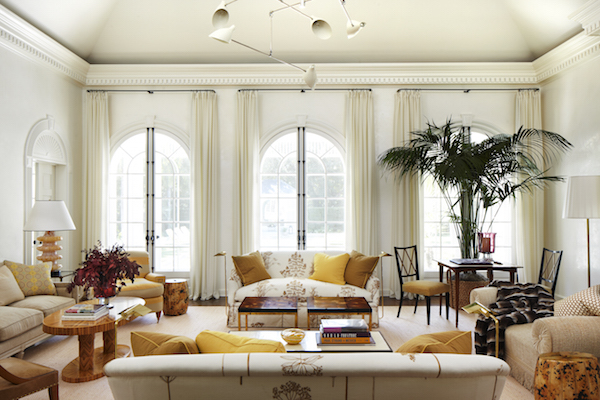
A tailored room in Carrier and Company’s book is defined as “clean and pared down,” strictly edited without excessive embellishment or major color play, yet sophisticated, warm and comfortable. In the Florida house above and below, crisp and clear forms are enhanced by strong details resulting in rooms with understated yet glamorous elegance.
The versatility of the firm is extended in a chapter of country rooms where rustic charm is still refined and well considered.
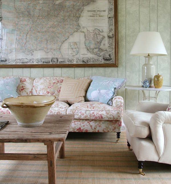
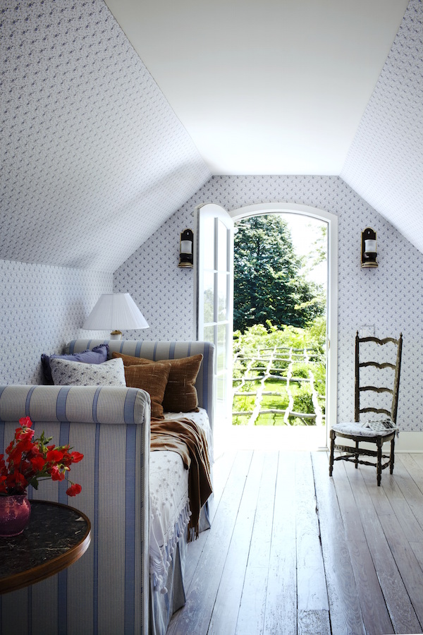
The design vernacular may be simpler and less polished but provides a gracious and stylish sense of place. As they say, “history matters” and each country project is aware of and speaks to its location. A Hamptons guest room in a converted barn, below, references local design history without feeling period but with an appropriateness that just feels comfortable and authentic.
When considering projects that have a traditional bent, they honor the past but aren’t restricted by it. “Tradition for us is something of a loose fantasy, rather than a tight construct of provenance and period.” It is the trained eye that is able to recognize, interpret and bring tradition forward for a new meaning today. Town & Country Editor in Chief Jay Fielden’s Connecticut home (again, not identified but previously published) actually falls within the chapter “Luxuriously Modern” but I think expresses an organic warmth that could be defined within the realm of modern traditional today.
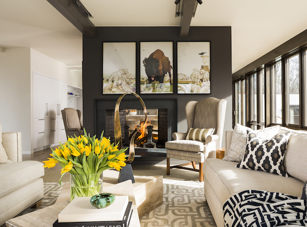 With an eclectic yet sophisticated mix of high low, from antiques and chic vintage finds to Restoration Hardware to thrift shop discoveries, it represents the best of both traditional and modern – appropriately, just like the magazine Mr. Fielden edits. And just like this and Jesse and Mara’s many other featured projects, the book is thoughtful, personal and perceptive. As Anna Wintour says in her introduction, “each and every interior here embodies a real sense of personal charm, these are homes whose high style comes from a very human-scaled sense of warmth and joy.” And isn’t that what it’s all about?



A ‘Perfectly Imperfect’ style of design…love it! Many thanks for the introduction, definetly one for the designer bucket list…
I was nodding my head in agreement throughout this. Have a wonderful week ahead, Stacey.
Each of these rooms is so inviting. I so wish we could enlarge your pictures, Stacey. I guess I will have to buy the book instead! Thanks for introducing me to these designers.
I love their range of design capabilities and how they translate traditional for modern living.
Beautiful. This aesthetic will always be on point. I’m going over to Amazon right now. Thanks. Mary
so chic!
Beautifully presented Stacey. This talented couple really know their business and both have such esteemed backgrounds. I just received this book and love, love it!!
xoxo
Karena
The Arts by Karena
Refreshing, clean, sophisticated design…comfortable for everyday living.
I wish more designers would adhere to that philosophy.
(I also would like to enlarge the photos:)
Comfort and ease of stye in every room. This will be my new favorite very soon.
xo, lissy
Amazing interiors! These are my ideal designs.