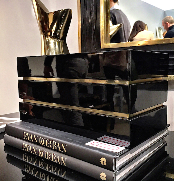
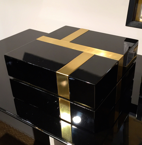
While there was certainly quite a bit of color to be found at NY Now (we’ll get to that soon), I noticed a fair amount of black and white entering the mix, the former often paired with gold tones or brass. One of the chicest introductions was the new Flair collaboration at The Lacquer Company. In keeping with their carefully curated modern meets vintage style, George Nunno and Jon Maroto have created a capsule collection of sophisticated and timeless furniture and accessories. With a nod to their shop’s Italian roots, these pieces have European 70’s flair with go anywhere appeal. Smaller accessories like this Brass Banded Box
 Pyramid Box, Righe (meaning lines in Italian) Tray, Globe Box
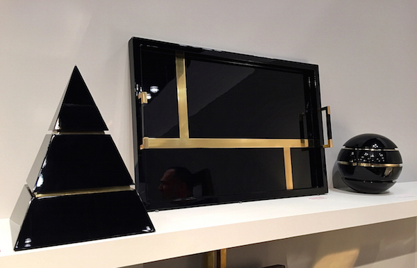
and Righe box would enhance any desk, tablescape or bookcase with style
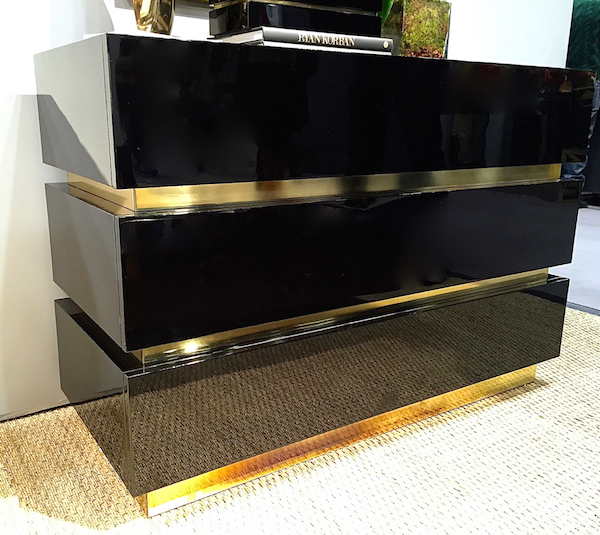
and the refined lines of the elegant furniture would work with almost any decor. The Brass Banded Chest offers storage swathed in a glamorous sheath of black and gold.
And the Edge Side Tables give a room that essential dose of black with fabulous brass detailing.

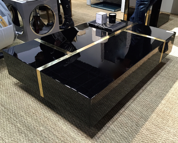
But the pièce de résistance of the grouping has to be the fabulous Righe Coffee Table. And while I adore the pieces in George and Jon’s signature black, they can also be ordered in other combinations such as white lacquer with nickel trim.
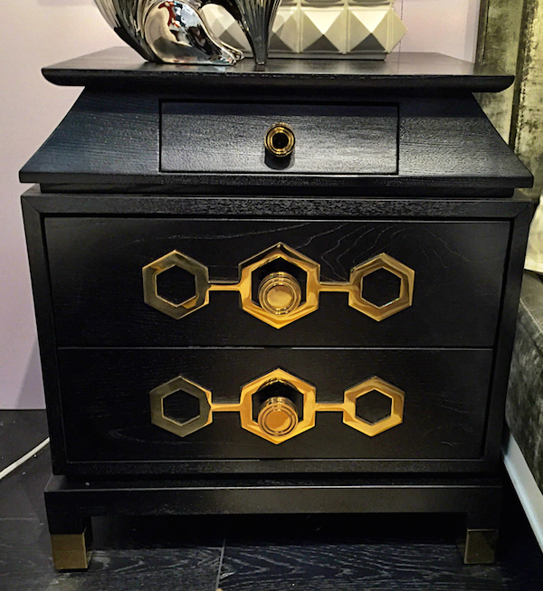
Jonathan Adler‘s show booth seems to be ever expanding and his use of brass, as we saw with his last collection debuted at NY Now, is always strong. And while his happy place is color centric, black and white was also thematic. He added to his Turner collection with this stylish small nightstand/cabinet
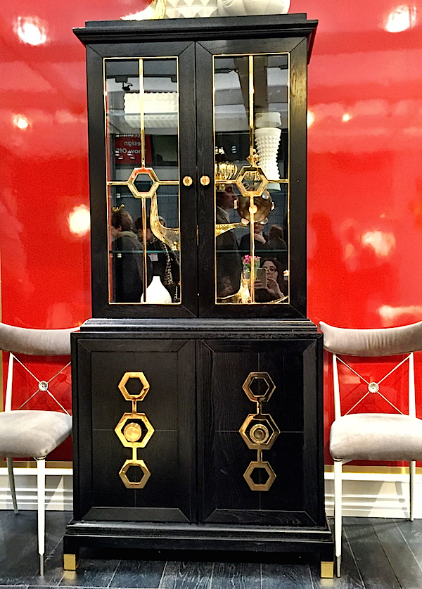
and this handsome armoire, both with the signature hex hardware and brass feet caps.
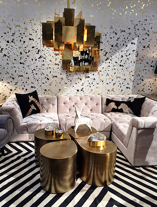
The black and white Bridget Kilim anchored a plush new mix and match sectional in front of a glittering new splatter wallpaper.
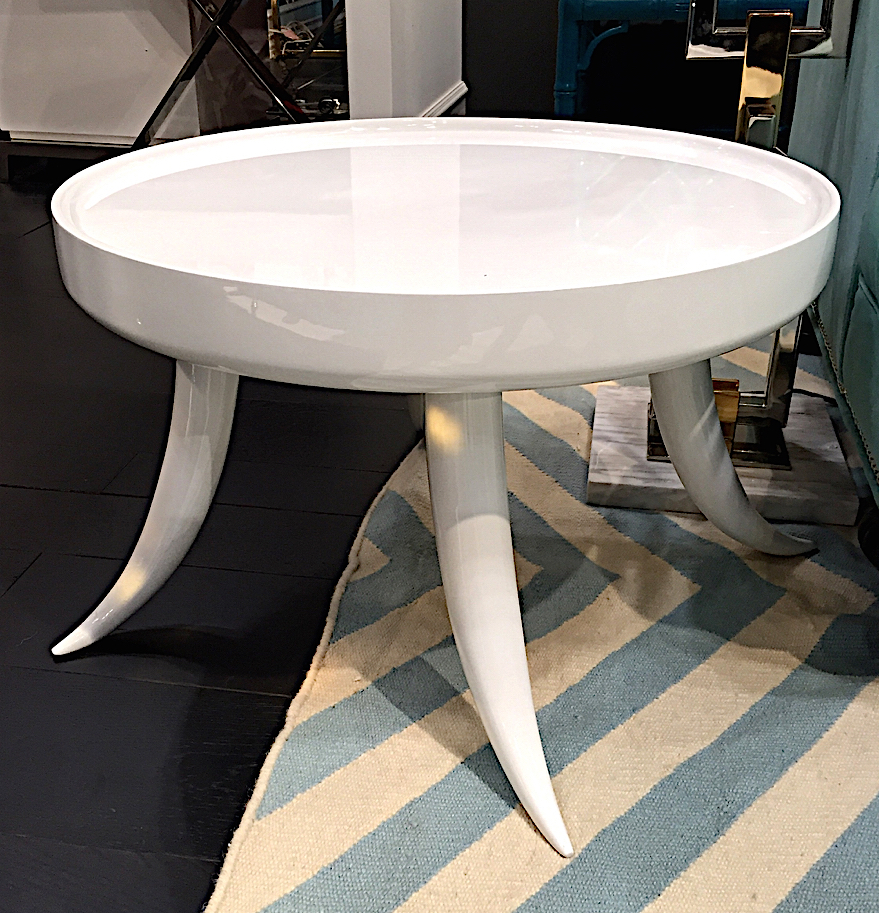
And adding to the smaller occasional pieces, I liked this fun white tusk inspired side table.
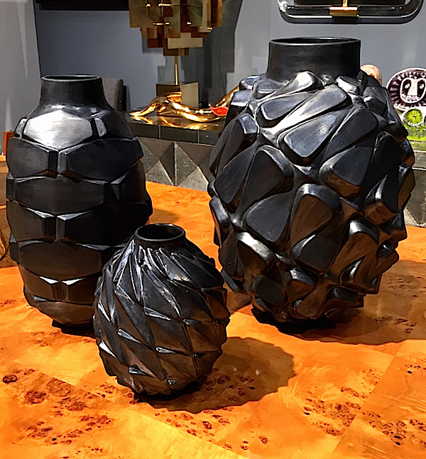
New ceramic pieces included these gutsy new matte black vases with their expressive twisting movement.
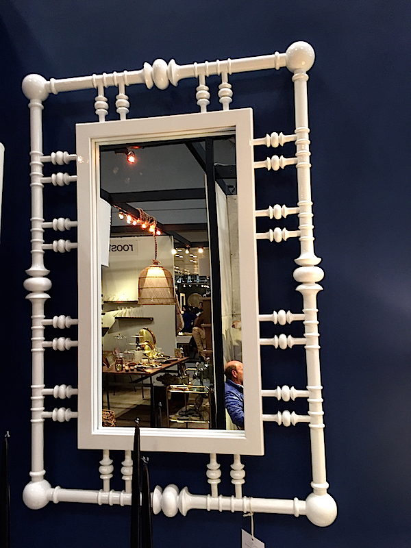
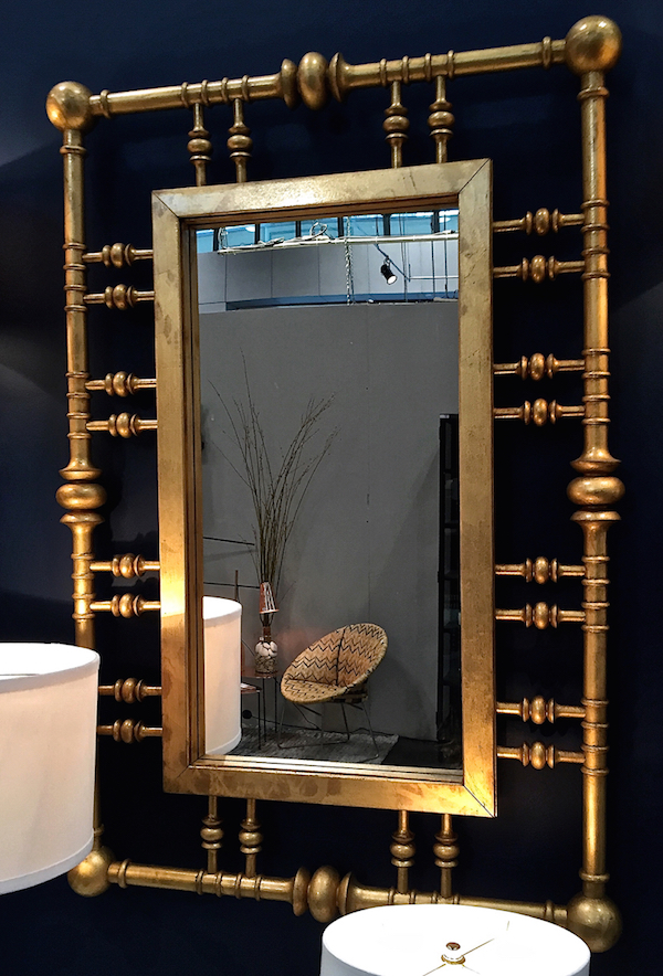
Dunes and Duchess continues to successfully expand their line and while they are known for their use of color, sometimes black and white is just right. Their Island House mirror is a home run and looked fabulous both in white lacquer
and their relatively new gilt finish.
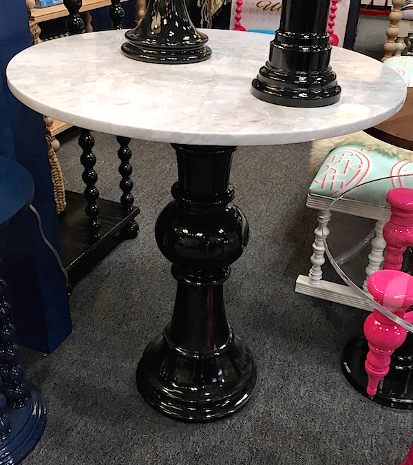
Stacy and Michael are starting to experiment with adding marble to some of their pieces and the black and white combination of their Captain’s Compass table base with a round carrera top was looking sharp.
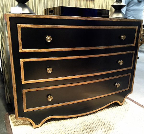
Black and white showed well at Bungalow 5 where their new Melony chest added gilt to the mix
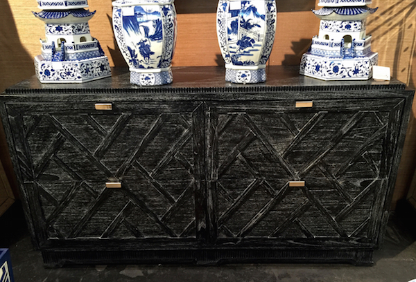
and the Cara dresser looked rustic chic in a black limed finish.
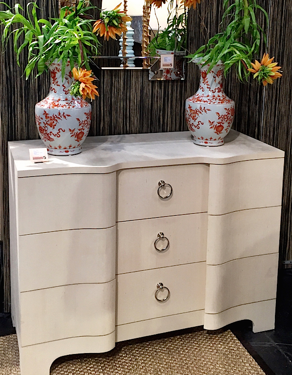
The new Bardot series has a vintage vibe with its serpentine shape and looked sinuously elegant in the smaller size with warm white finish.
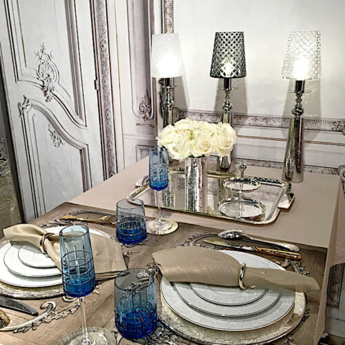
Black and white took to tabletop with graphic style. Kim Seybert presented one of my favorite collections in seasons including the new East West placemat and napkin with their classic Crystal Constellation napkin ring in black and White Fez placemat.
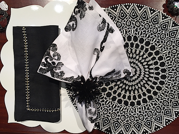
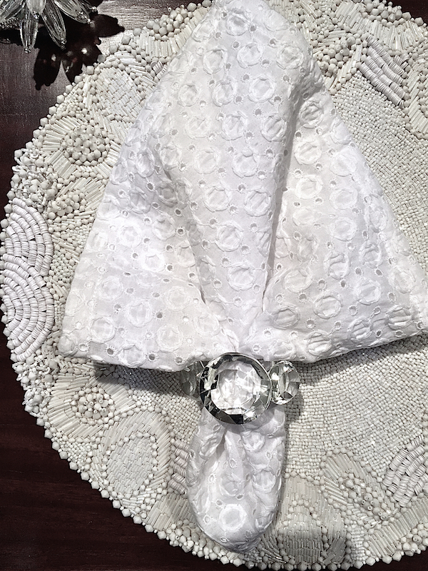
The new White Nimbus beaded mat and textured cotton napkin are perfect for spring/summer.
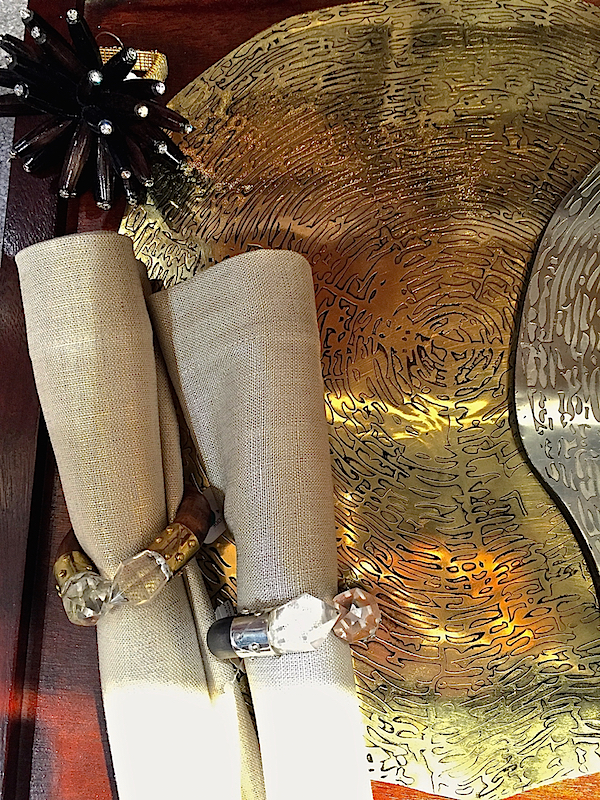
And for a touch of gold or silver, the new faux bois Timber mats offer metallics with a natural edge. The metallic linen napkins are a year round staple and the Geode tipped napkin rings are a fun bit of not too flashy bling.
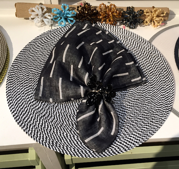
Deborah Rhodes has a handsome new black and white woven mat and coordinating napkin with a modern yet artisanal bold graphic look.
 Julian Mejia had a new mat featuring a molecular-like abstract arrangement I rather liked. It came in other colorways but the black and white with shades of gray was the winner in my book.
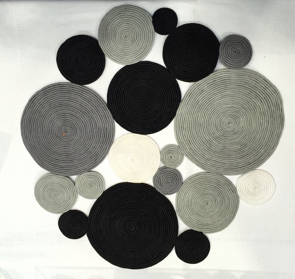
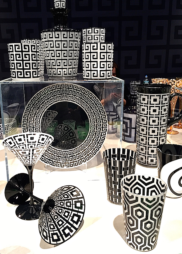
Britten Couture Home, out of Brooklyn, may be more known for her handmade linen napkins but her Gates dinnerware is a fun mix and match set in black and white.
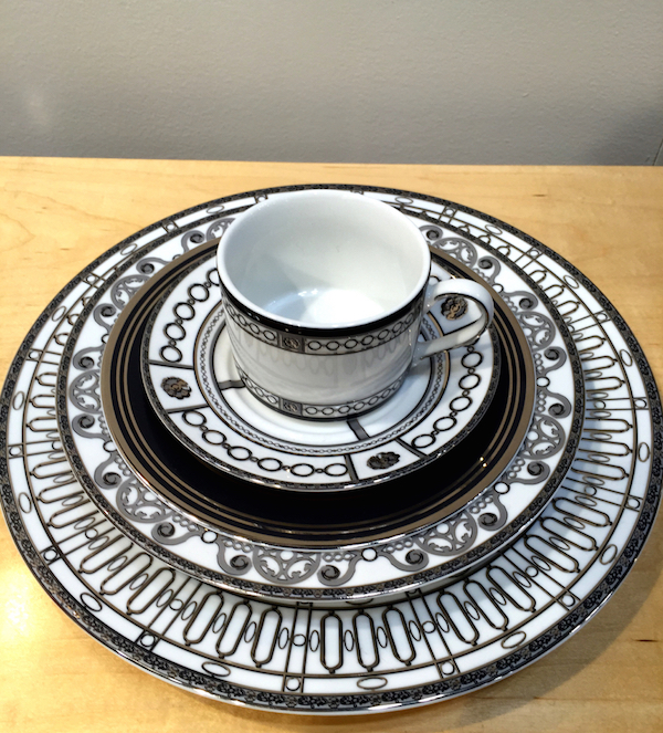 Artel‘s new black and white Graphic collection mixes classic and modern patterns.
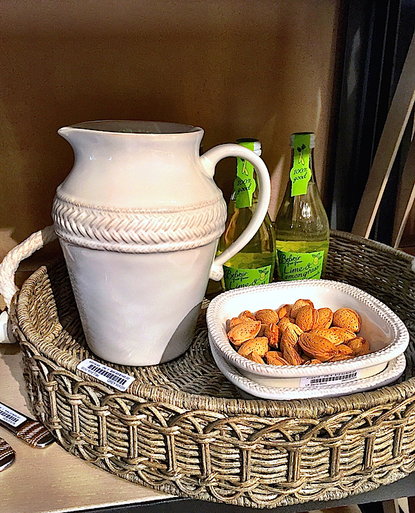
White was the color du jour at Juliska where their classic Le Panier basketweave was expanded into white dinnerware
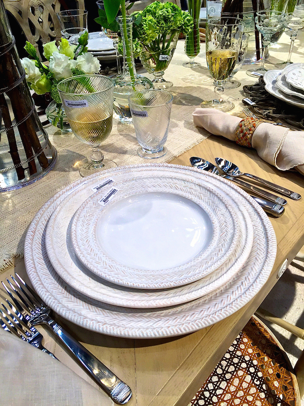
and a full range of accessories.
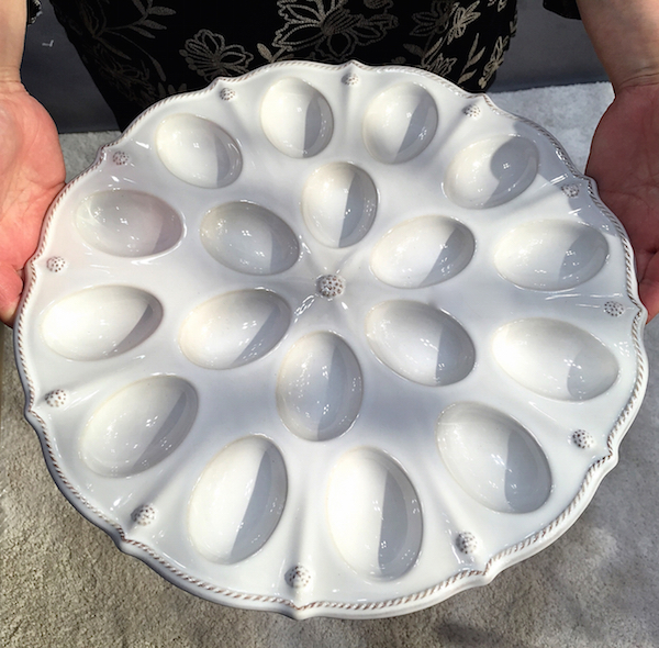
Additions in Berry and Thread included this charming deviled eggs plate.
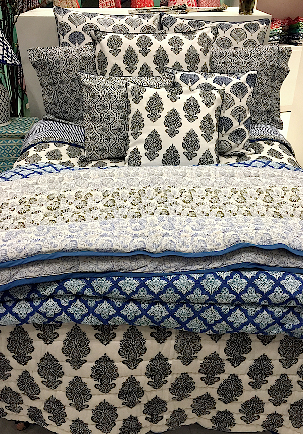
 In bedding, Roberta Roller Rabbit introduced several of their classic pattern in black and white for their signature mix and match.
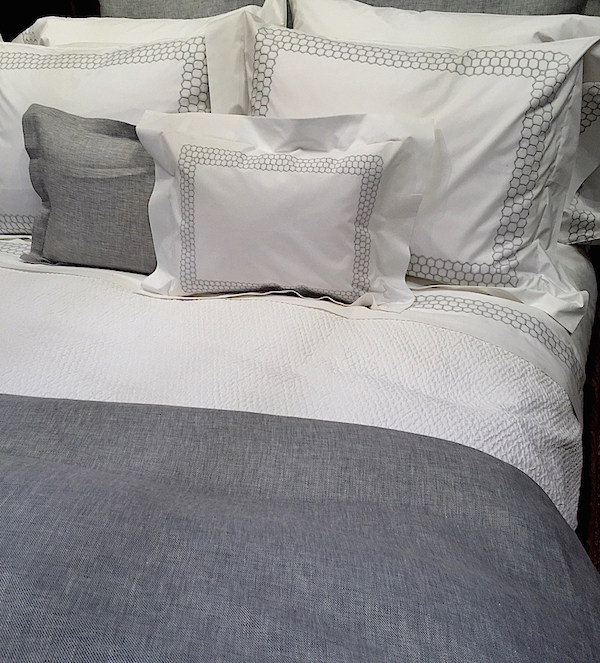
Matouk introduced a handsome new black and white coverlet.
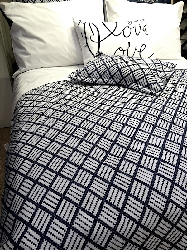
as well as lovely new honeycomb bedding.
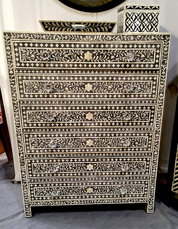
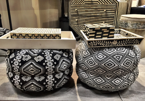
Manglam Arts brought exotic appeal to black and white with their wide ranging products out of Jaipur, India.
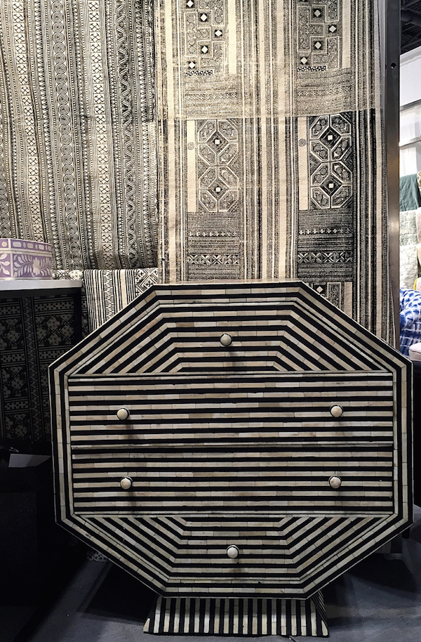
From rugs and beautiful inlaid furniture
to accessories, there were many ways to add black and white to your palette.
In our next look at NY Now, we’ll take a more colorful look at spring.



Cara dresser is drool-worthy…..
Oh the Adler Armoire, Dunes and Duchess always delights, and I always adore anything inlaid!!
xoxo
Karena
The Arts by Karena
Thank you, Stacey; I feel like I am there instead of snowed-in up here!
Absolutely SPECTACULAR!! Contemporary, period, bold, subtle, solid or patterned: B&W makes a statement!
Beautiful! The Edge side table and nesting tables have to be my favorite of the bunch!
xo. Leslie
Segreto Finishes
I think the Black pieces are chic, smart and fabulous, but they are giant dust magnets. You dust them, turn away, then turn back, and they need dusting again. Having a few dark colored (navy) and black pieces myself, I’ve over the years had to develop a blind eye to the dust that settles on them. I think Mario Buatta once said, after a year or so of not dusting, everything developed a wonderful glow, and dust was what preserved the pyramids. So black pieces, dusty or not will always me a decorating must have ;-}
Well, that seems to just about cover it. Thanks for the info, great photos and comments.