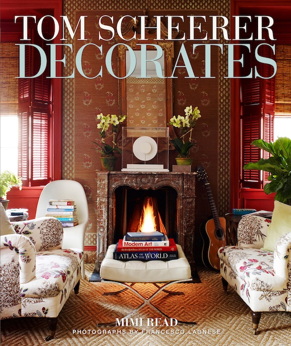
Tom Scheerer has clearly struck a chord. Already there have been quite a few pieces about this book, even before publication. There is a reason.
In a world that constantly celebrates bigger and better, Scheerer’s particular brand of understated, underdecorated design is like a refreshing Bahamian breeze. And Mimi Read has so perfectly captured his spirit and process. Like Scheerer’s work, the book has an easy-going “vibrant optimism.” You’ll want to live in its pages.
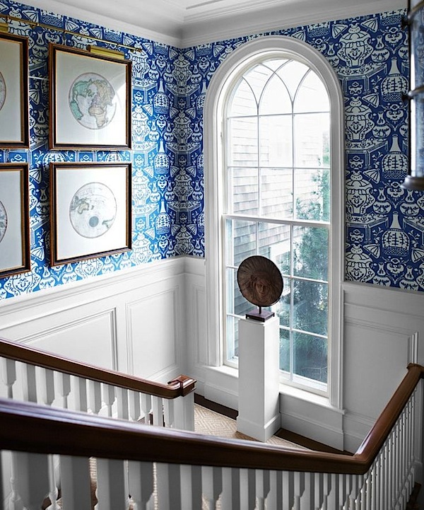 There had already been a quiet buzz building about the volume and then September’s House Beautiful, featuring a Watch Hill, Rhode Island project of his (that also appears in the book, above and below) hit the stands. His inspiring transformation of this sprawling new house into a spirited and personal home made its way onto hundreds of Pinterest boards, leaving people clamoring for more from the designer.
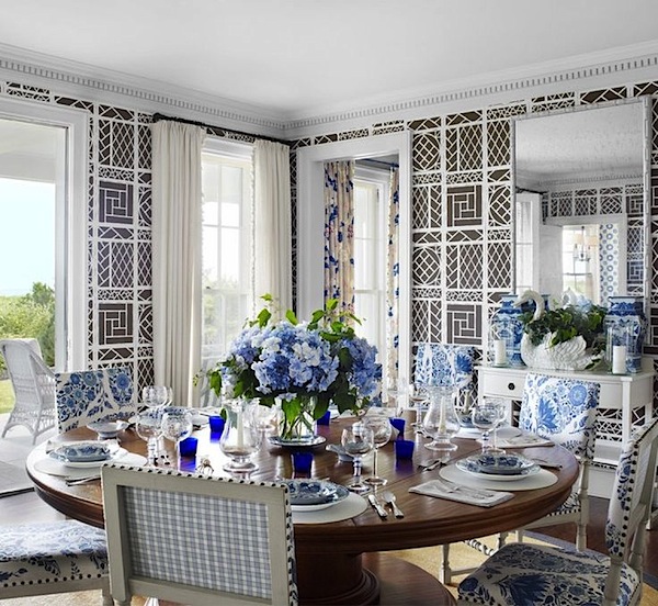
Just as comfortable at home in his family’s East Hampton house, below, as in a rustic island retreat, Scheerer and his work are my favorite kinds of dichotomies.
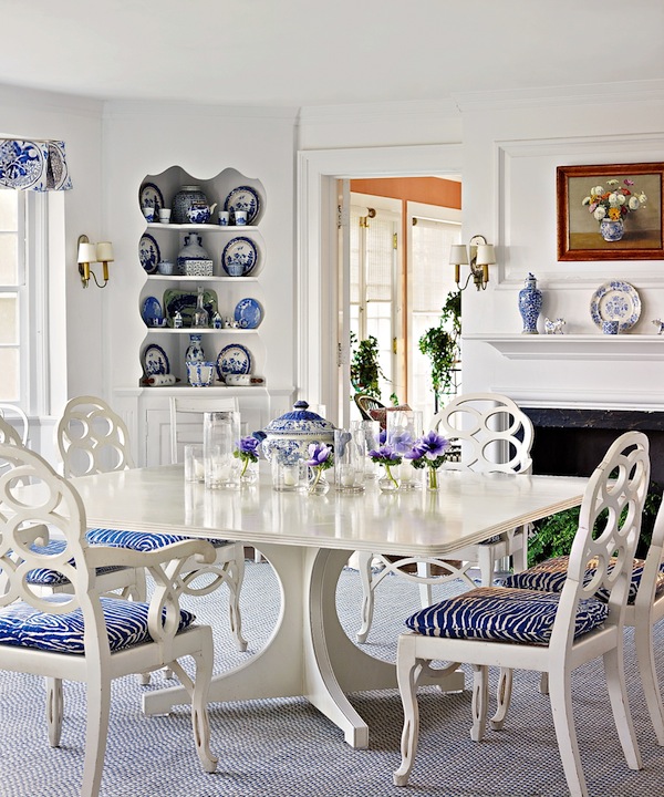
 An eclectic mix of WASP heritage, contemporary touches and a penchant for a mildly exotic bohemian vibe yields rooms that are classic yet modern and all completed with the least amount of intrusion. The East Hampton house’s dining room is much the same as it was when Scheerer’s grandmother decorated it, updated with just new table and chairs and a few coats of white paint, maintaining its old fashioned charm with a fresh outlook.
While Scheerer claims it’s the “superficiality and frivolity of decorating” that appeals to him, his rooms have backbone. With an architectural degree from Cooper Union and years of training his eye, he is the perfect example of someone who knows the rules and exactly how far he can bend them. Everything is structurally and proportionally correct but with a relaxed attitude.
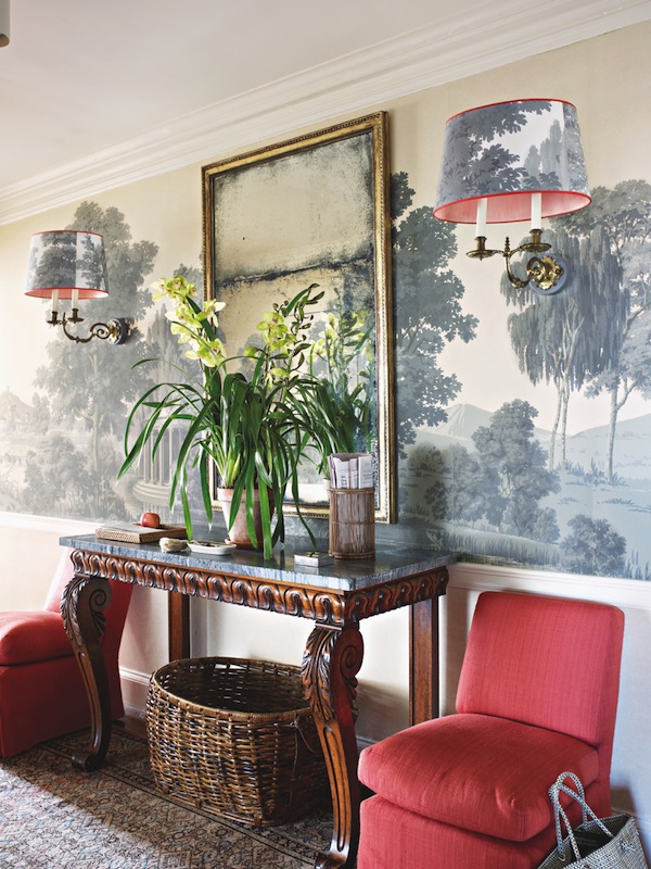
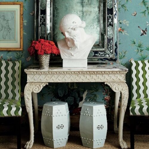
Take this chic Brooklyn Heights foyer. Elegant Zuber grisaille wallpaper panels and a pedigreed William IV table are brought down a notch with a rustic basket and plain potted plant.
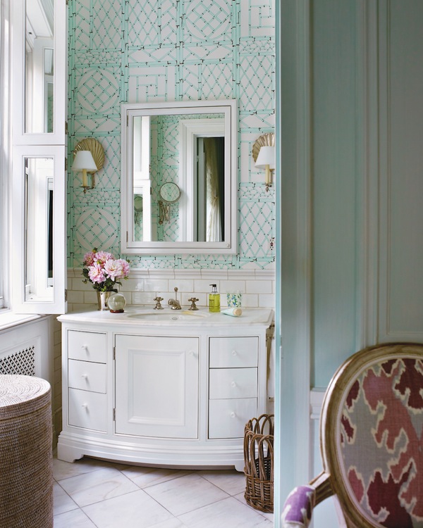
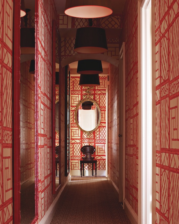 And in the same apartment, a narrow hallway is enlivened with Scheerer’s exuberant use of his signature Lyford Trellis wallpaper. He may have his favorite fabrics and papers that he uses time and time again, but nothing ever looks quite the same. Here the same paper recolored for a young girl’s NYC bathroom takes on a completely different personality.
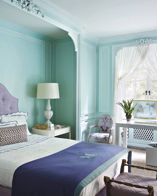
Her adjoining bedroom feels nostalgic with a contemporary twist. The lavender and robin’s egg blue palette adds a fresh youthful spirit to the traditional boiserie and feminine curtains.
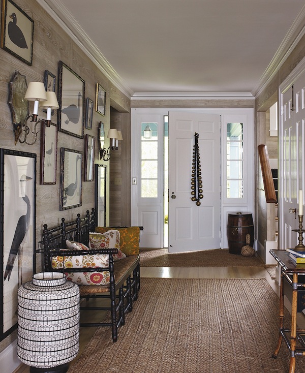
And while the results feel low key, the methodology is meticulous. There is an authenticity and appropriateness to Scheerer’s designs that result in complete comfort and relevance. For a house in Maine, he channeled the cozy comfort of Sister Parish. And his approach to art is the same as his designs – “an overall feeling of balance but with unexpected juxtapositions.” So while bird prints might be a natural choice for the locale, the scale and way they’re framed and hung feels bold and modern.
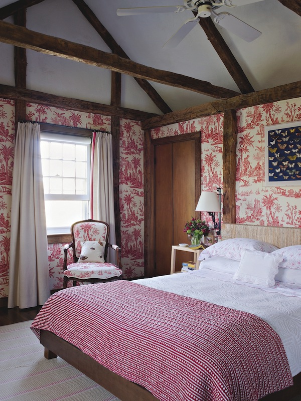
And in an 18th century Long Island house, Scheerer felt the the distinctive half-timbering related to a Normandy farmhouse so he enveloped the room in a document French toile, tempered with the “internet find” of a rope headboard and a graphic coverlet.
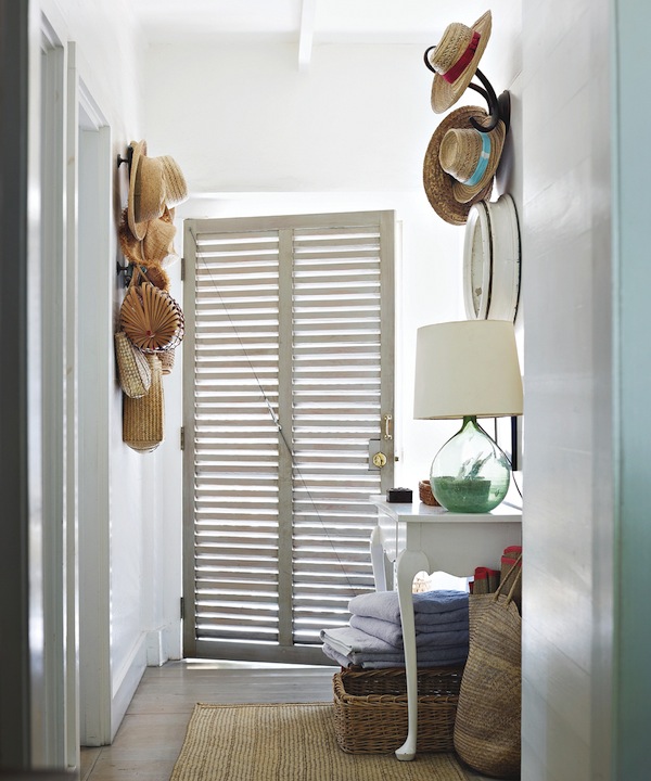
Over the years Scheerer has taken on quite a few tropical projects, including several on Harbour Island where he keeps a home. Here you see the essence of his work. His entry is simple yet full of charm and personality. As Read quotes Billy Baldwin, “Nothing is really interesting unless it’s personal.” And this is nothing if not that.
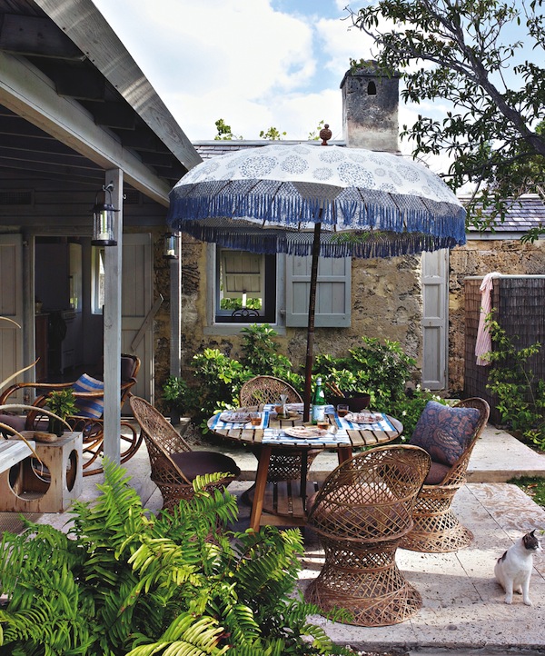
It’s an irresistible combination of Yankee practicality, island romance and vernacular charm. And who wouldn’t want to join Scheerer for lunch on his terrace, outfitted with woven-fiberglass chairs and a fringed Indonesian umbrella.
For a client on island, this bedroom says it all. Walking the line between indigenous elements and a timeless WASP aesthetic, “nothing seems contrived or out of place.” As Scheerer says, “It’s for people who want to live comfortably and smartly, but not glitzily.” And who wouldn’t?
Tom Scheerer is an original. His rooms aren’t trendy or trying to wow, but they are always right. In preparing to review this book, almost every page was tagged with a stickie for potential inclusion. As Read writes, “He’s the decorator for the long haul, the one who can compose a great-looking room that you never want to leave.”




Just smashing; ALL. And, a great review! ox
Wow and Wow…the way you write…Wow! These rooms are “simply” divine. franki
I’ll get the book and, more importantly, follow Mr. Scheerer…fabulous! Thank you for the introduction. D.
That entryway with the faux bois paper and the bird prints is absolutely wonderful!
Charm and personality are the perfect descriptor for Scheerer’s talents. I do want to crawl right in and live in these photos, Stacey. And I think that short of moving into a Scheerer home, I’ll have to add the book to my stacks. Thanks for the great write up!
It’s all so beautiful!! The results may be low key, but they are a wow to me. I love them. Thanks for showing us.
drooooooling…. not only do i love his work, but I love how you presented his masterful mix of styles and periods, balance, and ability to adapt to vernacular inspiration.
I have read every word of the House Beautiful article and love his style. I will have to add his book to my library and very much appreciated the additional images.
Best,
Liz
Absolutely wonderful. I have reserved the book at Barrett’s!