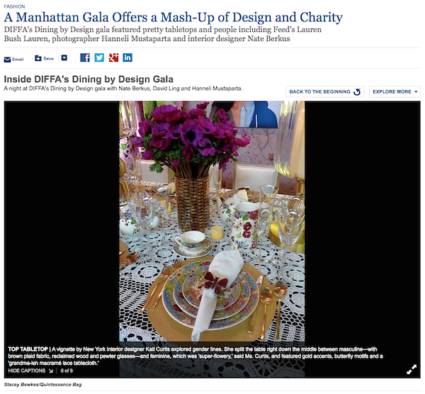
The Wall Street Journal Off Duty section is one of my favorite weekend treats. So I was especially pleased to be able to contribute a little something to today’s piece on the DIFFA Dining by Design gala, which I attended last Monday evening. Even though they got the credit wrong online, I was still delighted to have my photo of designer Kati Curtis‘ table for the NYDC featured. Perhaps next time I’ll be able to include some words as well.
As we take a final tour through Dining by Design, I begin with the Flexform table by Soren Rose Studio for Manhattan Magazine because I especially liked and try to personally prescribe to their message of buy less but better. Their clever vignette was inspired by the experience of visiting a custom tailor, where each piece of clothing can be individually created for each customer, by fabric, fit and style. For those who have a passion for fine craftsmanship and beautiful products, especially when made from sustainable sources, their space honored the unique, the innovative and the luxury of bespoke.
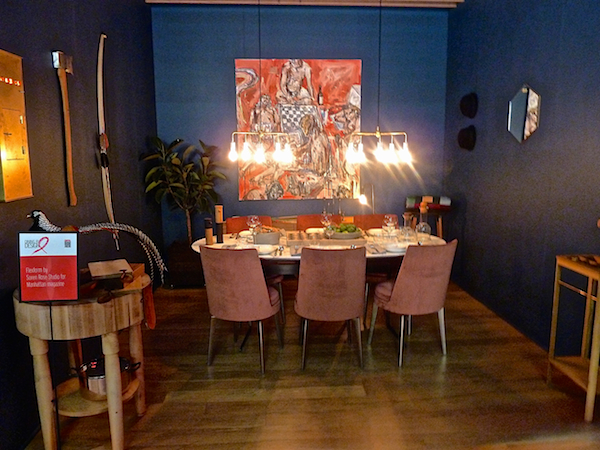
Their room included many items individually crafted either by the studio or through a creative collaboration with another brand they admire and work with. These objects symbolize the fact that “even though the design world is a difficult one to forge, we believe the key lies in giving up excess in exchange for fewer, well-crafted objects that can be passed down through generations.” Their Harrison Pendants over the table, inspired by classic 1930’s NYC glamour, are handmade from brass and porcelain. And the painting by John Copeland
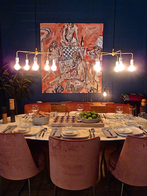
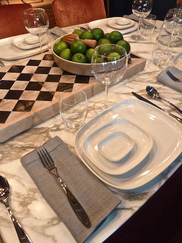
echoed both the rose tone in the Flex Form Feel Good Chair as well as the checkerboard in the custom Silas cutting board created by Peg and Awl, shown on Flexform’s Calacatta gold marble Fly Table. All tableware was Alessi‘s clean and elegant Ovale.
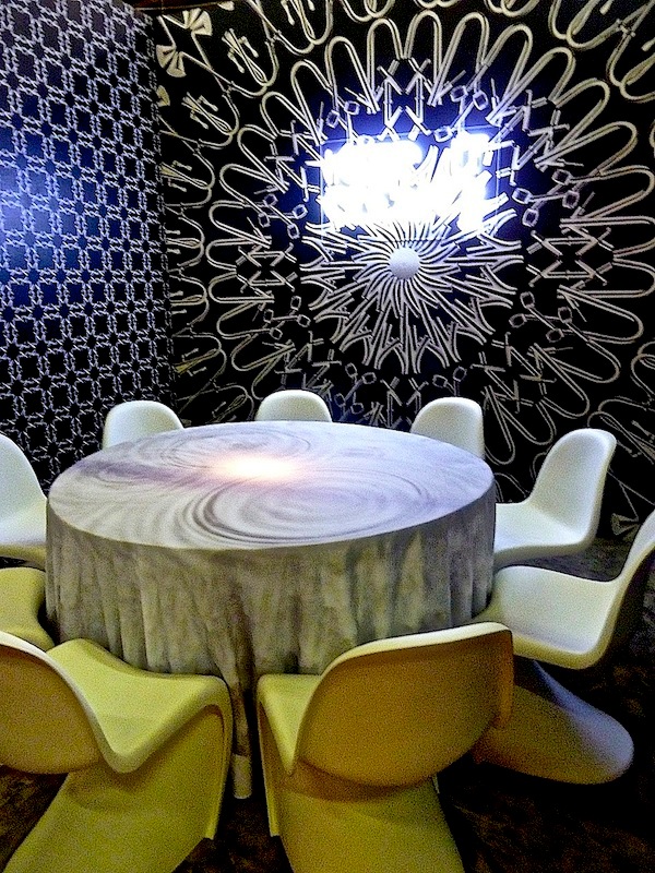
 Axor, the cutting edge designer bathroom brand, collaborated with Slade Architecture for their table. Featuring Vitra‘s sinuous Panton chairs, walls of a graphic black and white pattern formed from Axor fixtures and a glowing neon sign, the message was “Keep it Clean.”
The Pratt Institute table, with mentor Ali Tayar, was a strong statement in graphic colors and design.
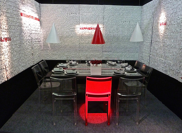
Three dimensional type on the walls created a meaningful enclosure.
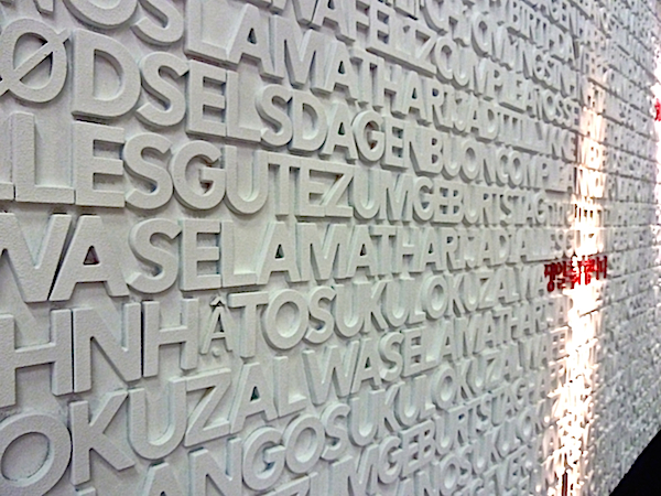
Ali Tayar also worked with Interior Design magazine on their bold table to target the end of AIDS.
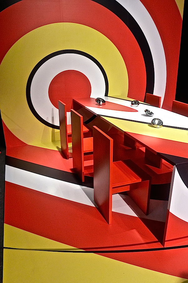
The Benjamin Moore table designed by Jamie Drake also sent a clear colorful message, encouraging others to contribute to the cause.
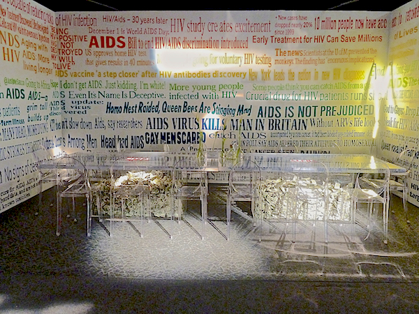
The upbeat celebration of the universality of love designed by Gensler for Herman Miller, included their iconic Eames chairs in a symbolic rainbow of colors.
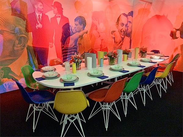
A fabulous custom wall covering by Flavor Paper, amazingly moved, bringing images in and out, from background to foreground, according to the colored lighting scheme. This table so effectively illustrated how the power of design includes so many varying elements that take talent and knowledge to coordinate.
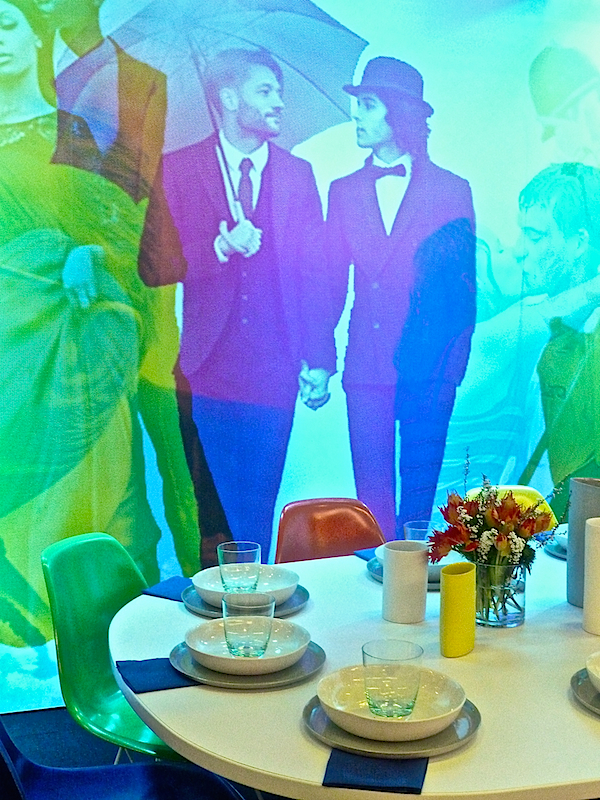
IA Interior Architects teamed with Teknion Studio for a modernist vision.
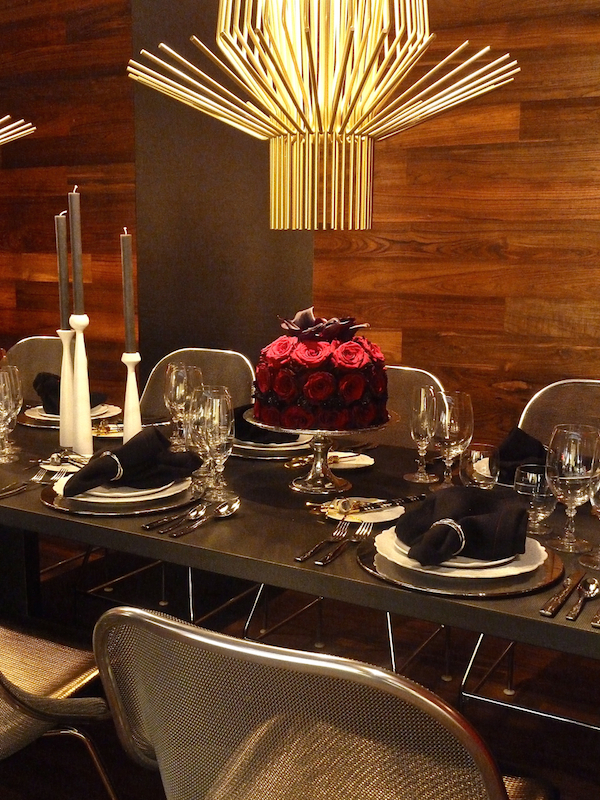
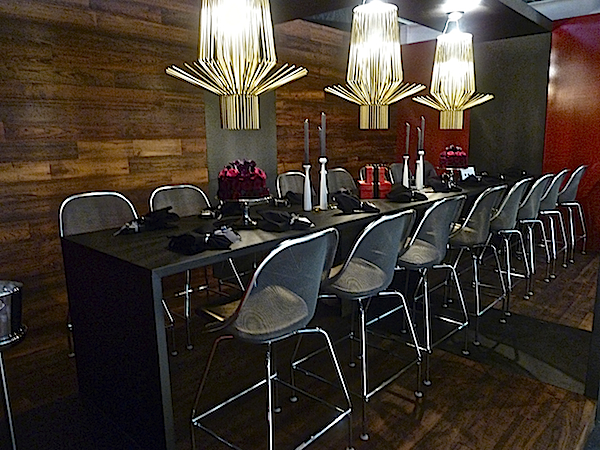 The contemporary furniture and the fabulous Foscarini Allegro pendant against the wood walls created a striking contrast.
Knoll, in collaboration with HOK, yielded a room featuring their signature red. Blue ultrasuede walls affixed with roses seemed a sign of hope for both the evening’s theme and that spring might hopefully be around the corner. A classic Saarinen tulip table
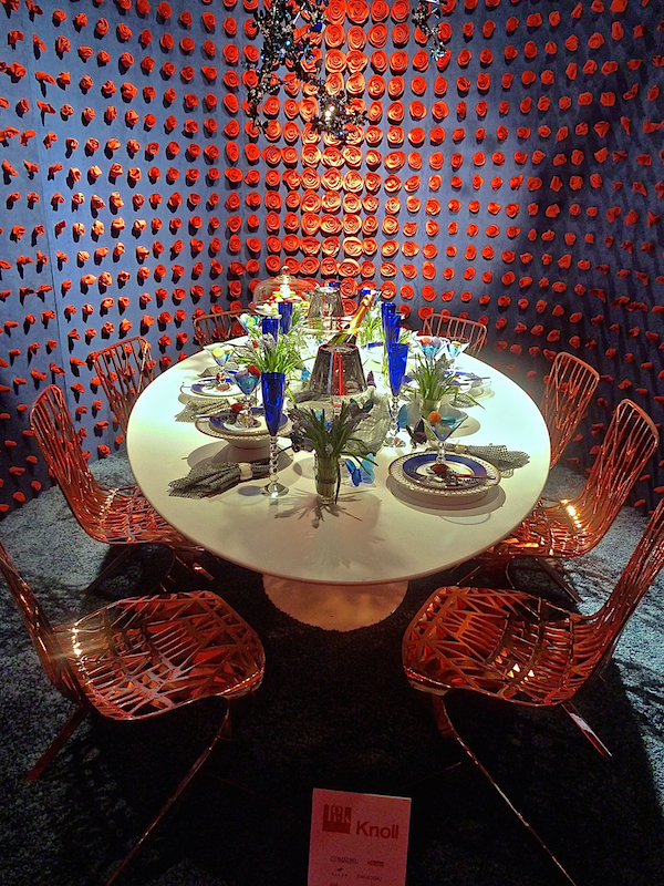
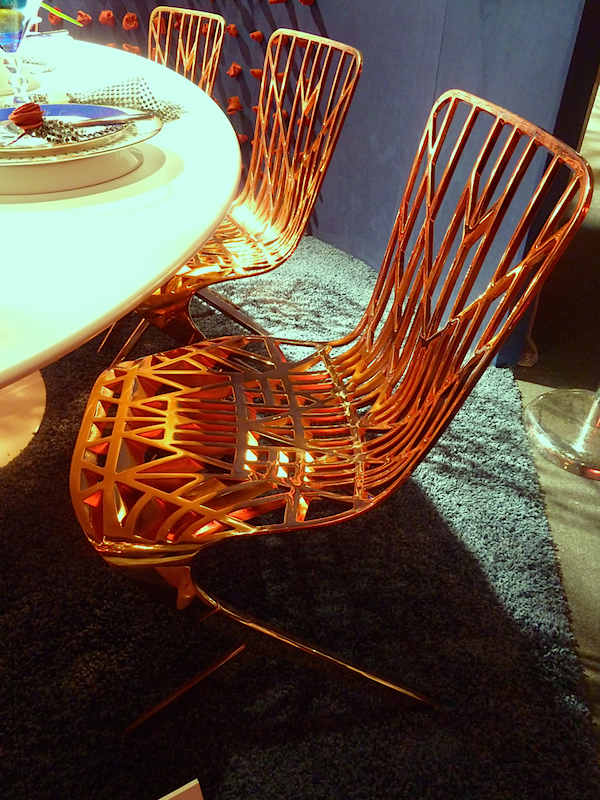
was surrounded by the graphic geometric lines of Washington Skeleton chairs by David Adjaye for the brand. I just love them in their copper iteration.
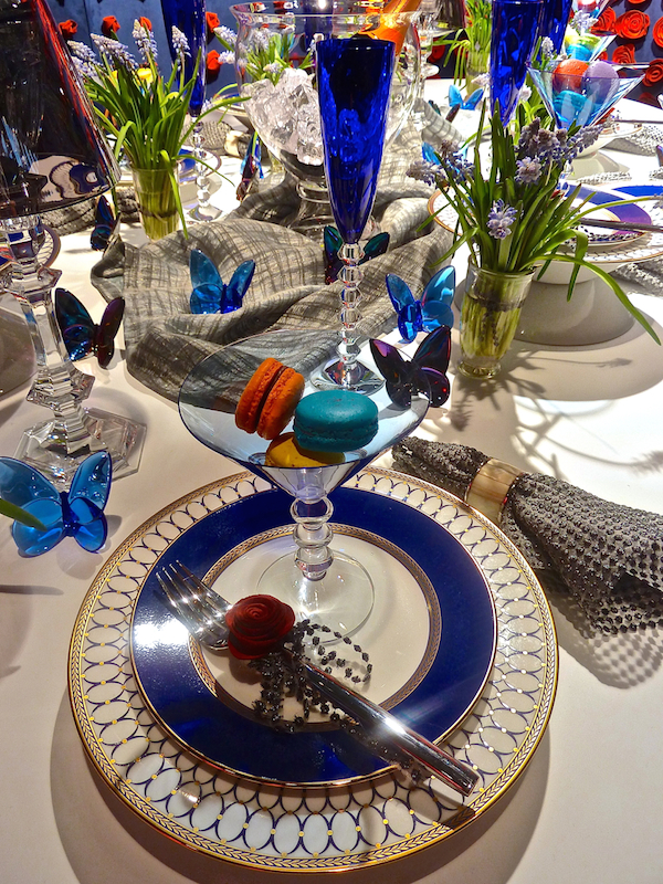
The modern aesthetic of the vignette was surprisingly offset by a luxurious tabletop with Baccarat offerings, echoing signs of spring.
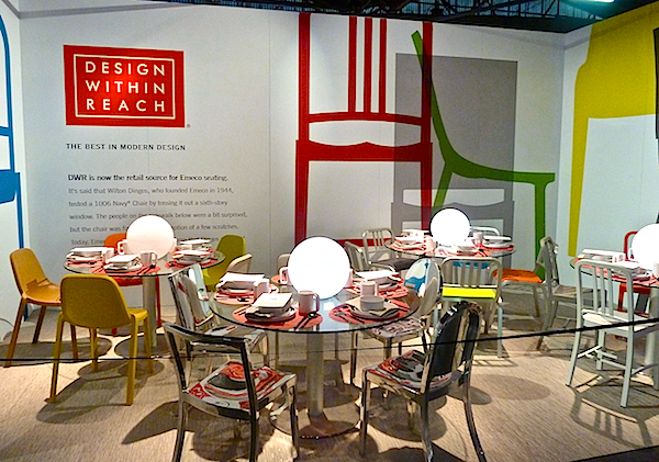
Design Within Reach, a sponsor for the evening, who offers products featured in many of the vignettes, emphasized their Emeco chairs in their large dining space.
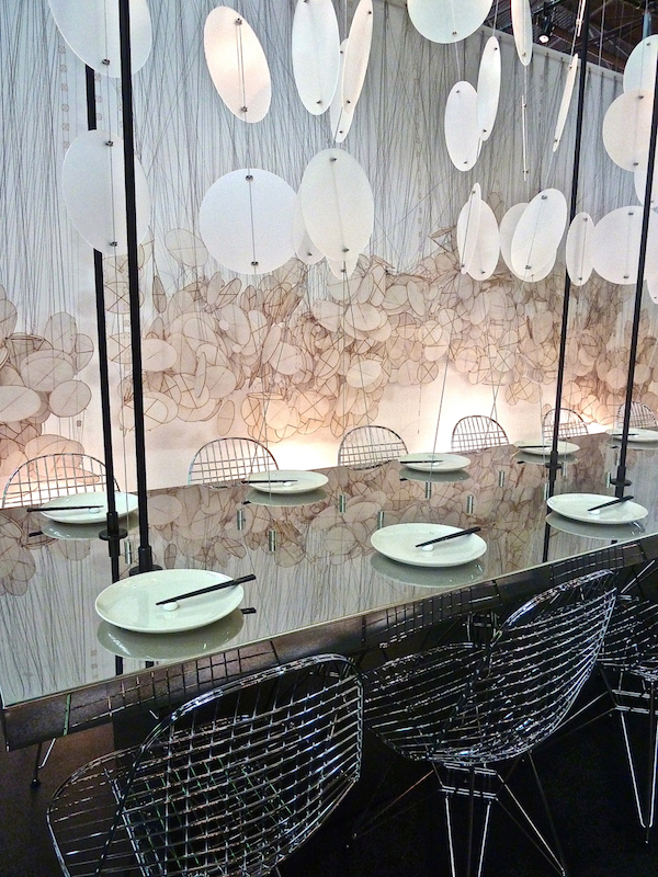
 Studios Architecture‘s space was a classic contemporary contrast of textures and form with round fiberglass discs suspended in front of an illuminated wall of similar imagery.
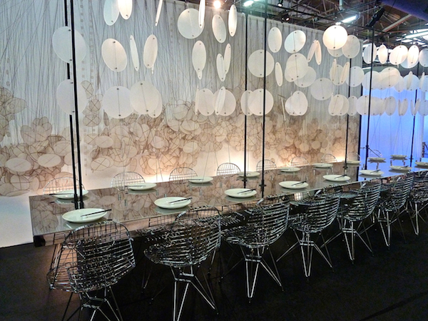
Eames chrome Eiffel Tower chairs and stainless table on a glossy black floor emphasized light and dark and geometric versus more organic form.
M Moser‘s dining fantasy was an interesting interplay of vintage and modern with exotic and sleek. A handsome Rich Brilliant Willing Delta IV light was a perfect match for the classic Warren Platner dining table. And the geometric pattern of the retro-feeling rug was echoed in the futuristic fabrication of the wall. Tie dye pillows and tub chair had instant 60’s time warp appeal.
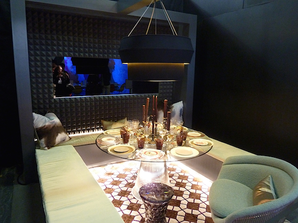
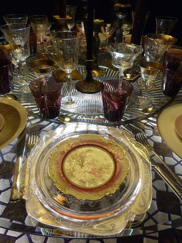
Even the tabletop seemed to echo the old and new mix.
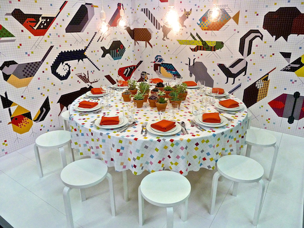
Designtex‘s happy booth featured flora and flora dominated Charley Harper wallpaper and the form meets function E27 Pendant Lights from Swedish designer Mattias Ståhlbom.
And lastly, Barney‘s table featured the work of iconic photographer Bruce Weber from his transgender Brothers, Sisters, Sons & Daughters project which was the basis for the store’s spring campaign.
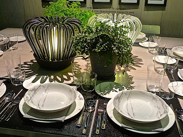
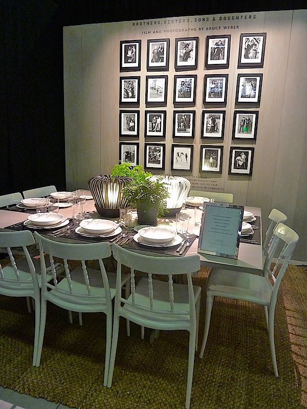 If you haven’t seen Barney’s windows or the catalogue they produced, it is a very moving collection of personal stories by individuals with interviews by author and Vanity Fair contributing editor Patricia Bosworth. The tabletop featured chic selections from their Chelsea Passage department including Dibbern table and glassware, Alessi flatware, SFERRA napkins, Barneys New York placemats and stunning Saint-Louis Saule crystal table lamps by Ionna Vautrin.
Stay tuned!! It’s going to be a very busy week so stop back tomorrow for more stories behind the style.


Those Harrison pendants are super and the copper Washington Skeleton chairs, so striking!
xoxo
Karena
The Arts by Karena
Flavor paper, Eames chairs…all those creative ideas shown…almost speechless (or…”wordless” if it’s the Wall Street Journal) :) franki
Credit or no credit, you’re still fabulous. And great post.