When a Chinese family was moving to America, buying their first house on Long Island, they turned to designer Christopher Maya to create interiors that felt traditional yet updated for today. The 1930’s classic Georgian colonial they purchased had great bones and proportion but Maya gutted it to start fresh, adding creative touches and furnishings to the English-inspired decor. Join me for a sneak peek at this beautiful project featured in the April House Beautiful.
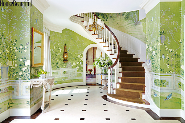
The core of the house is anchored by a majestic spiral staircase. Maya accented the graceful curve with new wainscoting and, like his design icon, Sir John Soane, infused the space with spring-like color by installing the glorious green Temple Newsam wallpaper by de Gournay. The sprightly feel of the foyer is enhanced by a light patterned limestone floor from Paris Ceramics. Adding a hint of gravitas to the exuberant color, elegant accoutrements include a vivacious Louis XVI demilune and Italian neoclassic gilt barometer from David Duncan and c. 1800 English chandelier from Yew Tree House Antiques.
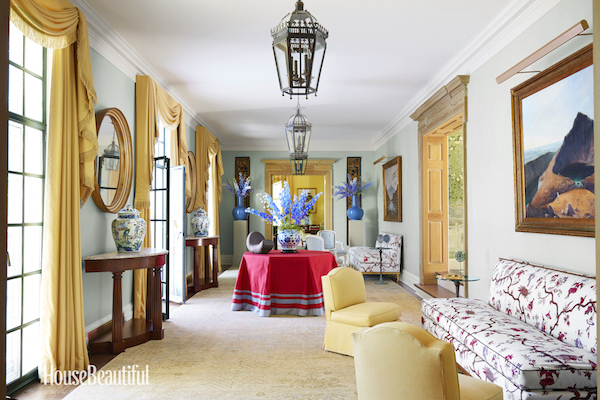
The gallery is a gracious space that could have been delegated as a mere pass-through but Maya has transformed it into an exuberant room with two comfortable seating areas. While the stately regency curtains and strict symmetry might have been stuffy, the designer has infused the room with a youthful buoyancy. A center table jauntily skirted with Jim Thompson’s colorful New Khmer silk, large scale flower-filled vases, the lively le Manach Mikado on the armless sofas all add life to the space. But perhaps most unexpected are the bare wood door casings, the rawness of which takes everything down a notch.
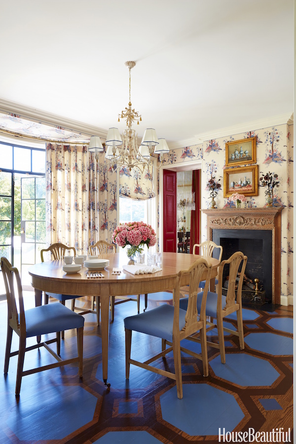
The breakfast room, again, could have been a very traditional space but Maya played with the color and scale of the classic painted floor pattern by Artgroove, lending an almost Alice in Wonderful spirit. Juxtapositions of new and old abound. While the doors are original, Maya had them stripped down to the original metal for the look of modern steel. The table is new of his own custom design surrounded by Hepplewhite chairs from J&M Antiques, stripped and bleached for a less formal feel with an Italian chandelier from David Duncan overhead. Curtains and walls are Maya’s own custom version of a whimsical Tree of Life pattern coming in his new collection for Holland & Sherry.
 photos above by Thomas Loof
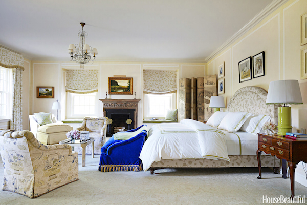
The proportions of the classic Georgian house allowed for a sizable master bedroom, with room for a generous sitting area. Fitting with Maya’s design doctrine of mood, comfort and suitability, a soothing scheme with soft patterns was enlivened with splashes of bold blue (Holland & Sherry’s Rambouillet on the settee) and green (antique table lamps from Gerald Bland). To see more of Maya’s adventures in design, you can follow him on Instagram. And be sure to be on the lookout for the April House Beautiful, coming online and to your mailboxes momentarily!



 photos above by Thomas Loof

Finally a beautiful rendition of classical with a modern twist…there is HOPE for magazines and decor after all. Love the mixture of colors, the miniature Palampore pattern…refreshing, invigorating, inviting! Thank you for highlighting a new vision…as when I open a fortune cookie, I look forward to this wish coming true. On another note, your Dawnridge story featured an image of you walking in front of 18thC Spanish Iron Entry gates, once original to our home and which I’ve longed to see. They were bought by Duquette in 1957 when our home and it’s original gardens were sold and parceled…only the Gatehouse remains aside from our historic Pavilion…what a joy to see them. I think he called them The Gates of Heaven.
How fascinating! I knew Tony and I know Hutton! I am sure Hutton would love to know this!! (he probably does know this….but doesn’t know you???)
He was not working for Tony in 1957!!!!
website: I forgot to fill in!
www,mccormickinteriors.com
Penelope
Color….did I see….color??!!?? franki