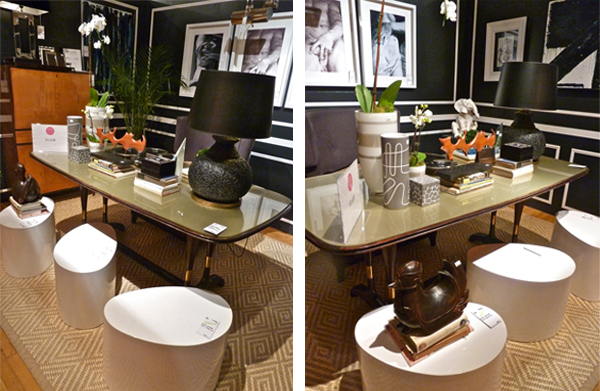
Flair Home designers George Nunno and Jon Maroto have a distinctive super sophisticated eclectic style I adore. With a mix of vintage and new Italian and American pieces, it is impossible to put a chonronological or geographic stamp on their creations. One can easily imagine some timeless cosmopolitan luminary like Luchino Visconti or Cary Grant in the space.
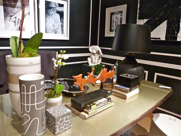
The Tilton Fenwick girls were lucky enough to snag the gorgeous 1950’s Dassi table from the room.
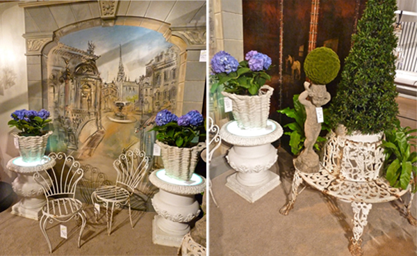
David Duncan‘s eponymous antiques store has been a go-to source for designers for decades. For fine furniture, lighting and accessories, the selection is always stellar. His Design on a Dime booth was a well curated collection of continental charm.
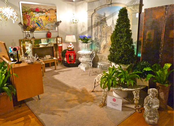
From chic living room with that amazing vintage mirrored mantel
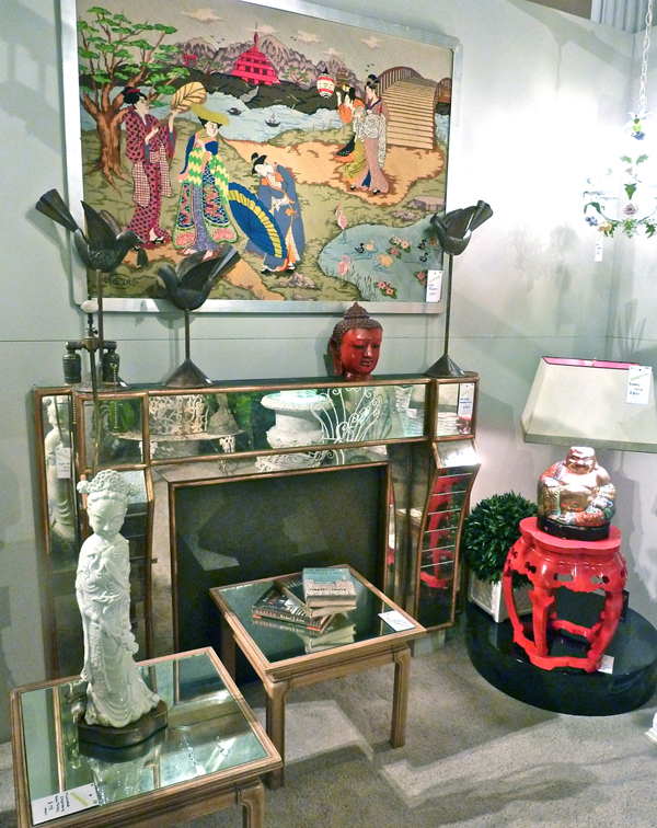
to imagined sidewalk cafe, the vignette had a “take me away” appeal.
New Trad winner Nick Olsen‘s vignette was a layered explosion of color. He makes coordinating all these disparate elements look so easy but of course we know better!
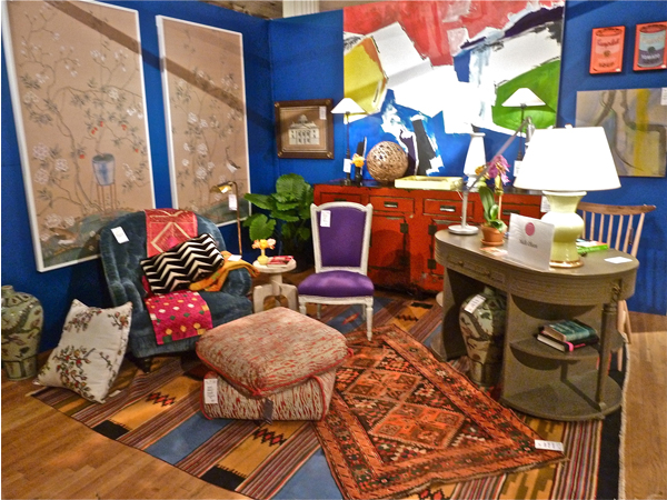
An eclectic exoticism started with rugs from Nick’s own collection and Metropolitan Carpet Gallery and a Turkish ottoman by Fine Arts Furniture with Samuel & Sons cord. The elegant framed panels are by de Gournay and the large painting was created by Nick himself – quite the Renaissance man! Lucky Marisa Marcantonio snagged the beautiful Christopher Spitzmiller lamp and Rebecca Soskin went home with the graphic black and white pillow.
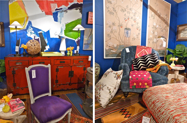 A successful play on scale, chairs varied from the small purple side chair that Nick donated to the larger blue tufted armchair from Luther Quintana. The red cabinet, donated by his friend Rebecca Gabin, with slender Circa lights atop, was a great color block piece behind the chair and against the blue walls. A great showing, especially for first time out!
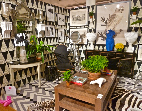
It was impossible not to be wowed by Miles Redd‘s amazing room. Starting with an incredible layering of black and white pattern and graphics, he added single punches of bright primary color – exactly like what we saw in so many of the fall 2012 runway shows. And it is a perfect lesson in how commercially available items such as Restoration Hardware’s Royal Master Sealight floor lamp and reproduction 19th C. Baroque Ravenna Etched Mirror can be successfully woven into a more sophisticated space. Lucky Amanda Nisbet nabbed the fabulous urns and author Susannah Salk will be finding a place to hang the fantastic Owl print!
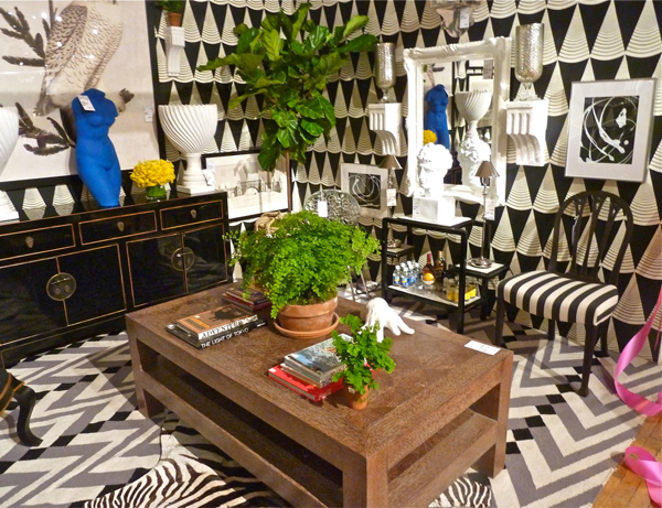 While remarkably busy, there is a soothing symmetry to the space that brings it all together. The mirrored vignettes on opposite walls may be different but similar in proportion, scale and composition, creating the perfect balance.
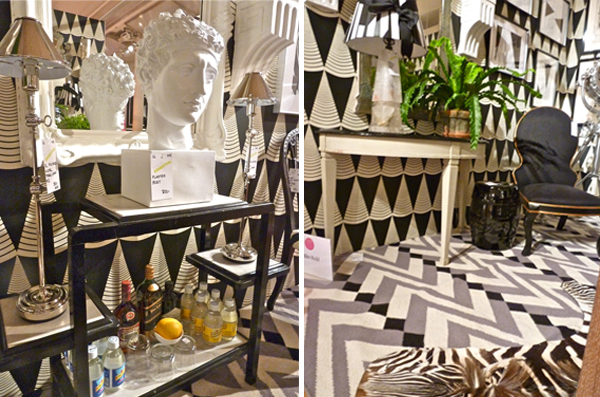
Here you can see how the black and white patterns complemented each other and the details of the mirrored assemblages. There is a very good reason why Redd is the Creative Director of Oscar de la Renta Home!!
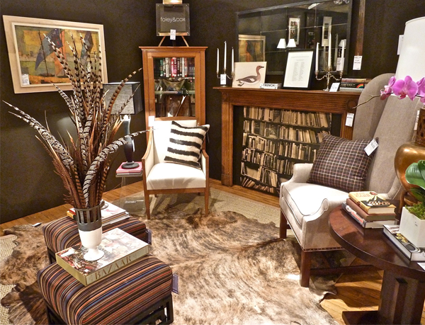
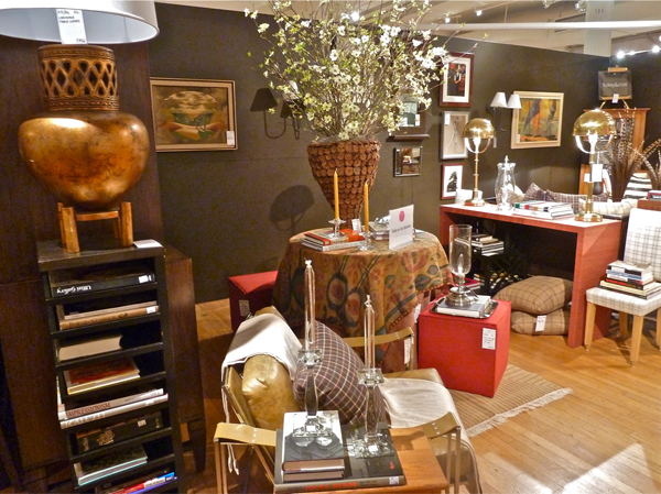 Foley & Cox had a huge double space that was impossible to shoot in one take. Elegant and tailored with sophisticated neutrals, they filled their space with donations from a vast list of top design sources.
 I must remember the idea of the feather arrangement come fall and I wish I had looked more closely at the faux books in the “fireplace” – so clever. You could probably achieve that look by just wallpapering a board.
Anchoring the other end of the space was a fabulous Cabinet no. Two Seventy.Two from The New Traditionalists (below left). Some lucky person got a fantastic deal if they had room in their home to have that delivered!
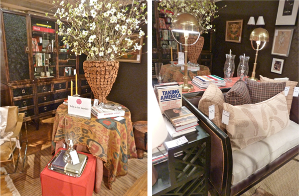 The mix of textures was terrific from the impressive cork vase to the “brass is back” Ralph Lauren Home Carthage table lamps from Circa. This is a space to reference if you ever have a long rectangle to transform into a comfortable chic living area!!
Patrick James Hamilton‘s handsome space presented a “moody masculine room with a reference to the global and exotic.” Starting with the Ikat inspired carpet from Niba Rugs, Hamilton chose a Koroseal embossed vinyl wall covering, “Aligator” in bourbon, that enhanced the rich color scheme and added a luxurious texture.
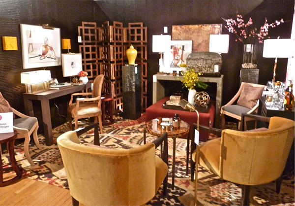
The open fretwork-like American walnut folding screen from High Point favorite Lazy Susan gave the space the illusion of height, implying the “impression of a space beyond what we can see.” The small shell topped table from John Lyle Design, grasscloth covered Bungalow 5 desk and Currey & Company concrete console together offered a combination of textures and as Hamilton said, “a feeling of personal history.”
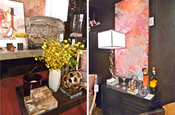 Fabulous art The Chinese Scholar’s Rock from Pagoda Red, above left, was an amazing addition to the space, bringing “epic proportion, instant history and color perfection.” A lot to offer from a single stone!! And while Hamilton’s vignette featured a bounty of beautiful art, I think my favorite was Margaret Pettee Olsen‘s custom commission above right. A RISD compatriot of Hamilton’s, her work is sensuous and sophisticated, the perfect foil for the masculine tone of the room.
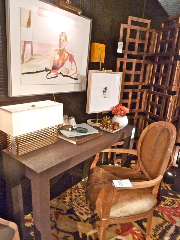
Hamilton generously listed all his donations on his very descriptive and informative site, where you can read more of his thoughts about the design of his vignette.
John Lyle Design: Pen-shell Topped Bronze Table
Jonathan Adler: Bristol Table Easel
Good Design: Kaiser Porcelain Reliefware Vases
Wisteria: Colossal Hurricane and (not shown) Architect’s Favorite Side Tables
A short finale will follow as my last Design on a Dime post!!

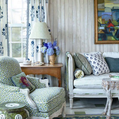
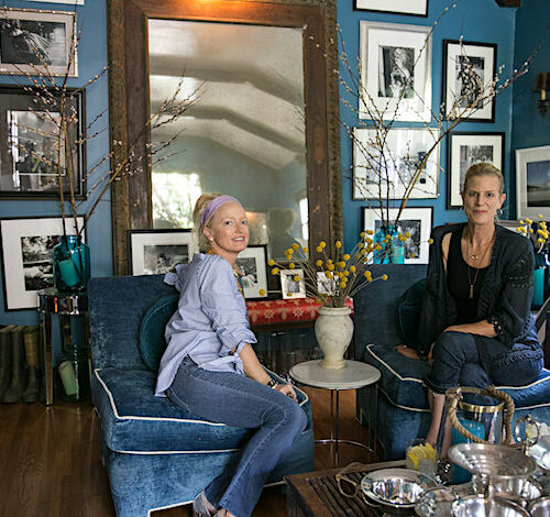

I am especially crazy for the last two rooms but there are ideas to tuck away for a later day throughout!
adore the foley & cox room, a keeper for my references.
best
debra
I am crying into my coffee this morning for missing this event. Your coverage and fabulous photos, along with the opportunity to enjoy vicariously are drying my tears. Perhaps next time you can do some shopping for your loyal readers? Thank you for your fantastic coverage of this great event.
How DO these minds think?!?!? Your photos and descriptions were better than ANY design magazine I’ve recently read…and I get a LOT of them!!! There are SO MANY IDEAS there…honestly, I can hardly contain myself. Fill in the adjective!!!! franki
I agree about the feathers – Great decorating idea – lets remind each other about it in the fall!
Stunning, elegant, timeless, and collected looks. Great design work! You have shared treasures with us!!
xoxo
Karena
Art by Karena
Took me a while to go through this post. I enjoyed really looking at all the details in each room. So many little tresures tucked in each one. The explosions of color were a bit much for me but still found individual things in them I liked. I lean toward a masculine look for daily living but like a more romantic feminine feeling for getaways.
What a fabulous post! Loved all of it, great descriptions, photos.. simple well done! Joined and look forward to future posts!
Karolyn:)-The Relished Roost
Wow! Busy lady you are! I will flag this and review again later. Love that vintage mirrored mantel!
I can’t begin to comment on everything I love here, but if Miles Redd is in the picture, I am happy. Amazing how he can follow trends yet add his punches of color. Amazing. Nick definitely picked up a few of his traits!
Just all the best of the best.
Thank you for sharing, Stacey.
Teresa
xoxo
Fabulous article on Design on a Dime in New York City!
What an event! We always love seeing what Myles Redd is up to. He gave a fantastic presentation for the Mint Museum in Charlotte. I’m crazy about David Harris of the New Traditionalists. Last market, if you can imagine we ended up at the surreal chest of drawers on N. Hamilton–oops. We were supposed to be at the South end, but they took it in stride.
Best,
Liz