Design on a Dime 2014 marked the 10th anniversary of one of the most popular design events in the New York community. Benefiting Housing Works‘ programs for homeless and low-income New Yorkers living with and affected by HIV/AIDS, the annual event features more than 50 (over 60 this year) top tier designers who create rooms with donated merchandise, which is then sold for 50- 70% off retail. Always a spectacular shopping opportunity, I was disappointed to miss the festive opening night, but did get a chance to see the rooms before they opened for the evening’s activities. Always a staunch supporter and frequent participant, designer Miles Redd this year received Housing Works’ Groundbreaker Award in honor of his advocacy for the cause.
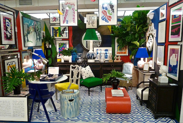 Last year when we shopped the event with Miles in our video he shared what a great source Design on a Dime is for art and his room this year proved the point.
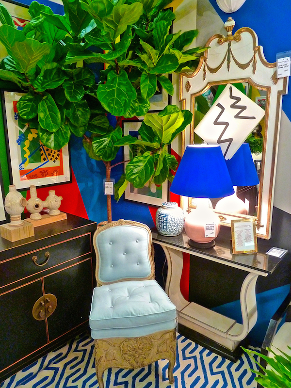
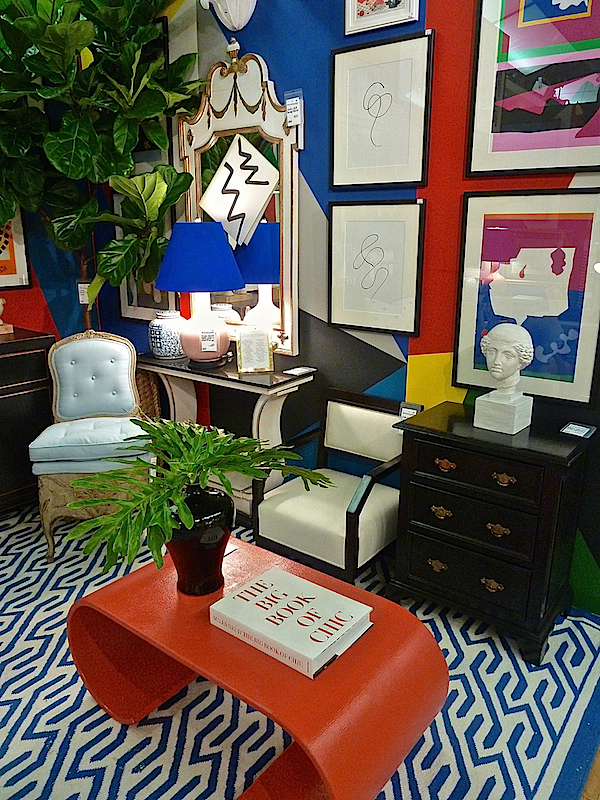 With framed pages from Henri Matisse Jazz, he channelled the artist’s penchant for pattern and color in a room bursting at its seams with eclectic finds.
 Friend Patrick Hamilton is another long time contributor to the event and his “Wicked Queen” room this year rocked a glam yin yang of feminine and masculine sensibilities.
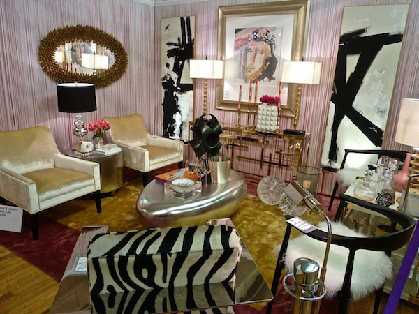 The season’s passion for gold mixed with strong graphics and bold yet elegant shapes yielded a stylish mix
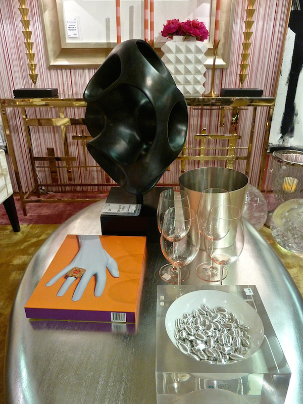 with great shoppable vignettes.
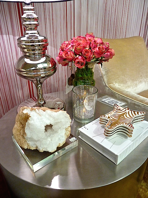
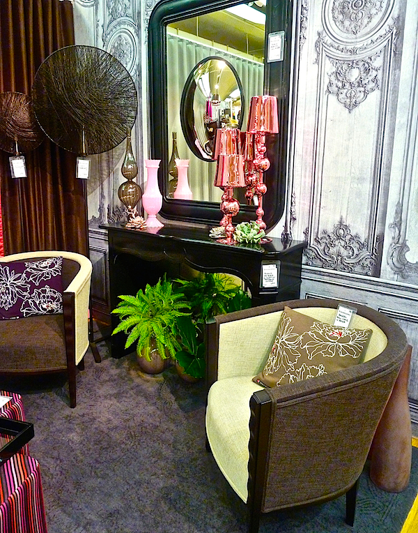
Pink was a popular shade at the show this year. Michael Tavano injected pops of the color in his alluring room for Roche Bobois.
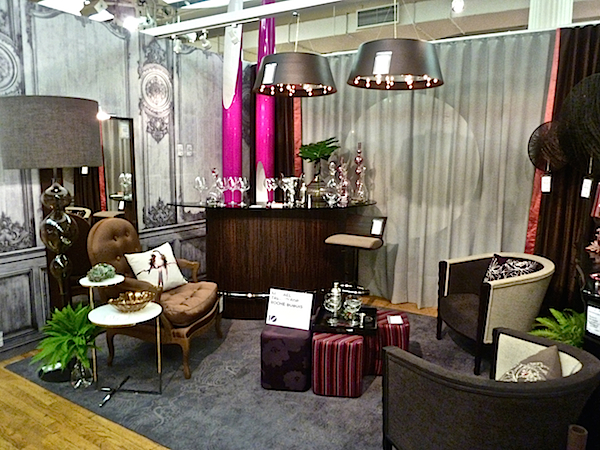 Again, he showed how pink can work in a room that has masculine tones
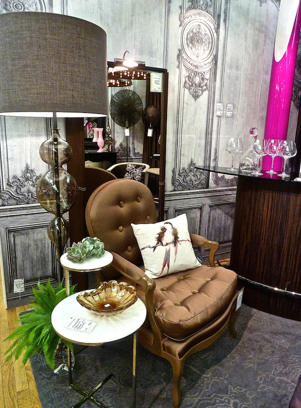 with feminine flair. I just loved how the chic In Création wallpaper set the sophisticated continental tone for the room.
 Nest Interiors created a fabulous mid century ode to the color.
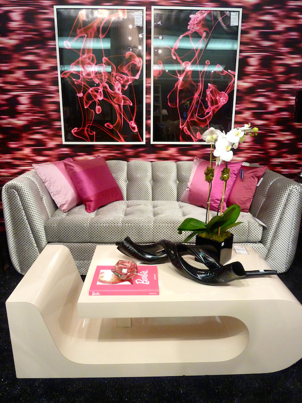
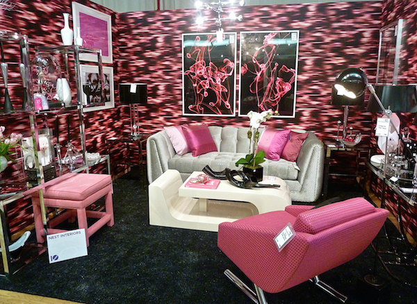 I’m not even a huge mid-century nor pink fan but was impressed with the colorful coordination of art and merchandise within the theme
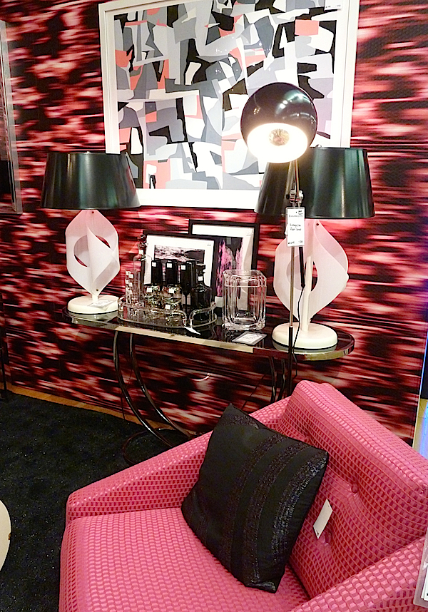
and mix of shapes, texture and pattern.
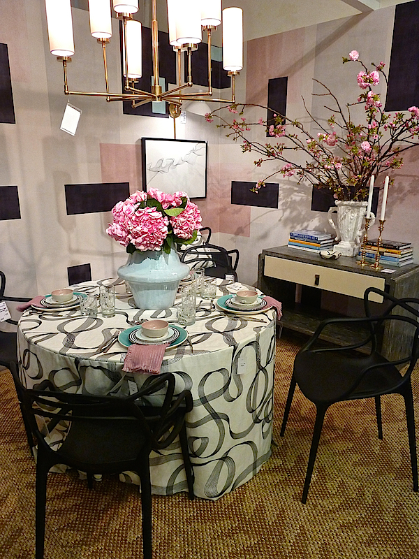
Jennifer Beek and Georgie Hambright of J+G Design used the palette for a refined and elegant space,
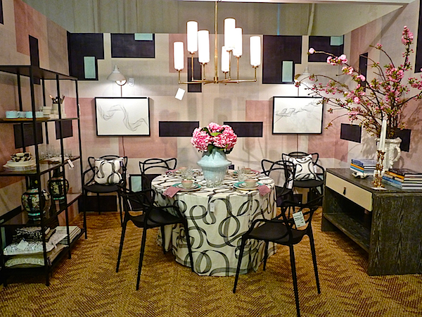
where curvilinear pattern met Mondrian-like architectonic graphics on the walls.
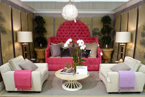
Fuschia was the main focus in Bradley Stephens’ space, anchored by a dramatic tufted day bed. Tailored chaired and Paris scenic wallpaper panels added a polished take on the space.
Anchored by a bold floral Designers Guild paper, Jennifer Flanders‘ room featured a more magenta shade
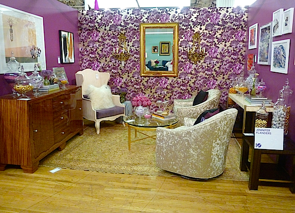
that incorporated two trends of the season – floral and gold.
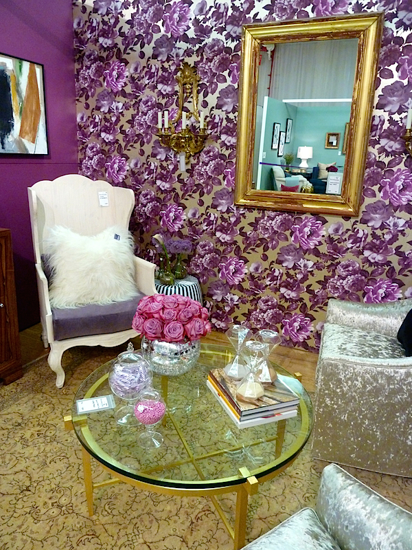
And Robin Baron executed an exotic twist with a similar shade
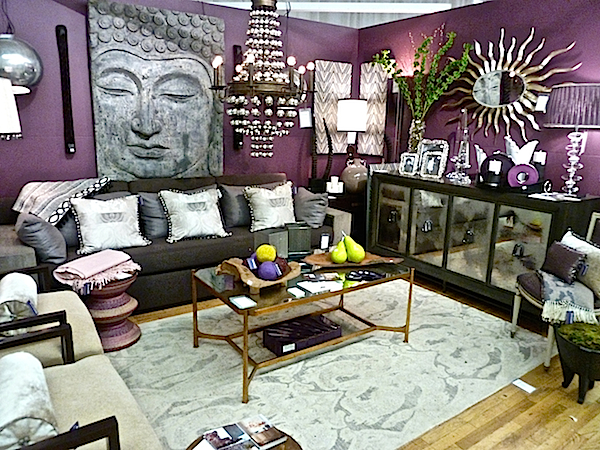
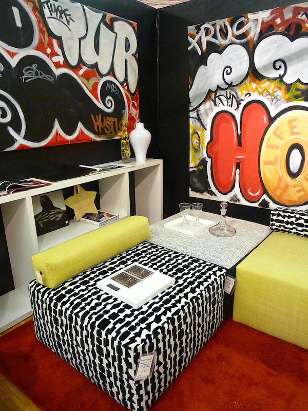
Several bold and dramatic spaces made great use of the small rooms. Ever since a trip to Buenos Aires, Francine Gardner of Interieurs has developed a strong interest in graffiti. She commissioned artist Gary Mercado to create two pieces for the space
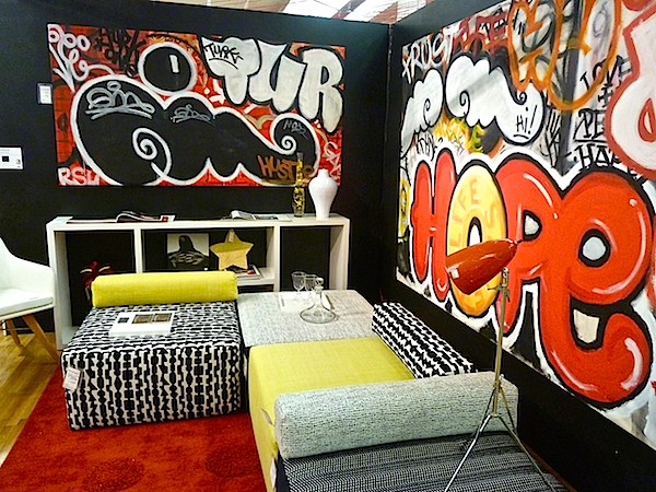
with coordinating seating designed by Interieurs using Romo fabrics, all of which sold within the first 15 minutes.
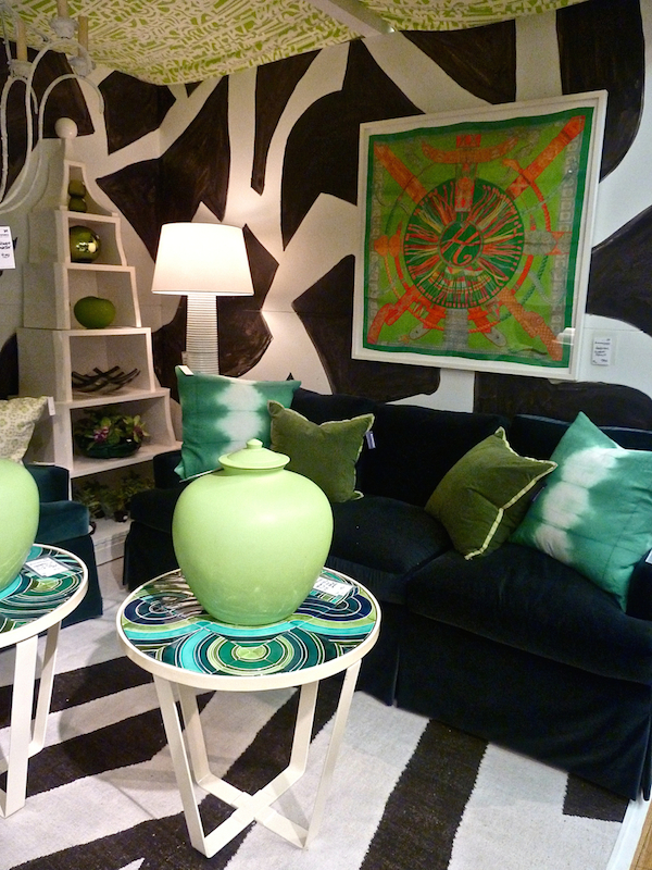
Another bold space I loved was HB Home‘s black and white with green tented room.
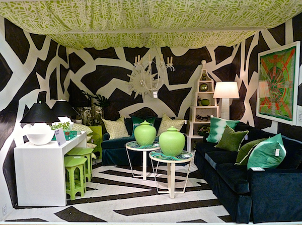
The graphic walls and rug were the perfect foils for the strong shapes and confident colors. A wonderful mix of items from framed Hermes scarf to lacquer etagere offered decorative shopping options.
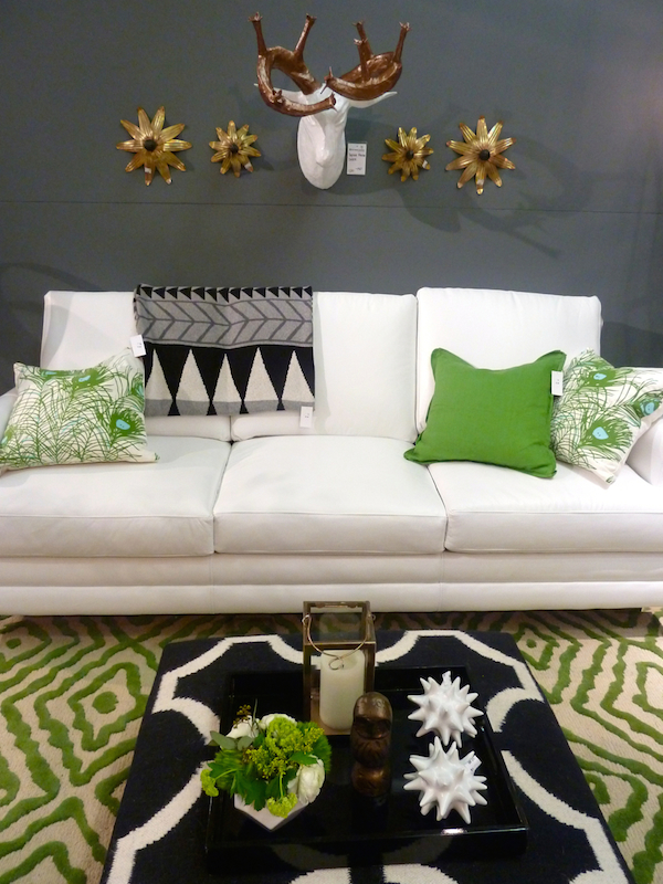
Design on a Dime Co-Chair, George Oliphant, used a related color scheme in his room,
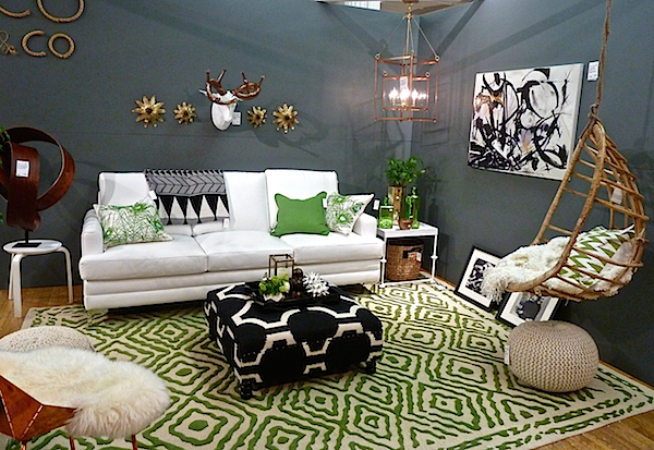
with the addition of gold, brass and natural wood tone accents.
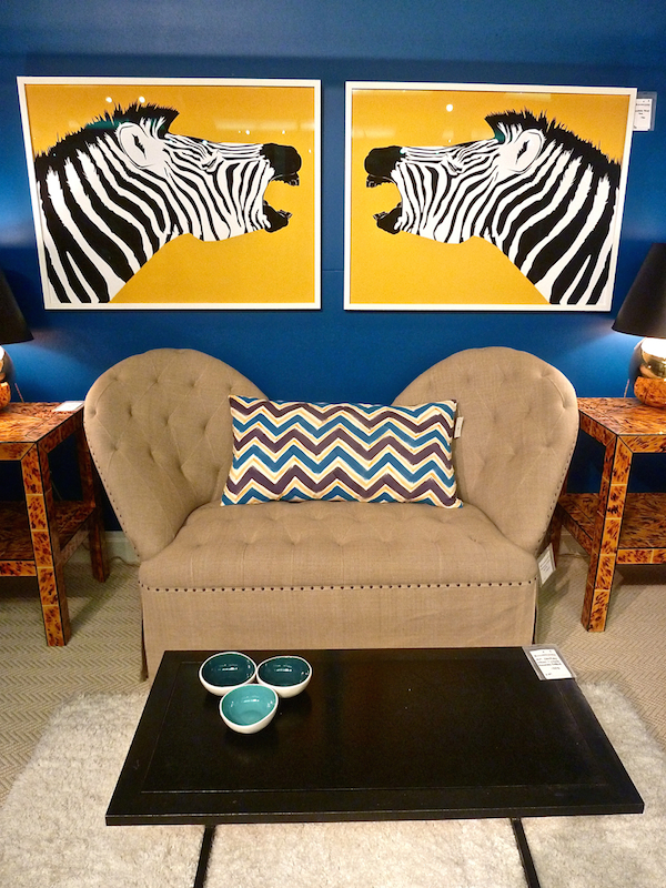
Leslie Banker for Pamela Banker Associates used a simplified version of bold colors and forms. This year’s most popular hue on the walls showed that a saturated shade can be a great neutral.
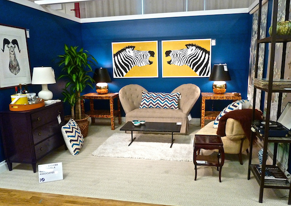
The clever play of shape, proportion and pattern struck a pleasing balance.
 Stop back next time for a final round up of Design on a Dime 2014 favorites. And then later in the week I’ll be sharing a special view of the rooms at this year’s landmark Kips Bay Showhouse.


These rooms are amazing – fun, vibrant and full of life. I love the framed pages from Matisse in the first image but am really glad I didn’t have to hang them! Happy Monday!
This was really a “colorful eye opener!” Happy rooms! I’m really “feeling” the pink and copper combo… Who knew! franki
I think I could find something I’d want to bring home in any one of these vignettes! Love all the color – especially the pink! XO
I am just blown away by the art, all of the contributors and Bravo to my dear friend Francine!
xoxo
Karena
The Arts by Karena
What a wonderful way to express beauty!!!
Sad I couldn’t make it this year especially after seeing your pics. Not usually a fan of pink myself but loved th ewallpaper in J&G Design’s room.