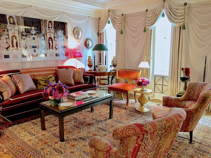
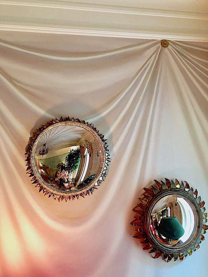
Today we start our final look at the 2018 Kips Bay Show House on the fourth floor with Alexa Hampton‘s living room, aptly titled Olympia’s Folly. It’s no secret that Alexa has a long standing love for the classics from Greco Roman antiquities to neoclassic art and architecture (watch At Home with Alexa Hampton for more evidence). Here she references the tradition of campaign tents, collaborating with Chuck Fischer and De Gournay on a faux draped ceiling and walls.
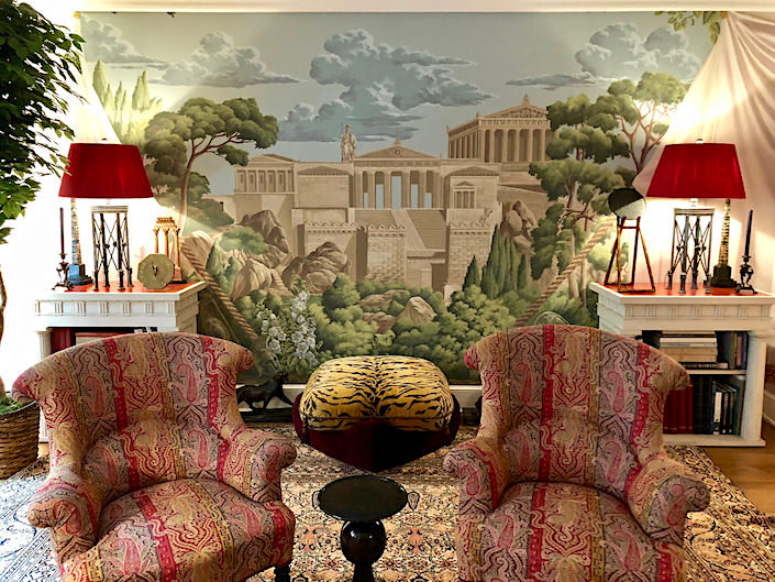
The most brilliant conceit is on the opposite wall where faux painted drapes are pulled back by ropes to reveal a scene of Greek temples, an idealized Acropolis of Alexa’s dreams. In front, a Mongiardino-esque pillow seat, flanked by pilastered end tables and elegant chairs upholstered in a favorite Pierre Frey woven.
Above the velvet sofa hangs a photo furthering the theme, “Antiquarium” by frequent collaborator Celia Rogge.
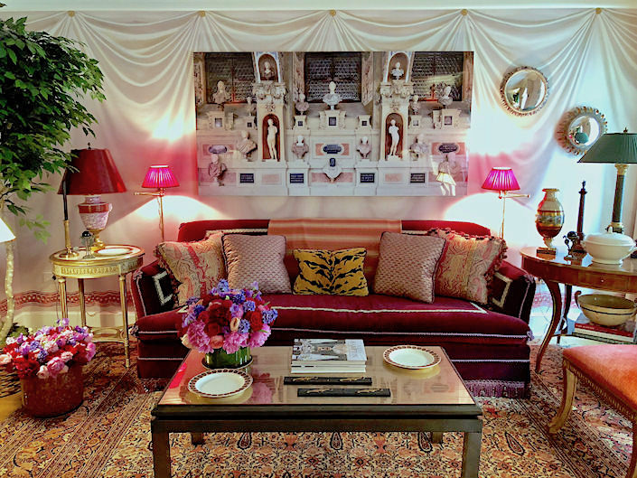
Throughout the room, worthy of a stay from Marcus Aurelius, are antiques and accoutrements completing Alexa’s imperial vision.
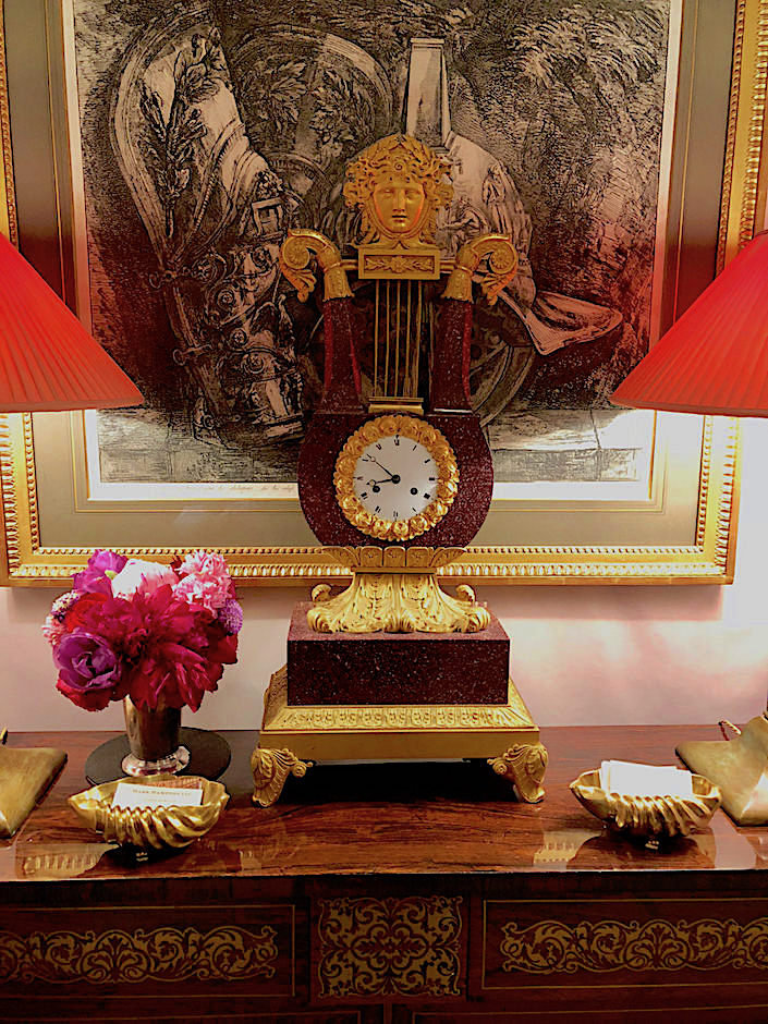
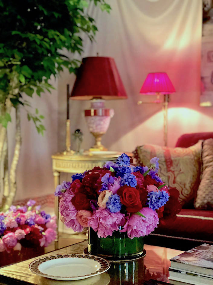
And how good is this laurel leaf detail – so smart, so chic – I bow to your brilliance.

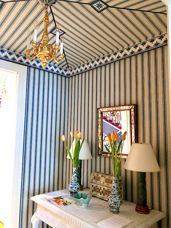
Mark Sikes also had tents, of a different sort, on his mind, as you arrive in his space through a chic blue and white tented entry.
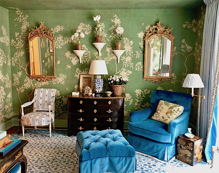
While known for his love of blue and white, Mark’s elegant “Sleeping Beauty” bedroom is swathed in a beautiful custom Gracie Wallpaper in a beguiling shade of green, the perfect backdrop for his new Schumacher fabrics he incorporated.
While the custom bed floats in the room,
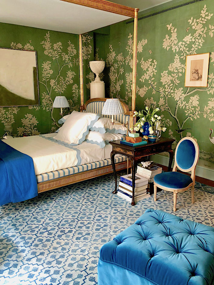
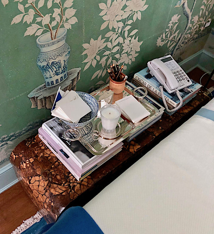
all conveniences and pretty accessories remain nearby.
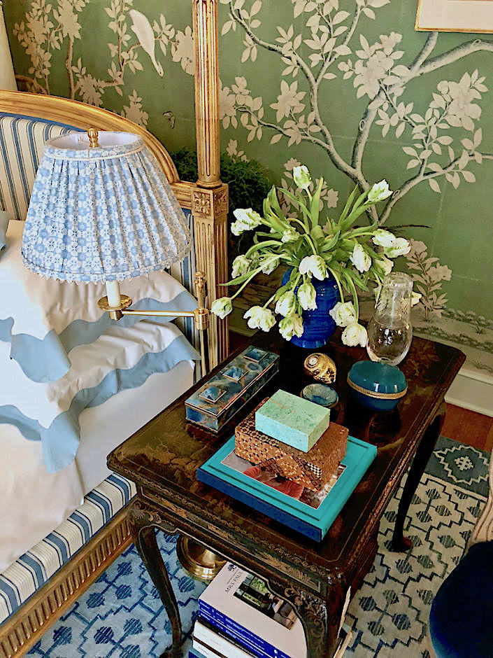
The room is filled with exquisite porcelain flowers by Vladimir Kanevsky.
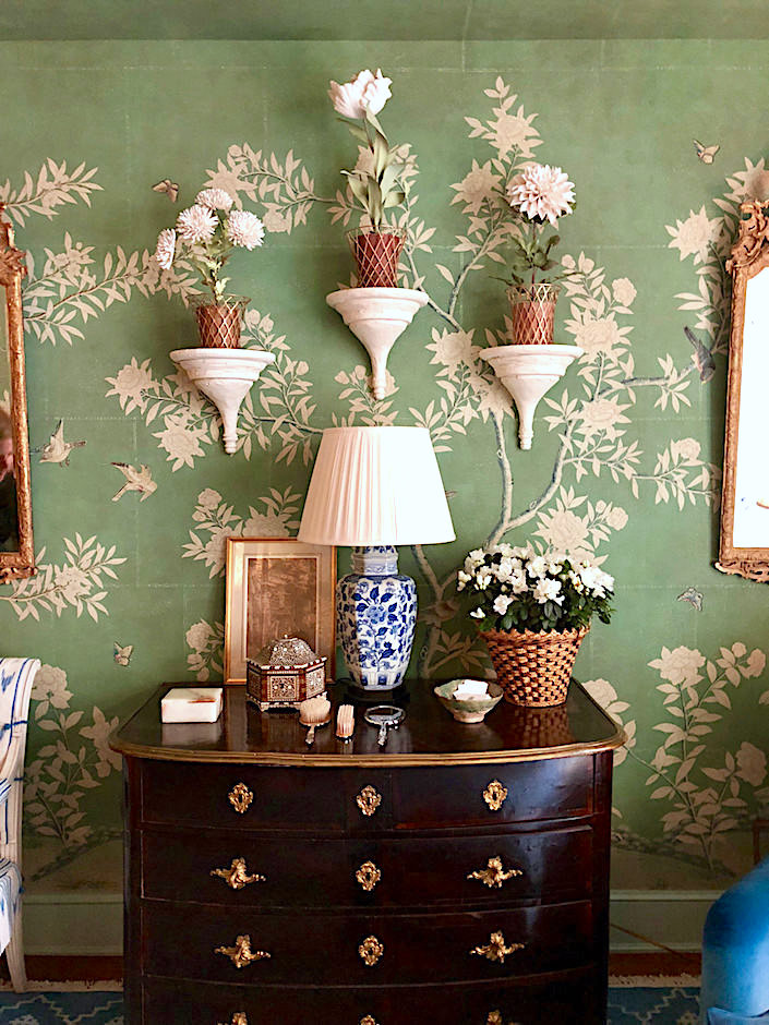
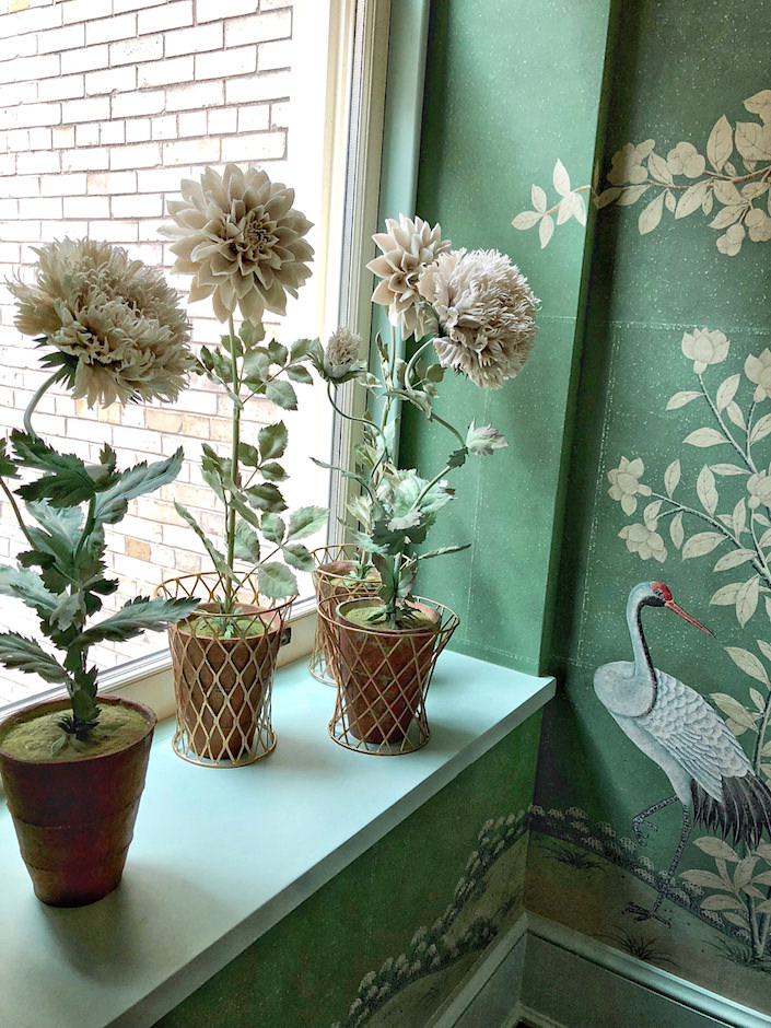
and thoughtful details – in the bedroom
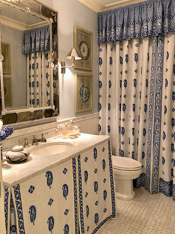
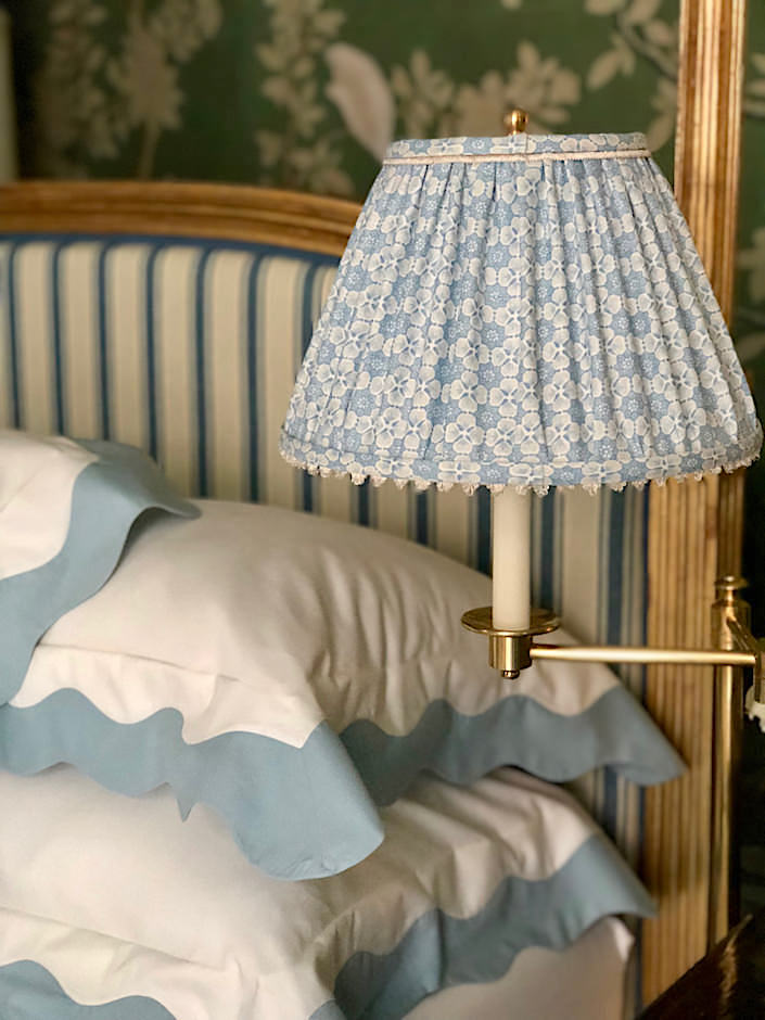 as well as the adjoining bath. You can visit Mark at home in Susanna’s and my video of his charming Los Angeles home.
Katie Ridder created her feminine guest bedroom as an escapist retreat.
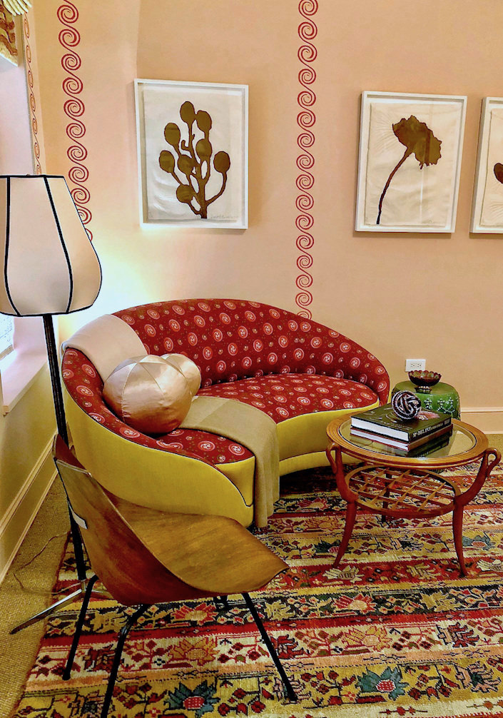
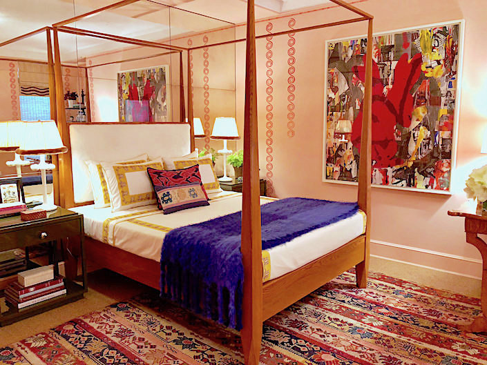 With walls in a custom Farrow & Ball pink and a custom four poster, she incorporated many of her signature artistic touches – stencils on the walls by Chuck Hettinger,
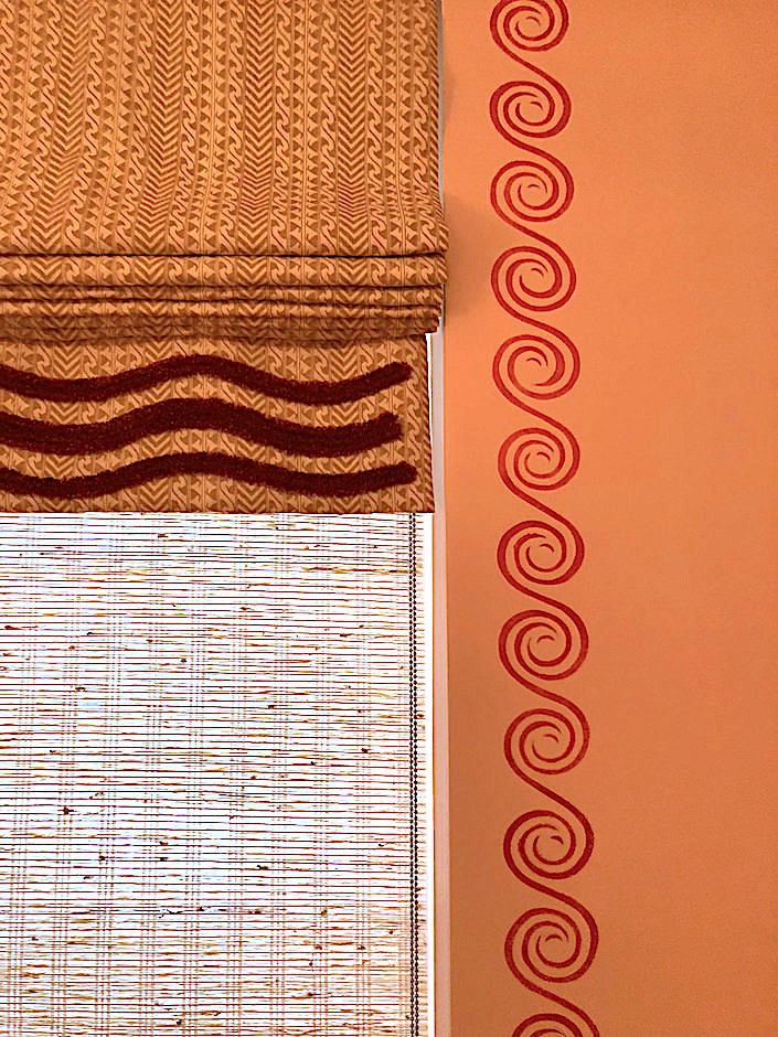
faux fur trim on the lampshade, above and desk chair below, whimsical teddy bear fringe on the Roman shades in a Lisa Fine’s Luxor and custom embroidery on the linens.

Katie has an incredibly eye for unusual color combinations as seen with the pink walls, Oushak rug and curvy settee in Decors Barbares’ new Aurel Rose fabric.
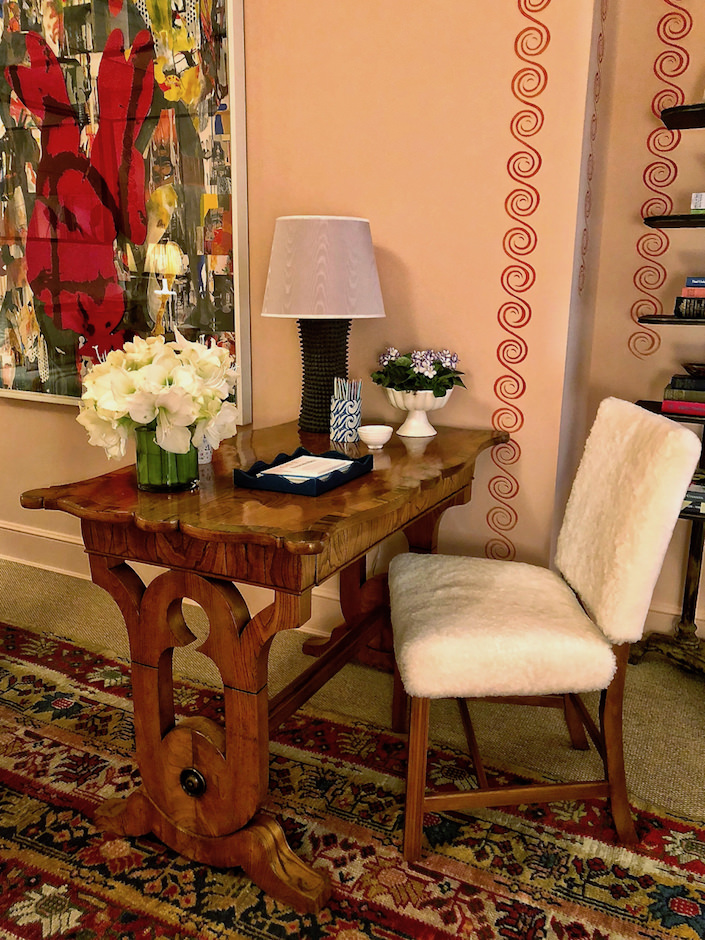
Even the desk has beautiful feminine curves with a furry upholstered chair.
Brian del Toro was also channeling feminine vibes with his “Laura’s Bedroom.” Starting with a gorgeous hand-painted Robert Crowder screen from the 1960’s, Brian continued
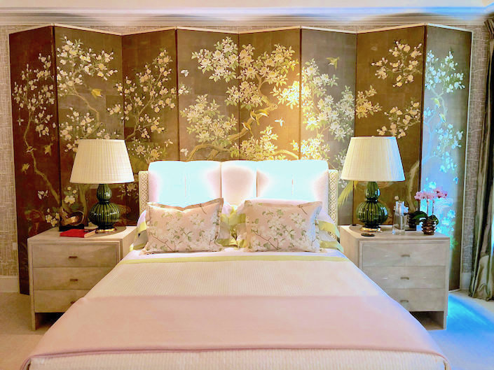
the scheme with streamlined pieces to give the space a more modern feel. In the niche by the window, an elegant dressing table sits under a custom antiqued mirror surround.
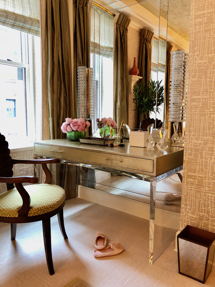
Elegant details can be seen on the distinctive bed trim
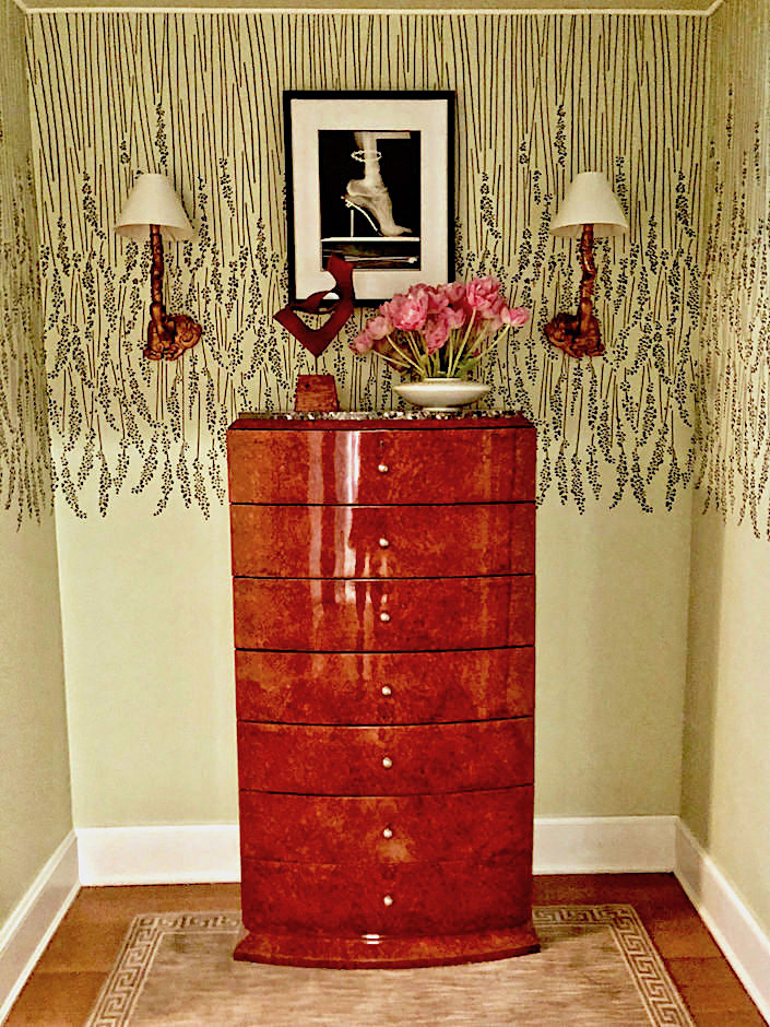
 and in the entry where Brian hung Farrow & Ball’s Feather Grass wallpaper upside down to great effect.
And lastly, but certainly not least, Philip Mitchell‘s impressive Drawing Room. I think everyone wondered how Philip would top his splendid art filled Kips Bay stairway from three years ago, but he proved the versatility of his talent with his room this year.
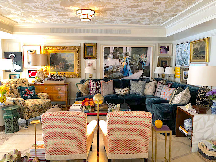
Inspired by the history of family and the love of collections, Philip’s space speaks volumes about how we can live comfortably while expressing personal style. While every single piece in this packed room was carefully curated, it doesn’t feel self conscious or “done.” Philip flexed his design prowess so effectively that you might not even realize he was here.
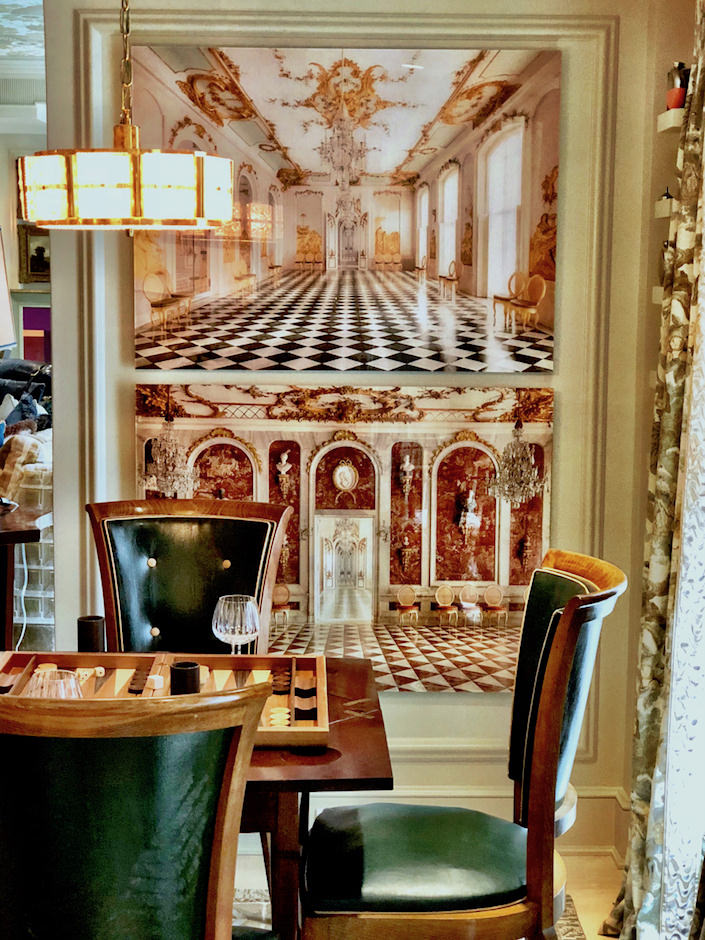
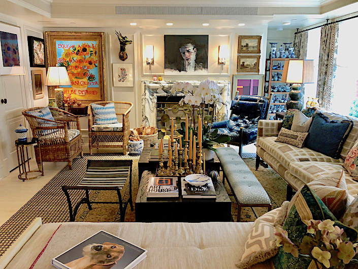 You enter and immediately feel the presence of the (fictitous) people who live here. There is a very human quality to the room – of life, of gatherings, of a tasteful eye and collections accumulated over the years. I wanted to know who had won the backgammon game under Celia Rogge’s fabulous enfilades.
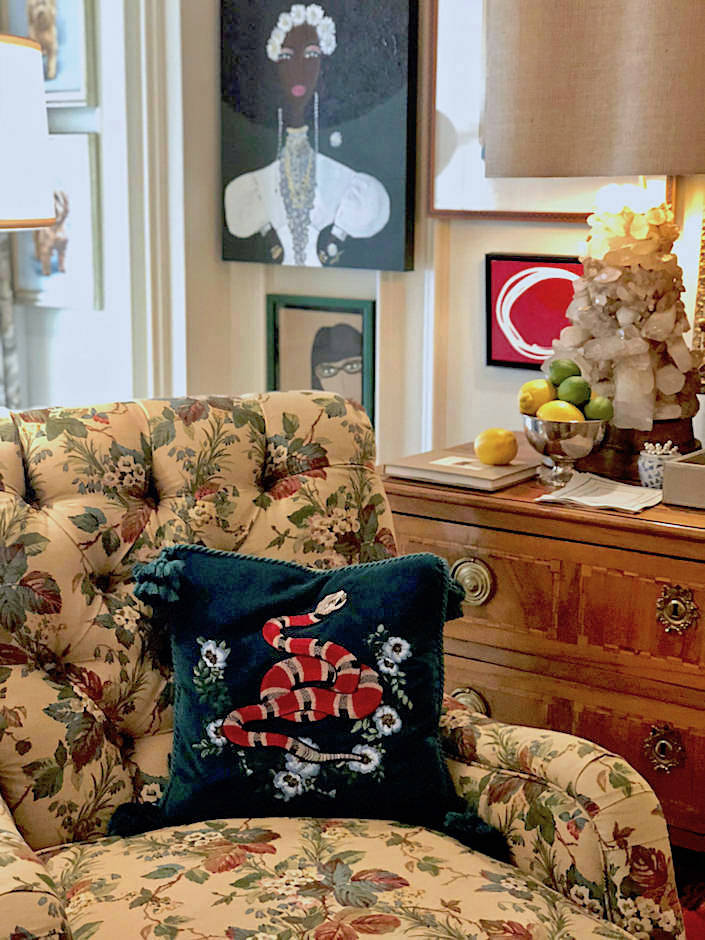
and who had bought the über chic Gucci pillow yet also loved their chintz arm chair that had perhaps survived other homes or generations.
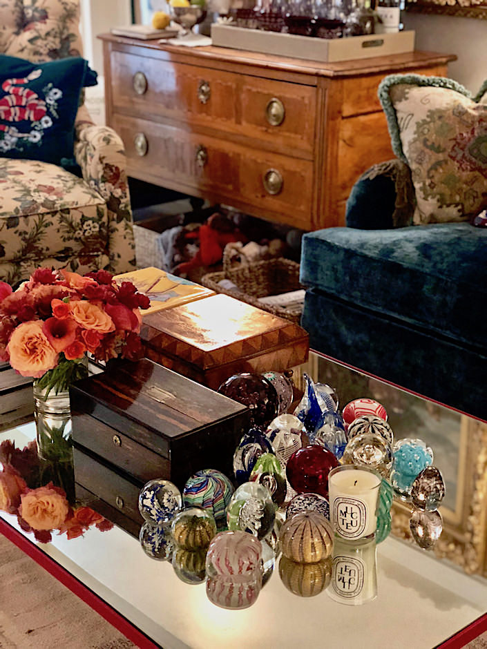
 There are many design lessons to be learned here but they seemed secondary to wanting to know where the occupants had amassed their collection of glass paperweights
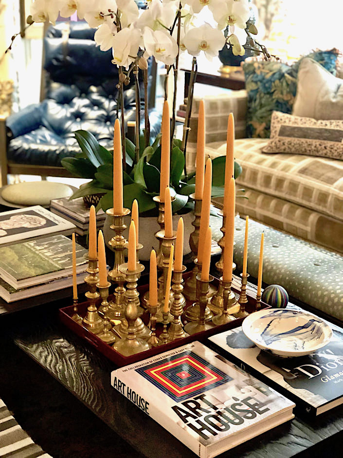
or how they had come up with the clever concept of putting all their brass candlesticks together en masse.
The collection of art is eclectic but conceptually cohesive – from the glamorous Mark Shaw Lee Radziwill portrait
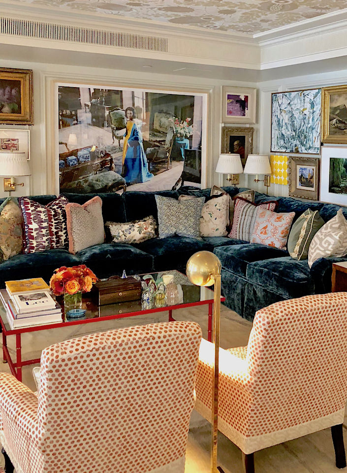
to the tongue in cheek CB Hoyo.
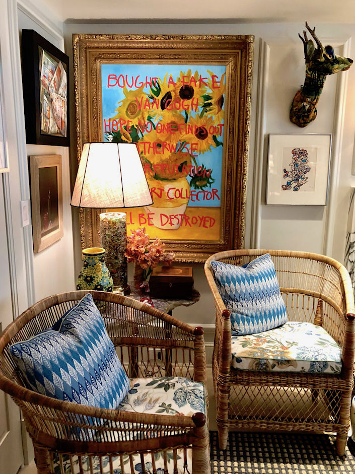
And of course, Philip had to include a tribute to his and partner Mark Naransky’s adorable pups Jacob and Wylo with a dog bed including custom pillows in Deborah Sharp linen
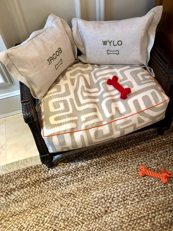
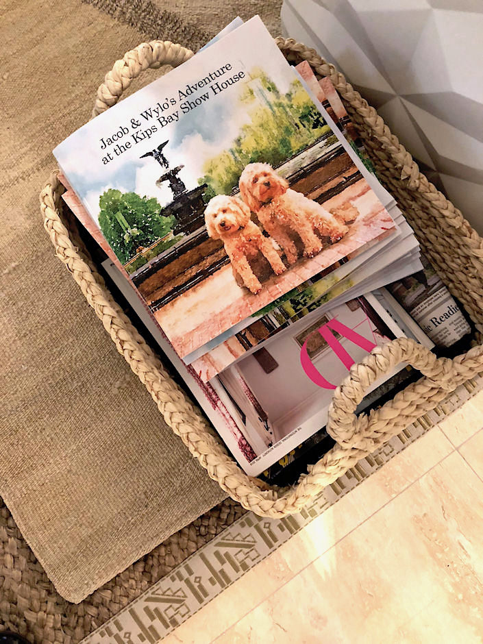
and a book chronicling their journey at the show house, which will available to purchase benefitting the Kips Bay Boys & Girls Club.
 all photos by Stacey Bewkes for Quintessence
It’s all about the story and Philip did a masterful job creating his room’s narrative with finesse and heart. Congrats to all the 2018 Kips Bay Show House designers! In case you didn’t see, don’t miss part I and part II of my coverage. And if you live in the area you’ll definitely want to see this year’s edition of Kips Bay – you can get your tickets here. It’s a great day of design for a great cause! And don’t forget, for the full 360, you can watch the live feeds from Susanna Salk’s and my visit here and here.


 all photos by Stacey Bewkes for Quintessence

Thank You for all the Beautiful Photo !
p.s. I am going Saturday.
All the Best, Al
Labour’s of love! franki
Well done Stacey. I see you saved the best for last! I could move into Philip’s room right now. But also Mark’s bedroom is fabulous. I’ll take everything but the phone. lol. Why that phone Mark? lol.
I absolutely adore your candle collection. In fact, I like all aspects of your house, but the candles are definitely my favourite
Some gorgeous, opulent rooms. I especially love the ‘campaign tent’ influence in the first room, plus some of the eclectic furniture choices. Thanks for sharing.
Some people really have magnificent takes on how to do a room. I love all of them. Thank you so much for sharing these.
Wow! It is really nice! Thanks Stacey for sharing this post 🙂