As we continue to look at the Designer Showhouse at Sotheby’s, the middle room, created by Ryan Korban, was designed as a grand hall.
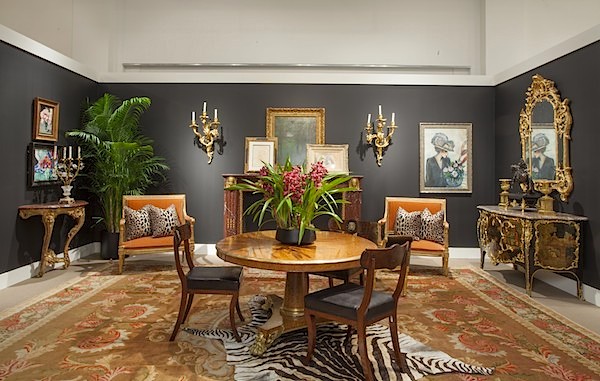 photo courtesy of Sotheby’s
As a transitional room, it packs a glamorous punch. While filled with elaborate period pieces, the space still feels modern with its dramatic contrast of black and gilt. Each vignette is thoughtfully composed for color, composition and an artful mix. Below, a luxe pairing of gilt regency mirror and Louis XV japanned commode are balanced by the saturated colors of the George III Axminster carpet and Louis XVI gilt wood marquise. The strong flat colors and signature outlining of Jean-Pierre Cassigneul’s Femme au bouquet complete the scene.
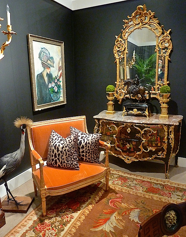
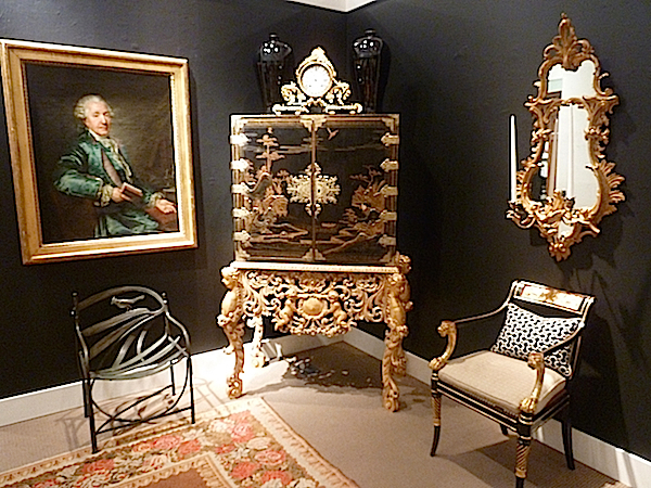
Across the room a William & Mary japanned cabinet on giltwood stand sits between unmatched but compatible pairs. One of a true pair of giant girandoles and an old master portrait by Jean Louis Voille balance above while a regency ebonized caned armchair and a metal chair by Claude Lalanne deliver dramatically different seating options, proving the power of pairs is an art rather than an exact science.
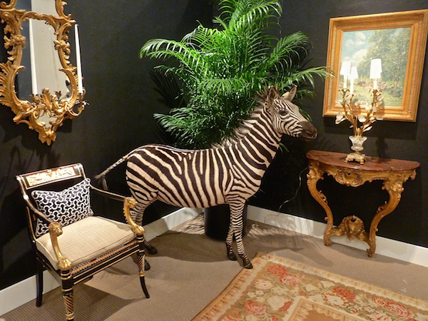
Korban’s signature touch of taxidermy appeared in the form of a perky peacock, two above and zebra, below, navigating the corner. Korban’s “ultimate home accessory,” they add a touch of exotic fantasy to the otherwise luxe decor.
 I could have moved right into Olasky & Sinsteden’s cozy chic drawing room. “Striving to make a livable space out of a plain white box” their starting point was the classical Geroge III style marble fireplace with elegant details and grand proportions.
 photo courtesy of Sotheby’s
Adding an architectural focal point to the room, they then organized a furniture plan giving thought to “comfortable conversation and relaxing.” A chic mixing of styles, periods, textures and accessories yielded a visually interesting and eminently livable room. The cheery saturated yellow walls with the strikingly graphic Francoise Gilot painting were the perfect modern foil for the variety of neutrals and traditional antiques.
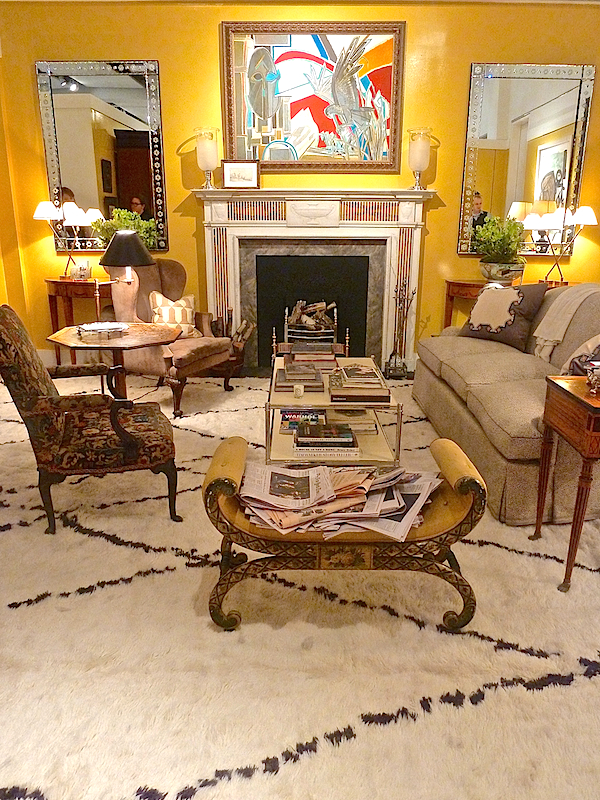 But it’s the mix that makes it. Along with a very stylish and comfortable functionality. You can sense that any occasion here, from a lazy Sunday morning to a chic Saturday night would not only look and feel good but work. There is ample room for a group to sit, enough light to read the Sunday papers and plenty of places to put your coffee or champagne. I can hear the music playing, smell the fire burning and taste my cocktail – in fact, where is my cocktail?! All signs of a successful design.
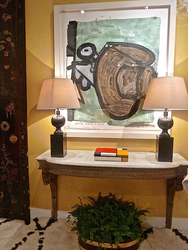
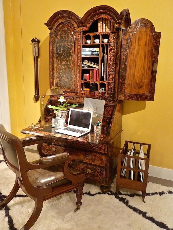 Old and new were effortless partners. An important Queen Ann desk with bookcase was a functional beauty. And a Louis XVI painted console looked just right under a contemporary painting and lamps with a covetable 18th c. coromandel lacquer screen peeking in.
The luxurious living room by WRJ Design Associates was a worldly take on contemporary living. With Belgian upholstered furniture and a mixture of rich textures and exotic woods, it was a serene and sophisticated room.
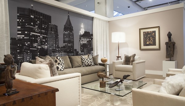
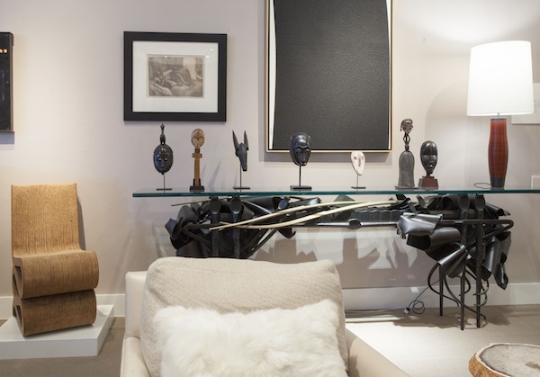
Inspired by Picasso’s l’Homme au Baton, above, Rush Jenkins and Klaus Baer, principals of the firm, based their room on the strong monochromatic linearity of the piece. Albert Paley’s sculptural sideboard, Frank Gehry’s wiggle side chair and the modern minimalism of Richard Serra below, work in synch with the tribal beauty of the African wood sculptures, all “reflecting subtle complexities of tonality, line and textures.
 two photos above courtesy of Sotheby’s
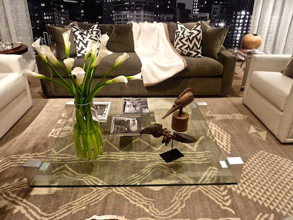
Oscar Niemeyer’s glass coffee table and a David Ellsworth vessel in the back right, are modern classics whose strong shapes and contrasting mediums give the room a discriminating artsy edge.
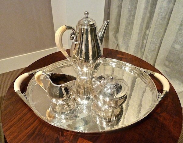
I couldn’t trace the provenance of this tea set but I liked its inclusion as a luxe glint of functional art in the otherwise muted textures of the space.
What a marvelous concept the Designer Showhouse at Sotheby’s was in giving viewers the opportunity to see works in context and offering imaginative ideas in how to use them. I’m keeping fingers crossed that this was the first of a series of annual events.

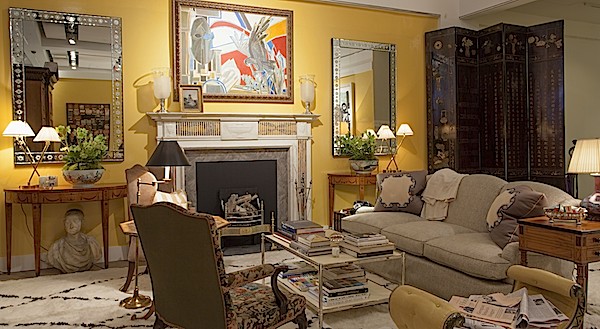 photo courtesy of Sotheby’s
 two photos above courtesy of Sotheby’s


Well, you are going to have to “move over” because Olasky & Sinsteden’s rendition is perfect. Just…perfect….I could move in anytime! franki
Stunning!!
Great Showhouse concept. LOVE the Olasky & Sinsteden room!! Sinsteden’s Instagram, too!