While we ended yesterday looking at bold and bright rooms at this Design on a Dime 10th anniversary show, there were also the dark and rich variety. Ron Marvin‘s room showed him at his tailored handsome best. His masculine haven was the sort that a woman would be happy to lounge in.
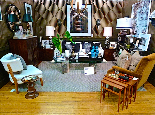
If they ever remake Rear Window, Ron would be perfect for the set design. A modern day Grace Kelly would look fabulous in this room whipping her negligee out of that iconic Mark Cross bag.
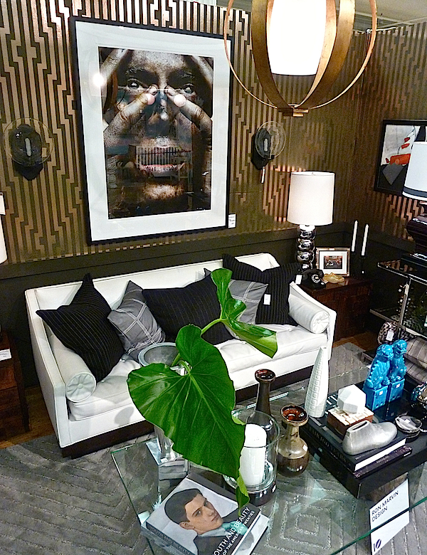
And of course every man’s retreat should include a chic bar, or a spot that can accommodate one.
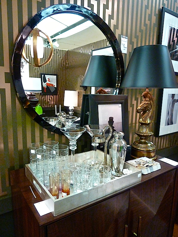
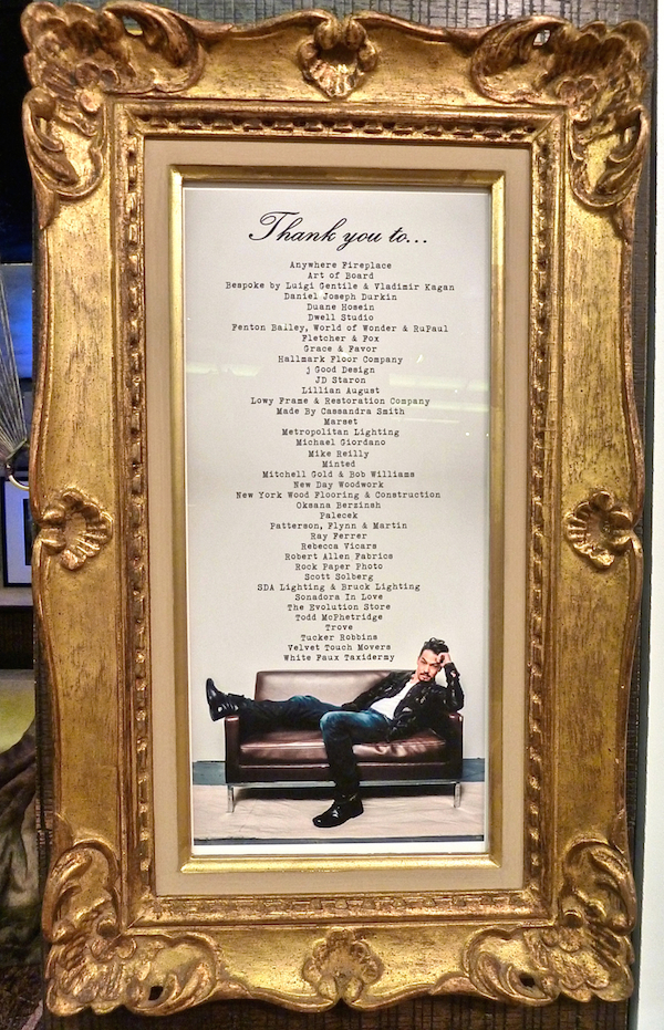
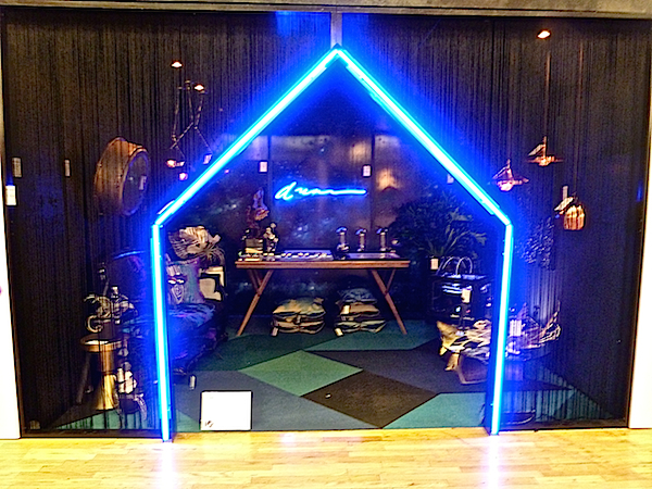
The invitation to Tyler Wisler‘s moody space was made even more intriguing with his clever partially partitioned entrance.
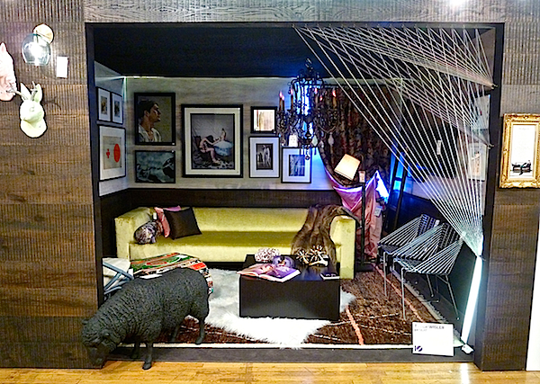
Once inside, the sexy lair was filled with an eclectic range of furniture, artwork
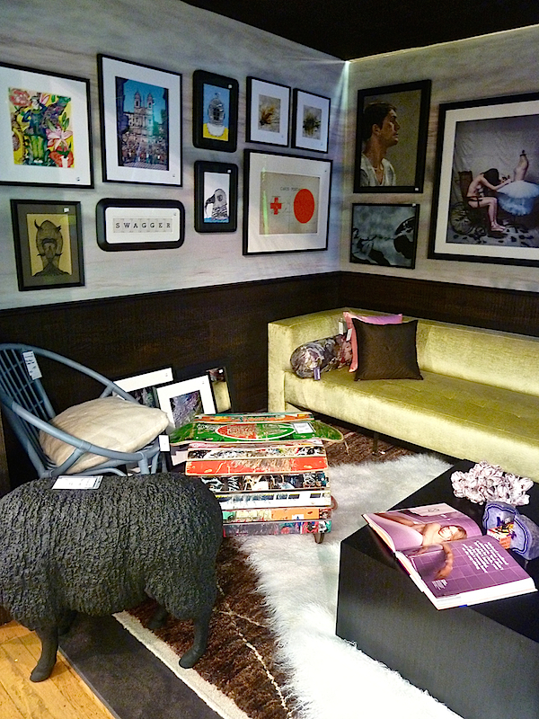
and suggestive moments.
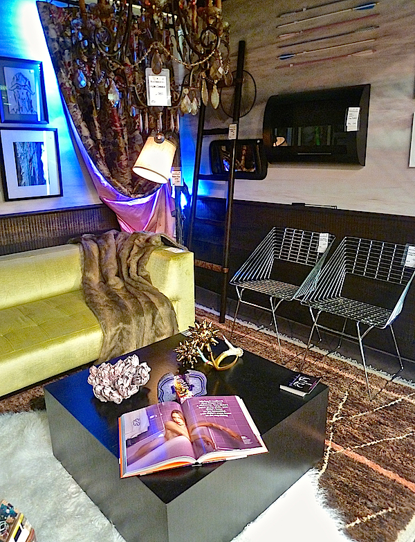
And Tyler wins 1st prize for most creative vendor display!
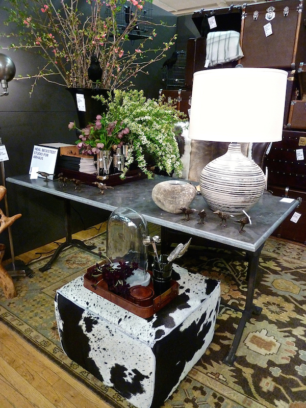
The dark background of the Neal Beckstedt‘s space for Arhaus space showed off the retailer’s wares to great effect.
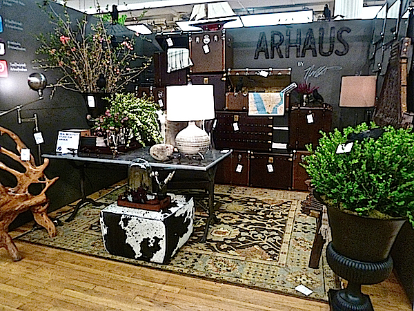 The designer did a great job merchandising without making it look like a shop.
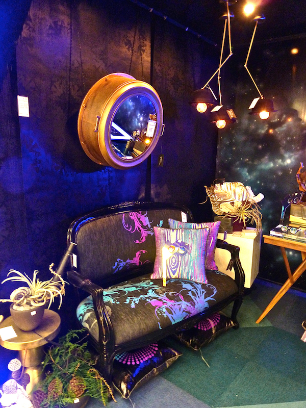
I wish I had better shots of 513‘s very creative room.
Their space was an alluring dark “dream” encouraging investigation and imagination.
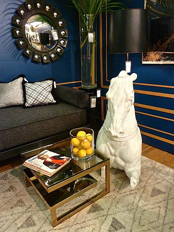
George Nunno and Jon Maroto of Flair always produce sophisticated refined rooms and this year was no exception.
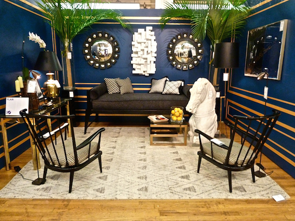
Their unerring selection and combination of stylish vintage pieces results in urbane and worldly vignettes. I loved the Azure Jazz blue walls from paint sponsor Valspar and how the designers paired it with black – such a chic and fashionable combo.
The shade du jour made an appearance in several other spaces. Friend Tamara Stephenson‘s charming dining room, inspired by a French seashore lunch, felt move-in ready.
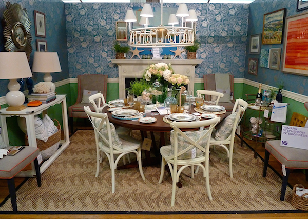
She and I share a love of tabletop and hers included a mix of vintage and new pieces with beachside related accoutrements.
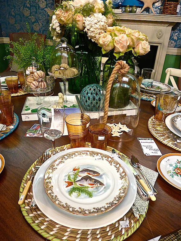
Thoughtful staging and details
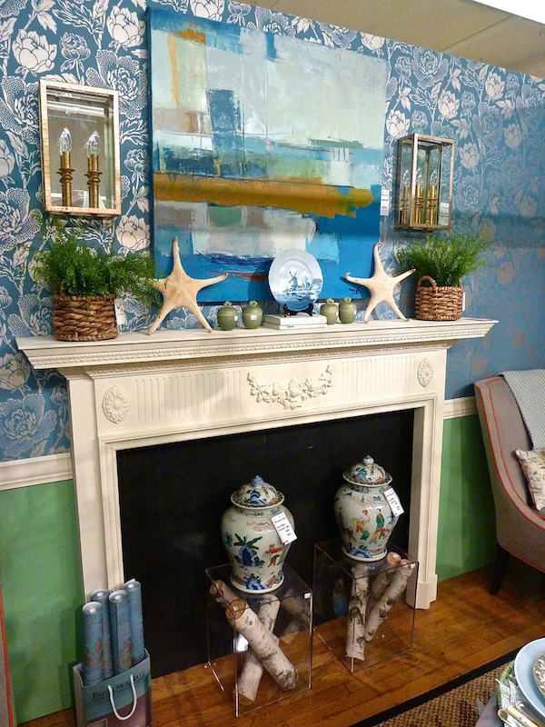
made the room feel like an actual home.
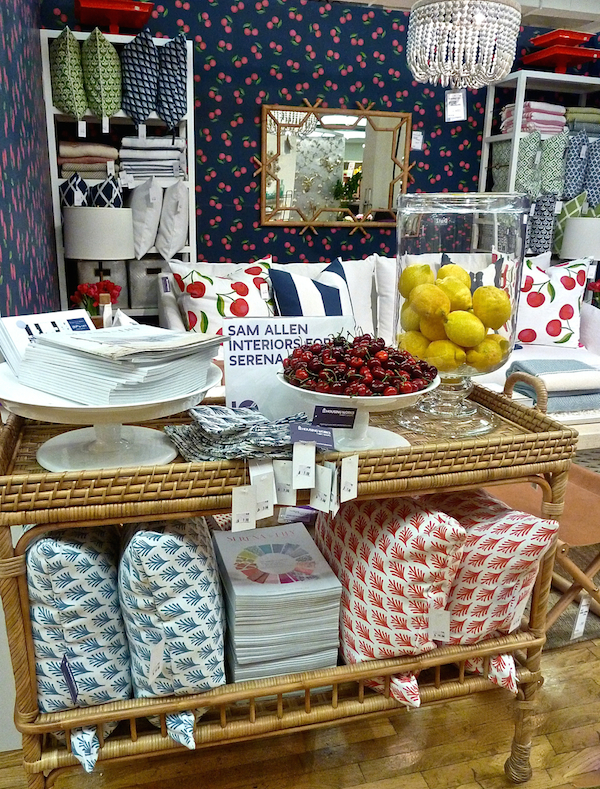
Sam Allen used the fun blue based Cherries wallpaper to set the stage for all the other cheerful Serena & Lily items.
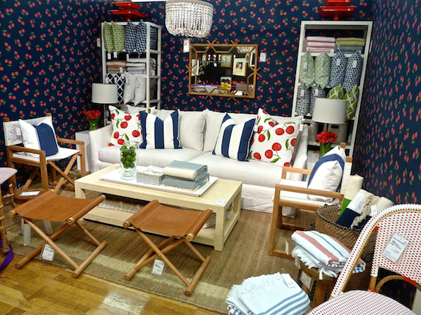 The room was chock full of practical product perfect for summer furnishings.
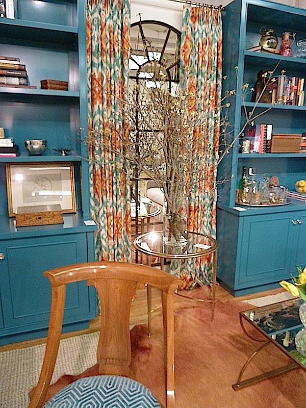
Teal is a shade coming on strong as we saw at High Point and you will see at Kips Bay. It was effectively paired with orange in Rinehardt Miller‘s stylish space.
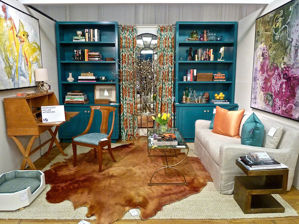
The ikat patterned curtains looked fabulous against the glossy cabinetry.
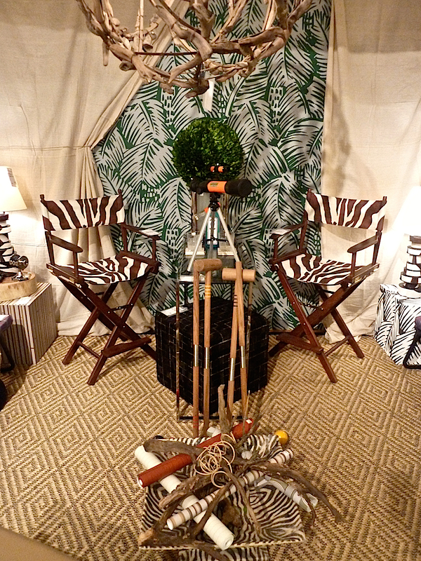
An entertaining thematic room was the safari inspired space by Eric Cohler.
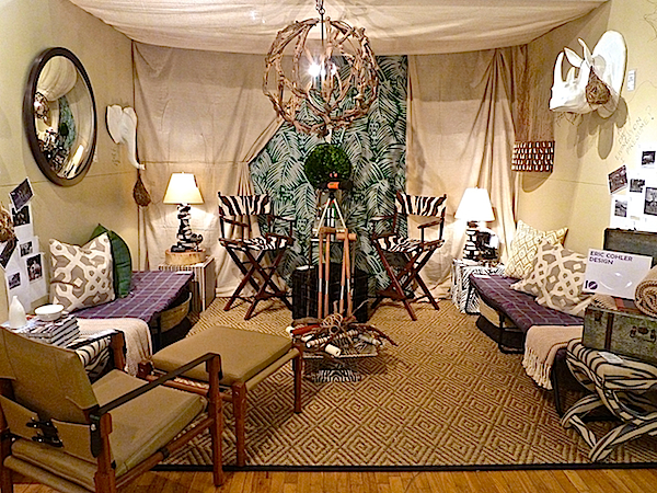
His fresh high low take on an African adventure offered arm chair travelers a vicarious shopping journey.
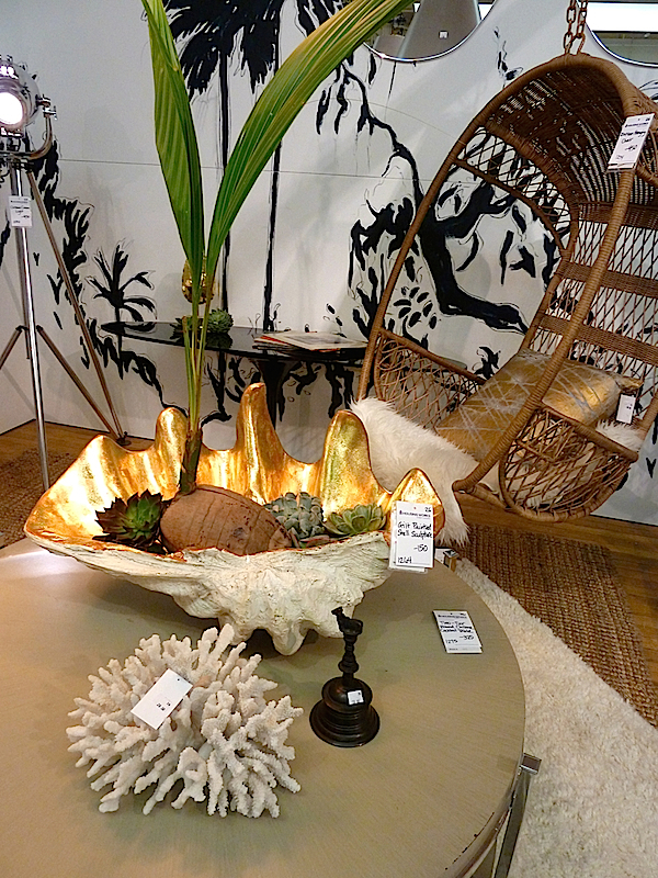
Nissa Botthoff channeled a more beachy exotic vibe. Her black and white illustrated walls were a nice contrast with the neutral palette.
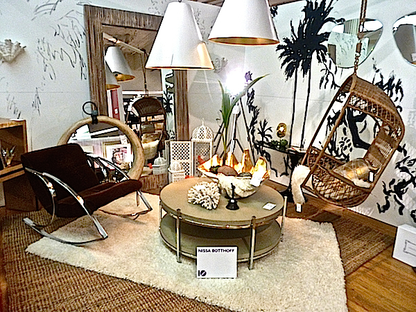 It was a pleasing mix of natural materials with glints of gold. And I’m envious of the lucky customer who brought that hanging rattan chair home with them!
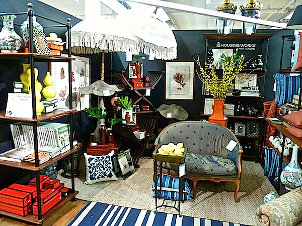
 In terms of shopping opportunities, Housing Works‘ own space was a great choice. Tons of affordable merchandise was stylishly arranged into an appealing homey scene.
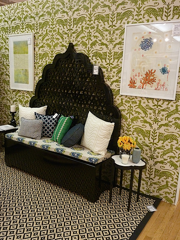
 Patterned walls were a popular solution for the blank white boxes to which the designers were assigned. I loved Sara Gilbane‘s choice of Pintura Studio‘s Escorial wallpaper from Studio Four.
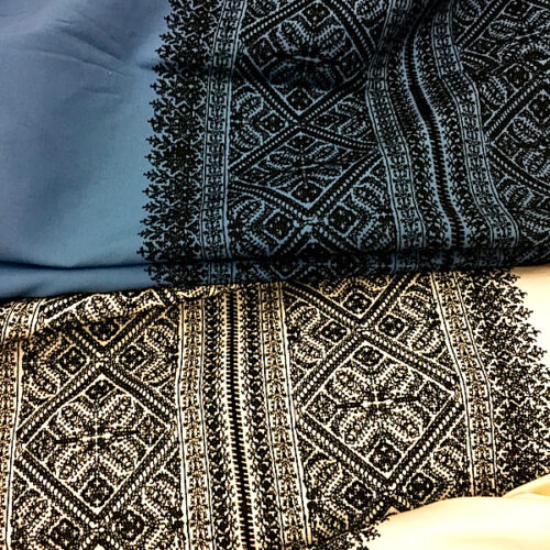
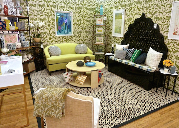 Paired with Tulu Textiles‘ wonderful Seljuk headboard, the space was a lesson in fearless mix and match.
A very clever wall treatment was executed by ID 810 Design Group
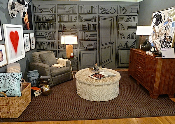
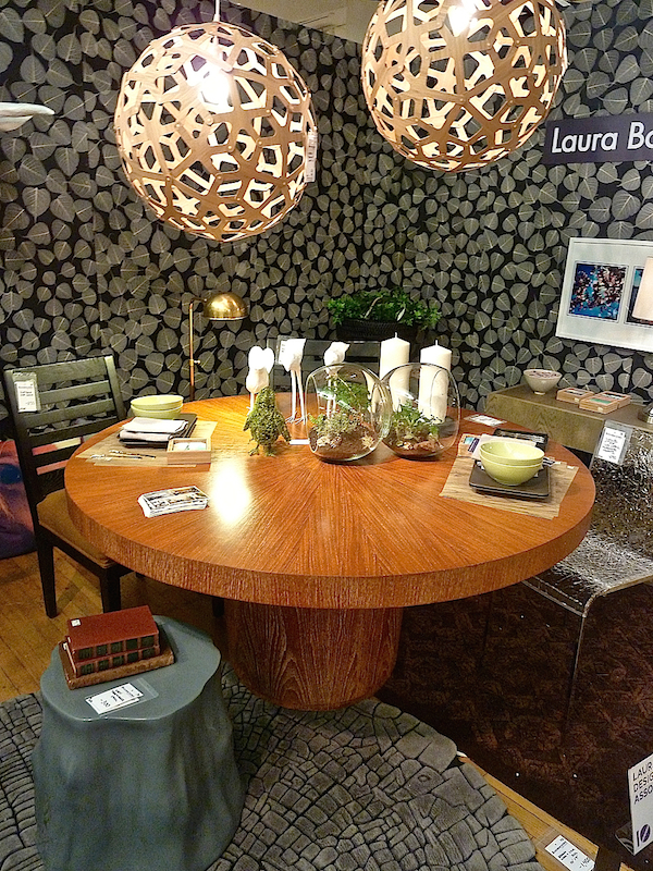
and Laura Bohn‘s large leaf patterned walls unified her corner space.
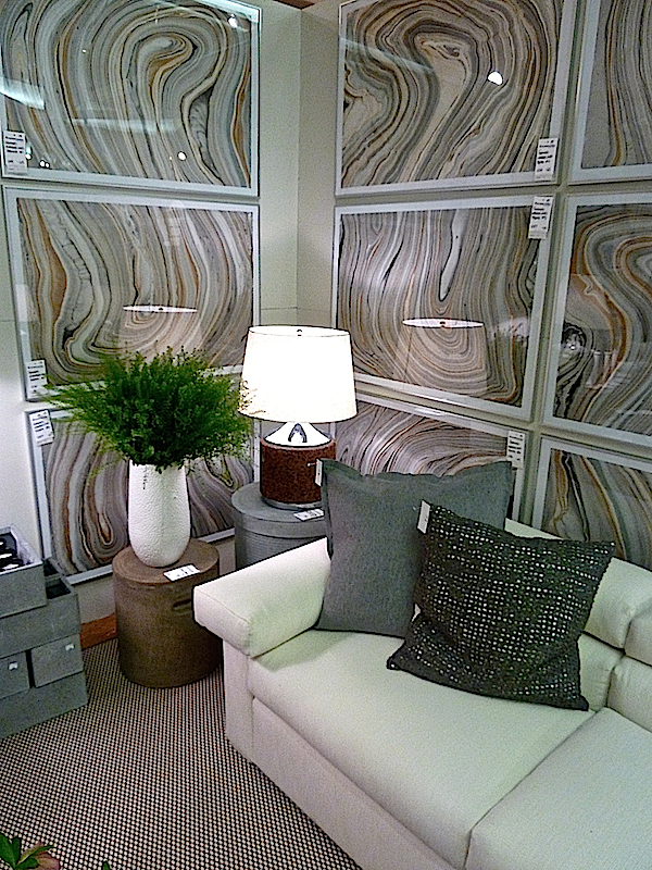
Design on a Dime Founding Chair James Huniford found both a chic and affordable solution for the walls in his space.
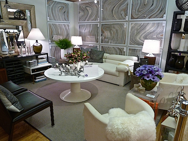 Using marbleized paper available at retail level, he framed them simply, grouping them in a large mass that rounded the corner for maximum effect. Such a clever trick that could also be achieved with wallpaper or prints from a book.
Stay tuned. I have a great sneak peek and a special treat from Kips Bay all coming this week.


The marbleized paper was the BEST idea! Cheers for all.
I have always wanted to attend this event. Your excellent coverage is the next best thing – a lot of great ideas to be found here. Many thanks!
Marvelous design ideas! Love these dynamic and richly eclectic rooms. I especially appreciate seeing wall art in any form…….all too often it is overlooked today. Wonderful, thanks!
Stacey, style ideas galore. I loved the many sophisticated spaces and the settees by Tulu Textiles, and 513 really caught my eye!
xoxo
Karena
The Arts by Karena
It’s so amazing to see what these talented designers can do with donated home furnishings and we love seeing Sara’s room all pulled together. We hope the event was a huge success for Housing Works and that people shopped ’til they dropped!
xxoo
C + C
That setee’, pillows and rug! That HEADBOARD!! Total love! franki