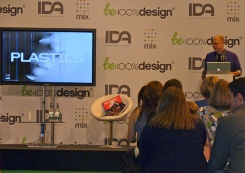
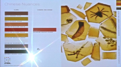
 Have you ever wondered how it is that different designers and manufacturers all seem to be on the same color page for a season? Many of you already know about color forecasting but at 100% Design in London, we had a fascinating presentation by Mark Woodman of Global Color Research who took it a step further. He explained how twice a year their global panel meets in London with external experts to establish the palettes two years ahead of time. Then 3 additional meetings are held in Europe, North America and China to tweak the trends for those particular markets. Below, for example, is an example of the “Chinese nuances” for one color way.
The color professionals at the London meeting represent a variety of industries, as do Global Color clients, from fashion and interior design to lifestyle and consumer products, including such diverse companies as Benjamin Moore, Dupont, Kimberly-Clark, Maybelline, Merck, Nokia, Swarovski Crystallized and many more.
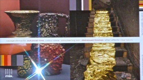
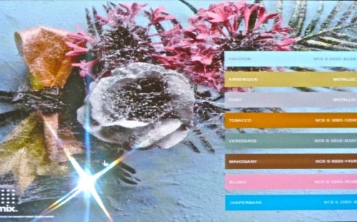
We were shown the four palettes for the Fall/Winter 2012/13 season with explanations and examples. The first, Ember, was the theme at the booth display. A warm palette mixed with distressed finishes and textures, it has a dark and brooding depth punctuated with fiery brights.
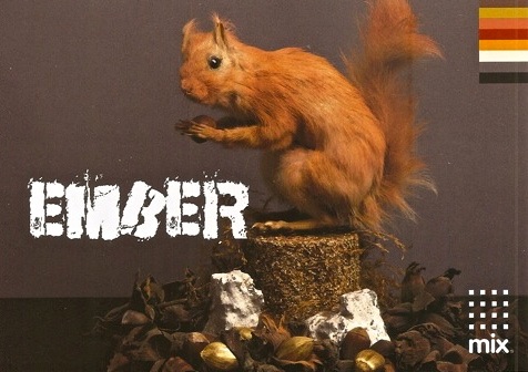 It encompasses the following palette
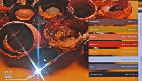 including metallics with a burnished effect.
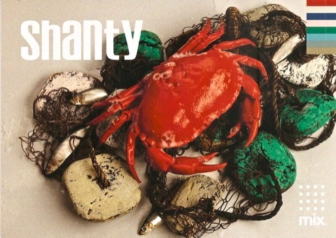
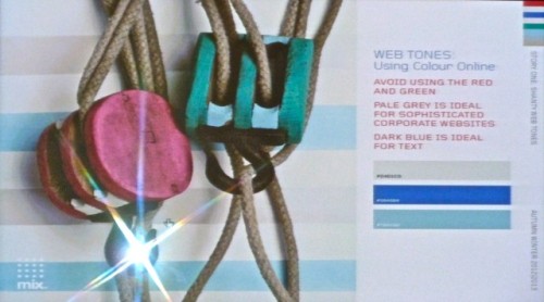
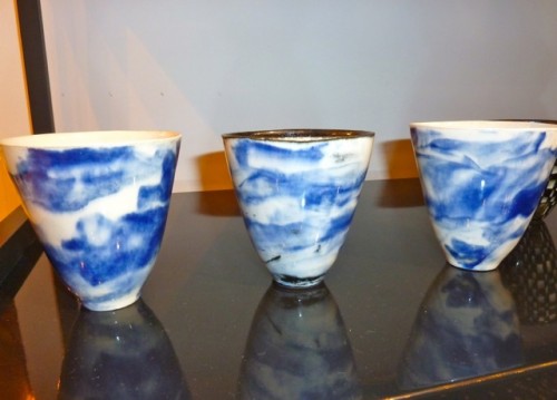
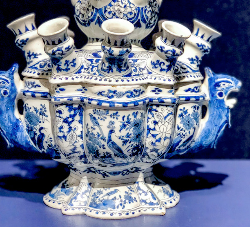
Shanty is the new take on all seaside, combining traditional maritime with rough, eroded and stormy themes. It’s luxe east coast style downgraded with a little driftwood disintegration. Denim will be a big color with aqua bridging the gap to the lighter hues. The green we are seeing everywhere is part of this color scheme.
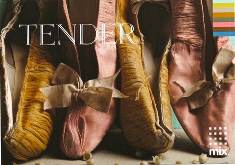
 Tender references all things classical, especially in the past. Think of gathered silks, stucco plaster, mother of pearl, patina of wood and antique tapestries.
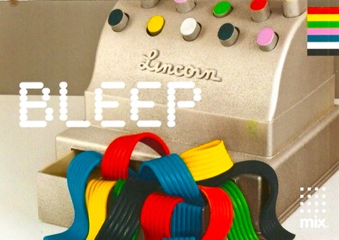
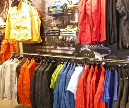
Bleep is the playful take on the primary brights, with a retro, technological feel.
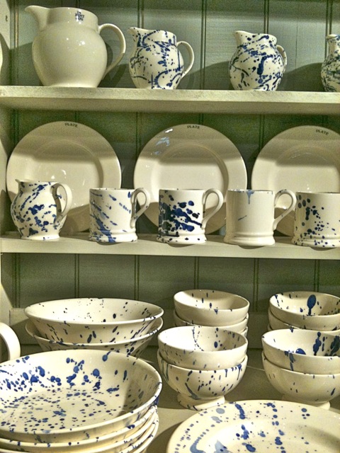
As I walked through London I started to see these color trends peeking out everywhere. Shanty showed up in this exclusive Emma Bridgewater collection at Liberty’s.
 And Bleep was present in these Barbour brights
Once you’re aware, you’ll begin to see the palettes emerging everywhere too! And if you’re interested in learning more about color forecasting and industry design trends, Global Color publishes a beautiful quarterly publication, Mix Magazine.




I love this topic. Color is so important in all of our lives. It is so fascinating that there are people out there studying so deeply studying to start these trends.
whoops, a little too much studying, sorry.
And so it goes…fascinating.
What a fascinating post and it’s true, now that you mention it, that I have seen elements of these color ways starting to pop up here and there. Thanks to you, we are all on track for the future…as always!
Color is a pretty fascinating topic. I realized a few days ago when I was out with a beautiful blue velvet to match up, thinking it would be a 1,2,3 deal well…..2 hours later and hundreds of blues later, I realized color is a whole other world. How many whites are there? Like over 150 I believe! Its interesting to see the trends in colors too……great post.
While color is more of a personal thing this post was so fascinating who would have thought? Never could I have imagined that they try to predict colors years in advanced and the steps to get there. This was so insightful and eye opening. Wonderful post!
Fun to see what they predict the future will bring!
It sure sounds like your London trip was fantastic!
It is so interesting, I must be tender with Chinese nuance undertones. I do think this idea tends to stymie a creativity. pgt
Stacey, thank you so much for sharing this with us! I am always fascinated by color forecasting. I’ve been seeing a lot of “Tender” over the past year +. Interesting about the “nuances” for various markets. Great post!!
What a fun job, to study color and be immersed in figuring out which ones will rise to the top and when! I do like the Shanty colors – and of course the Emma Bridgewater collection caught my eye immediately!
I’ve always been fascinated by color and how people respond to it. I think it’s the part of my job that I love the most, and it seems to be the most appreciated from my clients. Choosing colors is alot about a person’s sensabilities, but it’s also about changing the perceptions and the mood of a space. Nothing does it better than color. fun post!
I love studying the layers in colors. The color world is fascinating. I so enjoyed this post and I am bookmarking it for future reference. It appears the colors coming up are a bit more saturated, I love that!! Thank you so much for such wonderful information!! Kathysue
You can never learn too much about color! It changes things more than any other element of a room.
Thank you for sharing this group, q.
Teresa
xoxo
It always amazes me how teh trends are forecasted so far in advance. Great post!
Color forecasting is such an interesting topic – so fascinating to think about the discussion being held to establish palettes! Happy Monday Q! xxKelly
What an interesting post about color! I enjoyed learning about the forecasting of color trends. Your blog continues to be such a wealth of information on design. Thanks for all you do!
Love all of the collages illustrating each palette. Fascinating.
Lynn
Now that we’ve put to S/S 2012 collection to bed, you’ve given the colors for fall… wonder how we can translate these into our designs?
xxoo
This one was simply fascinating to me, I loved learning ‘how it works,’ I had no idea they forecast two years out. Your images illustrating each theme are wonderful, the Barbour brights look like candy.
Sending you a smile,
tp
I’m always fascinated by color, and love learning more about how they predict for the future. Wonderful post!!
Always amazing to see where the color trends emerge from! The creative world always seems to be in sync – like everyone is channeling the same things at once!