Last week, Sotheby’s debuted its inaugural Designer Showhouse, partnering with its 1744 Young Collectors Club, targeted toward those just starting to build collections. To illustrate how art and antiques can successfully add to the mix, the auction house invited six interior designers to comb their inventory for pieces featured in upcoming spring auctions for inclusion in their individually designed spaces. Showing how fine and decorative art can “not only allow the viewer an opportunity to reflect upon the pieces’ historical and art historical importance, but also give these pieces new meaning and significance in the world of today,” each designer’s vision offered a different perspective. Sotheby’s International Realty, Town & Country magazine and Bespoke Global sponsored this fresh and innovative concept that will hopefully become an annual event.
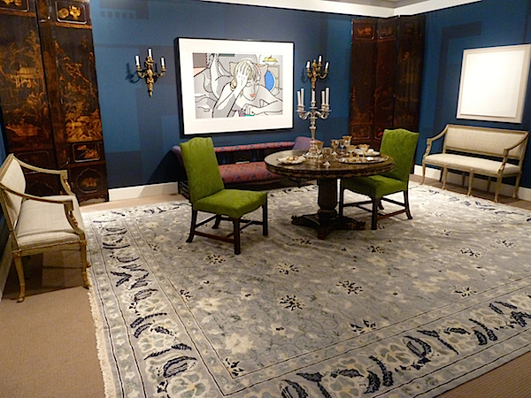 Ann Pyne, designing for McMillen Inc. explained that “The most iconic room of our firm, is a square dining room, created in 1928 by the founder of McMillen Inc., Eleanor McMillen Brown. So when we were given a square ‘room’ for our presentation, we naturally wanted to do a dining room, and in Mrs. McMillen’s honor.” Starting with a gorgeous Chinese export parcel-gilt black lacquer table c. 1835, paired with George III chairs, they hung Roy Lichtenstein’s Thinking Nude
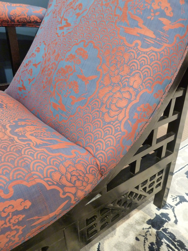
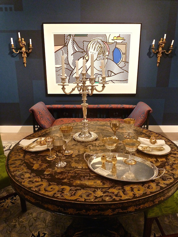 over an important British aesthetic movement settee circa 1873.
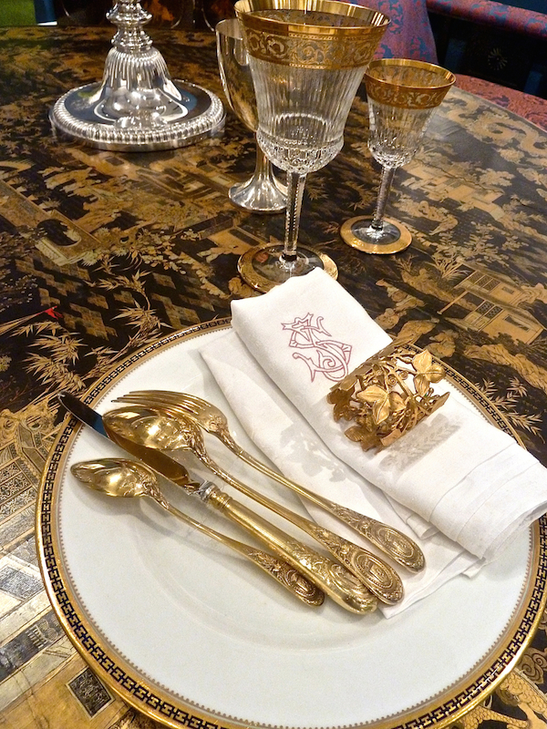
 “Of course, this is a juxtaposition our 130 year-old founder would have never have completely approved of, but someting we like as epitomizing the mix of history and the present.” The table vignette included Christofle flatware c. 1890 and Saint Louis crystal.
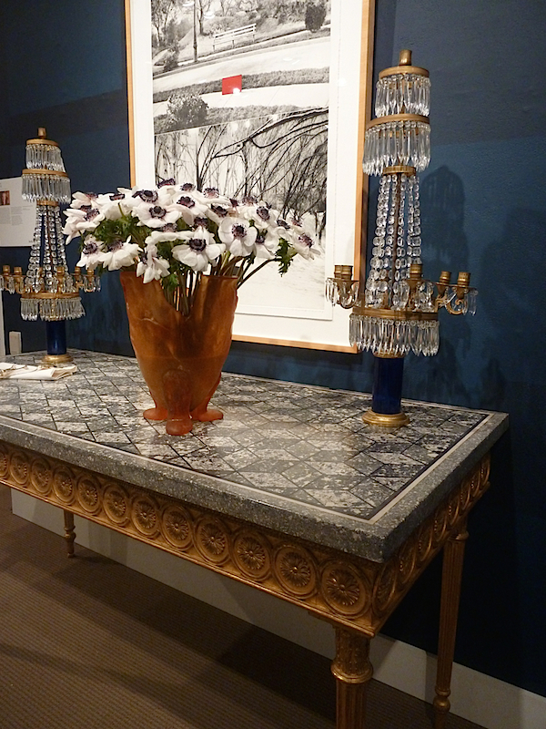
A handsome George III side table with a pair of elegant 19th c. Russian glass candelabras was paired with contemporary artwork by John Baldessari.
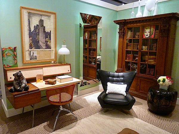
Daun Curry, the designer behind the firm Modern Declaration, created an impressively eclectic vignette. With her first pick of a Cassigneul portrait, Curry followed the green and pink palette to create a room of glamour and whimsy.
 photo courtesy of Sotheby’s
Known for her fashion-inspired interiors, she had an artist use four pounds of commercial grade eyeshadow to cover the walls. “I always like to use innovative materials and infuse a bit of glamour into my spaces … The eyeshadow will create a subtle sparkle on the walls and marry beautifully with the painting’s hues.” Below, a mid century George Nelson desk sits under a contemporary Christo print, echoing the architectonic lines, across from a mid 19th c. Victorian bookcase anchoring the entire corner.
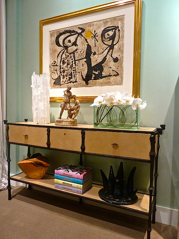
I loved the tonal pairing of the Miro over an Ingrid Donat console table. The warm golden tones with black accents in both pieces bridged styles and eras – a reminder of the unifying power of color.
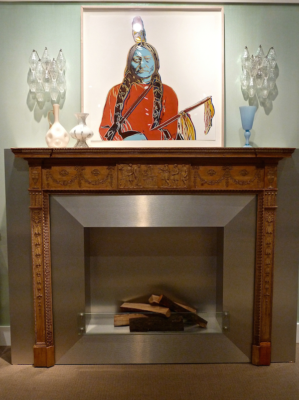
 And I would never have thought to put the Warhol (which I believe also made an appearance in Alessandra Branca’s Designer Visions apartment) with the George III carved pine mantel – accompanied by a contemporary surround, but it somehow works. And that is exactly why this type of event is so valuable – it enlightens your eye to the possibilities!
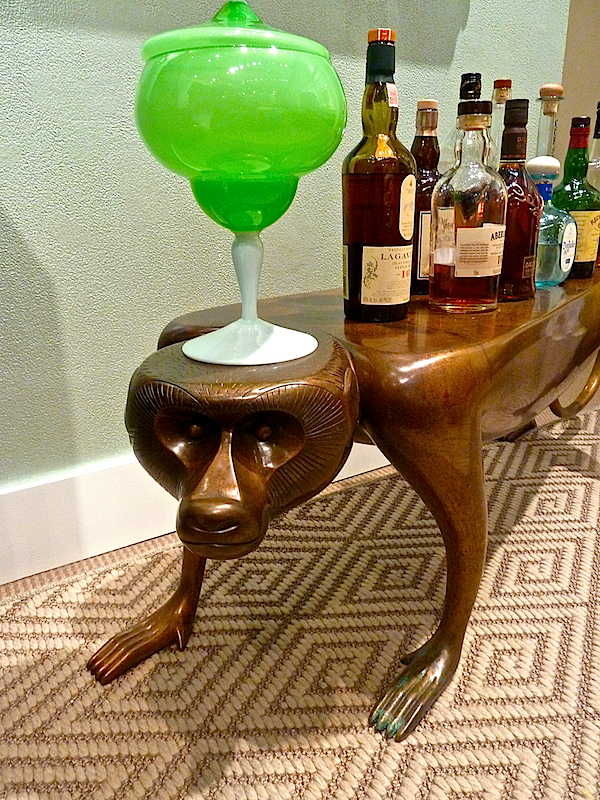
 My favorite moment in Daun’s space, however, was probably the winning adaptation of Judith Kensley McKie’s baboon bench as a bar – truly a whimsically inspired moment.
Interested in melding his interests in world-wide cultures, objects from different eras and contemporary creations, Shaler Ladd created a design library enclosed in a tent entitled, “Library for Travel Through Time and Space.” Silk panels with sisal matting layered with a 19th century Tabriz and seating cushions created an “experience of nomadic travel.”
 photo courtesy of Sotheby’s
Inspired by two seemingly disparate pieces in Sotheby’s coffers, Ladd found they worked surprisingly well together. Francis Bacon’s Étude pour une Corrida and a 1954 ceiling light by Angelo Lelli, above, both express movement in their forms.
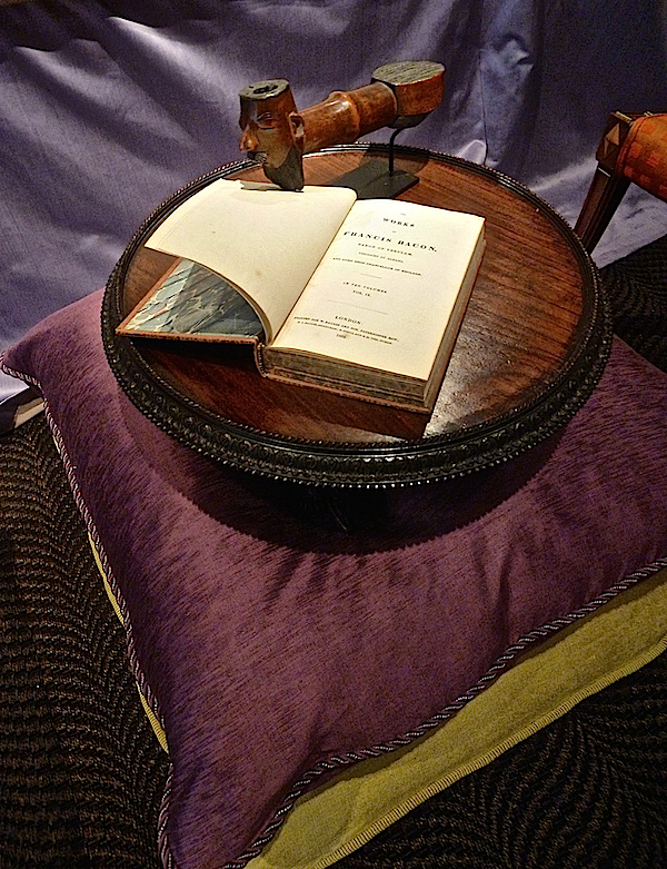
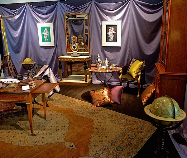 Other objects, including a 19th century French brass telescope, a pair of Victorian “terrestrial” and “celestial” globes, two George III bookcase cabinets as well as stacks of antique books and other pieces are all taken from former libraries.
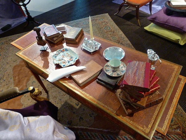 A quiet teatime reading break on an elegant Louis XVI bureau plat is expressed below with pieces from a c. 1815 Mason’s ironstone Imari dessert service and a rare American silver c. 1790 silver tea and coffee service.
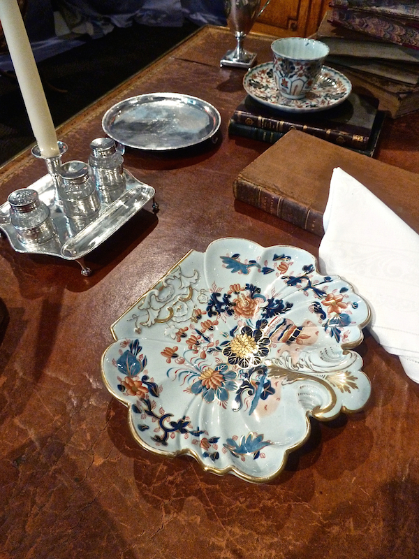 As Shaler summarized, “What better place to explore the past and its relationship to the present and future than a library equipped for travel through time and space?” A Rosebud moment captured below.
Stop back tomorrow as we look at the other three designers’ rooms created for Sotheby’s Designer Showhouse.

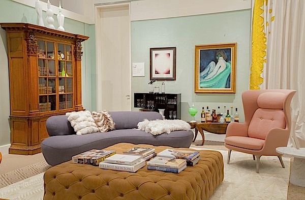 photo courtesy of Sotheby’s
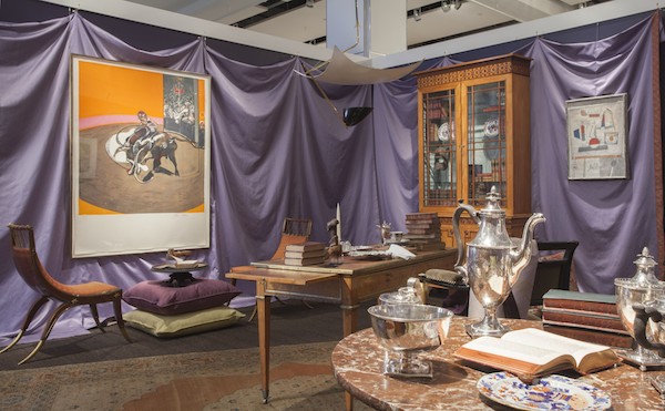 photo courtesy of Sotheby’s

Stacey this is one of the most memorable posts I have ever seen! The stunning works of art, fabulous furnishings, equisite accessories, all juxtaposed beautifully. Of course contemporary art paired with antiques is a favorite always in my book. Bravo to The Sotheby’s Designer Showhouse!
xoxo
Karena
2014 Artists Series
Wonderful to see the eclectic mix of all the arts: paintings, furnishings, objects d’art. All beautifully showcased! Great post!
Four pounds of commercial grade eyeshadow covers the walls? That is a modern twist!
Karena just relayed my thoughts! And, then, OMG…eyeshadow??? Who thinks of this….artists!!! franki
Sotheby’s is on to something there for sure!! The breaking news is the commercial grade eyeshadow on the walls! We need to hear more about that for sure.
Best,
Liz
such depth of beauty. thank you.
Amazing
BEAUTIFUL !!!