For those who haven’t heard, this year’s Housing Works Design on a Dime was a rousing success, raising over one million dollars to support New Yorkers living with HIV/AIDS. It was a packed house on opening night with a fantastic selection of creative vignettes filled with shopping treats. Today we’ll take a peek at a few more. I was delighted to see much orange this year and one of the more layered spaces was that of designer Patrick Hamilton.
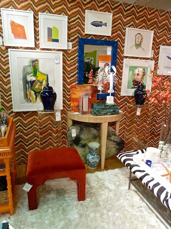
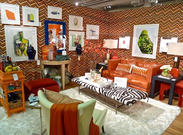 Free form chevron walls set a sort of op art tone for the art filled vignette. By using unified frames, disparate art of varying sizes works together.
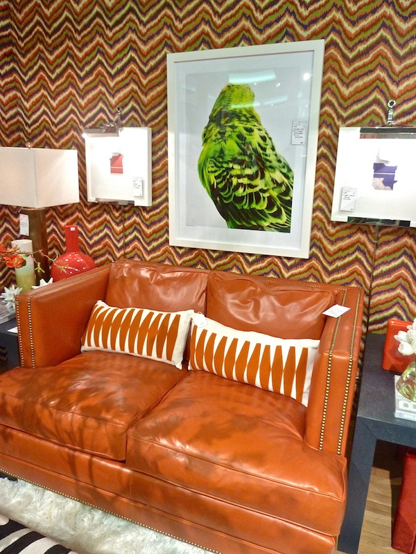
 I loved the unusual shape of the leather settee.
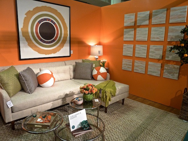
I caught the fun Cullman & Kravis‘ orange vignette before it received some final tweaking but I still thought it was a great ode to my favorite shade. Graphic artwork from Maria Aldana and playful cube and ball pillows from Sterling Upholstery gave the space an upbeat feel.
Etageres from Thorp Brothers Restoration offered the opportunity for colorful staging
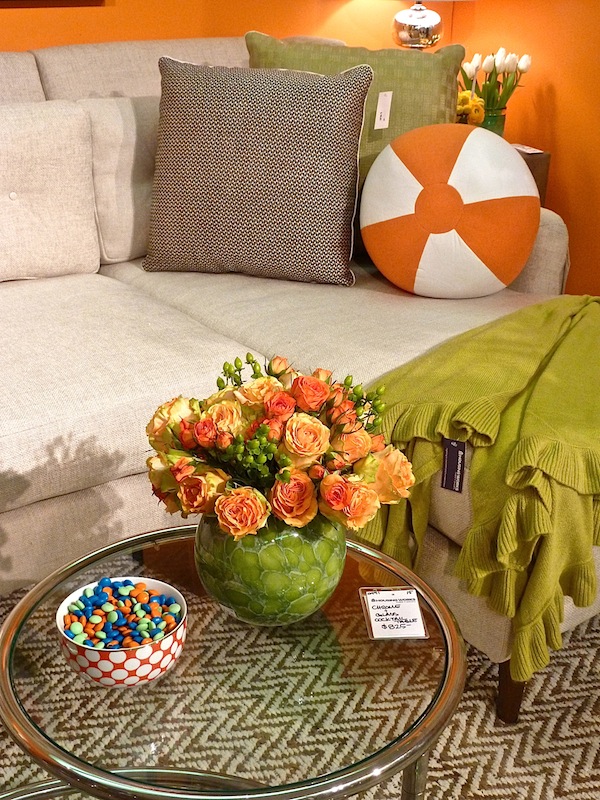
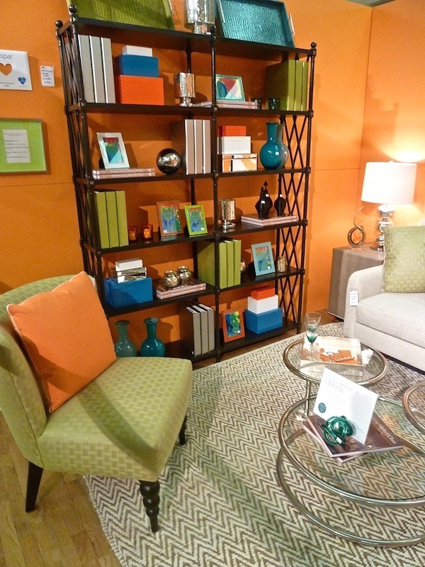 And I noticed Ellie and crew managed yet again to sneak in some color coordinated sweet treats to their beautiful styled vignette.
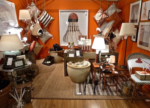
Foley & Cox used vibrant orange walls to set off a creative collection of neutral art and accessories. I have always loved the gigantic shuttlecock print from Room 125, which effectively anchored the space.
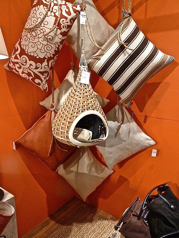
And I thought it was very clever how they had the series of pillows strung up nautical style in each corner.
While Rob Passal‘s incredibly diverting summery space wasn’t based on orange, the hue made strong runner-up appearances.
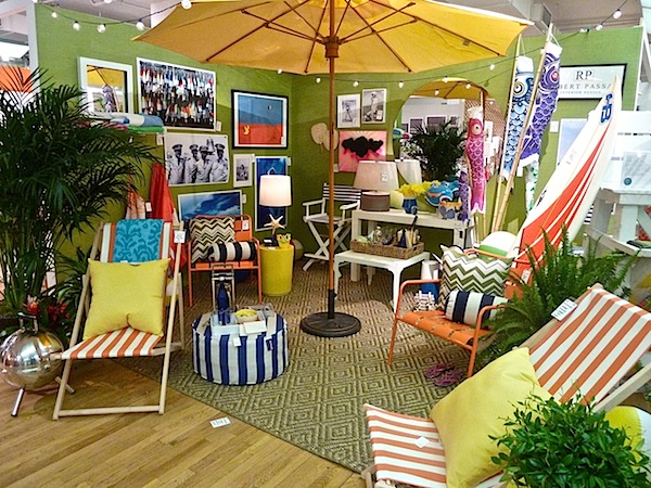 Everyone was ready for a trip to the beach after visiting, especially when the six pack laden lifeguards showed up in their swim trunks (sorry – missed that photo opp)! There was tons of great affordable art.
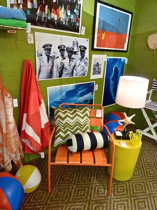
And it was clear that Rob had fun creating his whimsical vignette.

Aside from the orange filled spaces, there were those rooms that had a handsome, rich, masculine vibe. David Scott‘s signature layered luxe was a perfect example.
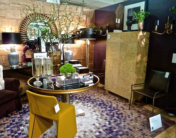
Gold and black tonalities with warm matte and burnished surfaces, worked together for a sophisticated versatile space.
 Carefully coordinated vignettes featured contrasting shiny and antiqued.
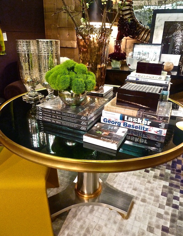
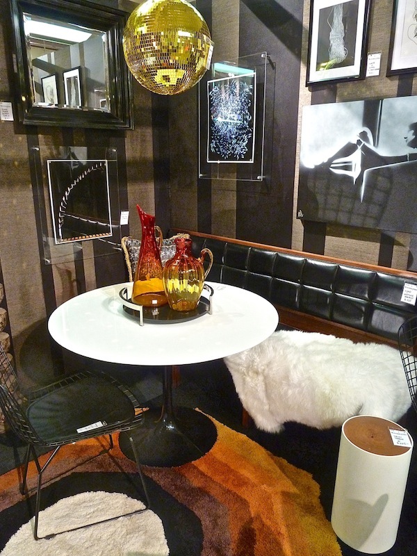
Tyler Wisler‘s room was a dark domain as well but with a bent toward a mid century/modern mix.
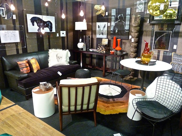
A great selection of art against the textural striped walls

with a version of the tulip table, felt like a chic cafe corner
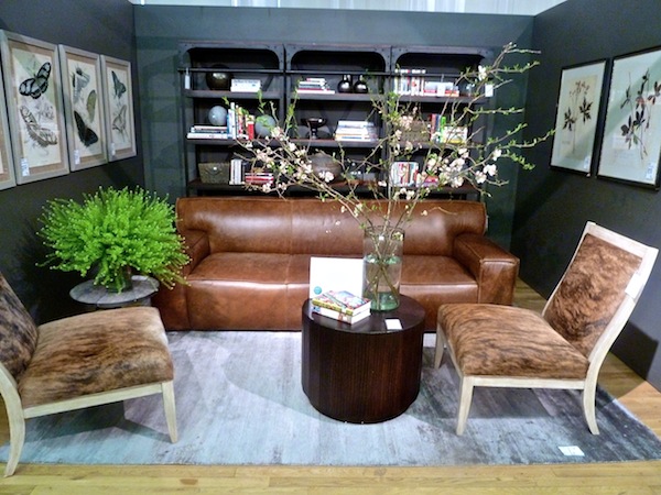
And Brad Ford‘s room for Arhaus was a tactile combination of textures, playing off of a handsome saddle and gray color combination.
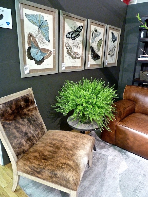
The series of butterfly prints added a graphic touch with a bit of color and movement.
 Alla Akimova for ARCHIVES ID started with charcoal walls courtesy of JAB – ANSTOETZ
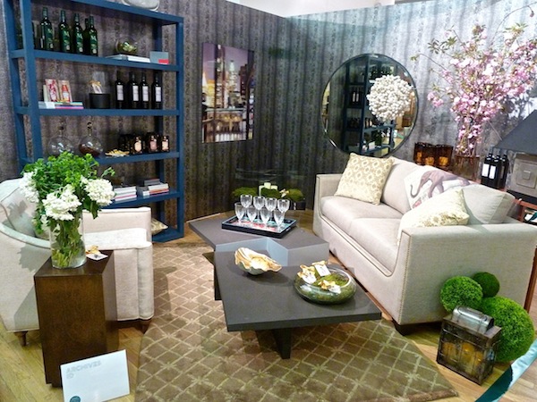
but then added the more feminine lines of the Avery Boardman sofas and hints of pink and lavender in the artwork

floral arrangements and accessories

Congratulations to all the designers involved in this year’s record setting event. And be sure to come back tomorrow as we wrap up our coverage with a fun Stylish Shopping episode of Miles Redd shopping this year’s Design on a Dime.



S-
Thank you for sharing. It was also great to see you at Martha Stewarts offices.
Sincerely,
Bradley
Thank for your great coverage of this amazing event, Stacey! It’s such a joy to be a part of each year, and an honor to be included among some of my very favorite design colleagues!
Interesting…not a lot of frou frou. franki
Great post! In the crush of last week’s crowd I missed a lot of details that I just noticed in your photos. Housing Works is a great organization that does important work, often overlooked at such a glamorous event. David
Thank you for covering and Many thanks to Housing Works team!!!