Hearst Magazines’ 6th annual Designer Visions is a marvelously conceived showcase (for more information, see this earlier post). It’s not surprising that the three apartments, one sponsored by each of the Hearst design group magazines, are beautiful but when attending a preview last week, I was impressed with the incredibly detailed back stories created by each of the designers for their imagined muses. They are so complete and realistic that the spaces feel very personalized with meticulous detailing. In addition, Hearst partnered for the first time with 48 Hour Film Project (filmmakers had to write, direct, film, edit and score their piece all within 48 hours) who curated a special competition for the showcase, creating two short films in each apartment, which will debut at an exclusive premier in a couple of weeks.
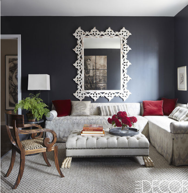 photo by Bjorn Wallander
As the most recent addition to the Hearst line up, ELLE DECOR is participating for the first time this year. Collaborating with designer Matthew Patrick Smyth, one of the magazine’s 2012 A List honorees, the apartment reflects the sophisticated global view synonymous with the publication, combined with the designer’s classic, client-focussed elegance.
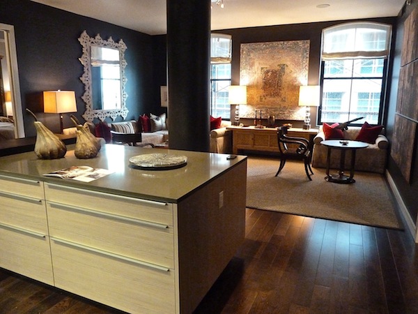 Working with the most challenging apartment layout, Smyth rose to the task. For example, a divisive column in the middle of the space was minimized by painting the space a unifying dark gray.
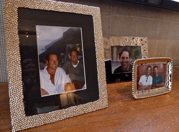 The fictional owners are a male couple, pictured above. One works in Hollywood and the other is in finance, with work taking him to Europe and the Far East. They compromised by buying a residence in New York, the apartment reflecting their experiences, travels and trips around the world – a modern day grand tour, where all their accumulated possessions have meaning and tell a personal story.
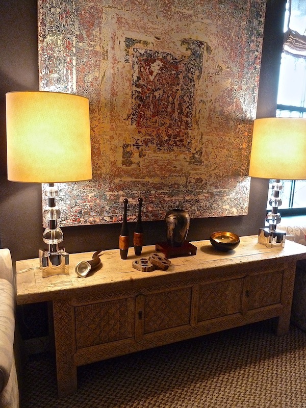 They brought back this Chinese cabinet made of willow wood, combining it with a textural painting, contemporary lamp and varied accoutrements for an eclectic vignette.
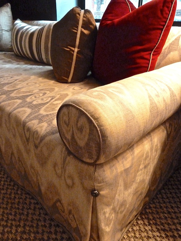
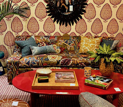
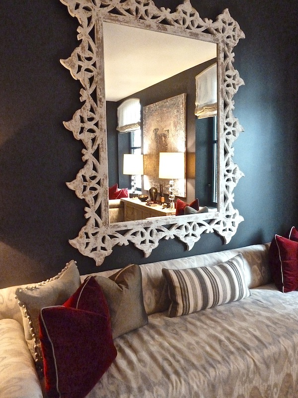 And the mirror above the sofa, covered in a Schumacher ikat-like fabric, is French from the 40’s. Matthew’s work always features terrific tailored details like the button detail at the inverted pleat
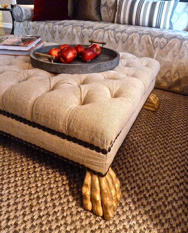
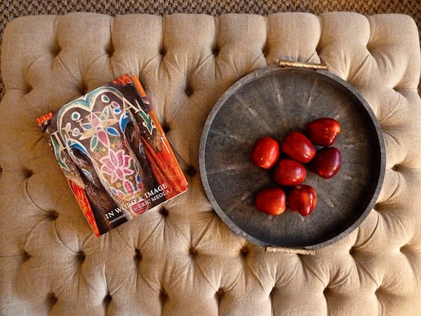
And the mix of character-filled elements, like this idiosyncratic ottoman, reflecting the owners’ tastes is typical of his practice.
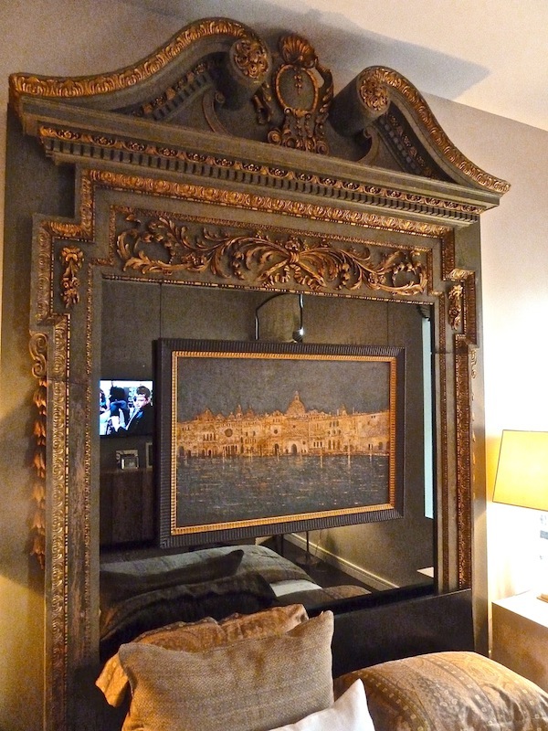
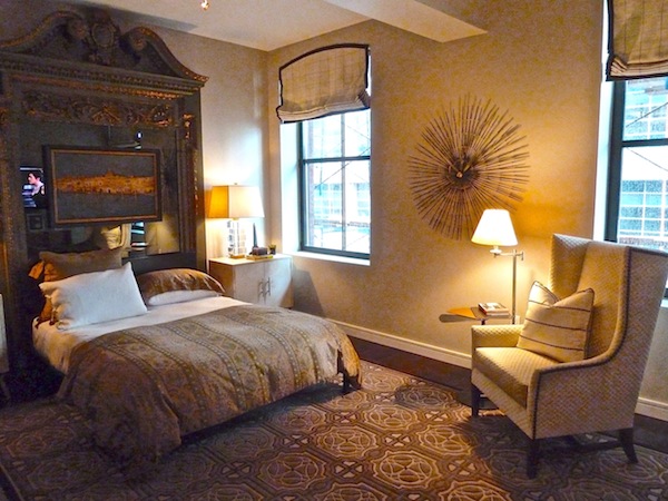
 Many of the pieces used in the apartment give the space’s blank slate a sense of architecture and history, such as the spectacular English doorframe that Smyth used as a headboard.
Filling it with mirror and cutting it down about seven inches to fit the space, Smyth used the piece to great effect, giving the room focus and much needed character.
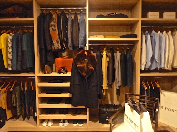
 The closet is a dream space that even fellow showcase designer Anthony Todd personally coveted. Fully outfitted with clothing and accessories from the stylish online retailer Mr. Porter, there were items like this Burberry iPad cover that could go on my wish list as well
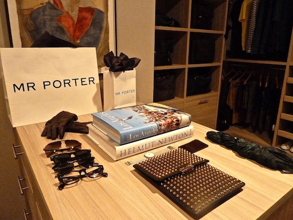 The perfectly appointed closet features our California resident’s casual wardrobe on the left, our East coast financier’s more buttoned up attire on the right and a shared dress wardrobe in the middle – lucky them!
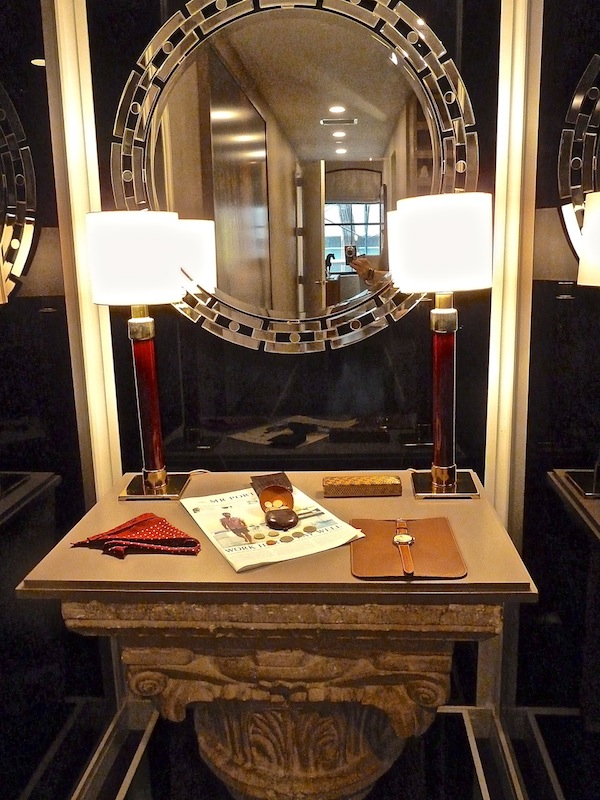
Smyth cleverly converted an awkward niche into a totally chic dressing table. I love the mix of the gutsy rough hewn architectural fragment with the graphic glitz of the mirror – the perfect reflection of the grand tour.
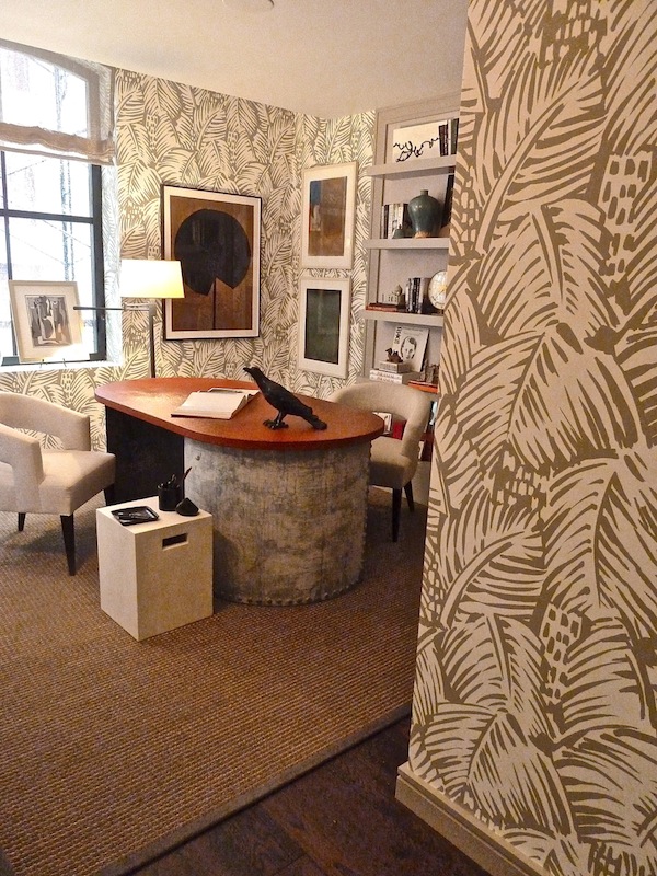
 Nothing expresses the personality of the occupants more than the stylish study. Swathed in the fantastic Feuillage Hermes wallpaper by Raoul Dufy, the thoughtful mix of furniture, patterns, books and accoutrements speaks volumes.
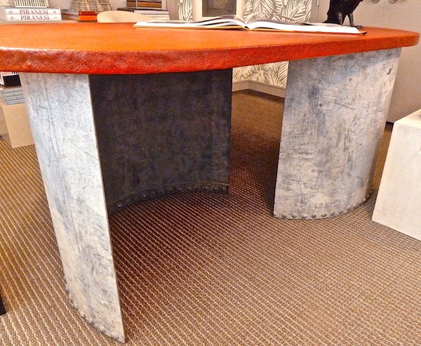
Smyth added an element of the handmade by dividing a found barrel in half and affixing the orange top – et voila – a rustic chic partner’s desk. In fact the barrel was found the same day as the English doorway used as a headboard and the two armchairs in the living room – together they set the tone for the project.
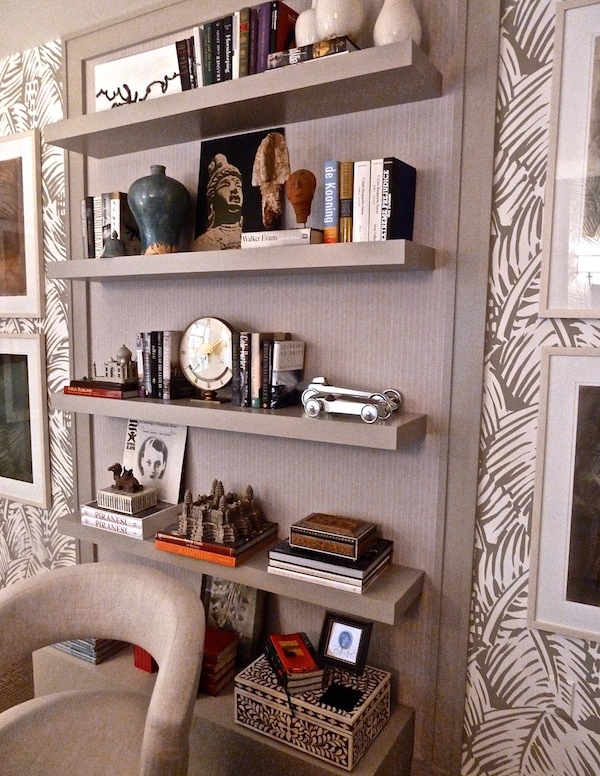
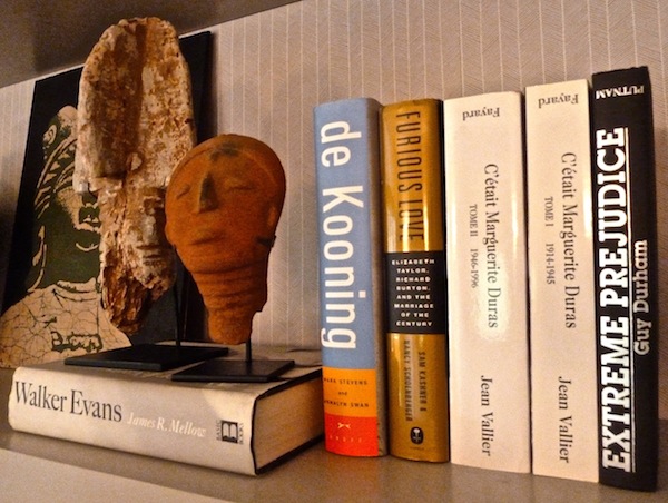
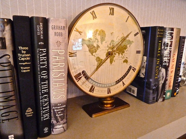
Artfully styled bookcases tell the story of our well traveled couple
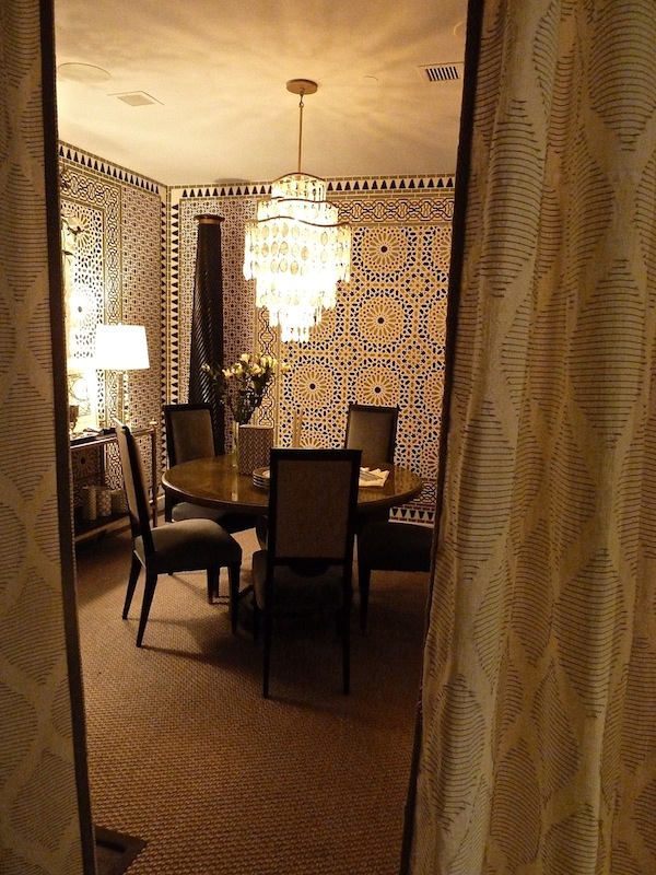
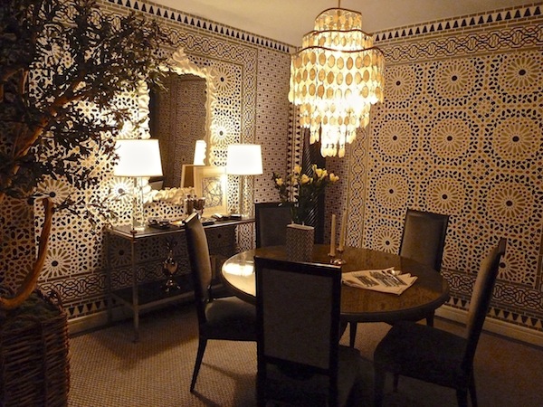
But the pièce de résistance of the apartment has to be the jewel box of a dining room. Smyth showed his talent in surmounted challenges by transforming a small windowless room into a magical space, transporting you to some exotic hideaway.
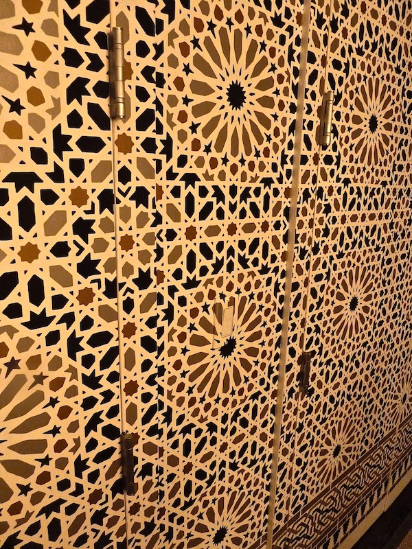
A peek through the curtains lures you into the space beyond, where a North African inspired graphic wallpaper from Schumacher envelops the room.
Lexington Gardens executed the lifelike tree that Smyth commissioned above left. And Smyth cleverly concealed doors with an almost jib appearance so as to have no interruption in pattern. Smyth really deserves kudos for overcoming substantial challenges and coming up with creative stylish solutions for his apartment.
Stop back to see more of the Hearst Designer Visions showcase.


Isn’t he just absolutely brilliant? I could live in the bedroom and the dining room. Just so smart, but always something exciting from MPS. Terrific post…all those terrific details!
Stunning work! I love the art, and the mirror is unbelievable.
Thank you for sharing, Stacey.
Happy Monday.
Teresa
xoxo
I truly loved the carefully selected fabrics and mix of colors, ” it is a design lesson for translating a modern couple’s lifestyle into their home”. Masculine details and a warmth added by all the furnishings , especially the bedroom headboard which as a designer found most fascinating !
Well done . Stacy Miles Designer
The apartment tells such a beautiful and interesting story. Oh and to have created and edited a movie in 48 hours – wow!
xoxo,
Chic ‘n Cheap Living
Thanks for the visuals. I am planning to go and see the movies, it is such an interesting venue.
What an amazing attention to detail – you can almost imagine this worldly and talented couple living in this beautiful apartment. As always, your pictures are worth a thousand words. Stafe dry and safe!
xxoo
C + C
Gorgeous Stacey – that last photo take me right back to the Alhambra. Amazing tile work! Love all the textures in the apartment.
Hope you stay safe today – I’m sending warm thoughts your way. Take care!
This one…just….BLOWS MY MIND!!! The bedroom and painting and wallpaper…Good Grief..one of everything, please!! franki
I love the use if architectural elements and reflective pieces! The book shelf is great, headboardWOW!
Simply wonderful!
Karolyn
The Relished Roost
Thank you Stacey! Since the movie preview has been delayed due to Sandy, it’s especially fun to get a glimpse now! That wallpaper is so cool! Can see it in so many places!
Be safe and well all!
Fantastic wallpaper in the dining room. Love it. Just show how versatile Moroccan pattern is and appropriate in so many settings!
Congratulations on a fantastic installation! It reminds me of a wonderful project we did for male couple in Chicago! Our decor was different of course as our client was not fictional, but still a great challenge and lots of fun making two guys with very different tastes happy.
What an amazing attention to detail!Stunning work!