The Rooms With a View Gala last Thursday was a roaring success. In a festive venue, crowds gathered to see the designers’ inspiration. Many familiar faces perused the rooms.
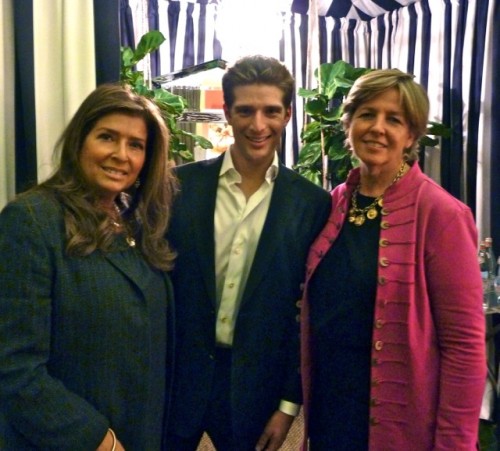 Above designer Leslie Allen with son, Rooms with a View designer Sam Allen and Connecticut Cottages & Gardens editorial director DJ Carey convene outside of Sam’s vignette.
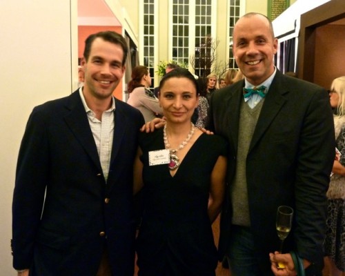 Ceramic lamp designer Christopher Spitzmiller, Rooms with a View designer Olga Adler and past Rooms with a View interior designer Harry Heissmann.
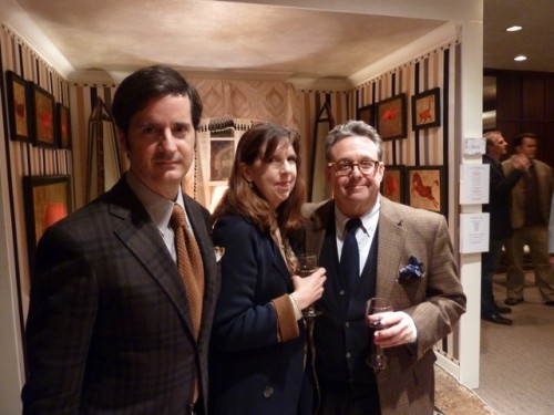 Rooms with a View designer James Andrew, marketing executive Janice Langrall and Scalamandré president Steven Stolman.
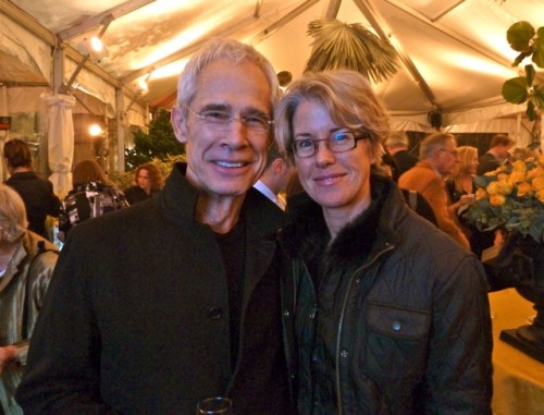 Connecticut photographer Ben Larrabee with wife Trudy.
So let’s take a look at the first group shall we?
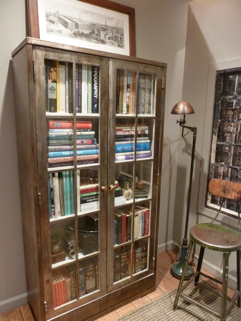
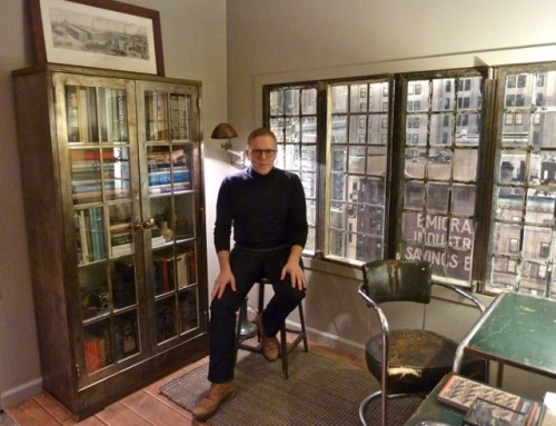 Michael Adams‘ post industrial office was a moody evocative space. With vintage period pieces and his creative window treatment, I felt transported back to 1930s New York City. The Kem Webber desk harkens back to a time of early modernist design, when form and function were clearly united. The precursor to Mid Century Modern, the streamlined American Modern design of Webber perfectly suits the loft aesthetic.
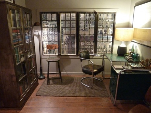 I think Adams could easily segue into set design as well as interiors. Even his small vignette felt authentically WPA-aged.
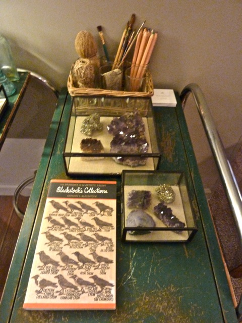 And of course anyone who has a collection of signed books by his favorite design icons is okay by me!!
 Olga Adler’s elegant room was styled for a sophisticated woman who loves to travel. Feminine yet tailored, I loved the urbane mix of elements and cosmopolitan color way.
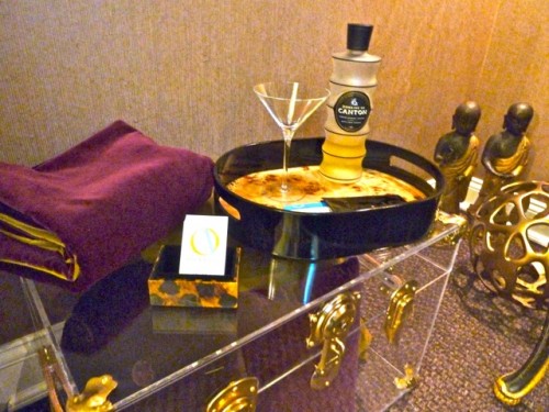
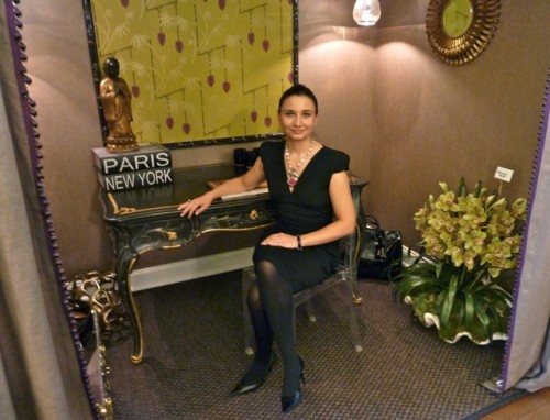 A European sensibility was evident, as the French desk held court center stage. Yet it was the mix of old and new that made this space so appealing. The lucite chair and trunk against the gilded desk and mirrors were a great contrast.
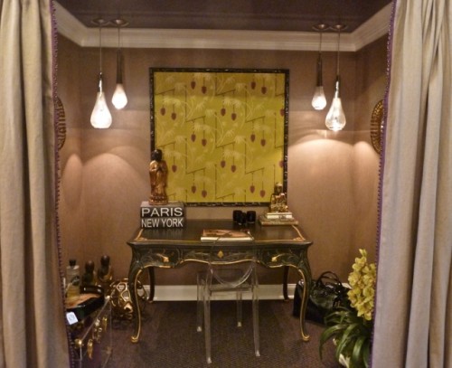 And the attentive details such as the trim on the curtains and the elements of the vignette below completed this restful retreat.
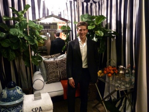
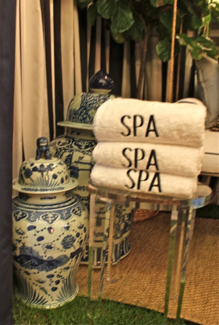
 Sam Allen‘s charming vignette was an homage to a vintage Hollywood poolhouse cabana. The crisp tailoring, stripes and bar tray were definitely channeling Mr. Hadley’s aesthetic.
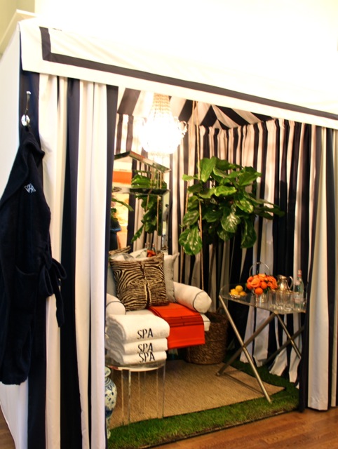 I think this vignette would be just right for a modern day Tracy Lord. She would consider all Sam’s thoughtful accoutrements very “yar”.
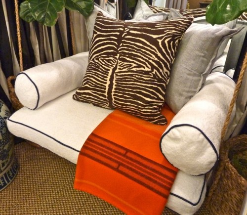 You can imagine how much I loved the addition of the orange Hermes blanket on this comfy terry-covered swing above or the orange touches in Allen’s perfectly outfitted bar below.
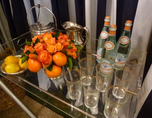 Of course the blue with orange is one of my favorite poolside combinations.
James Andrew‘s ode to Albert Hadley included a chic eclectic mix of materials, furniture and objects. Many of you who know James from his stylish blog, What is James Wearing, will not be surprised by his fashionable space.
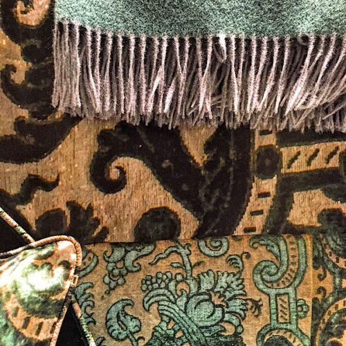
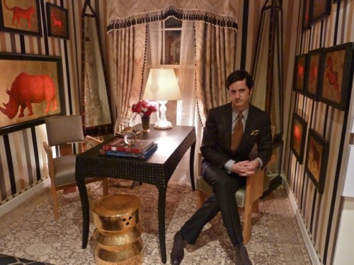 Sponsored by Scalamandré, his vignette included several beautiful fabrics from their new collection – the bold Giles Stripe on the walls, Montpellier Ikat curtains, Herringbone di Lusso on the chair and the fabulous Giraffa Lampas on the bench below.
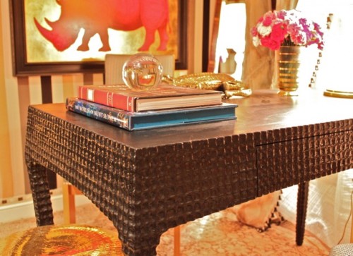
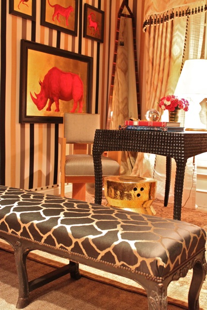 In typical Parish Hadley fashion, the many seemingly disparate elements work together to create a dynamic whole. The Scott McBee art on the wall and Tucker Robbins zigzag stool added a bit of gilded glitz set against the spectacular Delalain Atelier “Bertrand” writing table.
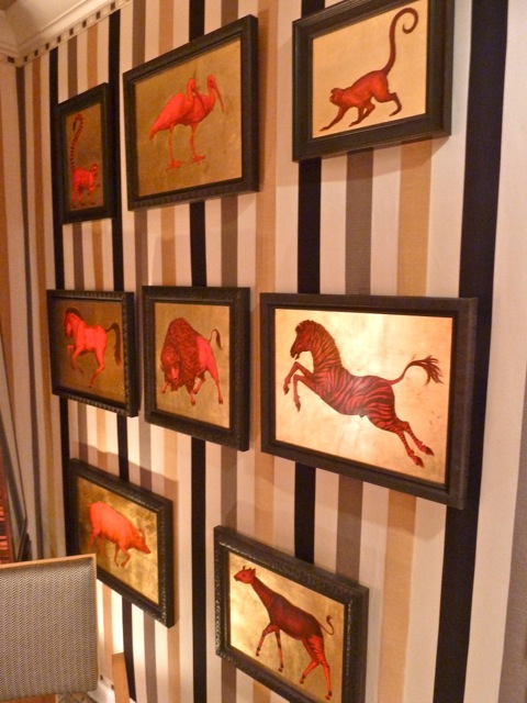 This gorgeous piece set the stage for a subtle tablescape.
Be sure to stay tuned tomorrow for the next set of room reveals.


Looks like a fabulous evening! The vignettes are so interesting and unique. It’s so nice to get the first class tour.
Lovely pictures! I love the ornate desk in Olga Adler’s room and the chic black and white in Sam Allen’s room!
xoxo,
Chic ‘n Cheap Living
These look like fabulous rooms and I want that industrial bookcase from Michael Adams’ room! Have a wonderful week Stacey.
So much inspiration! Love seeing the first set of rooms..
Once again….. I love it ALL!!!!
Love this post–the cabana room is fantastic! Wonderful attention to detail and great mix of old and new. Looks like another fabulous evening!
Everything is exquisite! Larry did such a wonderful job describing the vignettes to me, but the pictures just take it to a whole new level. Wonderful job Stacey!!! Thank you for sharing with us.
Such fun, it looks like a wonderful evening! I really enjoyed the Michael Adams and Sam Allen rooms, but they are all lovely, the talent on display is amazing.
Sending you a smile Stacey!
tp
Everything is so well appointed. The post industrial office was my favorite. Love everything single thing about it!
A veritable Who’s Who of design talent was gathered, I see!!! So happy to see Sam with his mother, Leslie, in that first shot with DJ!
Thank heavens we have you to show us inside!!!
Can’t wait to see more! xo
So nice to revisit these rooms and the evening in this post. Beautiful job and I love seeing the photo of Ben and Trudy. Such lovely people.
Michael Adams is on my radar. I’m still thinking about all of the details in his space. Fantastic.
Amazing spaces, all… I love the Adams’ aesthetic, Sam for Tracy Lord, indeed! And. adore the stripes from James and can’t get enough of Scott McBee’s work! Thanks for the tour, part I. ; )
HOW FUN!!! James Andrew, adore him! And Ben and Trudy! We have about a dozen gorgeous family photos by Ben all over the house…BUT, none have my little son in them…time to call the Larabees and rectify this situation, thanks for the prompt! Looks like a fantastic time was had by all, thanks for keeping us in the loop!
Such fun to see Janice Langrall in your pix! I will be seeing her at a lecture in Baltimore this weekend. And LOVE James’s room!
Each one better than the last! I am eating this up…what a treat : ) So much great talent! Can’t wait for the next post…. xxKelly
a wonderful venue indeed! i adore living vicariously via you
xo
debra
Q, each and every room is very impressive! A talented group of designers!