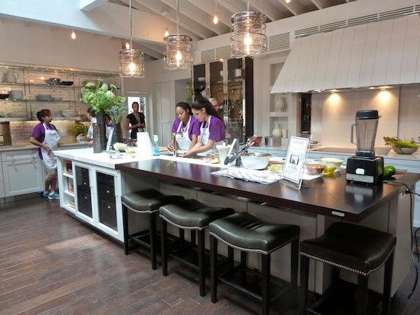
One of the most important considerations in any kitchen is storage and Mick De Giulio offered some beautiful solutions in his Kitchen of the Year for House Beautiful. Taking a look at the island from the living side, you can see how he divided the large mass.
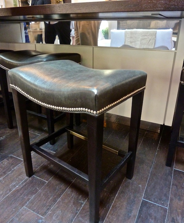
Cleverly coordinated, the visually heavier wenge wood insert on top has open area below for the beautiful Hickory Chair Madigan stools, while the lighter Caeserstone Supremo counter handled the bulk of the closed white cabinetry. And De Giulio added a little surprise under the counter to further lighten the look, relating it as well to the stools’ nail head trim.
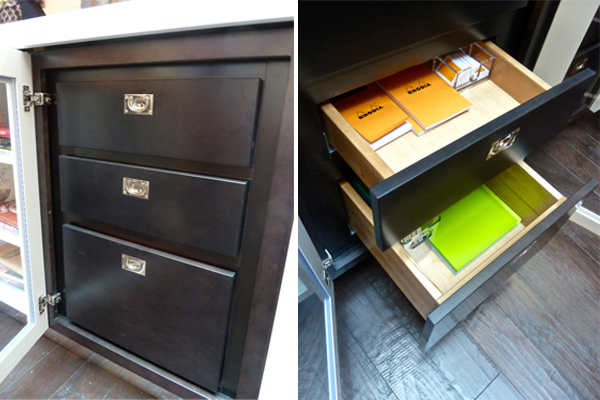
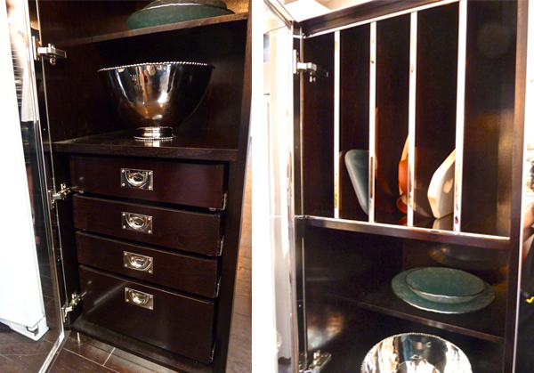
Behind the white doors were wenge wood storage drawers – I love the contrast of both the materials and the two different nickel pulls!
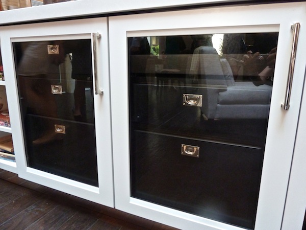 These concealed a fully functioning small home office with an adjustable laptop “desk”, including set up for a wireless connection, charging plugs and outlets. Other drawers were neatly filled with organizational supplies courtesy of The Container Store.
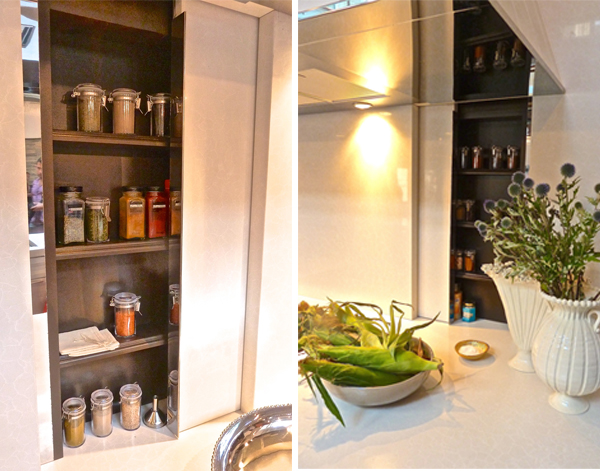
 The wall behind the cooktop contained another of my very favorite features. De Giulio kept things elegant and simple by cladding the walls in the Caesarstone supremo. Yet behind the sheath of the stone he hid two spice storage areas, again trimmed with the polished stainless. He thoughtfully added a buffer area of stainless against the stone to prevent any caught fingers – again, it’s all in the details!!
Along the appliance wall, more storage areas were handsomely delineated with the wenge wood, elegant nickel pulls and the repetition of the polished stainless trim
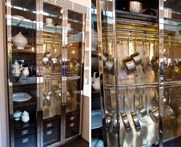
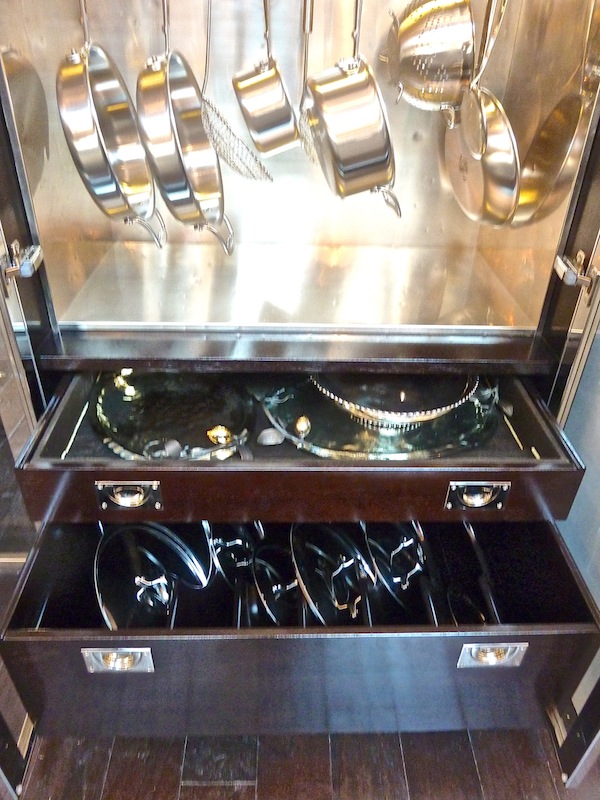
One of the most distinctive pieces in the kitchen was the gorgeous De Giulio-designed Metal Boy available directly through de Giulio kitchen design. An alternative to the ubiquitous hanging rack, the slightly distressed stainless interior combined with the polished stainless and wenge wood gave it an industrial jewel like appearance.
A sculpture for pots and pans, it elicited oohs and aahs when the incredibly convenient lid drawer was opened, always a storage challenge.
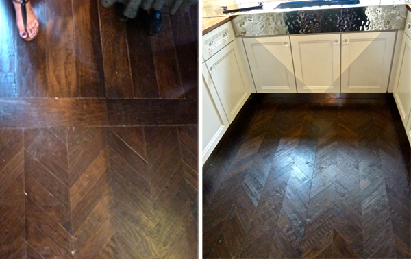
Behind the kitchen, hid the charming butler’s pantry. Again, a marvelous melding of materials yielded a room full of visual interest. De Giulio indicated the segue from kitchen to pantry by changing the handsome walnut Shaw flooring from straight plank to herringbone, perfect for the smaller space. Hand-scraped and distressed, it added a wonderful warmth and texture to the crisp and clean design.
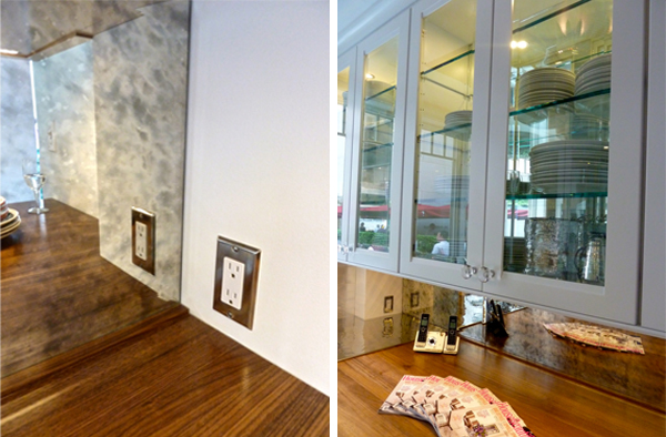
Glass fronted KraftMaid cabinetry with mirrored backs and an antiqued mirrored backsplash helped to keep the small space open and bright. Attention to detail, such as the stainless switch plate make all the difference.
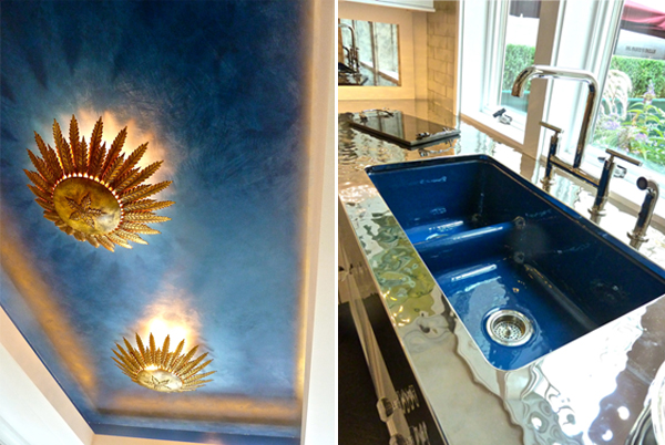
De Giulio brought in the blue from the adjoining “La Mattina” with same handsome Jonathan Adler Annapolis navy in the Kohler iron-tones sink and repeated the stainless theme, this time with a hammered finish that glittered with all the light streaming in from the terrace.
The ceiling was a celestial surprise with blue Venetian plaster and Suzanne Kasler’s Apollo flush mount fixtures for Circa in gilded iron – a bit of a departure from the aesthetics in the rest of the kitchen.
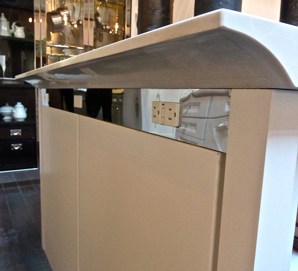
A final feature to note was the variety of counter edges. De Giulio included some very clever details that could easily be overlooked but added to the subtle sense of a sculpted space. I loved the gentle curve of the Caesarstone overhang on the island. It added a lightness and softer feel to the shape as well as hid the power strip encased in the continuing theme of polished stainless borders.
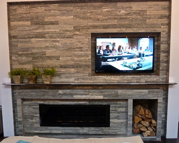
The fireplace wall in the living area featured De Giulio’s elegant approach to balanced asymmetry. The muted horizontal linear ribbons of the Ann Sacks Palladium Noir were offset by simple geometric openings for the Napoleon fireplace, TV and logs. Notice how he created several layers within the space to avoid a flat mass of stone.
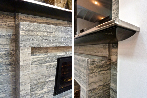 And floating in between is a thin mantle, with the repeat of the stainless piping and a beautiful gentle curve of carved walnut underneath. It is this thoughtful attention to details that illustrated the mastery of De Giulio’s design skills. Hope you’ve enjoyed our look at House Beautiful’s amazing kitchen of the year. Next up a fabulous showhouse in the Hamptons.



Stacey-
There is no end to how fabulous and functional this kitchen is. I love the Hickory Chair stools. Beautiful.
Thank you for sharing.
Happy Monday.
Teresa
xoxo
What a great post! In general, on first glance, this is not my kind of kitchen at all, but when you break it down to the details and see how the function and design work seamlessly you have to appreciate its beauty even if its not your own style. WOnderful!
If budget allowed, I would be ripping out my kitchen today and putting this one in.
My favorite thing in this post was the fireplace. I love the fireplace wall, everything about it.
You have brought this room to life (on the web) with words and imagery. Today, consumers demand function and beauty and Mick is a master at both! Thanks for post!
No detail was left out! I love the way he curved the countertop edge; how clever! And i also really enjoyed the mirror panel below countertop island. And the stone on the fireplace is absolutely gorgeous!! this kitchen is truly impeccable!
http://www.donnaviningblog.com
I cannot even tell you how obsessed I am with the metal boy…fabulous!!
Seems like nothing was overlooked in this stunning kitchen. I love how the pans were used as art!
XX
Debra~
LOVE the idea of a hidden home office in the island. Adding that to the wish list for our next kitchen. Have a lovely week, Stacey!
He packed so many clever ideas into that kitchen – it is really well done! Love those stools especially!
Truly a dream kitchen! Every detail was so well thought out and is something that a cook would truly love. Wishing I hadn’t already done my kitchen…this makes me want to start anew!
Stunning.. function, beauty, the whole ball of wax! Love those stools! Just when I think I’m “finished” I see something like this and start to re-think things.
leslie
The kitchen is fabulous. The Metal Boy sculpture is the most amazing thing I have ever seen; so simple in its design yet filled with bling! The Herringbone floors, Venetian plaster ceiling, the leather bar stools; I have to go back and look some more.
uh-huh…serious kitchen envy here!
The details, OMG, the details!!! franki
Beauty is in the details! Thanks for covering all those details we design nerdes obsess about.
That countertop is amazing. So many beautiful things here. Love all the shiny glamour of it all.
How do I purchase Metal Boy? Does anyone know?
Yes, it is through Mick De Giulio – I will email you directly as well to be sure you receive this info!! It’s so fabulous!!
I love this kitchen. I had never heard of him until I fell upon his showroom in Wilmette, while shopping for a client. Sadly, she wasn’t in need of anything kitchen, so I had to make my visit quick. He is a master though.
Thanks so much for taking us through all the details. I would’ve missed many without you!
I could not agree more. Congratulations for this kitchen of the year. I like your kitchen because it’s very classy and cozy at the same time.
I would love to know where to purchase the Metal Boy cabinet by Mick DeGiulio. I live in North Carolina.
Thanks Much
Laurie