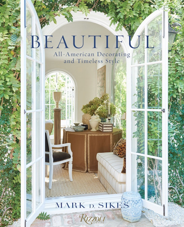
Anyone who follows Mark D. Sikes on his popular blog is familiar with his love of “chic people, glamorous places and stylish things.” Mark has a great eye and recognizes the best in fashion, interiors and personal style. And now with his book Beautiful, he shares with us not only his inspiration, but about 15, almost all previously unpublished projects, that illustrate how his classic, all-American style successfully translates to his design practice.
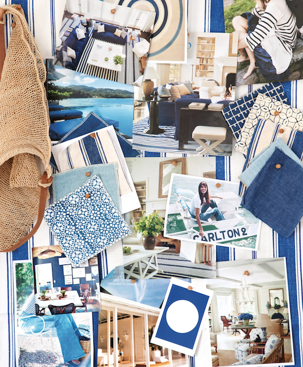
 Organized around his favorite color stories, Mark shows, as director Nancy Myers so succinctly explains in her foreword, “how classic can look fresh, how style and comfort go hand-in-hand.” Each chapter opens with an inspiration board and it won’t surprise readers to know that Mark’s #blueandwhiteforever hashtag inspired the first section.
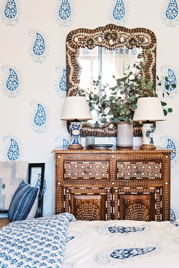
 Consistent throughout his blog and social media stream is an easy, modern take on California living with blue and white and stripes as a main theme. And just as his everyday uniform of white jeans and a chambray shirt is an essential classic, so these interiors, layered with dhurries, sisal, and chinoiserie touches are timeless, easy to live with spaces. Below, a bedroom, with les Indiennes block printed textiles shows how the classic color combo forms a perfect base for pattern mixing with other elements.
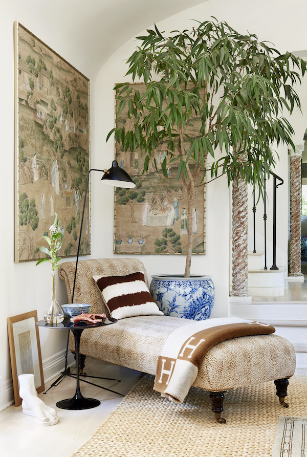
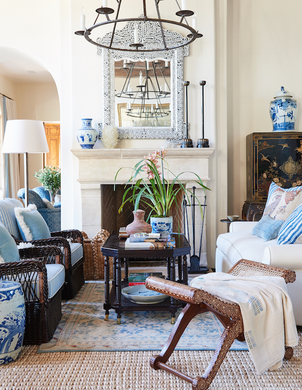
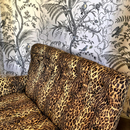
The chapter on Timeless Neutrals evokes the glamour of Old Hollywood. With an uptick in refinement and formality, these spaces are infused with a contemporary flair that melds inside and out with a breezy open style. A corner in Mark’s own living room, below, shows how it’s done with a comfy chaise longue in Cowtan and Tout’s Malabar anchoring a chic mix of old and new.
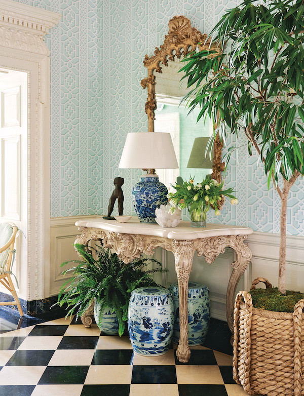
The chapter on Garden Green illustrates how nature’s neutral is always a versatile option and the perfect foil for his favorite blue and white. Mark’s spaces at the Greystone Maison de Luxe showhouse last year transformed a formal grand hall into a welcoming garden room with this classic combination. Schumacher’s Zanzibar Trellis echoed the timeless appeal of the black and white 1920s floor and tempered the formality of the Jean-Michel Frank parchment table and ornate mirror.
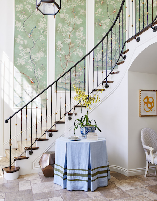
And in a client’s Pacific Palisades entry a table skirted and pale blue with olive trim sets the tone with handpainted wallpaper panels emphasizing the concept of bringing the garden in.
 all photos above by Amy Neunsinger
And while not in a specific chapter, the opening shot in the book, below, is a perfect example of Mark’s easy approachable all-American style. With an eclectic mix of genres and textures, he brings the outdoors in with moss covered potted plants, wicker furniture and garden stools. It’s a room that’s as easy and stylish as jeans and a pressed shirt – a celebration of beauty for everyday living.
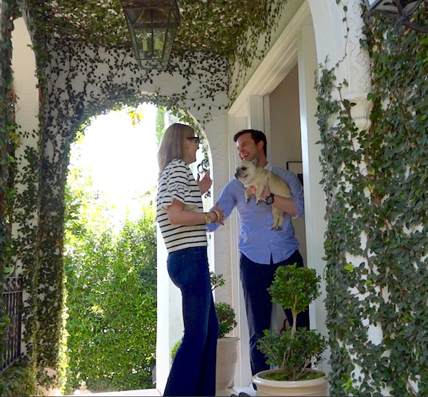
 And it’s this same aesthetic, with universal appeal, that can be seen in Mark’s many collaborations this fall. With a new fabric collection from Schumacher just out, Mark also has a furniture line with Henredon and rug collection with Merida on the way. AND be sure to look for Susanna’s and my At Home with video tour of Mark’s charming Los Angeles home coming in November (behind the scenes sneak peek below) – you’ll feel like you’re just there with us!!


 all photos above by Amy Neunsinger



Beautifully uncontrived.
What an eye!!! franki
I love his relaxed style and I can’t wait to lay my hands on a copy but especially to see your At Home with video in November! Great post!
Can’t wait for the book to arrive! I love him and I love Nancy Myers, thanks Stacey for another great post xx
I sure would get a lot more reading done if I had a little reading space like that with that chaise lounge/tree/reading lamp! How cozy.
Another book, along with Bunny’s due to be delivered next week and I cannot await!