Having debuted their inaugural designer showhouse last year, Sotheby’s took a giant leap forward with their second iteration this year. With the Sotheby’s 2015 Designer Showhouse, the auction house chose thirteen designers (up from six last year) to each transform a room on the fifth floor exhibition space of their NYC headquarters. With a beautifully designed mini printed catalogue and fantastic dedicated online access, everyone near and far will have the opportunity to meet the designers and experience the showhouse on some level.
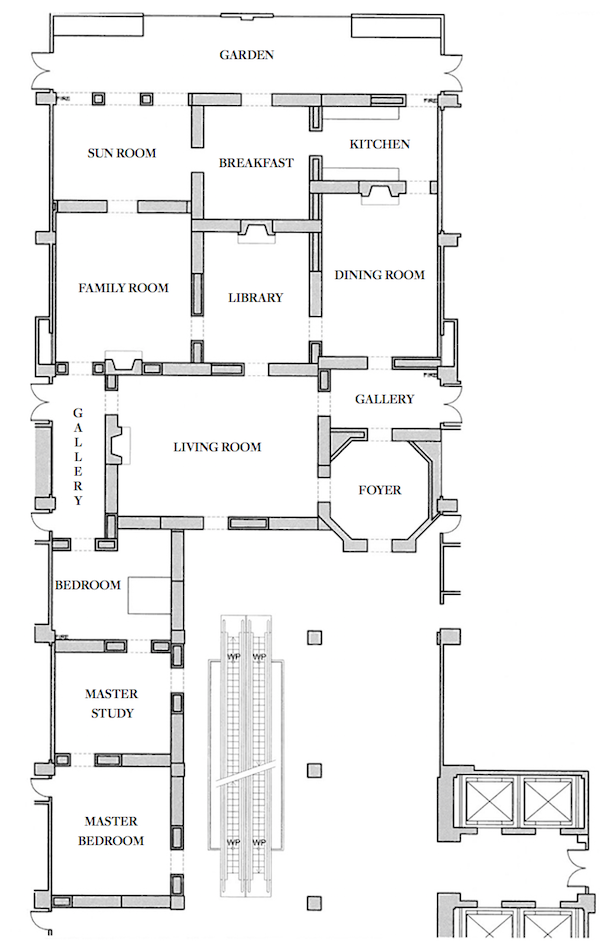 Culminating in an auction on April 20, the showhouse features items from across many departments including English & Continental Furniture, 20th Century Design, Photography, African and European Sculpture, Carpets, Old Master Paintings, Latin American Paintings, Ceramics and Silver and more. By creating engaging living spaces in an apartment-like configuration designed by participating architect/designer Trey La Fave, it is easy for customers and collectors to imagine how all the fine and decorative art can be mixed and integrated into a beautiful home. When you visit the site, the above plan is interactive. Click on a room and effortless navigation transports you there to virtually meet the designers and peruse the property list. From printed catalogue to online destination, every touchpoint of this show has been aesthetically and technologically coordinated with impressive results.
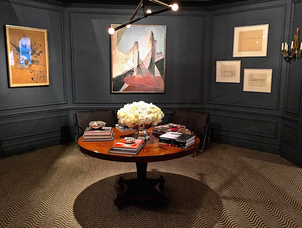 I visited the showhouse last week and while not everything was quite finished, you can still get a sense of the rooms. Starting, as everyone should, in the foyer with attached gallery, Janine MacMurray with Scott Francis, of AREA Interior Design, created a chic and sophisticated entry. Adding beautiful millwork that helps to define and articulate the octagonal space, they painted the room a handsome dark gray that perfectly sets off the furnishings and art. From the auction they chose a classic George IV (circa 1820) round mahogany rosewood and walnut center table surrounded by a fabulous selection of artwork, including one of a pair of Dali works on the left above (and in photo below), María Pacheco in the middle and three drawings by Fairfield Porter on the right.
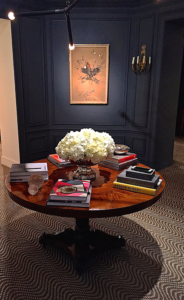 For lighting they brought in an Apparatus fixture for overhead which is a nice contrast to the set of Empire style gilt bronze sconces from the sale. The Stark sisal adds movement and helps segue seamlessly into the attached gallery space. Here they added a tonal Phillip Jeffries grasscloth for texture, a subtle sheen and to differentiate the adjoining rooms. On either side of the doorway to the dining room they placed pairs of fine George III marquetry demi-lunes with giltwood and gilt pier mirrors above from the same period.
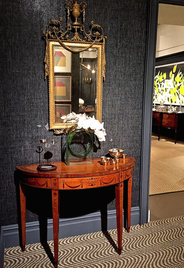
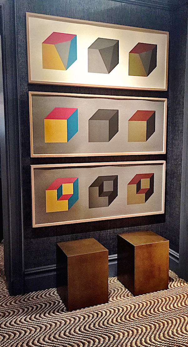
And across from this very classical composition is a symmetrical collection of six Sol Lewitt silkscreens (three each side) for a modern juxtaposition – a perfect example of how old and new can coexist harmoniously in the same space.
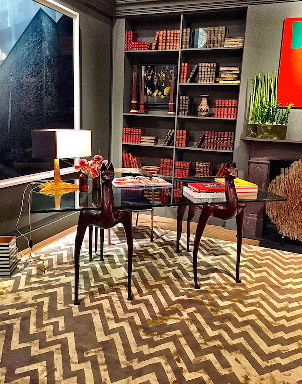
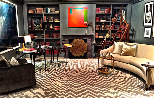
Another dark and handsome space was Juan Carretero‘s library. Tailored and timeless with a cultivated air, his room includes an elegant and eclectic mix of pieces from the auction. I love library steps and the inclusion of the turn of the century English oak step ladder (lot 42) adds movement, height and balances the large Chen Jiagang photograph on the opposite wall.

The star of the space is the fantastic Judy Kensley McKie “Lynx” Desk. Her inventive bespoke furniture is a wonderful example of functional art that lends an organic yet whimsical touch to any room.
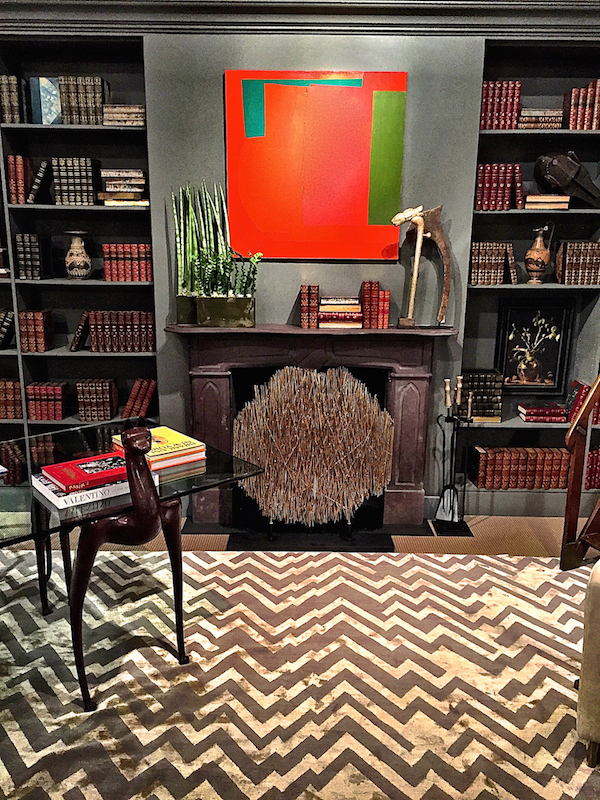
The Victorian slate chimneypiece (with a rather reasonable $6,000 opening estimate) is a great centerpiece and the perfect foil for the bold modern painting (the only real color in the room) and John Lyle’s Matrix fire screen and Torso fireplace tools (all of which Juan brought to the space). On the mantel and bookshelves is an assortment of curated international accessories from Greek style terracotta vessels to Mali mask to Sudanese throwing club.
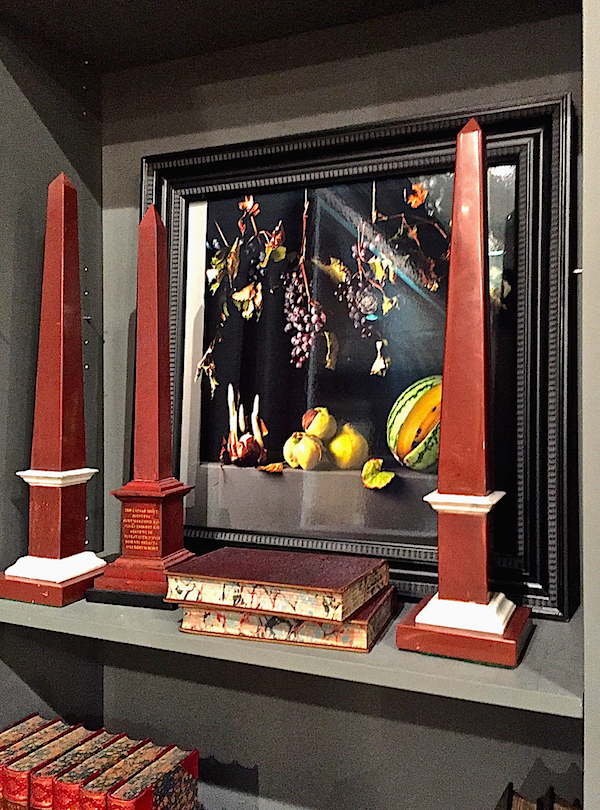
 One of my favorite shelfie moments is with this group of three Italian Grand Tour marble obelisks and photograph by Paulette Tavormina, whose gorgeous work I discovered at this showhouse last year.
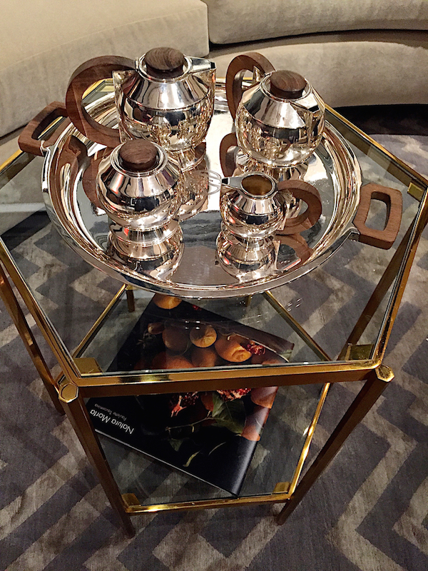
And for tablescape appeal, a beautiful 1930’s original Puiforcat silver tea and coffee set adds an elegant moment of civility.
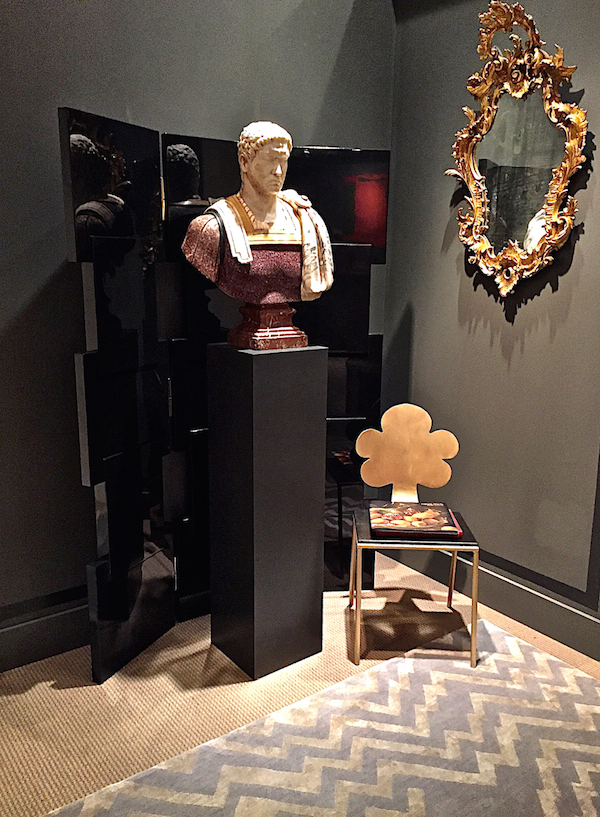
In the back of the room two quiet corners reveal carefully composed vignettes. A porphyry and marble bust of a Roman Emperor tries hard not to check out his stalwart gaze in one of a pair of Italian Rococo style giltwood mirrors. Juan brought in a library chair by Marsia Holzner Studio and Links Screen by A. Rudin to complete the look with an element of custom contemporary craftsmanship.
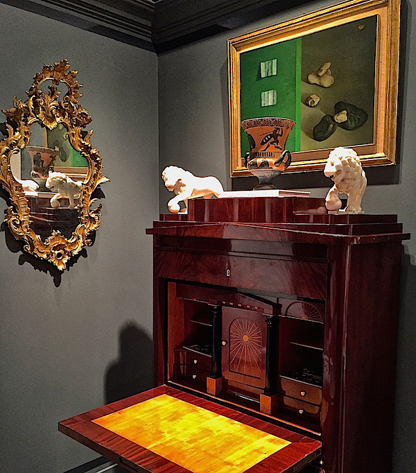
And across the way, the other mirror reflects a striking German neoclassical secrétaire à abattant hosting a pair of Italian alabaster Medici lions with Chilean painter Claudio Bravo’s contemporary still life, which, as a 20th century painter with distinct ties to the past, I think he would have liked.
Kudos to both AREA and Juan Carretero whose stunning spaces show us chic ways to live stylishly with art and antiques in timeless settings. I’ll be back with more from Sotheby’s 2015 Designer Showhouse.


Definitely the showhouse of the future and what an amazing shopping experience that would be!
Stacey, Astounding and creative pieces in every room and I cannot wait to see more!, The Lynx desk is so phenomenal! I also love the carpet designs!
xoxo
Karena
The Arts by Karena
The Library by Juan Carretero at Capital C Interiors is my favorite room. Just not a typical Library. There’s excitement to his design and there are elements that make the space more inviting and fun. His color choices are amazing. Light and Dark gray are the major colors of the room. Pops of red and green from paintings and books accent and compliment the space very well. I also love the Agate side table which adds a touch of glam without being too loud.
STUNNING!! Phillip Jeffries grasscloth has a place in my home!! franki