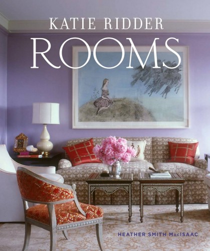
My local independent bookstore, Barrett’s, asked if I would write the design book reviews for their holiday newsletter again this year. As I am thrilled to have a brick and mortar location nearby where I can actually look and feel before I buy, I of course happily agreed. As always, there are many tempting volumes this season but as soon as I opened Katie Ridder Rooms I knew it was something special.
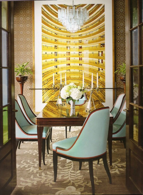
As a former publishing art director, I appreciate when the actual production of a book is as beautiful as the designs it features. Many are attractive with fabulous photographs but very few show the attention to detail that this volume does. Each chapter opening is color coordinated with both the type and a charming related Katie Ridder-style graphic. Take for example the title page and the opening photo of this spectacular dining room.
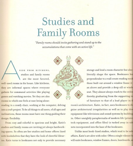
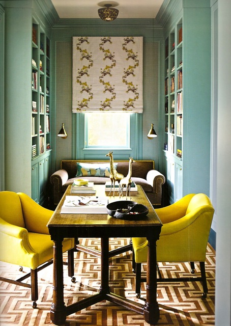
 Or the double page spread (shown here vertically) for the section on Studies and Family Rooms
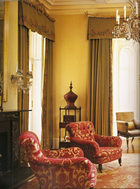
My vertical presentation does not do justice to the stunning double page layout. And it is this same attention to detail, these thoughtful but important touches that sets Ridder’s work apart. I adore that she seeks out master artisans to collaborate with. Take, for example, the work in this Virginia horse country living room. The valance is crowned by reproductions Ridder commissioned of antique gilded-wood branches. And the wool sateen curtains are embroidered with berries, twigs and leaves by specialty house Penn and Fletcher. The woodland theme then continues with a leaf pattern on the custom lampshades, not visible in this photo.
There’s something about Ridder’s unique design vision that is totally addictive. Perhaps it’s her combination of sophistication and practicality or her distinctive color combinations but Katie Ridder’s rooms radiate an upbeat livable style that is appealing to a wide range of tastes. I practically gasped when I opened to the symphony of orange in this fabulous foyer in the same home.
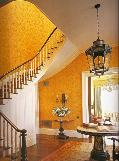 The antique furnishings support the grandeur of this 19th century Italianate house and yet it still feels fresh and vibrant,
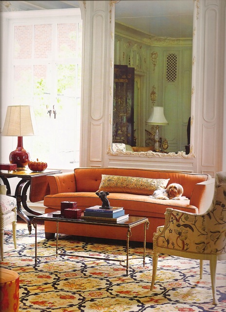
as does this living room where the modern shape of the linen covered sofa (yes, orange again) is paired with period chairs recovered in a classic Robert Kime linen.
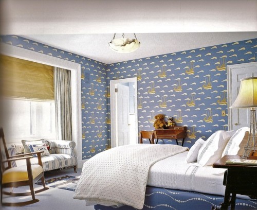 Organized by rooms, her innovative ideas are laid out with easy accessibility. Two bedrooms show how color and pattern can be both lively and serene. In a NYC apartment, the boy’s bedroom above overlooks the East River, inspiring the theme. It’s so clever how the waves on the box spring (which also appear on the headboard) echo the sea faring pattern of the hand stenciled walls.
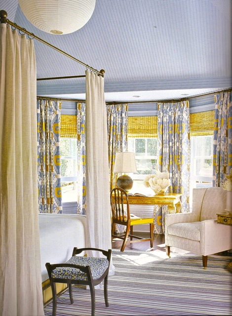 In a Hamptons bedroom above, the bold pattern of the Scalamandré silk ikat curtains is kept in check by the painted beadboard.
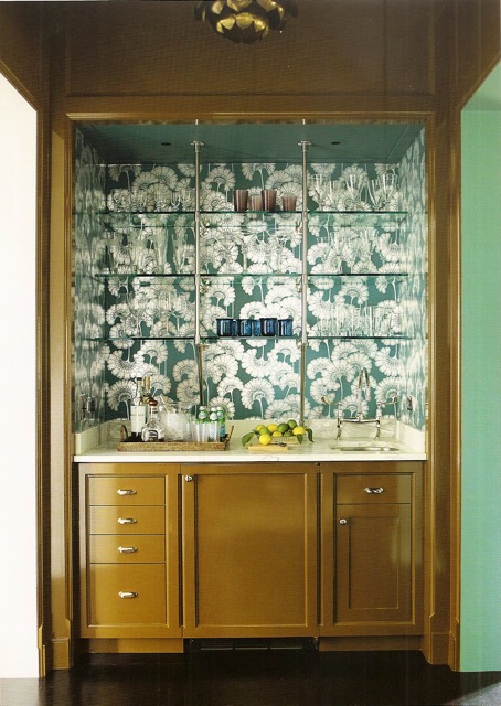 Even a small space like this Arkansas house bar deserved detailed attention. How fabulous is the glass and nickel shelving against that silver-on-peacock Japanese Floral wallpaper by Florence Broadhurst. Such an unexpected yet successful combination.
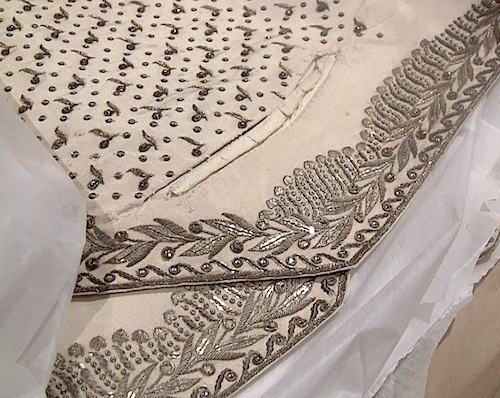
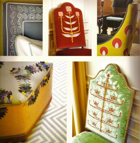 In addition to the beautiful designs and principal photography by Eric Piasecki, Katie Ridder Rooms is brimming with useful tidbits from “Anatomy of a Full-Length Curtain” to “The Ideal Dining Chair.” Featuring an extensive list of sources and a chapter on Ridder’s signature details, such as her use of embroidery shown above, this book is a must have for any design library.



You sum things up so well. I’m friends with Katie’s sisters who live in Seattle, through them I have heard about her book. After reading your descriptions, I am hopping over to Amazon asap.
I adore Katie Ridder’s work…this is definitely on my Christmas list!
Stunning! Well reviewed!
What a wonderful book, as Amanda says definitely one for the Christmas list!
I have been a terrible blogger of late and am still trying to catch up with everyone, have just been going through your previous posts, you have been a busy girl, I especially love all your London Design posts. Visiting your blog is always a joy.
XXX
Thanks so much for this review. I have been editing my library lately and have the perfect place for this beautiful book. Enjoy your new project! xoxo
OK based upon your review this sounds like a book I must add to my collection and of course th pictures do it justice too…wow!
I wish she could come do my house! But since I don’t think that is happening… her book is on my wish list!!
Kate has such style and
this book is definitely going
on my Christmas list……
Thanks for all of the great
background info!
xx Suzanne
That orange linen sofa is going to stick in my mind – I have been looking for years for an idea to reupholster one of mine…this could be the one that sticks! Thank you!
I love her use of color, there without being overwhelming. I’ll have to add this book to my list!
Fabulous! I am to going o be able to resist this one…
Whoops, the iPad is acting up!:-) the book looks fab! Can’t wait for more reviews.
I share your love of her thematic attention to detail. This is now top of the book list for Christmas – to give and receive!
Stunning! The colors are sublime– the best in the business. Your review was worthy of her incredible talent. I will order this book immediately from your bookstore! The cover sang to me with the complimentary lavender and oranges. She does what the Italians always do perfectly–they make grand delightful and welcoming. Thank you again! What a great post.
Best,
Liz
Beautiful. Amazing rooms, colour and photography. A feast for the eye.
Great for you, q! I love my local bookstore too!
I love shis artist’s use of color and pattern. Just beautiful.
Look forward to more.
Teresa
xoxo
These images make me realize what pure joy looks like. The happy, but sophisticated colors, patterns and light make these rooms sparkle. This is a super review. Thanks. Mary
Definitely one for the Christmas list – wonder if the hubby would get the hint if I forwarded your post onto him! The cover room is one of my all time favorite and that study is to die for.
xxoo
By golly, I’m sold!!! Always love Katie Ridder, but your opinion I so value, so this is a must have!!!
What a beautiful book. This is definitely going on the Christmas wish list! Thanks for including all those gorgeous photos. I agree with you about a bricks and mortar book store, isn’t it a treat to browse and look at all the books.
What a delightful aesthetic!
Well this is a MUST have for any library. Thank You for the introduction.
Every image is gorgeous. I so appreciate this kind of attention to detail. I notice font choices and continuity of design and love when they are done well. One thing I always long for in these types of books is a small photo of what the home looks like on the outside.
One of the best reviews I’ve seen on this looks-so-lovely book. I really need to get to my own brick & mortar shop to purchase it. Thank you!
what stunning and refined rooms…love Katie Ridder’s work as she creates a balanced and well crafted design…stunning images..
best,
maureen
I love the spirit and whimsy of the book. I want to order it asap as I have to buy paint this week for my painters.
I was wondering if any of you interior designers can recommend a fabric brand that makes the outdoor wear fabric meant for use inside (having the look and feel of indoor upholstery, and a neutral like camel) I need to have new day bed cushion (french seamed mattress made) This day bed is my sofa, so I use it alot. (not for sleeping though) My dream would be mohair but ( $$$$)
Thanks to anyone who responds! And I love your blog, it is my favorite daily email!
This book is definitely on my Christmas list, actually it’s the only item on my list because I normally don’t do one. Great review…makes me want to get it that much more!
Oh my goodness, what mouthwatering rooms. I typically go for a more neutral palette, but the robins egg blue dining chairs hooked me in and the orange (!) sofa completed the conquest. Wow, thanks for the introduction Stacey.
An Aladdin’s cave of design treasures!
I love Katie Ridder!! Such a huge fan, I have this book on my wish list….so happy to see a sneak preview. It does NOT disappoint. Can’t wait to get the real thing! xxKelly