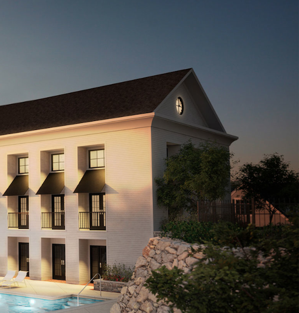
When I heard that designer Lynn Morgan had decorated the model homes at Kensett, a new local luxury condo development, I couldn’t wait to get a peek. Her clean, crisp, contemporary version of updated traditional is always appealing and has been featured in almost every top shelter magazine, including this month’s Traditional Home. I also wanted to see what is proving to be a unique housing alternative for the area, a private community on 15 acres, of over 60 luxury units with meeting house, below, pool, gym etc.
Lynn designed two model units that I was able to tour and couldn’t wait to share since there are so many wonderful decorating and styling ideas to be gleaned from her stylish spaces. The first, Norwood, features an open plan with stone terrace courtyard and finished lower level.
From the entry, you can see how the tailored dining area flows into the living space beyond.
 photo courtesy of Lynn Morgan Design
The neutral scheme is enhanced with fresh pops of bright apple green in both upholstery and accessories.
Whites rule the pale neutrals in the living room for an elegant yet relaxed ambiance. Note the chic Oomph backgammon table serving as a segue between the two spaces.
I loved the easy style of the room – casual yet sophisticated. A clear cocktail table is a visually space saving move while the pop of black in the fireplace surround anchors the room. Symmetry is soothing as the bookcase styling successfully proves.
The room also opens onto the beautiful kitchen, making for a great-flowing entertaining space. Thoughtful architectural detailing and a classic combination of sleek modern fixtures and textural neutrals are fresh and upbeat.
Storage is always a concern and a capacious pair of pantries handily deal with that issue.
Off the entry in the other direction is a private den with french doors setting if off from the rest of the open plan. Adding deeper warm tones emphasizes the coziness of the room. I loved seeing the new large sized Oomph Fairfield coffee table offering lots of ample tabletop for styling, games or books.
Moving upstairs, a generous landing accommodates a work space for two. If only my office were this neat!!
 And the spacious master bedroom references a restful shade of blue, so appropriate for the casual coastal chic of this Connecticut town.
I was wowed by the enormous dressing room – what a luxury!
And with this crisp contemporary master bath, you could easily spend a day relaxing in this well appointed master suite.
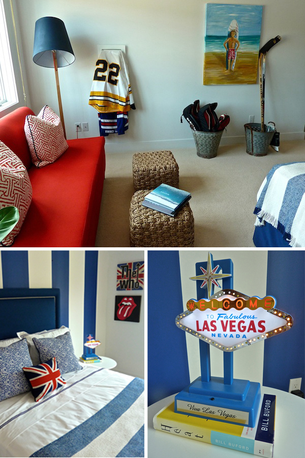
What a fun treatment for this boy’s bedroom! The patriotic color scheme is anything but hokey.
A mixed bag of sports and travel accessories make this a lively personal space, with plenty of room to hang out with the guys.
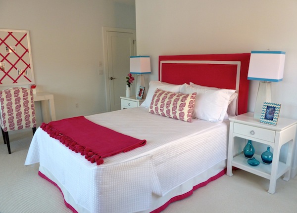
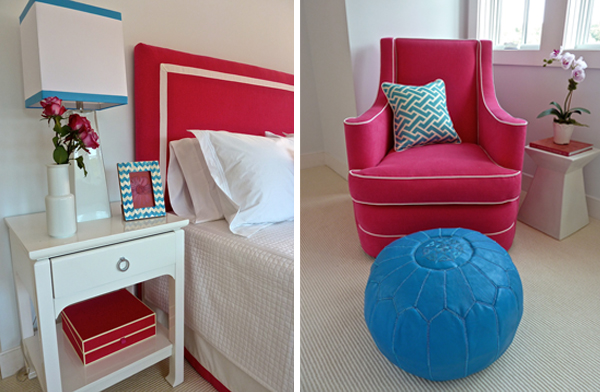
The third bedroom was designed for a girl, with a scheme that could easily segue from single digits to tween and beyond. For those of you detail-oriented readers who noticed, I’m sure the bedcover was pinned up to clean.
A bright eclectic group of furnishings and accessories could easily be added to and personalized to complete the space. And of course each of the children’s bedrooms is equipped with a great outfitted closet space and individual bath.
A visit to the lower level completes our look at Norwood. Of course when purchasing a condo unit, finishing this area is optional, but after seeing this great mancave, I can’t imagine anyone not opting in. How fun is this retro mad men bar Lynn installed?
There’s a roomy pool area with spectator seating
and still room left for a large movie viewing area that my family would be all over!
Next time we’ll take a look at the the sophisticated styling in the Piper House unit, which instagram followers got a sneak peek at last week!






She’s made it cozy yet neutral. Anyone could move in and make it their own!
Obsessed with the kitchen, that closet and the clever use of the upstairs landing space!
It’s cool, but I would love to see a little more depth.
Mary
A super turn key spacious and very attractive alternative to call home. Lynn has a keen eye and it feels inviting and totally up to date right down to the accessories. Of course, it has OOMPH!
The fixtures over the kitche island really “caught my eye!” Beautiful! franki
I absolutely love this space! The family room is so inviting with its relaxing neutrals and pop of apple green. Love the kitchen that it’s attached to. Those light fixtures are fantastic! Not to mention my love for little boys….that room would be a perfect fit for my 10 year old.
Lynn has shown once again why she is highly regarded. Thanks for the sneak peek!
~ elizabeth
Beautifully designed, and I noticed a couple of Oomph pieces in the space! It’s clear why her work has been published in many magazines; such talent! Love the clean lines and I think every man would love that man cave.
http://www.donnaviningblog.com
I am available to move in! Looks like everything was thought of… storage and the computer spot on the landing to the beautiful kitchen and baths.
Beautiful. I could move right in!
k
Lynn always creates a laid back yet chic environment for her clients and never disappoints. We’re sorry to have missed the opening as it fell on high school “Back to School” night for us. Thanks for sharing the great pictures!
xxoo
C + C
I am completely smitten with this unit. Love the pop of apple green in the neutral space and the kitchen is wonderful – great pendants over the island! And yes, the office is wonderful – perfectly organized…so wish mine could look like this…
Loving all of her design work, so fun to see it on your blog!! I just wrote a post myself on her beautiful work. She deserves all the wonderful accolades she is receiving. Thank you for sharing her work on your post, I really enjoyed reading your post,
Kathysue