Featured today are the last 4 vignettes from the wonderful Rooms with a View show house. For those of you who haven’t been following, these rooms are last merely because the designers’ names fall at the end of the alphabet!
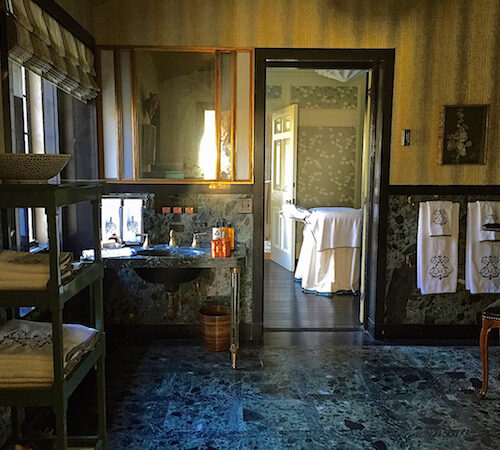
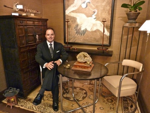 George Marshall Peters‘ refined vignette was inspired by a trip to Asia he took last year.
 photograph by MANUFOTO
Peters worked the vignette around the spectacular piece of art which is part of his personal collection. The space included a sophisticated eclectic mix of Asian pieces mixed with American 20th century interwar period table and chairs. The fabulous architectonic ceiling also reflects this sensibility.
The urbane fusion of styles is both elegant and serene.
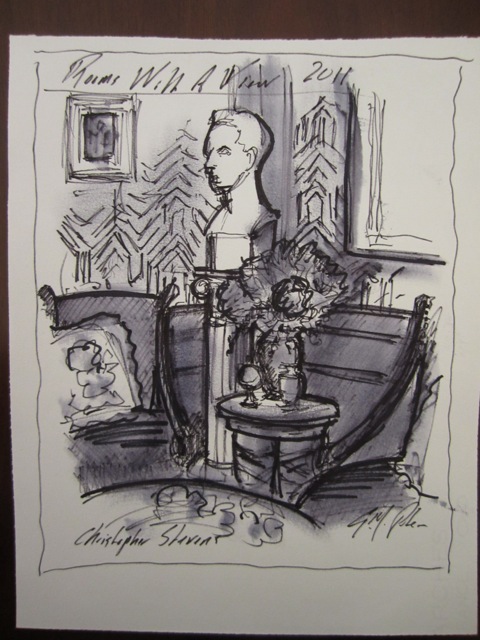
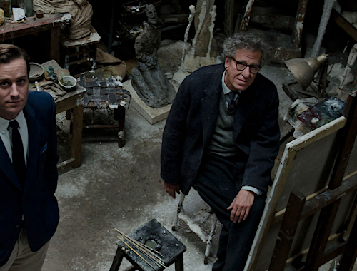
 Among Peters talents is that of quick sketch artist. It was incredible to watch him work his magic with merely a Flair pen and some tissue. Peters generously sketched all of his fellow designers’ vignettes (in the back room) with great style, accuracy and ridiculous speed!! It is a talent we all agreed we wished we possessed!! Some were more stylized than others but all were frame-worthy!!
Above is Peters’ interpretation of Christopher Stevens’ space.
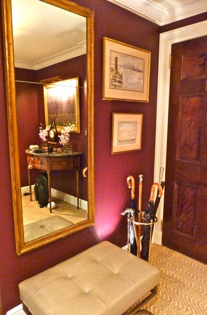
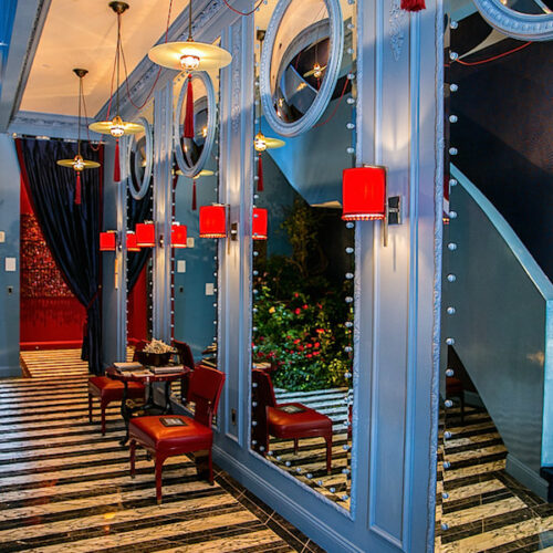
 I felt like I could move right into JD Petersen‘s classic vignette. His version of a New York City pre-war Foyer was spot on.
 The space was impeccably appointed with all the perfect pieces for a gracious city entry. From the 19th century English brass and steel umbrella stand, to the handsome Baker Thomas Pheasant leather bench, the room was both practical and elegant.
 And isn’t that what great design is all about.
 And yet Petersen’s space was not without humor. I loved the Bronze Penguin “Parenthood” with egg sculpture by Michael McLaughlin. Subtle yet effective, its placement seemed, like everything else in the vignette – effortless. The sisal is the beautiful new wave pattern by Stark.
 Understated yet exquisite, this tabletop vignette speaks volumes. The marble topped demi lune is a circa 1790 Louis XVI Console Table graced with a circa 1835 Austrian Biedermeier Mantel Clock. Flowers, candles, a chocolate treat and a place for a gentleman’s gloves – timeless, classic – so very civilized!
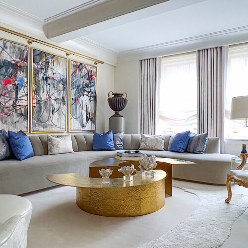
 Carmina Roth of Belle Haven Interiors’ vignette was inspired by Albert Hadley’s home in Naples, Florida. A modernized version of Hadley’s ode to white, Roth’s room was dedicated to her children, the next generation.


 3 photos above by MANUFOTO
A fun upbeat mix of materials and textures, any child would be thrilled to hang out in this space. Of course the stand out was the fabulous bubble chair but I also adored the purple croc on the 1970s chair.
 Don’t you love how the M&M’s match? What a great detail!
 There was fun artwork such as the 3D piece above made of toy soldiers and Stephanie Hirsch‘s “Your Dreams Here” created of oil, rhinestones and embroidery on canvas.
A multifaceted mix of elements mingled on the shelf from a cool Zeppelin Air iPod Dock to a textural sculpture, white orchid and a Richard Meier-esque fish “condo” with live goldfish (which sold). With lots of pillows for guests, I’m guessing Roth’s children might be begging her to bring home this vignette!
How could anyone not love Christopher Stevens‘ title for his fabulous vignette – Biblioteca Floribunda?! A modern take on a classic English library, his exuberant mix echoed what we have been seeing on the runway and in London – the successful mix of color and pattern, of floral and geometric and of new and old.
 Inspired by Hadley’s use of color and graphics, Stevens chose a punchy Osborn and Little floral and Hicksian linear pattern to anchor the space. The floral plays off David X. Young’s modern artwork beautifully.
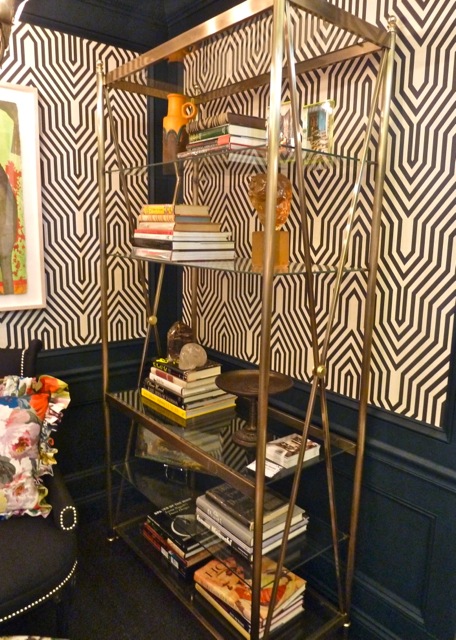 The neoclassical brass & steel étagère is definitely reminiscent of Hadley’s style with its clean geometric lines as a perfect foil for the busy patterns.
 There is a lot going on in this small dynamic space yet Stevens orchestrated all the elements to a perfect pitch. A colorful contemporary mix with a nod to a modern master is the perfect ending for this final feature.
Huge kudos go to this incredible cast of young designers. What an amazing assemblage of talent!! And a salute to Melissa Makris, a design chair with a vision. This was a show house with an eye to the future of great design!! I was thrilled to be a part!




 3 photos above by MANUFOTO


All lovely but the first two are my faves…the colors are so rich and elegant and the classic elements present just radiate timeless beauty. Fabulous coverage Stacy…you did such a fabulous job! Thank you!
Fabulous…. I am so sad this is the finale. Like the ending of a wonderful novel.
So inspirational. That heart made of toy soldiers has given me so many ideas, it is very interesting. I’m afraid the Biblioteca room makes me a bit dizzy. I am most in awe of GMP’s sketching. What a talent – I can barely draw stick figures. I would so love to be able to do that. I imagine carrying my sketchbook book with me everywhere and capturing my journeys in images – daydream. LOVE the Parenthood sculpture :)
Such great inspiration from all involved! Another great round of fabulous from the final group!
Love those sketches! I always enjoy seeing how other designers draw. It’s like their personal signature on a design. Thanks for sharing that, Stacy!
Loved the tour. All of these designers are amazing.
q-
Gorgeous post! I just went through a weeks worth. I don’t know how, but our blog isn’t on my blogroll. Tired of blogger. Several disappeared into thin air!
I love the purple chair and all of the orange in the other post.
Ok, so back to normal. I thought that you were out of town. Fixing now.
Teresa
xoxo
I am giving great consideration to purple in a room now it looks wonderful in the room above, something so classic about it. Thank you for taking us along on this amazing tour and introducing us to all these talented designers!
These must have been something to see in real life! Love the ceiling of the first room!
xo Cathy
JD PEterson’s is my favorite! Love how the lighting plays such an important role in his vignette! They’re all great though!
There was something in each of these rooms that grabbed me! The city entry!! Christopher’s fabulous wallpaper. The toy soldier artwork (cool for a little boys room) and that hanging 70s chair!!!
This year’s round up for talent was nothing short of exemplary!
Thanks so much for giving us the inside scoop!
I have to admit total sketch envy. The sketches alone would be beautiful framed and hanging in a library. This post brings the evening back to life. Beautiful.