 Almost four years ago, we downsized and moved to a more modest house next door – yes, next door. With our third child about to go away to school, my husband understandably decided that we didn’t need such a large and expensive-to-run house any more. Rationally it made sense. Emotionally, it was another story. I had put my heart and soul into renovating our house. Those hefty files filled with tearsheets and notes had finally found a purpose. I had spent years preparing for just such an opportunity and relished every moment. We lived in a rental dubbed “our lady of the four garages” (as you might glean from the name, a house that was 3/4 car port and 1/4 living space) while every day I visited our project as it developed into my dream. A lovely family lives there now, with three young children who fill the house with laughter, love and lots of legos. My youngest spends much of her time there and in the end it has worked out to be quite an agreeable situation. Now that I am more removed from the emotionality of the separation, I’d like to share with you a bit of my handiwork. After building, I didn’t have much of a budget left for decorating, so please look at these photos more for the architectural, rather than interior design, value.
The kitchen is how the whole project started – and where my focus was most intense -Dutch tiles, mahogany and carrera counters, antique halophanes, Lacanche range.

Coffered ceiling, fireplace with storage abounding – the cabinets on either side just fit my stacks of magazines.

kitchen sitting area
Open shelving, fireclay sink.

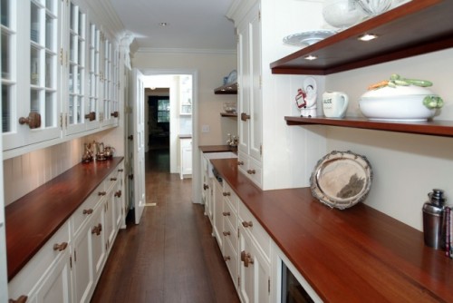
Possibly my favorite room – lots of wonderful storage, clever halogen lighting under shelves, second dishwasher and wine fridge.
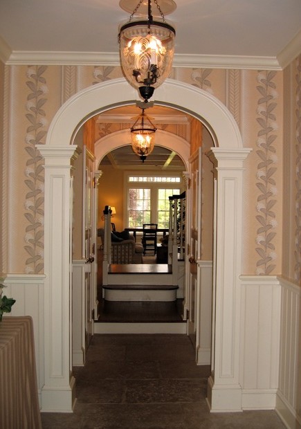
Powder room with now discontinued Schumacher Paris map wallpaper, black high gloss paint, custom mirror and vanity.


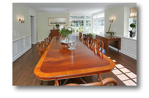
Dining room with wonderful corner window. The current owners put in the bookcase/windowseat at the far end that I had designed with the architect, Rink Dupont, but never put in.
Family room has two walls of bookcases and tailored millwork on walls.
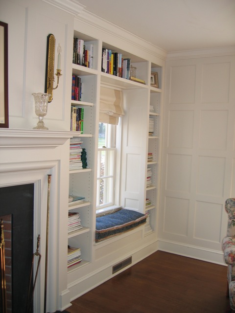
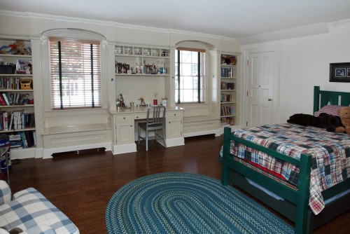
My younger son’s room had lots of built ins to help keep things tidy.
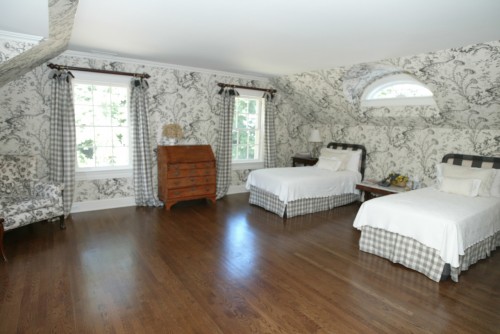
Guest room with my favorite Pillement toile and charming eyebrow window.
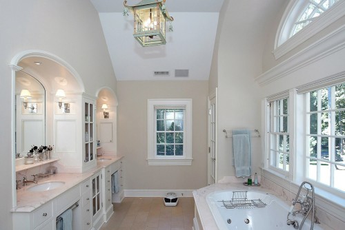
This bathroom came out so wonderfully, I don’t know whether I liked this or the master better.
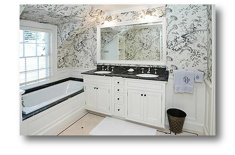
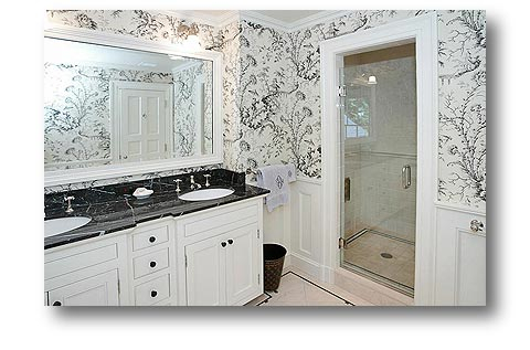
Can you tell I like working on bathrooms? The girls shared this bath with the pretty Clarence House wallpaper. You can’t see very well in this photo but the marble was a lovely Oxford pink.
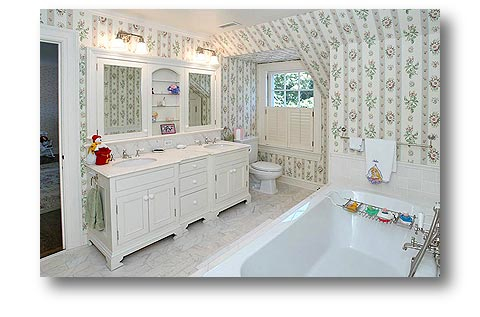
I had the sinks divided by the middle cabinet for extra storage and so I didn’t have to look at my husband’s messier side. He wouldn’t let me take the fabulous John Rosselli fixture.
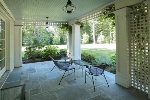
This terrace was a lovely place to sit for much of the year. It took me several tries to get the blue ceiling exactly the right color.
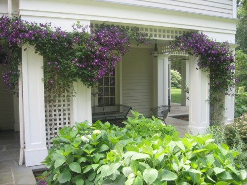
I can’t take credit for the fabulous clematis – my husband is the one with the green thumb.
Even though I miss the house, I’m happy to know that the family who lives there now appreciates and enjoys all my hard work. They have since built a beautiful pool and pool house that I featured in a previous post a couple of months ago and are always finding creative ways to expand and improve upon my efforts.


Your former home is beautiful and so clearly shows all the love and attention that you lavished on it. Moving on is bittersweet….but change is always exciting and I am sure that your new project will be equally beautiful. xv
vicki – thank you – yes change is exciting and I am always looking forward to something new.
Stacey: I share your taste. There must be some consolation, in not wanting to sell a house, after the real estate values have declined. Your children have beautiful educations, and when the time is right, you will find another perfect place to make beautiful. Your dining room table must be in storage. I will say moving next door is a bit of salt on the wound.
Best,
Liz
Hi Liz – yes, we sold at the very beginning of the downturn. And yes, education has certainly been a priority. Dining room table is not as big as it looks – photo was taken with a fish eye lens and was actually a fantastic buy from an estate sale. The chairs came with a beautiful Cowtan fabric that coincidentally matched my walls exactly! Living next door was tough at first but wonderful now because my daughter is such good friends with the new neighbors.
Such a wonderful house. Yes, we do grieve our houses, but it seems as if your love has found a family to make her happy.
mary – thank you. And yes I think she (and I like that you have assigned her a gender) is indeed happy and fulfilled.
What a gorgeous house. It almost looks familiar to me? Is it possible that I have driven by it…? I feel like I see shades of Louise Brook’s designs, which is a compliment to the highest degree in my book, as I love that lady’s style. I can’t imagine moving from my home, we have been here 10 years this month, but often with change comes great new things…this was a lovely tribute to your home.
zhush – thank you! I doubt you have seen it – we live on a small dead end, but you never know. Rink Dupont (in New Canaan) was the architect for the renovation – the original house was a stone and clapboard Ed Wallace from 1939.
Such a lovely home! My husband and will be downsizing in the next few years, and I am actually looking forward to it! The porch is so beautiful and I know what you mean by finding exactly the right shade! Do you happen to recall what shade you used and would you mind sharing that information? Thanks!
vicki – thank you! I would be happy to share the color with you if I could remember what it was (it was over 10 years ago) – I know I tried several different ones. All I can tell you is that it was Benjamin Moore – so sorry I couldn’t be of more help. Some of the colors I do remember – that’s just not one of them.
I cannot decide what I like best, solid educations or stone homes that have been lovingly educated to know how to act even after one has moved on.
Wonderful tribute to your graduates, I mean to your children and your home.
pve
pve – thank you! I wish the children behaved as well as the house.
the color of the ceiling looks like palladium blue
Palladium blue could be a great ceiling color – and I used it in my daughter’s room this time around. This particular blue is something else – but is indeed along the same lines.
A beautiful home indeed. I can only imagine how hard it was to leave, but the fact it now has wonderful caretakers and you can visit, must help ease the pain.
I truly love the butler’s pantry! In our builders plan, we have a space called a BP…amusing since it barely more than the size of a coat closet!
Oh, and I thought all the interior design elements were very attractive!
A&A – Thank you! Yes, the butler’s pantry was great – and even a smaller one would be useful
WOW! You did an incredible job designing your home…and I’m sure it was a cinch to sell. With your talent, any space you occupy will be amazing.
Elizabeth
Are you in New Canaan? We are in Pound Ridge, but on the literal border…just off Barnegat!:)
Wow. So pretty. That copper sink is killer. I know it must have been hard- especially to move next door! Post pics of your new house!
Yes – loved the sink – and the guy who made it was so nice! New house not ready for viewing!
Love all of the work you did: gorgeous! I can’t wait to see what you do with your new house :-)
Thank you! And loved your review of the Peter Pennoyer book – am anxiously awaiting my copy. Maybe you’d like to check out the posts I did on Gil Schafer.
Just discovered you via SlowLove Life and read this post on your spectacular home. What a beauty and labor of love….You have given me strength for when I must move on from my beloved home. Now…if I could just have that Schumacher Paris Map wallcovering I would be happy….I noted you said it was discontinued……
Looking forward to seeing your new home. You have exquisite taste….
Pavlova – Welcome! And thank you for your complements. You will be fine – it’s difficult at first but usually works out for the best. Yes, isn’t the Schumacher paper great? They might still do it on cork. Do stop by again.
… the Paris wallpaper! the coffered ceilings! the pantry! the master bath! If I could live in one room I would combine all those elements, I mean what else would I possibly need? A little bubbly, perhaps! Stacey, your home was simply beautiful – the detail exquisite!