Saturday night the Metro New York North Red Cross held its annual Red & White Ball, one of the largest fund raising events in Greenwich, CT. With hundreds of glamorous guests, they raise much needed monies to provide immediate humanitarian aid to those affected by emergencies and disasters. This year’s theme, Designs for Hope, brought out many top designers to contribute to the cause.
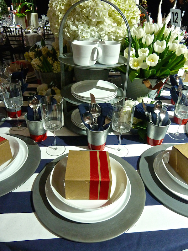
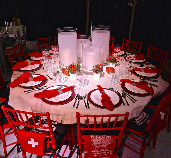 Held in the NetJets Hangar at the Westchester Airport, local media sponsor was once again Cottages & Gardens, whose table for 2014 was designed by Kerry Delrose, above. Design chair Mary McDonald created a picnic inspired table with tabletop provided by Crate & Barrel
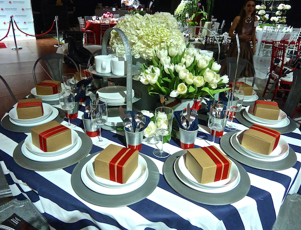
and flowers from The Flower Bar.
Peter Fasano created a whimsical table with Ondine Karady reminding us to connect with the child inside.
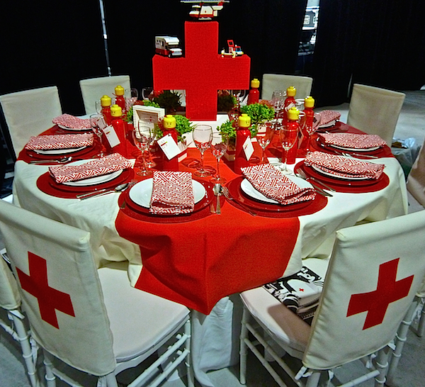 My love of Legos is well documented and I appreciated all the clever touches including the red cross centerpiece built by Bill Probert, local Lego maestro.
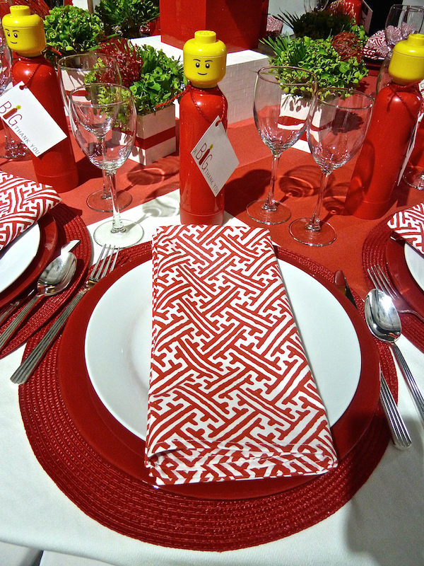
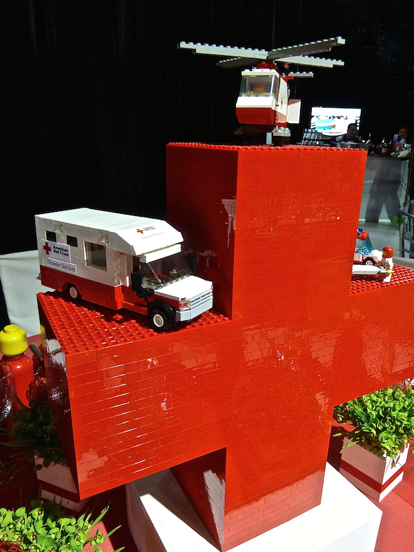 Peter designed and executed the tablecloth red cross, napkins were in wife Elizabeth Hamilton‘s Pambell with Lego water bottles offering a BIG thank you.
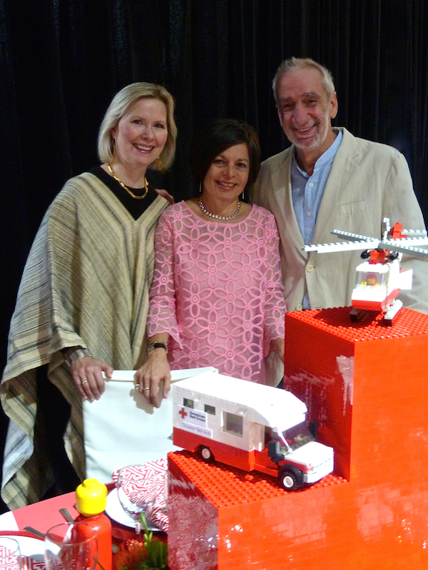
 Below, left to right, Elizabeth, Beth Dempsey of Images and Details, Design Coordinator for the event, and Peter.
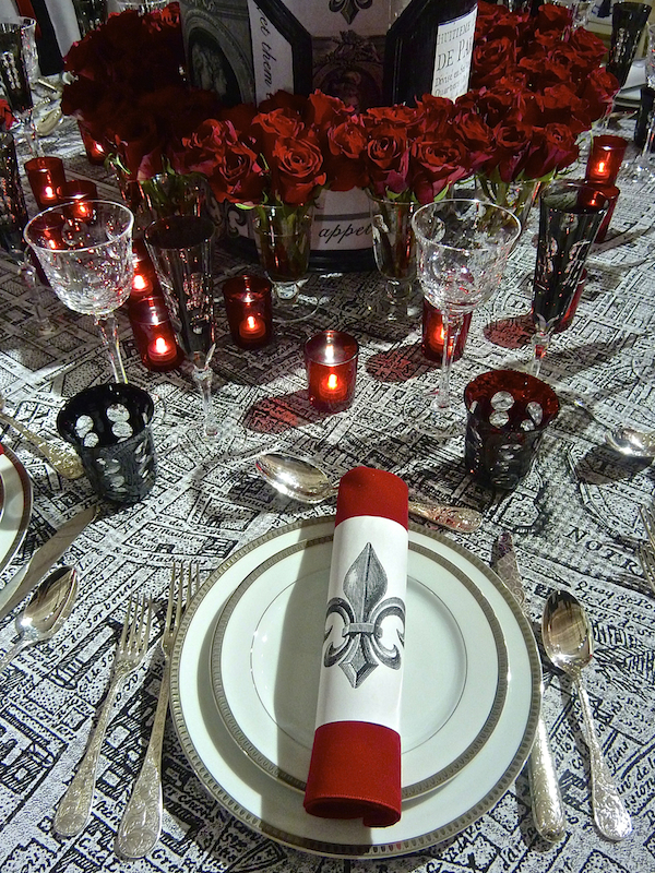
Matthew Patrick Smyth‘s exquisitely appointed table was an ebullient ode to Paris.
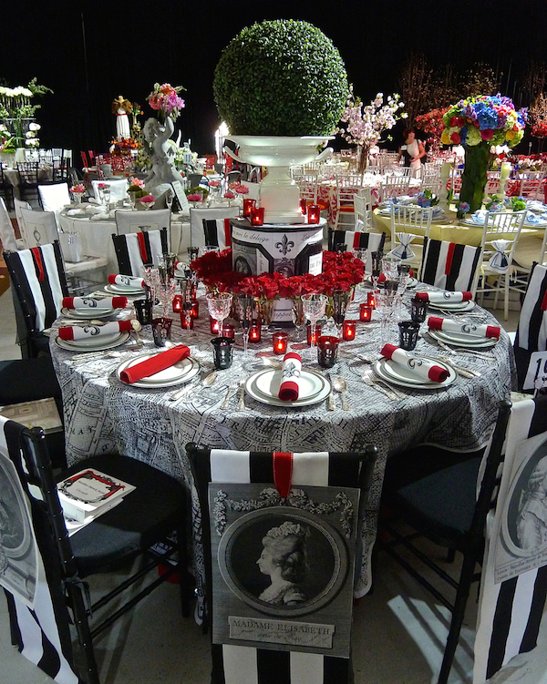 With a tablecloth printed with an 18th century map of Paris, elegant accoutrements were from Christofle.
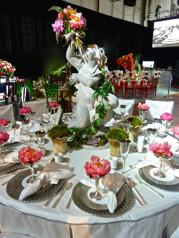
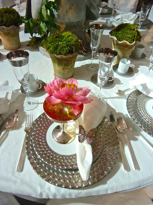
Carey Karlan‘s table also beckoned us from the city of lights, with a fresh evocation of a Parisian park.
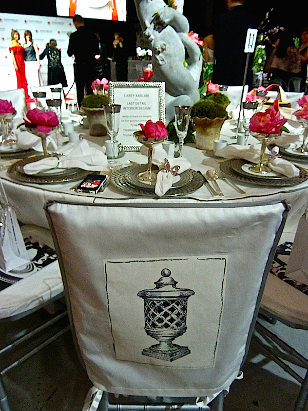
Charming illustrations by B. Russell Melzer graced the chair’s slipcovers.
 It felt like springtime in Paris with tabletop dinnerware from l’Objet, charming pots from Pennoyer Newman and blooms from Flowers & Flowers.
Silvina Leone’s amazing table was an extravagant homage to the 17th century. “My tabletop designs are always inspired by old master paintings and, in this opportunity, I focused my research on French and Dutch seventeenth century art and those enthralling tabletops proudly parading beautifully crafted items and encrypted with coded meaning.” Using Alessandra Branca’s Melogano linen damask for Schumacher, based on an Italian textile of the same era, she amassed a tabletop collection expressing a palatial ode to nature.
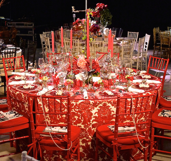 “I chose a fabric with a pomegranate motif and powerful energy because across cultures and at different moments in history this juicy red fruit with many seeds has been a source of food and herbal medicines, an image of the earth’s bounty awaiting us as well as a symbol of passion and generosity.” With an impressive background in art history and design, Silvina went to great lengths accumulating the perfect pieces for her table. “In this graceful vignette, I chose the anchor, the acorn, the swallow and the bee to communicate my message of hope, refuge, survival, trust, determination, generosity, passion and hard work.”
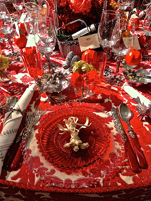
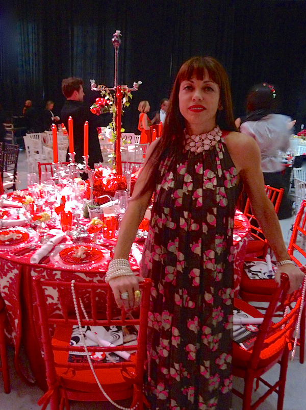
In chatting, I discovered that she sourced the glasses at the Dior Home store after reading my piece on the fabulous shop and actually commissioned the charming ceramic scallions at each place setting. “Superb craftsmanship as well as an appropriate color and material combination for this event (i.e. red-white-pewter-translucent and colored glass) controlled the selection of fabric, glassware, flatware, plate and décor arrangement.” The chic designer and I share a love of fine workmanship, travel, jewelry (her necklace was divine) and more. I’m sure we’ll be visiting with Silvina again sometime soon.
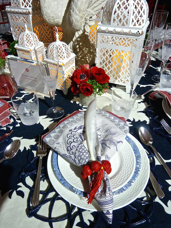
I loved Suzanne Eason‘s chic take on red, white and blue.
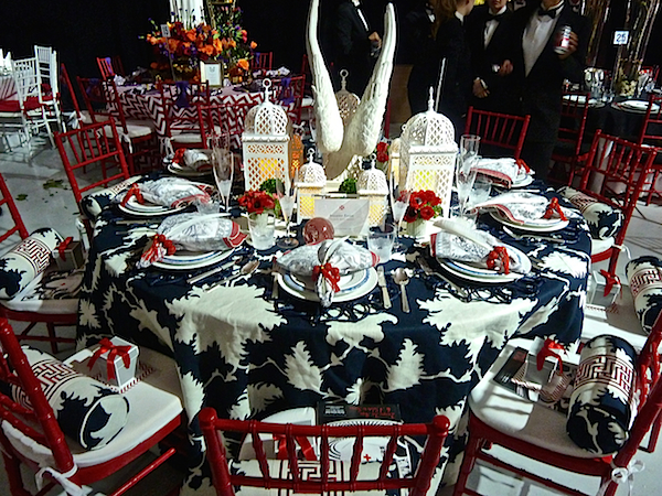 Her table featured such beautiful layering and so many wonderful details. I only wish I had had a chance to write her to include all the sources for you readers looking to enhance your tabletop collections.
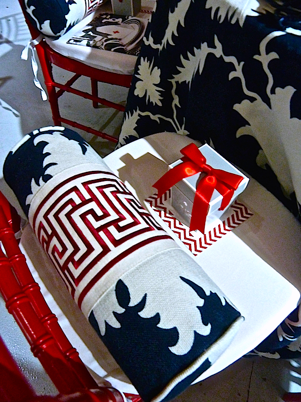
 And I’m wondering if the lucky table guests got to go home with these stylish custom bolsters.
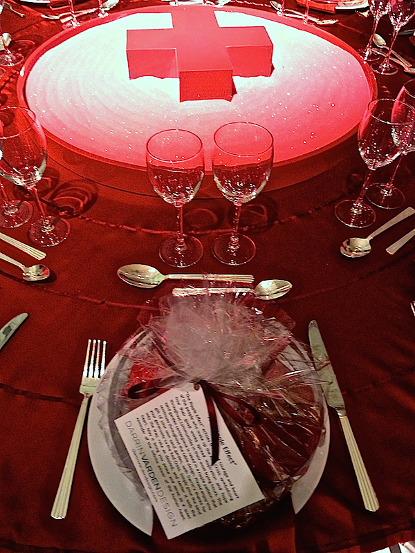
Darrin Vardin had a personal connection that motivated him to create his Ripple Effect table, representing how the good works of the Red Cross spread throughout a community following a disaster. Three blocks from his Harlem apartment, a gas leak caused an explosion claiming lives, displacing others and destroying buildings and businesses. The Red Cross arrived immediately to “assist, to provide comfort, support and all-important logistical aid…(my table) echoes the quiet courage and heart of the people who make up the Red Cross.”
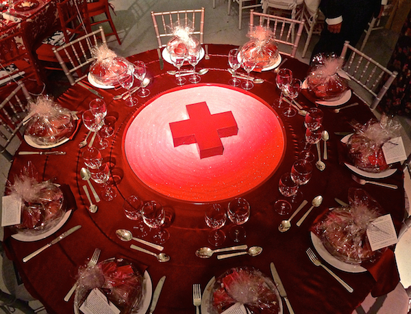
The gloss-lacquered Red Cross sat on a custom tray filled with red sand that was raked in concentric circles with a Zen sand garden rake, echoed by the circles in the tablecloth. Each guest received a miniature Zen sand garden complete with rake and a heart to place in the center filled with the message “Your heart may seem to be one drop in a sea of humanity, but its intention can be felt throughout the world. Thank you for your generosity.”
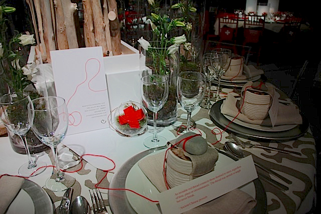
In thinking of the Red Cross, designer Krista Fox realized that they are connectors – of those in need with those who can help. “We wanted to create an organic, casual, natural environment with a strong message about connections. We are all connected in some way to both each other and to nature.”
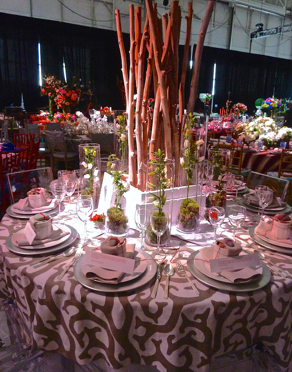
“The Chinese proverb of the red thread seemed right for the theme
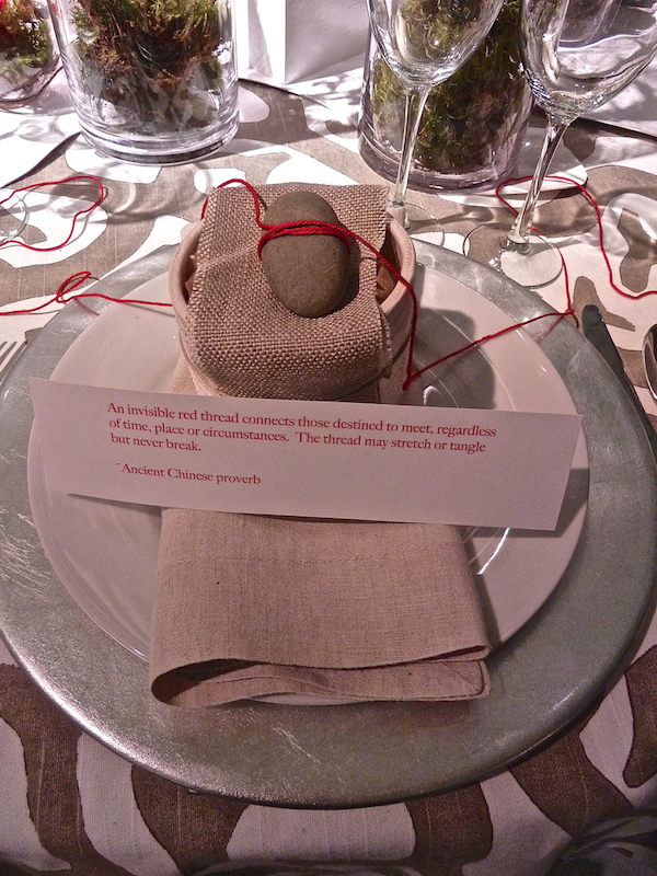 as we translated the thought to a visual metaphor.”
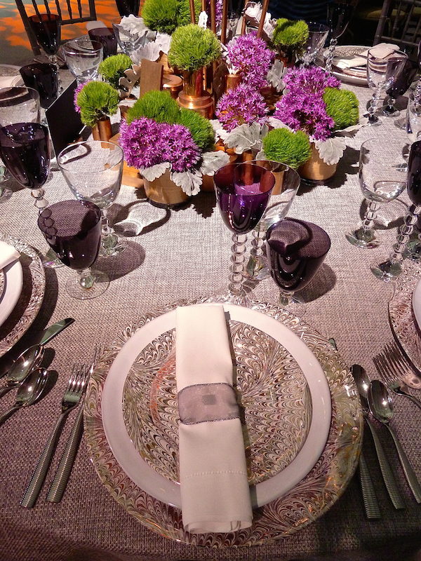
The Nanz table, designed by Alisberg Parker Architects was of tonal elegance in gray and purple.
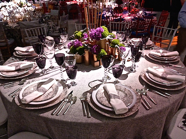 Juliska plates and Baccarat stemware were a lovely counterpoint to the lush modern centerpiece adding the warm accent of copper.
Francine Gardner of Interieurs presented a fresh take on the metallic shade du jour. Her tablecloth design, custom printed by Peter Fasano, was a modern take on a natural theme.
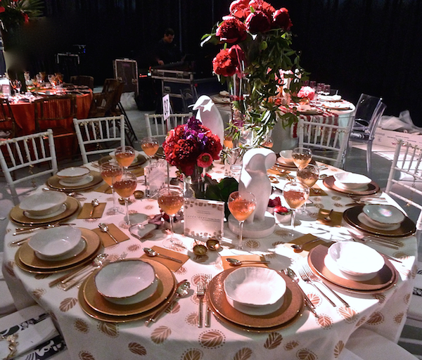 Hand crafted accoutrements within the gold palette added a glowing warmth against the lovely floral centerpiece.
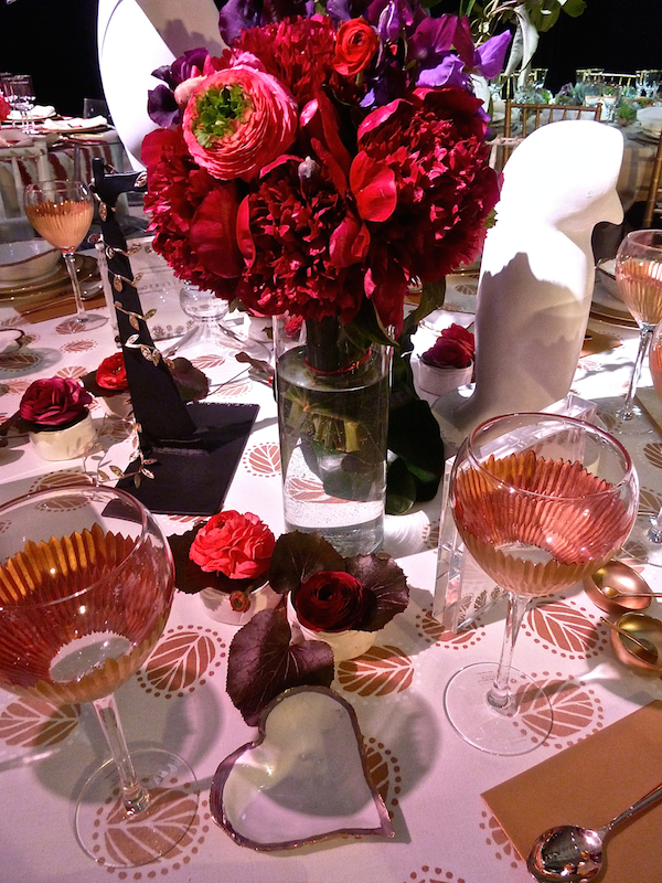 Gold was also the theme at the table by Pimlico, where pink and red accents added a fresh femininity.
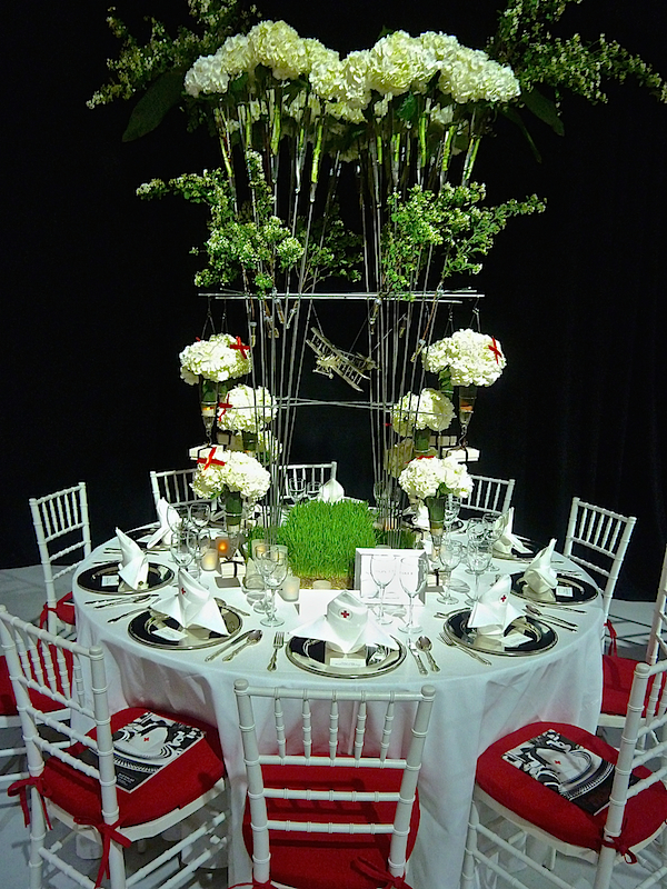
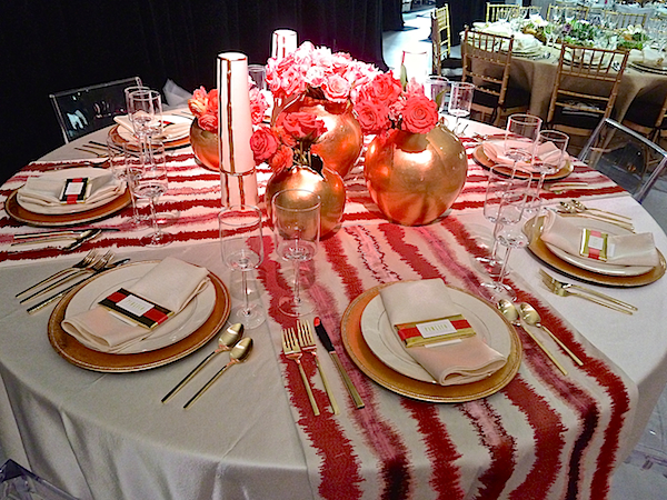 Simon Teakle, owner of the eponymous Greenwich shop of exquisite fine jewelry and unusual objets d’art, created a clever table highlighting one of his unusual finds – a silver model of a R.A.F. F.E.2B plane. Hallmarked in London in 1917-18 by Edward Dime, it hung as the featured element within the statuesque centerpiece.
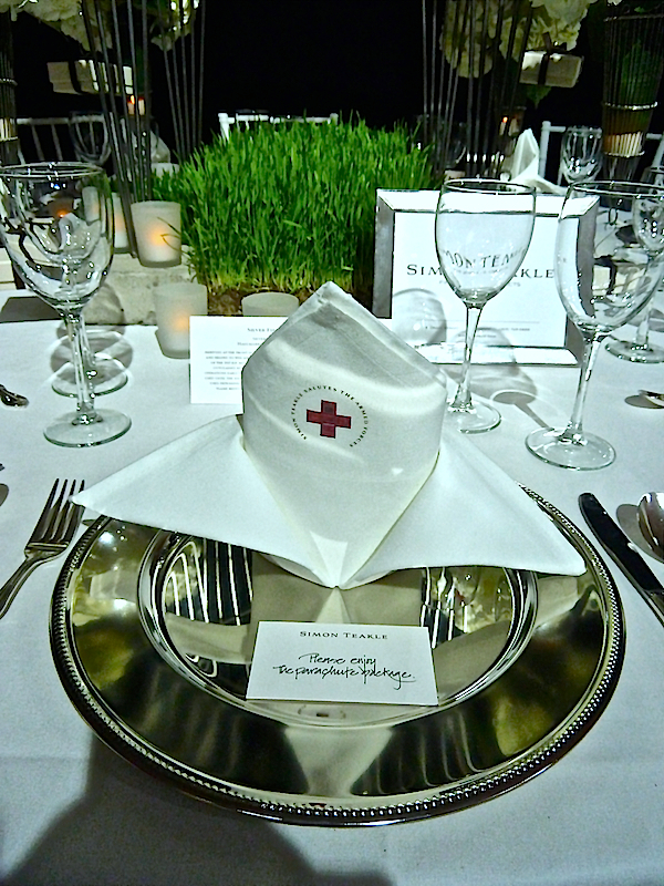
 And I loved how he cleverly folded the napkin to resemble a nurse’s hat – so charming.
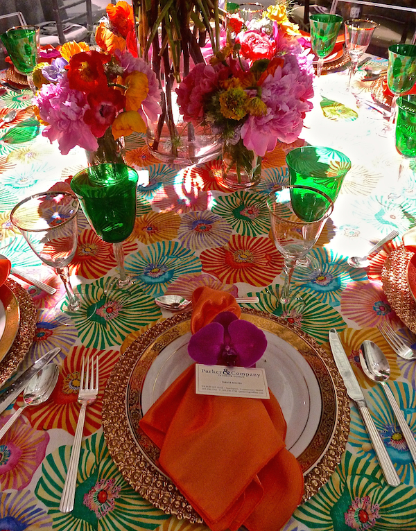
It’s clear Parker Rogers loves color and his table was a cheerful explosion of floral brights.
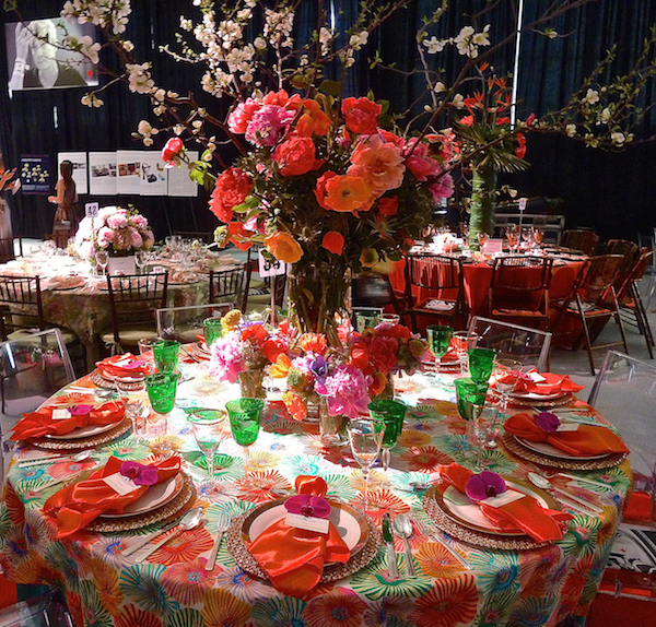
It would have been impossible not to be in a good mood among the kaleidoscope of spring bounty.
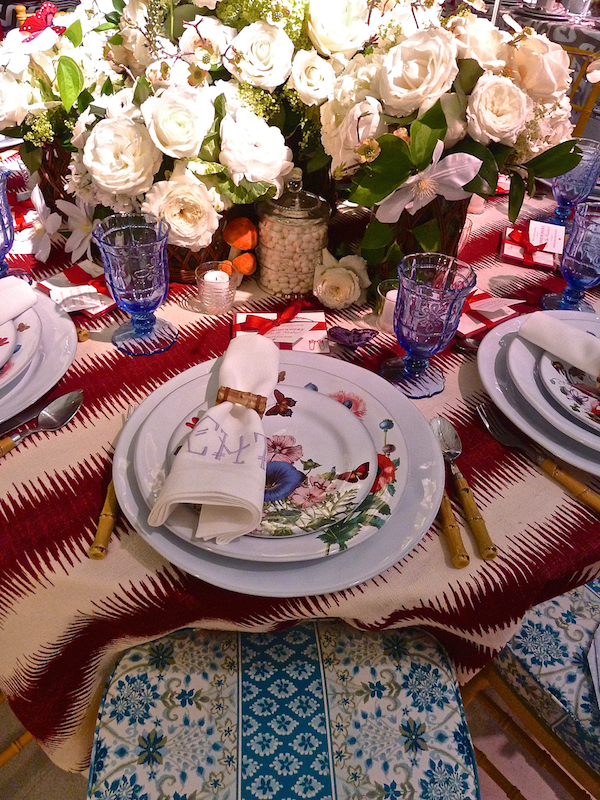
Event newcomer Catherine Tompkins of My Life in Parties made a terrific first impression with her “Over the Rainbow” table design.
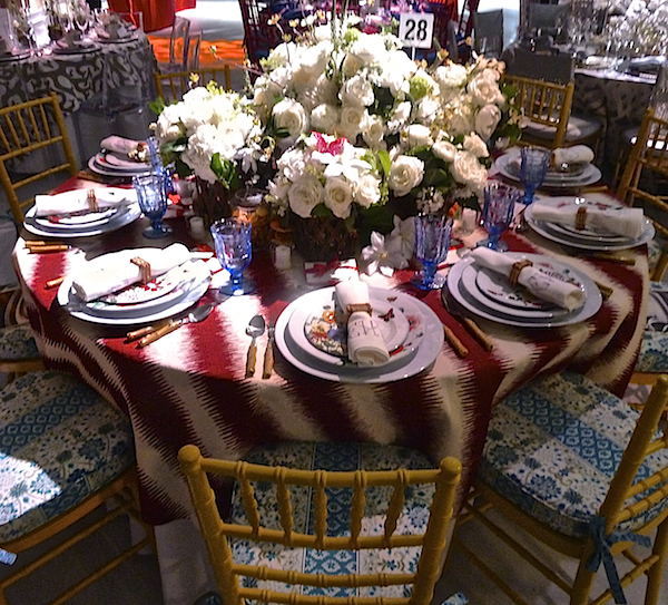
I immediately recognized the Tilton Fenwick for Duralee Rocat on the chair cushions, which coordinated wonderfully with the Juliska dinnerware, glasses and flatware. Beautiful Leontine Linens napkins and a spectacular all white centerpiece from Greenwich Orchids completed the fearless combination of color and pattern.
 Kudos to all the designers for their beautiful contributions to the Red Cross Red & White Ball this year.



Fantastic coverage of a terrific event! The nurses caps, the plane, the Lego cross, really creative designs by all. What I wonder if how do these designers find the time to keep their projects going, volunteer for these events and look fabulous too? You can tell that everyone really enjoyed the party.
Thank you Stacey for including my table! It was great to participate in such a worthy cause.
Beauty, design and great style combine to contribute to the well being of us all!
Love the style and creativity of the tables and for such a great cause.
Who needs food anyway! Visual feast!! franki
Terrific coverage of event, loved your Lego table ~ my son and I created many designs with Legos over the years so this was the ultimate ~ Congratulations xo
Stacey, I am constantly astounded by the artistic creativity shown at these important events! I could not even begin to choose …though Francine’s and Patrick’s really spoke to me…all are luxuriously done !
xoxo
Karena
The Arts by Karena
Hi Stacey- Great coverage! I love your blog and I am so flattered that you included my table in your wrap up. Suzanne’s bolster’s are to die for and Matthew’s table — just WOW!!! For my part, I can’t wait to use my Tilton Fenwick Rocat seat cushions for a garden party and maybe their Merlot tablecloth for holiday or Valentine’s? Thanks again! Cheers, Catherine
Stacey – So happy we were all there together and thanks so much for including us. Twas quite the event and we were so happy to be included. See you in LA!
Thank you SO much for your kind words and support Stacey! It was such an incredible event from beginning to end. We were absolutely thrilled to be a part of it!
Stacey, your coverage of the Red & White Ball’s tables is tremendous. Your photography and eloquent words capture the essence of everyone’s creativity so well. Thank you!
Stace…you know Francine is a member of our By Invitation Only group, she’s so very talented.
Love the place setting she designed, but everything is so overwhelming beautiful isn’t it? You are so fortunate to attend all these NYC events. xx’s
Thank you for the great table pics. They were all inspiring. A special thanks to Suzanne Eason for using my Schumacher trim and fabric for her lovely red white and blue table too! Loved seeing you there and loved participating for such a great cause!. x Mary
What a fun event! My best clients ever! ;) You ladies are all so fabulous! And super cool under pressure! Total pros! The pleasure was all mine, Mary! Your fabric & trim you did for Schumacher were gorgeous! You raised the bar this year! Thank you. xS
Thanks so much for including my chair cover designs for Carey. I am honored to be included in your blog, Stacey, it is uber chic and you have SO many followers! Was a pleasure chatting at the opening