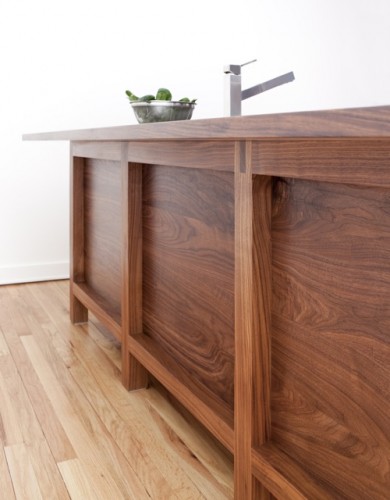
 I had been hearing about the launch of the new Bornholm Kitchen line for weeks and was so looking forward to seeing it in person. Well clearly I wasn’t alone – Susan Serra and partner/daughter Kelly’s booth at the show was hopping!! Their tagline “Warmly modern kitchens with great social skills” really is apt. It’s always such seemingly simple concepts that are the most difficult to execute well. Yet Bornholm’s Scandinavian inspired designs really succeed beautifully with the utmost in quality and understated style.
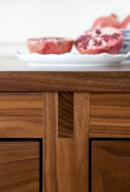 Their beautifully crafted pieces, with true mortise and tenon joinery and proper legs, allowing for open bottoms, really function more like furniture. And the low key elegant profiles don’t scream kitchen. This offers the possibility for the kitchen to become an authentic living space that can comfortably segue into any other room. Because they are free standing, the pieces can be configured in any possible combination to suit the space and homeowner.
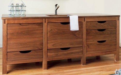 I also love the drawer cut outs which allow for a very neutral design profile that doesn’t have to commit to a particular hardware finish and can become a blank canvas for any style statement the homeowner desires.
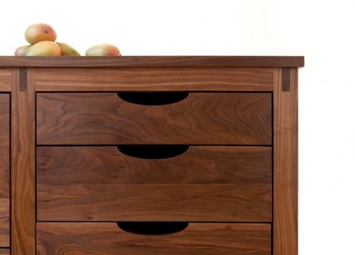 And of course this is exactly the point – for these pieces to become the backdrop for the room, or as Serra describes it the “classic black dress.” Too many times, the kitchen cabinets dictate the style of the room and the rest of the furnishings must conform. Serra was so smart and design-modest to have her line take second seat so to speak. It makes it so much more versatile in the long run.
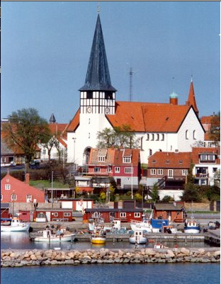 The line was inspired by the lifestyle of Bornholm, the largest of the easternmost islands off the coast of Denmark and the familial home of the Serras, where they have been going their entire lives. Both the aesthetics of this artistic island, home to many local sculptors, glassblowers, potters and painters, and its green aspects inform the furniture. And while this tiny island may be the inspiration, all of Bornholm’s products are American made of sustainable, recyclable wood products originating in the US, finished with natural plant oils and waxes and organic pigments, creating both a natural feel and healthy result.
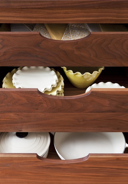 Currently available in Natural Walnut and Rift Oak, I would love to see the addition of a pickled or limed wood as well to round out the selection as an alternative to a painted white kitchen.
Here you can see how beautiful the finished details are with an undermounted Blanco sink or full integrated dishwasher or cooktop.


 photo by Susan Serra
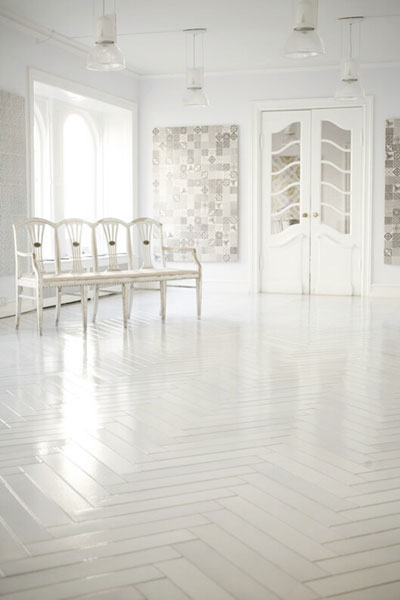
Serra encourages looking for alternative design elements to add to her kitchens to give fresh interest and creativity. This includes lighting, good art, sculpture and large statement pieces. She loves the modern classic look for example of rustic painted white herringbone floors or this beautiful white lavastone version from Italian company Madeamano.
 She also gave a nod to these metal tiles offered by Sun Valley Bronze.
 photo by Susan Serra
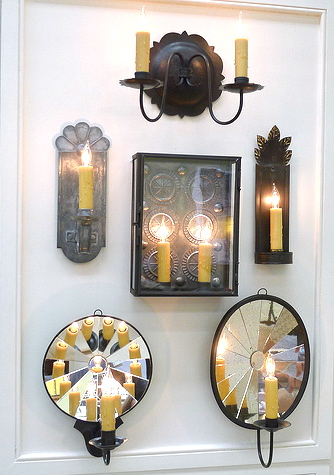
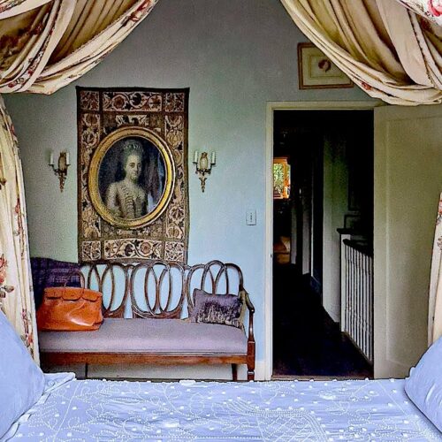
Serra feels special lighting can transform a kitchen. She loves, as do I, the beautiful historic sconces from Richard Scofield, based right here in Connecticut.
Overall she feels that kitchens are moving toward warmth – that people are craving warmth, coziness and softness which can be achieved through wonderful fabric choices, great lighting and welcoming design.
But most of all she stresses embracing imperfection and personal style. “Fearlessness and confidence will produce an amazing end result, we all know that. Remove the fear!” With her beautiful products as the background, anything is possible!!
 Bornholm was strategically thought out as a fully developed concept with products for all types of customers, which can be ordered three ways.
- The highest level of service available is by custom ordering, either directly or through a showroom, which is supervised by a NKBA Certified Kitchen Designer. No other manufacturer offers this service on a national scale.
- The Bornholm Basik line – standard sizes pre-made for kitchen and bath, offered in a variety of configurations and wood types which can be ordered online though 2modern.com
- The Bornholm Collection – a glamorous selection of one of a kind pieces based on their ideals of “clean simple lines and eco friendly manufacturing and finishes.” These pieces will be available through Avolli, the well respected source for Scandinavian antique furniture.
 If you live in the NYC area and are interested in seeing a Bornholm kitchen, the first showroom in the US to install it will be Kitchen Designs in Williston Park, NY on Long Island.
The best ideas are always the simplest and distilling many concepts down to a simplified essence is the most difficult. But Susan Serra has done just that. Bornholm offers a pure elegant design as the basis for the expression of personal style – and isn’t that what we are all trying to achieve in our homes – an outward personification of our inner selves.

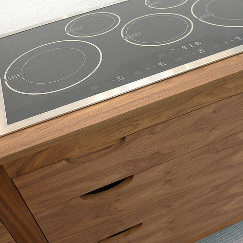 photo by Susan Serra
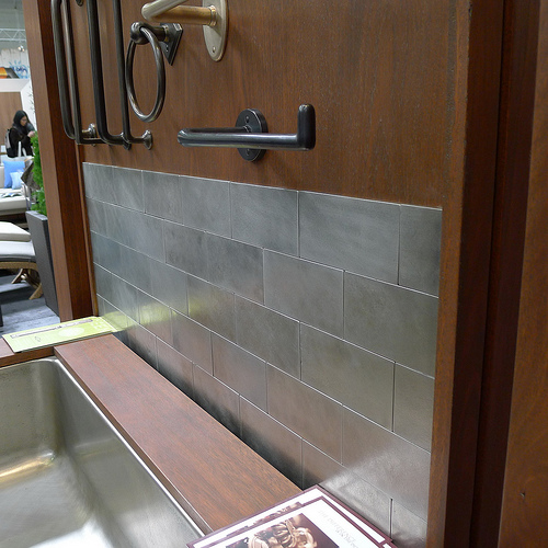 photo by Susan Serra


What a gorgeous aesthetic that appeals to the heart as well as the eyes. Bravo Q, as always for digging out the goods and giving us the low down on why they are so interesting!
The Bonholm collection is divine. I love going to home shows and seeing all the latest. Great post! XX
What a gorgeous combination of form and function!
xoxo,
Chic ‘n Cheap Living
It is so nice to see something other than Tuscanesque with TONS of granite and overbuilt cabinetry. Really interesting. I must keep this on file…
Susan Serra’s new Bornholm Kitchen line is beautiful and you did a superb job of showcasing all the details that sets it apart. I look forward to seeing it showcased in many homes!
warmly modern, indeed…love to see new kitchen ideas!!
gorgeous kitchen ideas…I’ve never been much of a kitchen person as I felt they lacked any real aesthetic….love these kitchens cabinets though…
maureen
I love the warmth of the wood. What a happy kitchen it would make. The white herringbone floors in the Madeamano photo take my breath away!
The Bornholm is right up our alley, we very much appreciate the clean, uncluttered lines. It’s funny you show the metal tiles, The Spousal Unit was speaking about those over the weekend, he had already been pricing them! I think my favorite photo of all is the Madeamano white with herringbone floor, it is so very pretty. Sigh.
Sending you a smile,
tp
The Borholm kitchen line is absolutely beautiful! I agree with their concept about a kitchen being a warm, inviting, and cozy space. I tried to do that with my own kitchen. Thank you for showing us the beautiful village in Denmark which inspired the aesthetics of this line. I also love those sconces that hail from Connecticut. What a great blog post, as always your blog reminds me of what many of my favorite magazines (which sadly no longer exist) used to do: give the reader thorough, well written articles with great photos, providing inspiring ideas to bring into our own lives.
I am swooning over the sink and the dishwasher!
Those white herringbone floors, that wood cabinetry, the modern clean lines, the fact that it is harvested FSC wood in the US…it’s all just divine! I’m currently working with an ugly kitchen from Home Depot. The wood is atrocious, but I’m a tad tired of white painted cabinets. Wish I could just nix trying to fix it all and buy everything from Bornholm Kitchen, then have flooring put down from Madeamano… One can dream right?
A wood countertop is so intriguing! The white herringbone floor is such a gorgeous statement too. I love the idea of custom and really pushing the envelope of what typical choices are for kitchens (and bathrooms!) XO, Kelly
I love the mirrored sconces — they have a very contemporary feel and I’ll bet they really do reflect a ton of light.
They have conceived a beautiful line. I so agree with them that kitchens are moving toward warmth. And lighting choices can play a big role in the overall feel.
So happy to learn about Borholm!
Well, it certainly is THE alternative to the white kitchen. I will personally always have one, but…it never ceases to amaze me that kitchens, master bathrooms and dressing rooms get more glorious everyday. Something has to happen to living rooms and dining rooms–they are simply not evolving and nobody really goes there, or cares. The modern living situation is a kitchen connected to a casual great room that includes a dining area–all one space. What on earth are we doing with our living and dining rooms, now that we have created additions with kitchen/ social space??
Best,
Liz
I LOVE THESE PIECES-Q! The quality is obvious here, and I love the simplicity. Just beautiful.
I love Scofield’s work too! These sconces are stunning.
Thank you again for taking us along on your tour.
Teresa
xoxo