While there have been a plethora of industry events, I am catching up here with a few highlights from a very busy week in design. Monday evening was a reception for the most recent installation at the Carpenters Workshop Gallery. In their stunning Fifth Avenue space, select works from represented artists were paired with bold nature themed wallpapers from Pierre Frey for a beautiful and thoughtful intersection of art and design.
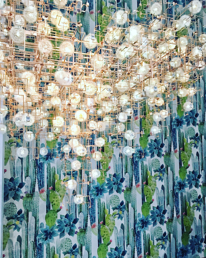 I remember being blown away (pun intended) when first seeing an incarnation of Studio Drift’s amazing Fragile Future dandelion chandelier several years ago in their Paris gallery. Exploring “the relationship between nature, technology and mankind,” the light sculptures are made of bronze electrical circuits enhanced by light emitting dandelions, all hand picked and individually glued to LED lights (detail below). The result is ethereal, functional and visionary, looking beautiful against Pierre Frey’s Cuilko, a large scale watercolor pattern recalling the desert plants of South America.

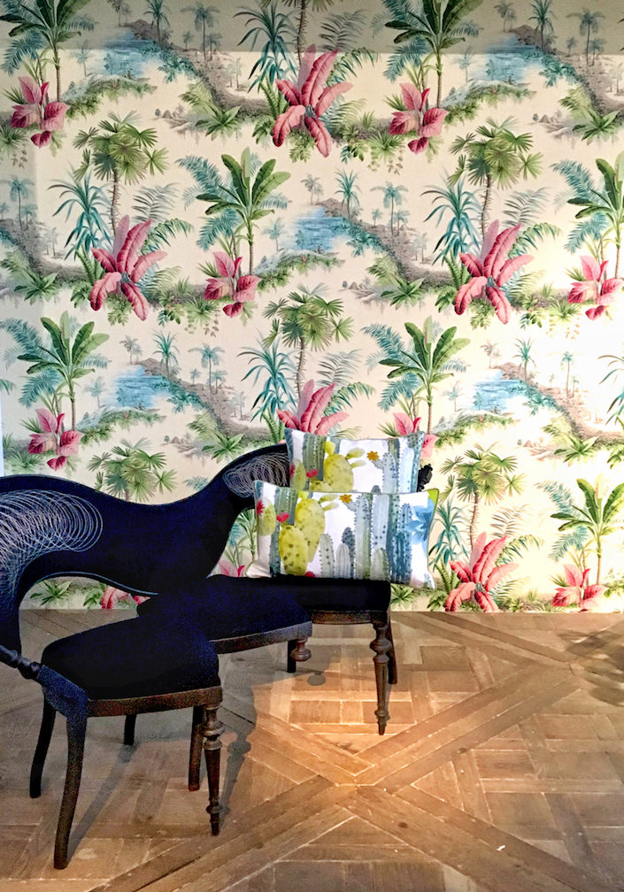
A favorite wallpaper pattern Alexandrie evokes the tropical splendor of the jungle behind Sebastian Brajkovic’s curvaceous upholstered bronze Conversation Piece.
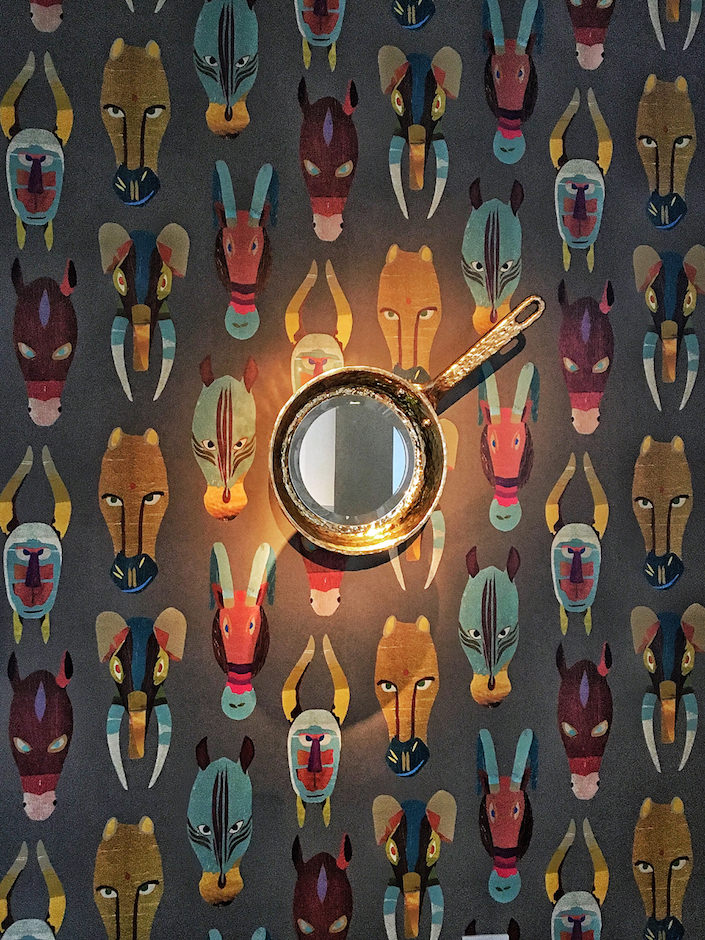
 With tribal influences, Pierre Frey’s Marabout illustrates animal masks influenced by statuettes of African art. Its whimsical quality is echoed in Studio Job’s Pan Wall Mirror.
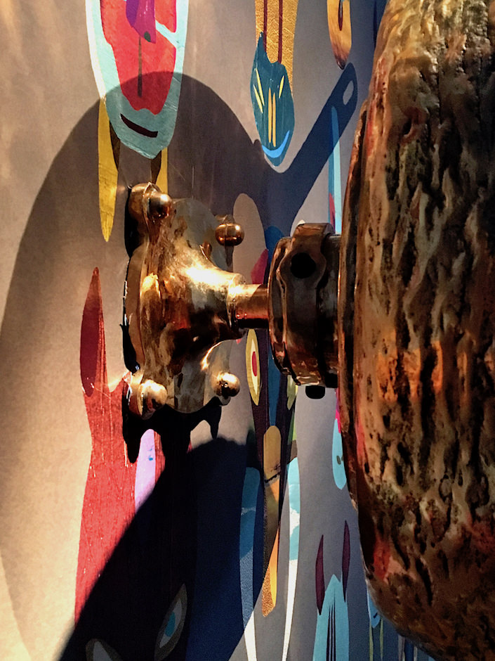
Of polished and patinated bronze, the back view reveals its clever swivel functionality.
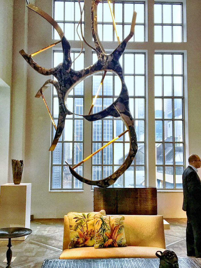
In the middle of the gallery hangs Vicenzo de Cotiis’ monumental DC 1706. Of brass, marble, antiqued glass tube and neon, it is a marvelous melange of old and new, refined and raw and, like all pieces at Carpenters Workshop, art and function.
Tuesday evening, I was delighted to join a group of esteemed design friends to celebrate the new trade program at Incollect. While the carefully curated and vetted art and antiques platform is available to the public, the In The Trade program confirms their commitment to interior designers and architects by offering them exclusive access to new inventory 8 days prior to the general public.
 Including over 300 of the world’s finest dealers, Incollect allows design professionals to communicate directly with sellers to get more information, negotiate prices and arrange shipping.
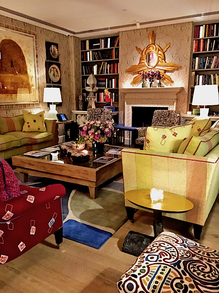
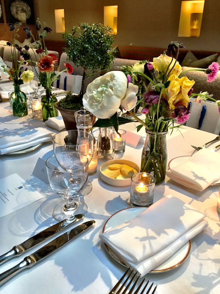
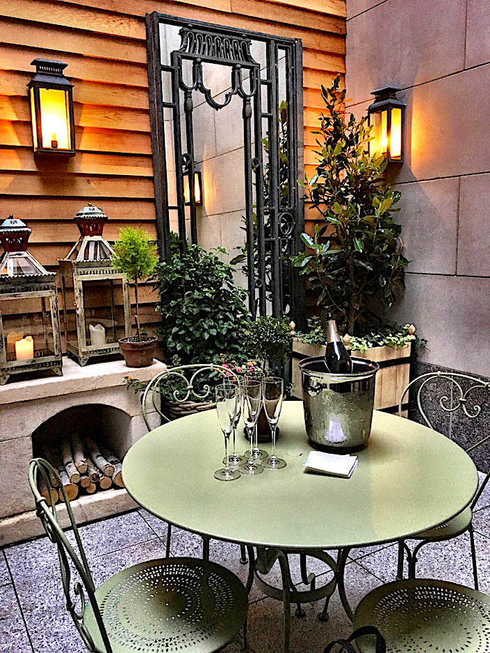 At a dinner co-hosted by Architectural Digest at the chic new Whitby Hotel (the uptown sister to the Crosby, both stylishly designed by Kit Kemp) it was a marvelous opportunity to catch up with friends and learn more about the program. Starting with cocktails in the cozy Drawing Room, top, and charming outdoor terrace, above, we segued into dinner in the beautiful Orangery, below,
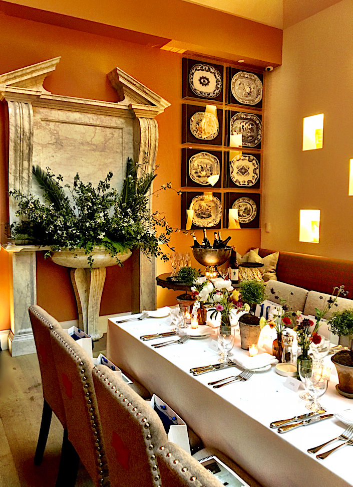
where dealer, designer and stylist Michael Bargo executed all the charming floral arrangements.
Wednesday morning I attended a preview for Michael Berman‘s new collection with Fromental. Based on the aesthetics of the 1920’s and 30s, all the wallpapers start with hand drawn sketches, which are then scanned at full scale at the Victoria & Albert, with their machines, used for fine art, archival and record printing. This allows for depth, detail and a perceptible hand in all the designs.
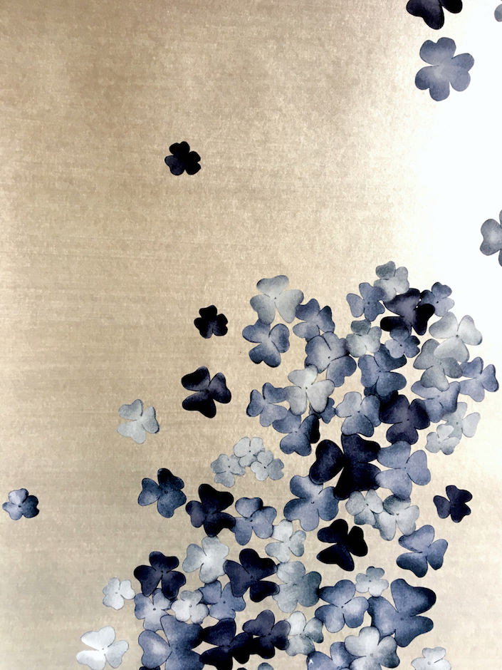
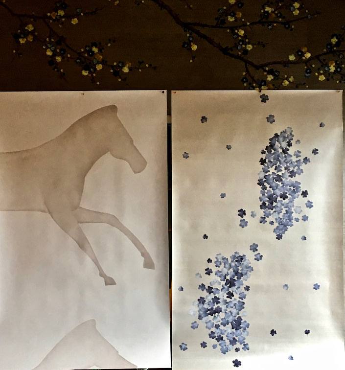 Palio, on the left, above, features graphic equine segments, referencing the famous Italian horse races. On the right is Blossom, an elegant design inspired by Kyoto screens from the 20s. A close up, below, shows the beautiful background and delicate flowers.
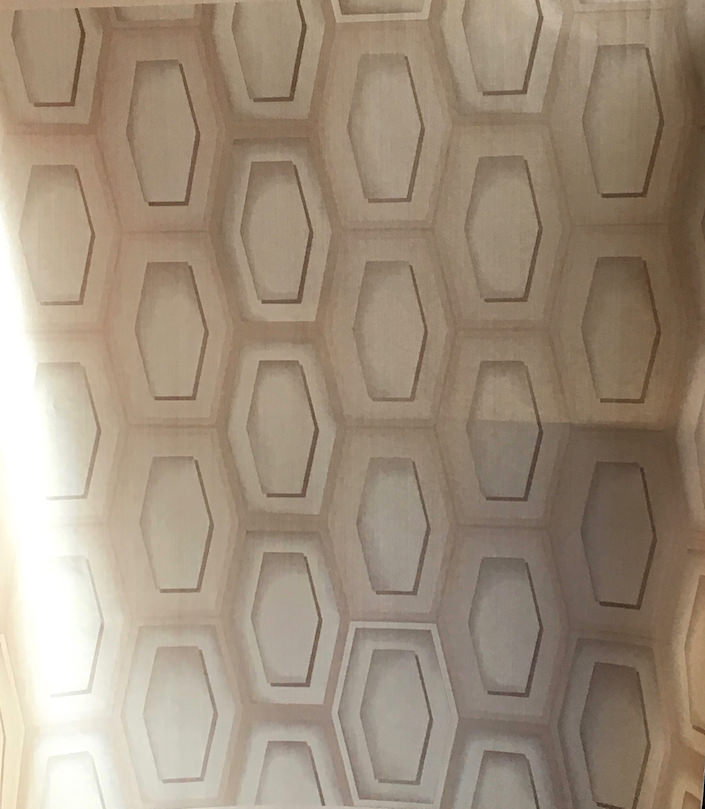
Hex celebrates the machine age with its graphic appeal.
Inspired by the backs of textiles, Scrim is a plain that adds incredible and versatile texture to almost any room.
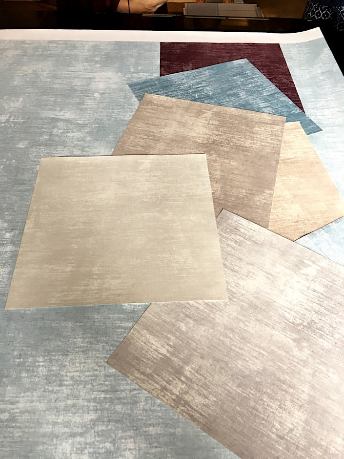
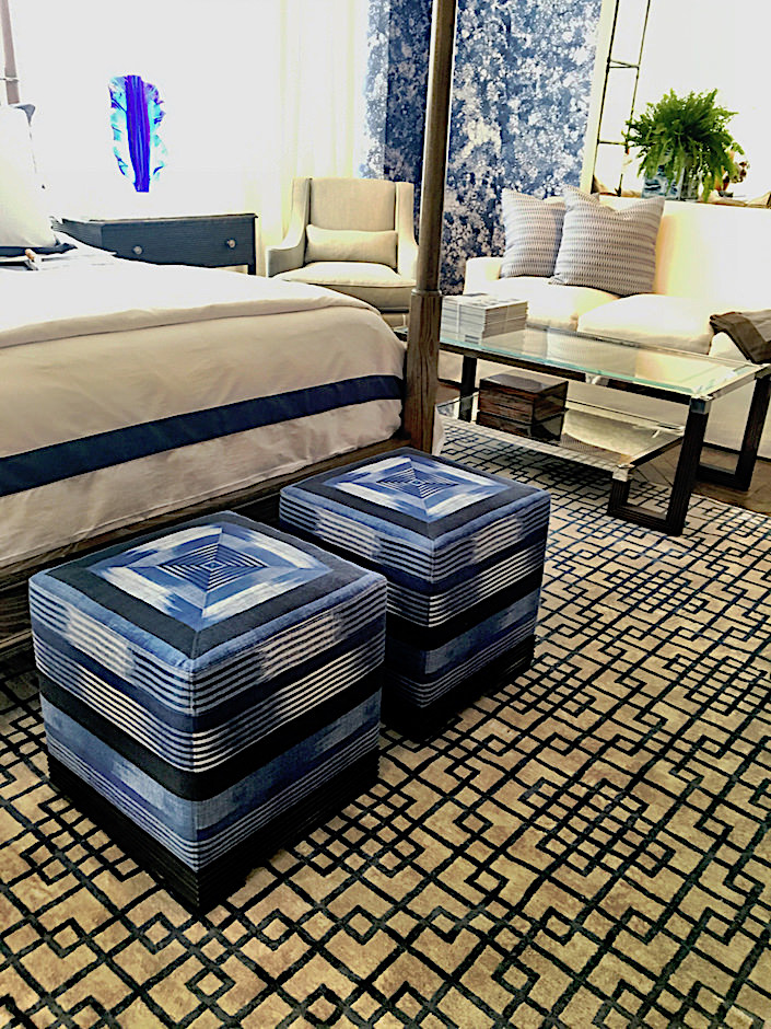
Wednesday was also Spring Market at the D&D Building and a big thank you to all who attended my talk with Marshall Watson at Ferrell Mittman. His vignettes in the showroom showed just how versatile his collections can be.
My final stop of market day was at the new THG showroom to see Timothy Corrigan’s new collections for the French manufacturer. Recalling the elegance of the classic interwar era, Timothy’s collections celebrate the beauty of jewelry and decorative objects of the period. West Coast offers a mix of materials, from rhodium plated sterling, below, to rose gold to 25 other options, all with guilloché, a decorative technique featuring a mechanically engraved intricate pattern.
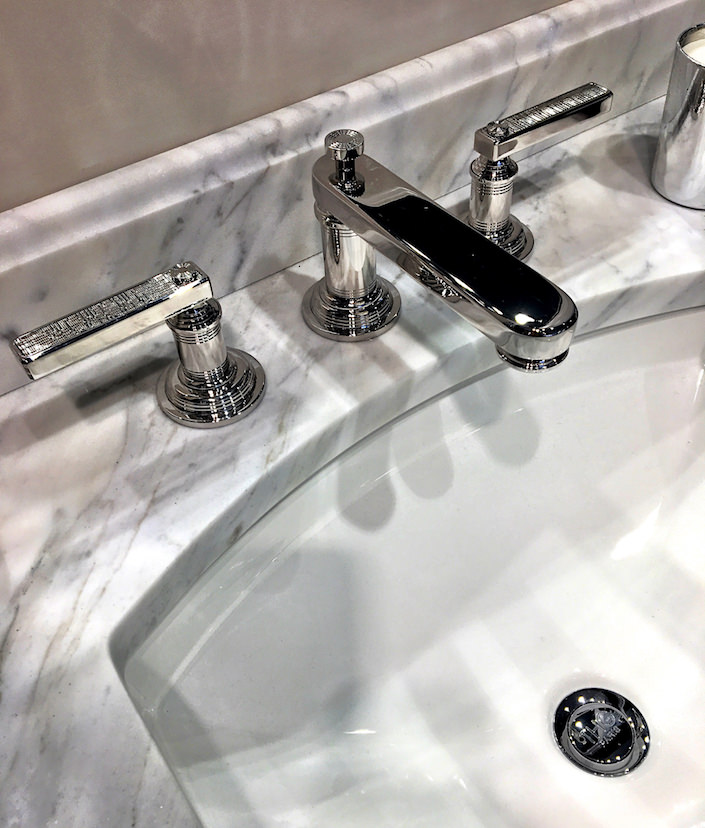
The mix and match options are endless.
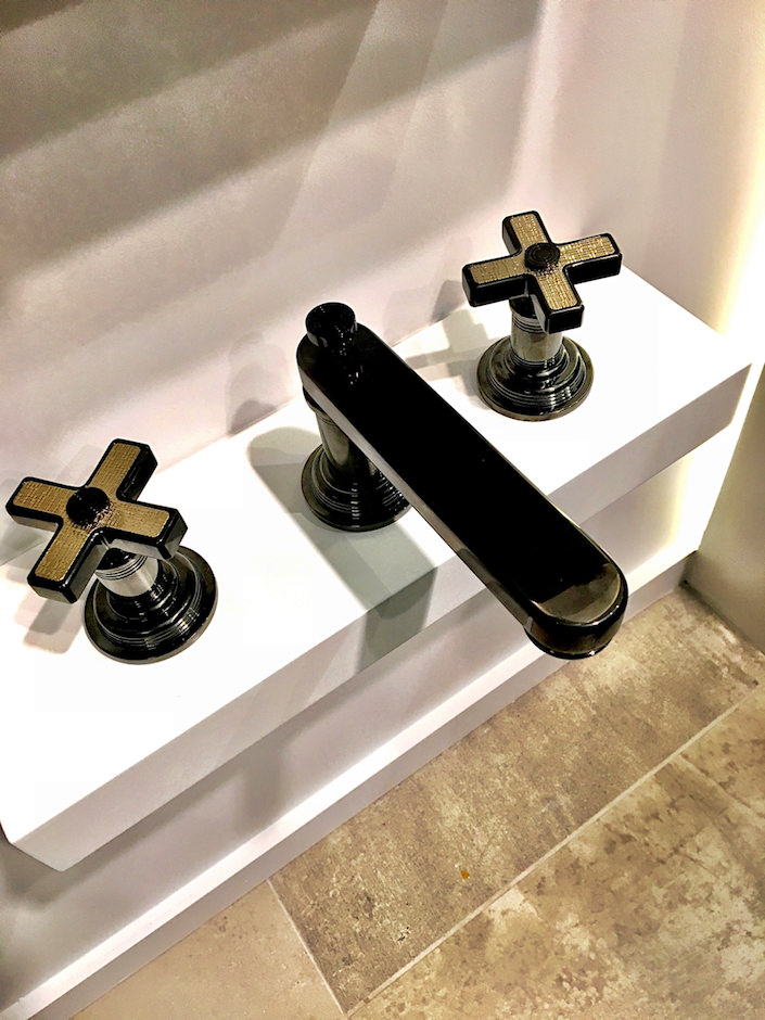
The Grand Central collection features ribbed metalwork, inspired by the columns outside of the celebrated train station, with thin pinstripes as accent details. This version below shows the handles inset with the option of white onyx. As Tim explains, “For me, beauty and detail are a basic part of the THG-Paris DNA. I tried to mix the best of both worlds into this new collection – both Grand Central and West Coast reflect a combination of French classicism and All-American boldness and optimism.”

all photos by Stacey Bewkes for Quintessence
My last stop of this very busy week in design was a small dinner feting friend Gaye Tapp for her marvelous new tome, How They Decorated. Stay tuned for more about this insightful look at sixteen of the most stylish 20th century icons and their creative homes.




Those dandelion lights are mesmerizing. But I wouldn’t want to dust them.
Aaaah, the Whitby. What a perfect setting for gathering with friends after such a thought provoking day. I’ve decided it’s my new home-away-from-home.
You have all the fun! :) franki