Even before Nick Olsen received official Rising Star status from the IFDA (International Furnishings and Design Association) last fall, he was already well on his way to gaining design recognition. With a degree from Columbia followed by an internship at Architectural Record Magazine, he then snagged a coveted position working for Miles Redd. Inspired by the master, Olsen fixed up his small studio apartment with such ingenuity that it landed on the cover of the Domino magazine November ’06 issue. Editor-in-chief Deborah Needleman then tapped him for their popular “Deal Hunter” blog which he penned until the closing of the much loved publication.
In 2010, Olsen went out on his own and has been on a roll ever since. This year, he created his first room for Design on a Dime and was named one of the new trad designers in Traditional Home’s recent issue of TradHome (nominated by previous winners Tilton Fenwick).
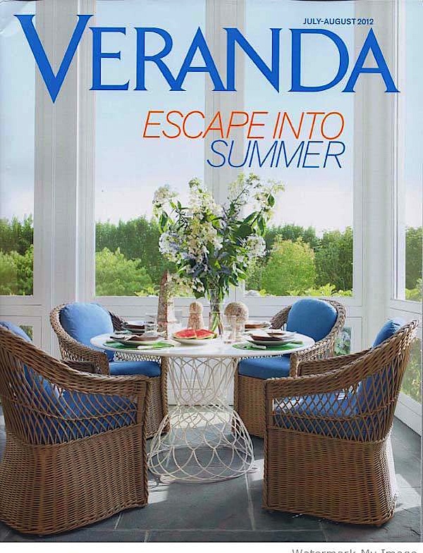 I was thrilled to get a peek at this month’s Veranda, which features Olsen’s biggest project to date. While it’s clear from his Domino days that he knows how to create great style on a budget, his educated eye knows the difference and it shows in this beautiful Manhattan renovation. Completed for a family with a young daughter who wanted to update and enliven their traditional Beaux Arts pre-war, Olsen proved that it is indeed all in the mix. With “color, pattern, and a mix of their own antiques, auction finds and contemporary pieces” he breathed life and a youthful, yet respectful exuberance into the classic space.
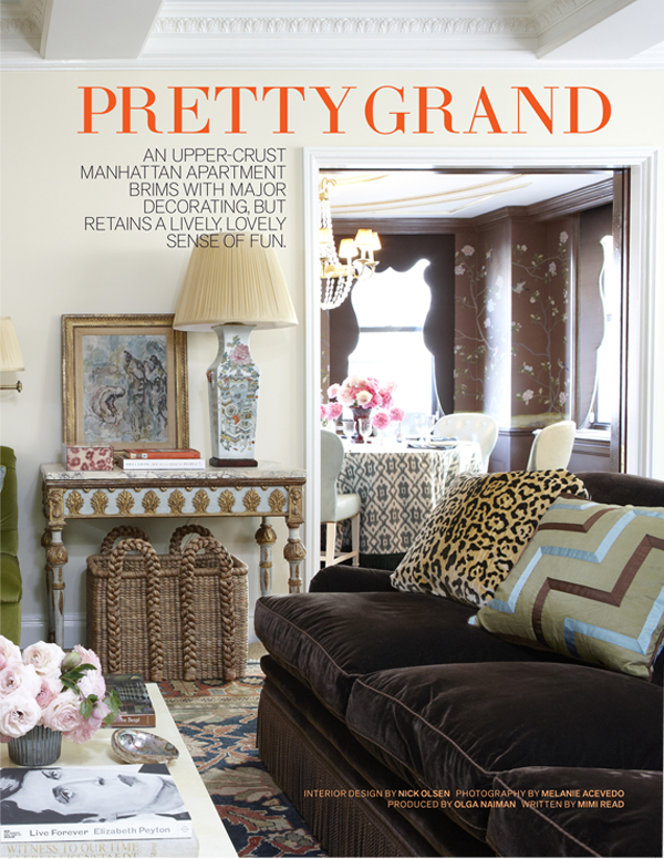 This is truly the essence of new traditional. As Olsen explains, “I’m 78 at heart. I’ve always loved old, grand things.” Ah – but it’s what he does with them that makes the difference – and like those who are very good at a skill, he makes it all look so effortless, like the pairing of the classic Clarence House silk jaguar pillow with a contemporary geometric one from Oscar de la Renta for Lee Jofa (Redd is the OdlR Home creative director). Or the way the rustic chic rush basket sits so comfortably beneath the 19th century Italian console he found at auction. And take a gander into the dining room beyond where an ikat tablecloth, custom Moores & Giles blue leather chairs, hand painted De Gournay silk and scalloped lambrequins at the window all play together so harmoniously.
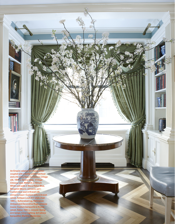
How beautiful are these vintage raw silk curtains in an elegantly genteel shade of “stepped on” green against the contemporary chevron of the stained floor. And this omnipresent color of the season looks totally fresh against the blue walls and white trim, both echoed in the arrangement on the 19th century library table.
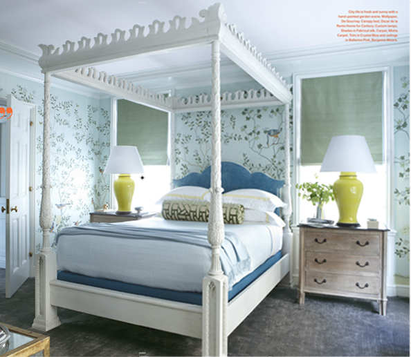
In fact the colors in the apartment echo back and forth as they transition from one room to the next. Blue, brown and green create a comfortable flow thoughout yet are punctuated by bright surprises to keep it lively. The four poster, originally brown, was given a coat of white to take the edge of the seriousness of the piece. And while the custom yellow lamps don’t exactly “go” with the gorgeous De Gournay wallpaper, they add that little oomph that Nick Olsen loves to inject. And there are plenty more unexpected surprises – the entire apartment is the result of an expert mixmaster at work, balancing it all like a fine tuned instrument. You’ll just have to take my word for it until you can see for yourself!!




His work is beautiful, and his booth at Design on a Dime was fantastic! Great post Stacey!
Bubble & Squeak
You can definitely see Miles’ influence on this talented designer.
His work has matured to classic elegance that is fresh and young!
Nice post!
Karolyn
The Relished Roost
Wow! We’ve been Nick Olsen fans for a long time!
Anazing!! So thrilled for Nick and love the review and sneak peek, Q!
Worship!! Yay Nick Mr. Chicness
No fair you got a sneak peek at Veranda but I’m so glad you did so we get to see more of this young designers fabulous work!
Enjoy your weekend Stacey!
XX
Debra~
Gosh, what a “job” you do on these descriptions…I just “live in the moment!” Thanks SO much! franki
So beautiful. I always love your posts, what a great site. Tks.
Gorgeous! I love the layers to Nick’s work. Thanks for the sneak peek!
Nick is truly a master of the mix! Can’t wait to see the new issue… How fun to see you last night and so glad we had a chnace to catch up!
xxoo
Nicely done! A big fan of de Gournay wall paper. The color scheme is lovely.
Wow- just stunning! The room in the cover photo is perfection!
It IS all in the mix, right?!! Loved seeing you last night and love this peek at this New Traditionalist. Love that Nick has always loved grand, old things….because he’s giving them new life.
Gorgeous apartment!!
~ e
Nice review! Nice basket tucked under the Italian console and those silk drapes are gorgeous!
Have a wonderful weekend
leslie
This was such a nice treat to come across today. Can’t wait to pick this issue of Veranda up..thank!!
Nick Olsen is very, very, very good. Those over-sized yellow lamps with the blue & white really make me sit up and take notice. Great post. Mary
i want THAT DIME!!!
absolutely divine.
and he has one of my favorite things….
a dark choc. velvet sofa to fall into.
thanks for a great post!
;)
Can someone tell me the actual name bedroom wallpaper? I was on De gournay but couldn’t find it. Too many designers.