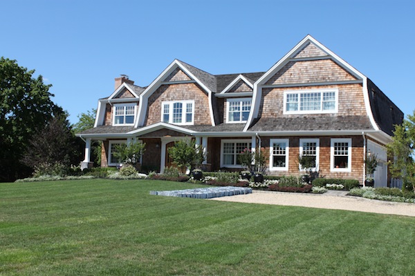
Saturday evening, Traditional Home magazine hosted several bloggers to get a sneak peek at their Hampton Designer Showhouse. What a treat! This marked the twelfth year of this wonderful event benefitting the local Southampton Hospital and we were graced with a gorgeous evening to stroll through the house, meet the designers and celebrate at the festive preview party. This year’s subject is a new 8,500 square foot, shingle style house in Water Mill built by Grande Design Residential.
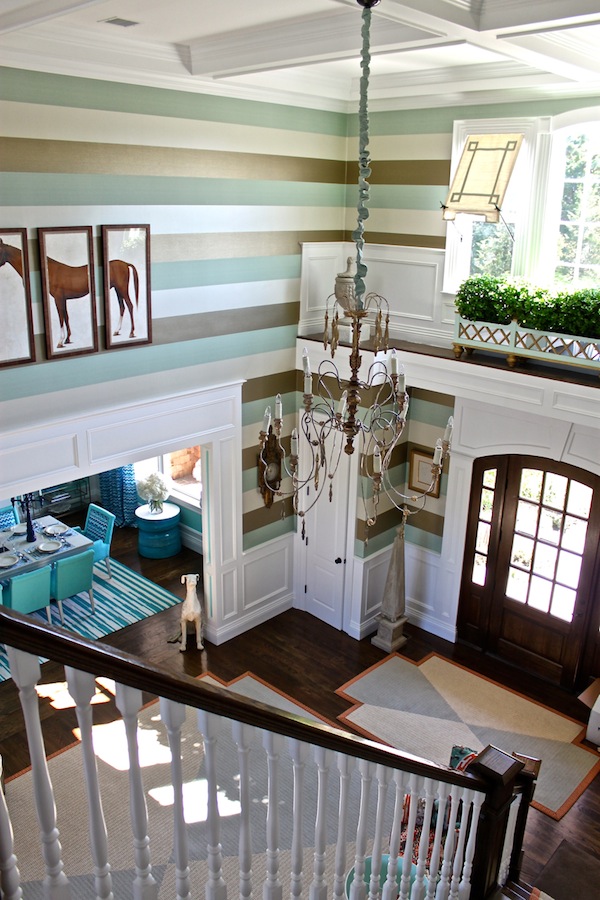
Upon entering, you are greeted by a handsome double story entry designed by Kentucky designer Lee W. Robinson. With a soothing color scheme referencing the coastline location, Robinson took full advantage of the height of the space with a fabulous Osborne & Little stripe wallpaper, the horizontal direction effectively enhancing the soaring ceiling.
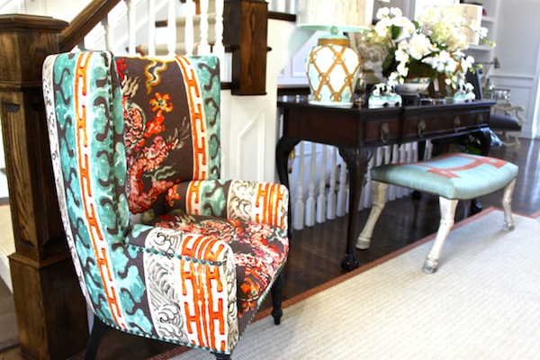
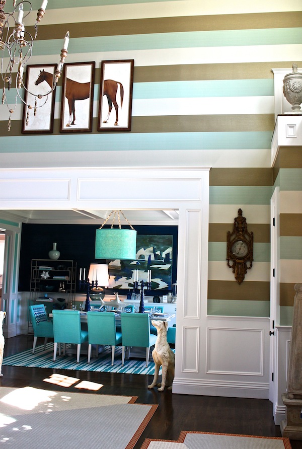 Robinson described the space as “bluegrass meeting the coastal serenity of the Hamptons,” his Kentucky roots expressing themselves in the equine references throughout. Note the subtle “H” motif in the elegantly exotic Jim Thompson fabric on the wing chair
and related, more linear version on the armchair in front of the graphic taped screen.
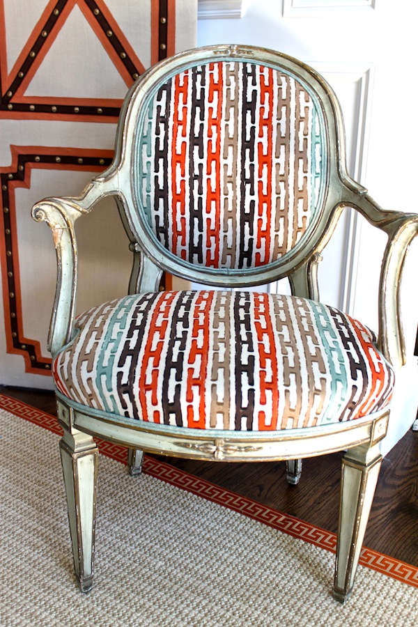
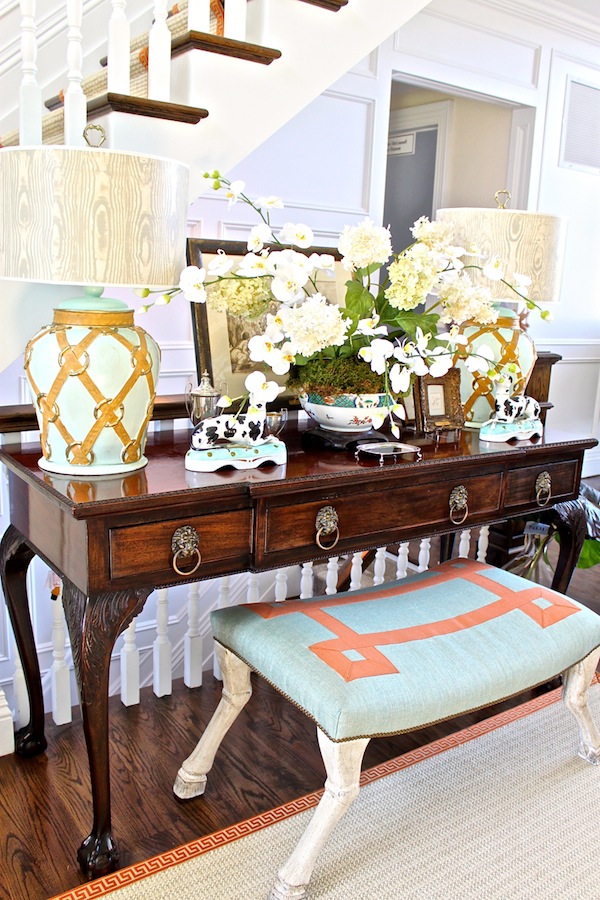
You can imagine how much I loved the mix of orange with the cool aquas and grounding chocolate brown – the perfect melding of equestrian and ocean life colorways. This classic vignette continued the motif with a pair of bridle bit lamps and horse legged stool. Yet tempered with the Staffordshire dalmations and other traditional accoutrements, the scene retains a fresh yet timeless elegance.
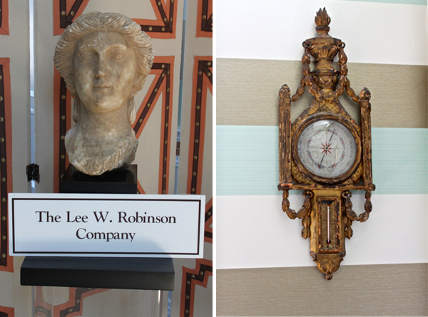
Touches of antiquity offered a glint of glamour and gravitas
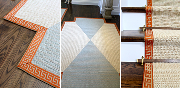
Such a large and airy entry could have felt cold but Robinson filled the space with terrific tailored details, such as the orange Greek key tape on the rug as well as stair rods, and large geometric pattern.
And you can see how he fully utilized the entire space, all the way up to the coffered ceiling.
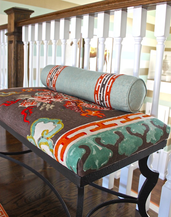
On the landing above, Robinson tied into the space below
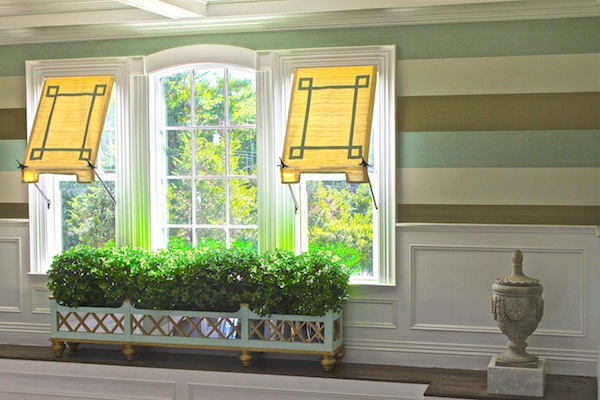
but the pièce de résistance was the charming ledge above the doorway, which Robinson designed like a mini terrace replete with decorative planter filled with NDI boxwood topiaries, urns and directoire style awnings/shades.
The showhouse is open daily through September 3, 11 am to 5 pm. And for those who can’t visit in person, we will continue to take our virtual tour here so do stop back!



so chic! Also absolutely loving that window ledge! Great visiting this year’s showhouse via Quintessence…can’t wait to read/see more.
I can’t wait to read and see more from you! Especially since I won’t be able to make it to the Hamptons to see. This entryway is gorgeous, and I love the color palette selected. Absolutely classic and traditional with a refreshing feel. Thank you for sharing!! And as ever, your writing is absolutely perfection!
Thanks so much for the glimpse into that stunning home! I enjoyed seeing some Jim Thompson fabric – that’s not one you see every day but one worth using, I think!
Love the window treatments – very creative way to finish off those high windows and still let the light in!
Thanks for sharing Q! Was sad to have missed the party so this is the next best thing, can’t wait to see more.
xo J
LOVE all of it! Any idea where the fabric on the bench upstairs came from?
Hi Elizabeth – yes, the fabric is the same Jim Thompson as on the wing chair!
Beautiful home, love the Jim Thompson fabric. Gorgeous fabrics!
i love the colors, the combination of materials and, the textures. GREAT shots you have shared so that I can study the details many times over. (I often go back to your old posts.) Fabulous!
What a fun, eclectic space – I’m especially in love with that Louis chair and feel a painting coming on. Since I won’t be making it to the Hamptons I’m so grateful for your virtual tour, Stacey. Thank you! XO
You ARE such a tease…CAN’T WAIT FOR MORE…this is going to be a good one! That JT fabric is fantastic!!! franki
I live in Lexington, Kentucky and I’m very familiar with Lee Robinson’s showroom and his work in Louisville. He has such a wonderful flair in his design and I’m quite sure that the polo set will embrace the equestrian design in this space as well as his great use of color and unique fabrics. Wish I could see it in person!
I love the exterior looking awnings inside of the foyer; so “cheeky”!
Talented use of Jim Thompson! The equestrian/sea connection – creative vision.
Even though I missed the House Opening I really enjoy the pictures! I love the details, the color choice and the pattern and the orage that come back throughout different spaces and objects! Great Pictures and thank You for sharing!