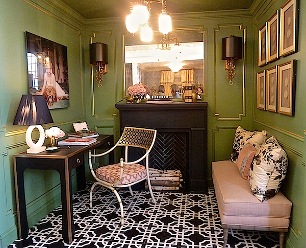
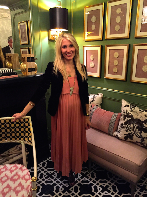
Today we continue our look at this year’s fabulous Rooms with a View 20th anniversary showhouse, celebrating the legacy of Albert Hadley’s original vision. Jenny Wolf‘s “Le Jardin Vert” was a cozy yet sophisticated ladies’ study/lounge executed with a sophisticated “mix of traditional elements updated with a modern twist.” Bold doses of black tempered with pastel hues and luxurious fabrics resulted in “a dramatic space that still felt calm and feminine.”
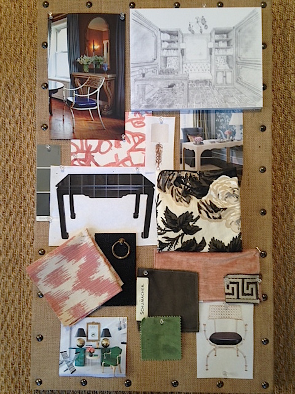
You can see on Jenny’s original mood board how her inspiration evolved into her fully conceived vignette.
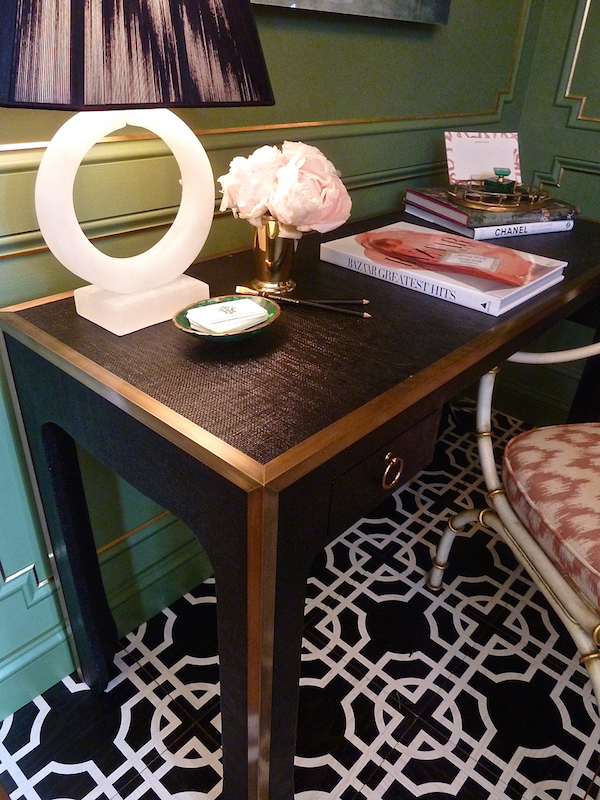
The beautifully executed millwork, painted in Farrow & Ball’s Calke Green and accented with gold leaf detailing and antique mirror served as a timeless architectural backdrop and the black and white hand crafted Mirth floor tiles offered “a fresh take on old school glamour.”
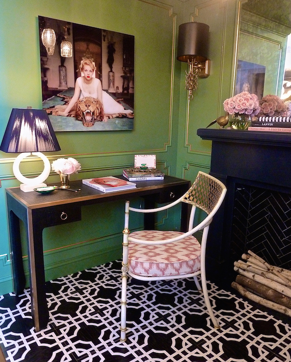 Amanda Nisbet’s Cielo Arm Chair for Niermann Weeks, with its contemporary white metal finish and classical allusions was a curvy complement to the handsome black lacquered grass cloth desk with brass framing that Jenny designed specifically for the space.
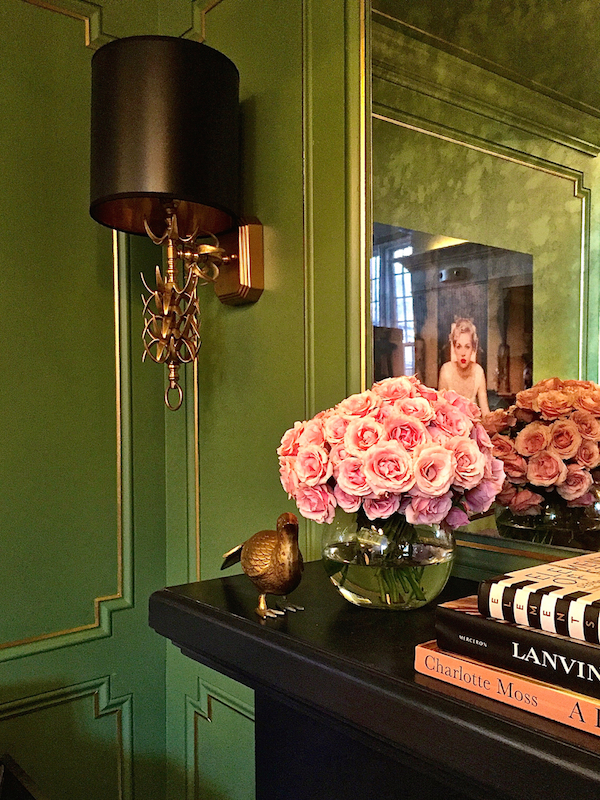 The brass detailing is echoed in the Ro-Sham-Beaux palm sconces, above, and Serena and Lily’s Alabaster Lamp furthered the contrasts of texture, shape and materials.
A custom bench from Thibaut in a blush linen was bedecked with pillows echoing the vignette’s bolder elements with a feminine touch and special significance. Schumacher’s black and white floral chintz Hollyhock was first used in 1962 by Albert Hadley for his client Mrs. Pyne – a lovely nod to the event’s founder.
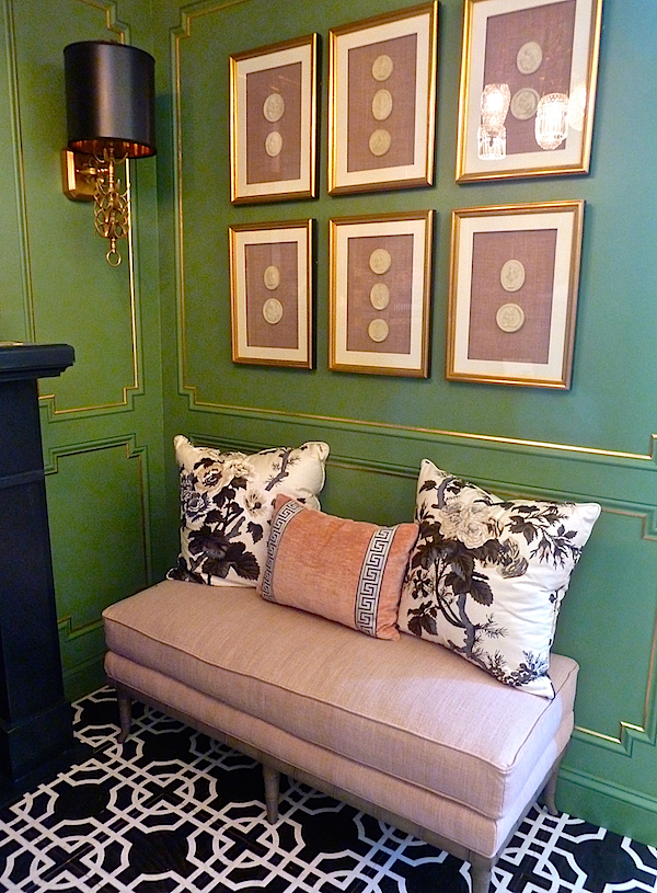 Even the art presented an appropriate contrast between traditional and modern. The custom framed intaglios, on blush linen, were an understated and refined contrast to the sexier expression of femininity in the Slim Aarons print from Jonathan Adler above the desk. I’m sure Jenny could certainly use a comfy place to repose when at work – wishing her all the best with her latest addition to her family!
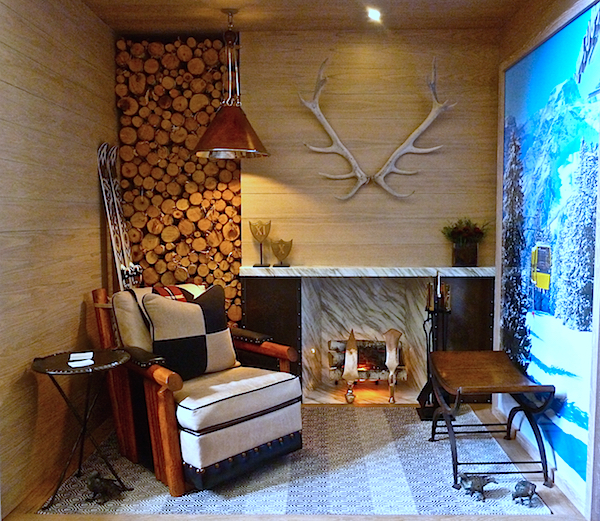
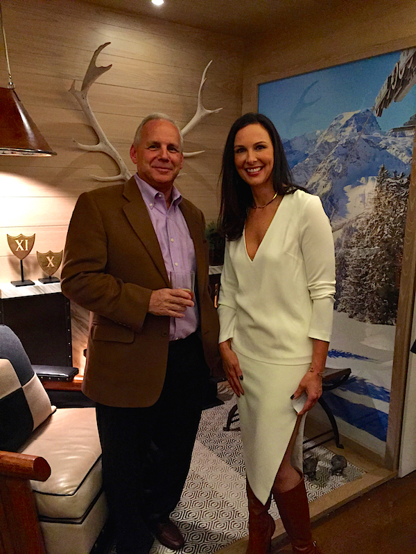
With the sudden change in temperature this week, Forehand + Lake’s “Alpine Exposure vignette was right on the money. Using this year’s 20/20 Vision theme’s tagline “classic simplicity with an unexpected modern flair,” Raymond Forehand and Christina Lake “set out to create an après ski environment with our take on the bare essentials needed to last the winter in the Swiss Alps. We wanted a simple rustic feel, while incorporating some more refined elements.”
 Yes, please! I think I would be much more inclined to brave the slopes if I knew I was returning to this enveloping space. You can see how the original rendering for the room morphed into a more luxurious version of chalet chic.
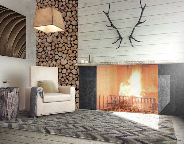
With a marvelous melding of rustic and elegant elements, the designers created a space exuding comfort and sophisticated style. “We envisioned that our occupants were just returning from an arduous day on the slopes and with the chill beginning to creep up on them the inclusion of a fireplace was paramount.” Their rendition was of beautiful grain matched marble, edged with contrasting bronze panels with bold rivet details and accessorized with gorgeous sleek fireplace equipment from John Lyle.
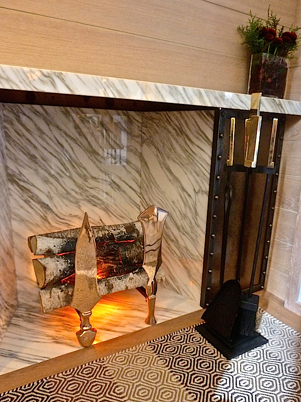 “Once seated in our Molesworth style chair (from Marc Taggart) it was necessary that a supply of wood be on hand so that nothing would interrupt the view through the door of friends returning from the mountains and the libation in hand.”
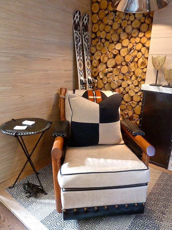
“We employed an array of textures to achieve our refined rustic feel. The khaki, brown and ivory inlay rug (from L&M Carpets) reminds us of a cozy wool sweater and softens the sophisticated marble fireplace and sleek bronze andirons.” Paul Ferrante‘s wonderful leather and steel hanging light fixture (in top photo), side table, above, and curved bench below contributed a sophisticated handcrafted sensibility. And cast doves from Holly Hunt added an artistic element from the natural world.
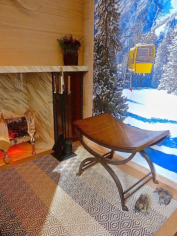
I think Raymond and Christina were ready to brave the winter in style.
Like Patrick Mele, Sara Gilbane‘s room got its inspiration from her fabric collaboration with Peter Fasano. For her vignette she reworked her Gypsette into a multi color version wallpaper.
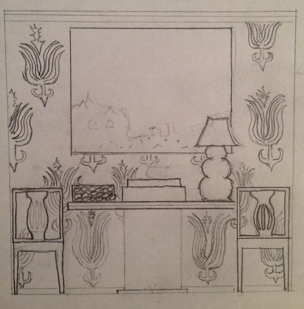
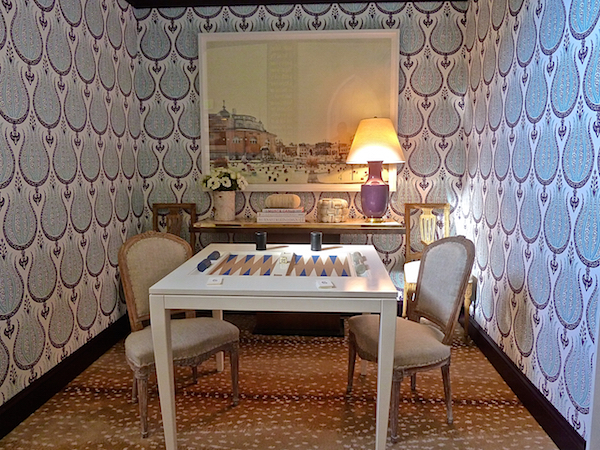 The bold pattern anchored the space, as can be seen in her original sketch below, and worked seamlessly with the smaller scaler of the carpet. “The antelope carpet by Stark is an all time fave and it finds its way into most of my clients’ homes as it is classically chic, timeless, and ultra durable.”
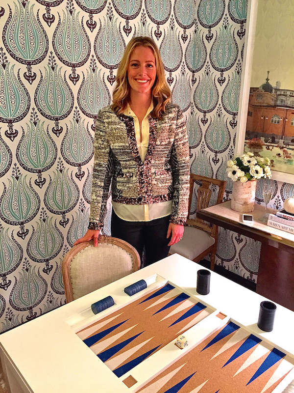
 “The sky blue and aubergine on white gives the wallpaper a sophisticated snap and is the perfect back drop for my game room.” Sara then chose complimenting Farrow and Ball colors for the trim and ceiling and a Christopher Spitzmiller lamp in a coordinating shade. With a few large scale pieces, the enormous summery photograph by Yiorgos Kordakis holds its own and adds a fresh spirit to the space
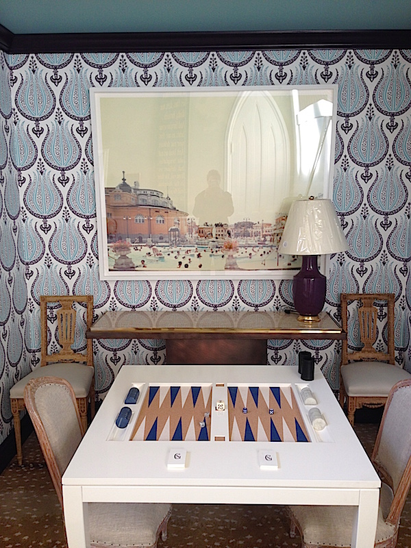 “The Oomph backgammon table is just too much fun and gives you a place to go sit and play. Plop a lucite cover on top and you can use the table for anything. I love to mix traditional, modern, antique, and contemporary as it creates just the right frisson in a space. Bringing in the two gorgeous yet clean lined antique pairs of chairs (at the table from Bermingham and against the wall from John Rosselli) creates charm in a space that has many contemporary pieces.”
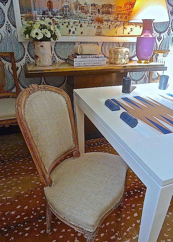
The multi-material console walks the line between old and new. With clean spare lines, it feels contemporary but is in actuality a French piece from the ’70’s. I loved seeing how Sara has now taken Gypset to its next incarnation.
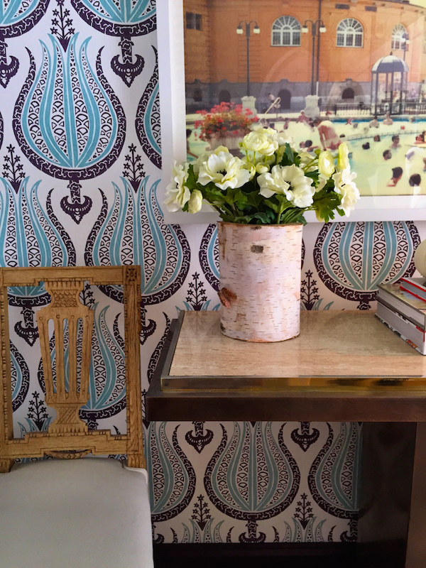 It really makes the space and shows how versatile such a large scale pattern on the wall can really be. I’m sure Sara would agree.
Stay tuned, there’s lots of great design coming soon – more vignettes from Rooms with a View and a behind the scenes video visit with several of the designers as they prepared their rooms at this year’s Holiday House fundraiser.




My maiden name is Molesworth, hence an affinity for Thomas Molesworth’s style. I spotted that chair straight away. That might go on a Christmas wish list.
The lead off room is divine. From the initial plans, I would never have thought Calke Green but it’s perfect. Loving the way the black plays off of it. Wonderful post!
And…love Sara’s jacket!! franki
Gorgeous, Stacey. I think Jenny Wolf’s space has to be my favorite. Love the color combo of pink, green and black. The Thibaut bench is to die fore. What a beautiful perch for being quietly creative! XOXO