Since 1901 Kindel Furniture has been hand making fine American furniture in Grand Rapids, Michigan. Whether their own designs or those from Dorothy Draper, the Winterthur Museum or architect Robert A.M. Stern, their bench made pieces reflect over a century of experience and commitment to quality craftsmanship.
 And now, Kindel has collaborated with designer Eric Cohler to give the brand a timely update. I stopped by the unveiling of their brand new showroom in the New York Design Center to chat with Eric and see the fabulous new look, above.
 By translating many of their iconic pieces with new finishes, colors and tweeks, Eric has given them new life, offering inspiring examples of how to harness the power of Kindel’s limitless customization options. The iconic Pinwheel dresser above, for example, looks fresh and crisp in Benjamin Moore’s Hale Navy.
 The classic double pedestal table is totally transformed in a new cerused oak finish. Eric even had the hairy paw feet recarved so that they are now a bit more graphic and a little less hairy – retaining the stance of the past yet looking forward. It still looks beautiful with a Hepplewhite chair, updated in a luxurious Edelman ostrich. But as Eric pointed out, the table would also look fantastic paired with a Mies van der Rohe Bruno chair in white leather.
 While keeping the beautiful neoclassic lines and painting on the classic Baltimore Settee, Eric has coupled it with a Rogers and Goffigon glazed linen, giving it a vibrant new look.
 The Irish side chair is reenergized with silver leafed legs. And covered with a snappy stripe in an indoor outdoor performance fabric, it is child, pet and even red wine friendly.
 Even the timeless Queen Anne chinoiserie chair was updated for contemporary living with a carefree indoor outdoor fabric.
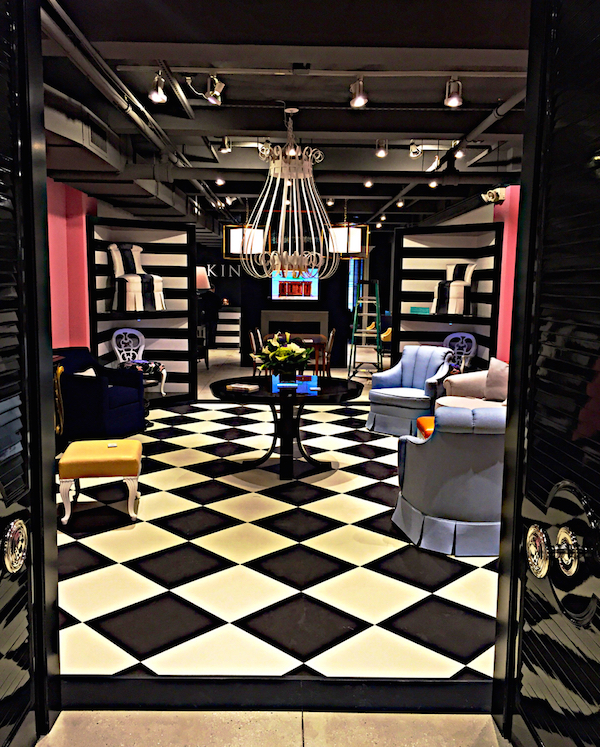
 Eric found these gorgeous doors in a salvage house and had them stripped and lacquered. With statement making hardware from P.E. Guerin, they are the perfect segue to the Dorothy Draper boutique in the center of the showroom. Through the doors you can see her chandelier, the original of which is in the Met. An ode to the Carlyle hotel, the black and white theme is carried throughout with jolts of bright pink.
 Here signature pieces such as her Braziliance Commode, named for her work at the legendary Quitandinha hotel outside of Rio, reside. While shown in classic black and gold, above and below,
 you can see in the original photograph on display how striking it is in white with black as well.

Her Camellia House Bench looks so chic swathed in the perfect shade of orange lizard printed leather.

And her Dorotheum Sofa, normally on a wooden plinth, is shown skirted, giving it a little more movement and lightness of being.

The round Mark table, originally made for the Mark Hopkins hotel in San Francisco, is bold and elegant in its new lacquered incarnation.
 Based on the concept of the Luce study center at the Metropolitan Museum, Eric created these corner niches so that the furniture is available for inspection, trial sits and interaction with other pieces.

The next space is devoted to the Robert Stern collection introduced several markets ago.
 His modern interpretation of classic design elements with its strong Deco influence is echoed in the Chesney’s mantel that Eric commissioned for the space.
 Behind the fireplace wall is another small gallery with several more pieces including a traditional Sheraton sideboard which received a subtle makeover.
 Contrasty inlay was muted and brass hardware was replaced for the first time ever with silverplate versions.
 A foundry in Michigan was sourced to make the pulls in a living finish that will tarnish authentically with age. Inside there is the option to paint the drawers in any color you wish.

And another Draper piece, the Westbury dressing table, was reimagined in the same Hale navy.
 In the back of the showroom, behind closed doors, is a small library/resource center.
 Here designers and/or sales people can sit with clients to look at products and/or books.
 Potterton Books, which relocated last year to the building, can also send up volumes for perusal or purchase. And Eric outfitted the doors with Guerin hardware to remind visitors that they are a compatible resource when designing a piece at Kindel.

And that is one of the qualities that sets Kindel apart. Each piece is built to order and any accommodation, whether in hardware, finish, wood or design, can be made to create the exact product you desire. The new showroom is meant to not only be a beautiful environment but to inspire what is possible.
 Eric’s updates are great examples how Kindel can bridge the gap between traditional American craftsmanship and a fresh outlook on design. Congrats to both on a successful creative collaboration!


During the 90’s I bought many kindel
Pieces – I even had a custom chaise made to match my Baltimore settee. I visited the factory and met all the workers on my chaise – I shared photos of their
Furniture in my home. One lady exclaimed” I painted those gold lines on your dining chairs!”. I love their furniture ,
I own over 20 pieces and wish I could start again with this new update. Fabulous!
A giant step in a 25 year period of ‘safe’
greige American interior decoration!
Finally decorative and colorful furniture
to take us out of the doldrums.
Originality and style are back!
Brava Dorothy Draper and bravo Eric
Cohler ….and to Kindel too!!
Love those new lacquered finishes and the painted drawer interiors and especially any furniture made in the USA.
Simply stunning with glorious detail. The first chest in Navy with gold bamboo is perfection, although I could choose many! Great job Eric and Kindel!
xoxo
Karena
The Arts by Karena
My dad called on their company as he worked for House Beautiful for 15years !They have great furniture ,Ilove that navy chest
Anne Rose
Every element featured in this post is such a work of art. I love the rich colors, attention to details and all of the finishes whether they are metallic, lacquered or polished painted or sewn!