Having a show house during High Point was a wonderful way to both highlight local and national talent and provide inspiring decorating ideas that got everyone’s cogwheels turning while shopping the market. Kudos to the Junior League of Greensboro and Traditional Home for assembling such a great group of designers who all contributed innovative and stylish solutions. The large living room on the first floor was a knock out rendition by Miles Redd for Century furniture, using some pieces from the Oscar de la Renta line, for whom Redd is the Creative Director.
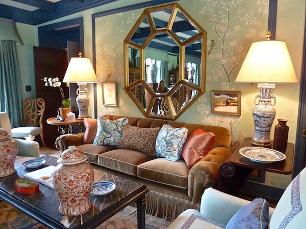
One end was anchored by a comfortable seating area and the other by the fireplace, in a sea of elegant cool blues.
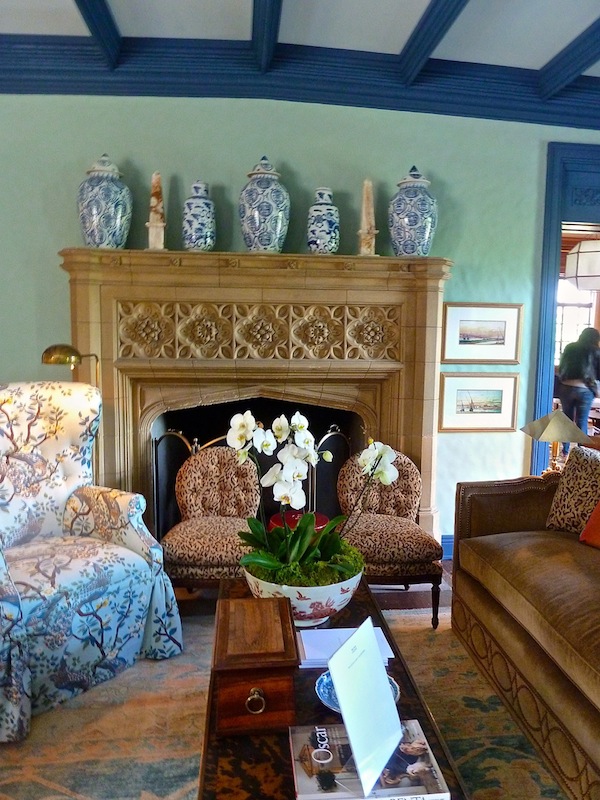
Although an enormous room, the space was graciously divided with various groupings that could function beautifully for effortless entertaining.
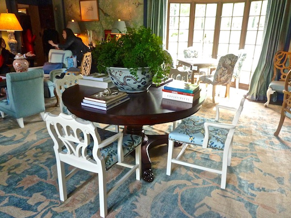
With his signature mix of old and new, painted and wood finishes, whimsical window treatments and lush layering, Miles set the tone for luxurious living at Adamsleigh.
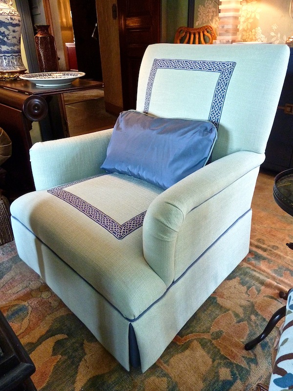
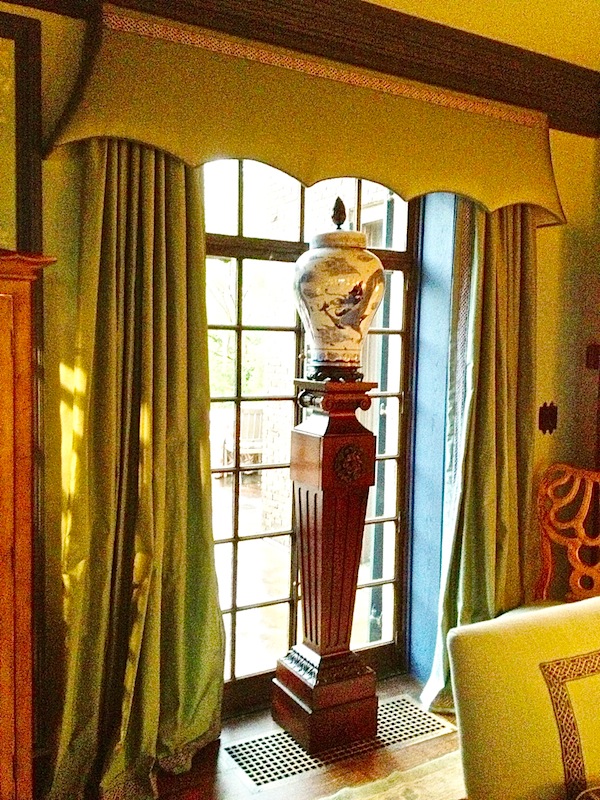 Everyone seemed to love the colors and decorative detailing on this chair.
Next door, Suzanne Kasler‘s den for Hickory Chair was an ode to elegant neutrals. Starting with the beautiful paneling original to the house, the tonal treatments let her focus on forms and shape.
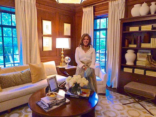 I love how the otherwise refined space is punctuated by bold graphic punches. Kasler’s oversized Morris lantern for Visual Comfort related perfectly to the Hicksian hex in the rug.
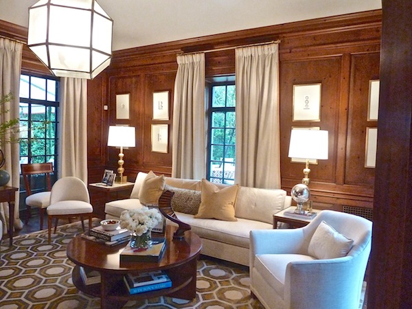
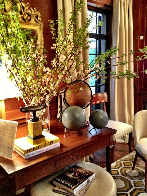
Pops of yellow and gold provided the accent colors in the room. Whether books in the spare styling of the bookcase
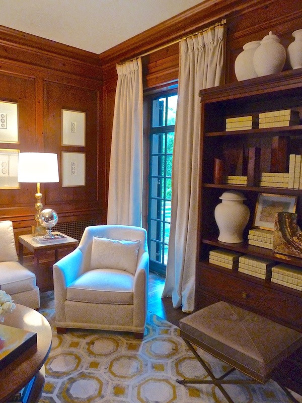
the burnished brass of her jewel-like leather topped Lille bench
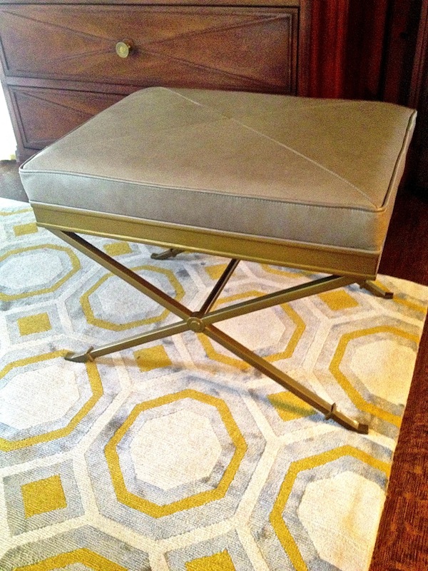
or the flowering branches and gilded mirror in her layered vignette, her room was thoughtfully orchestrated for a soothing yet elegant, updated look.
Local Greensboro designer Ann Legette was also dealt a handsome paneled room. Responsible for the design of the library, she dealt with her show house room slightly differently. The beautiful custom hand-dyed silk curtains set the cheerful tone for the space.
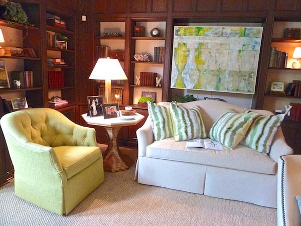
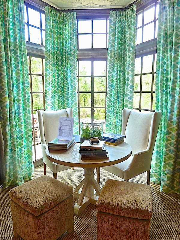 A sophisticated melding of classic design with modern touches, her room featured citron yellow and green shades that were the perfect fresh counterpoint to the brown woodwork. Wesley Hall upholstery and Bunny Williams Home’s gold Hourglass table offered comfortable yet stylish design.
Eric Cohler was sponsored by Pearson to design the sun porch. He created an incredibly vibrant eclectic mix with their versatile pieces including the parchment coffee table I loved last market and a fabulous folding custom screen.
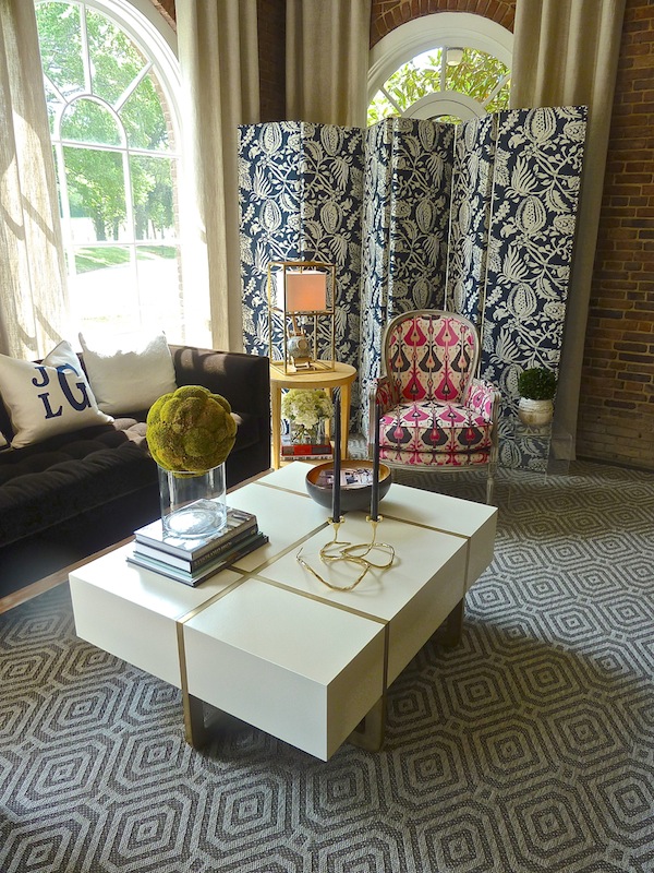
I loved the creative styling on the coffee table (corner paperwork notwithstanding).
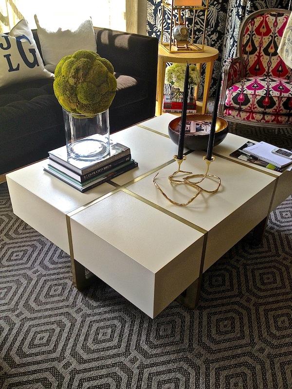
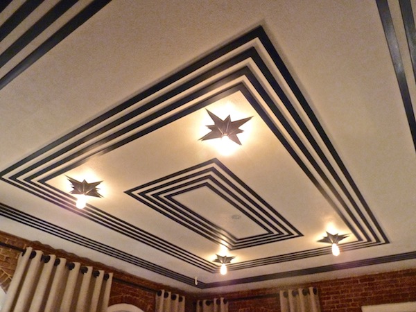
As many have noted, the hex pattern trended strong at market and looked great in this Stanton rug. The graphic pattern played stylishly against the fantastic detailing of the ceiling.
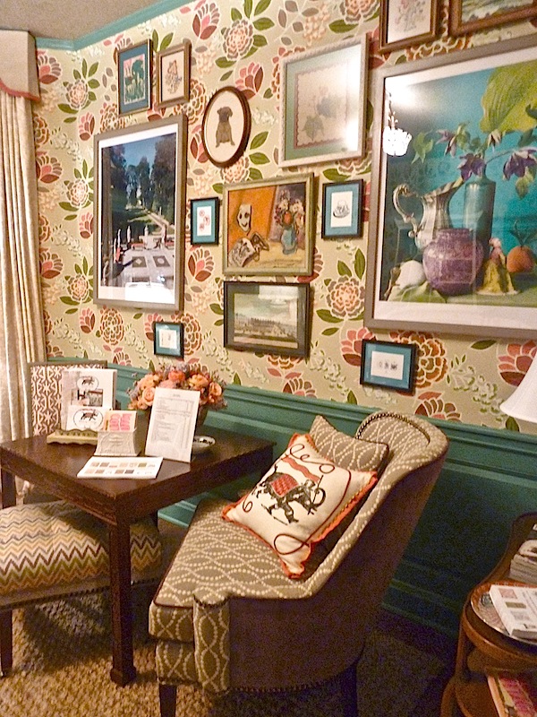
 John Loecke and Jason Oliver Nixon of Madcap Cottage designed a playful breakfast room. With a nod to tradition and featuring a panoply of pattern, their show house room was indeed like a charming cottage injected with a dose of modern personality
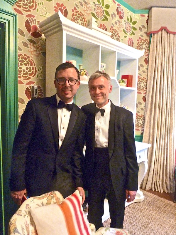
The small space packed a punch with a large scale Thibaut pattern on the walls, retro charm valance, Kindel Dorothy Draper Console and Curio, the designers’ new pillow collection and appropriately scaled Thibaut furniture.
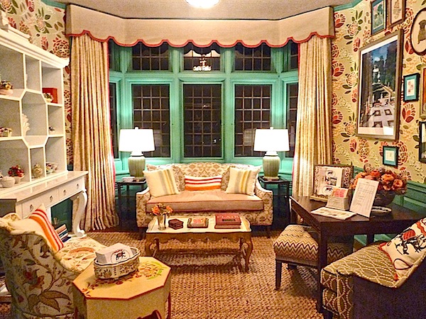
A collection of vintage art adorned the walls adding layers of visual interest.
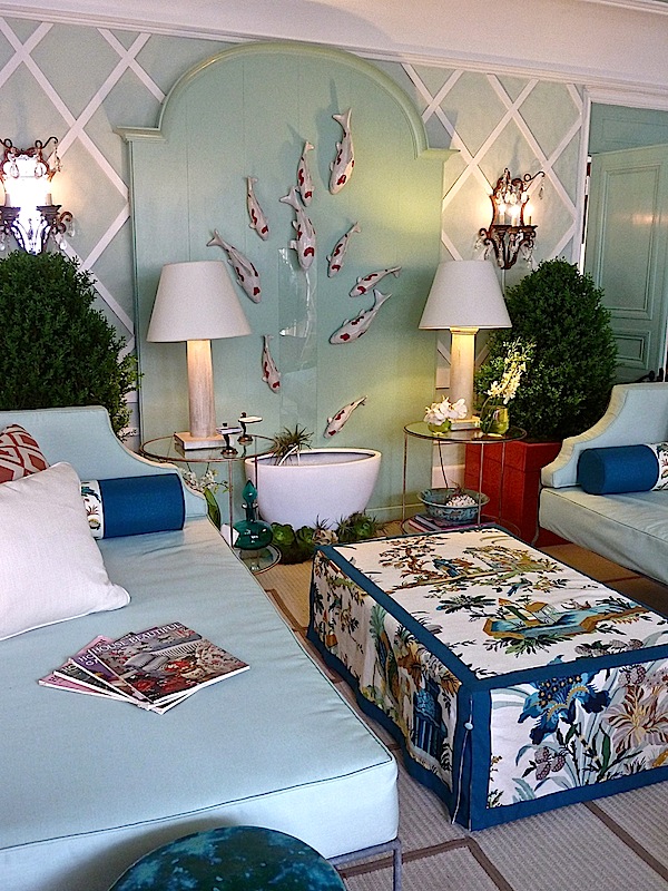
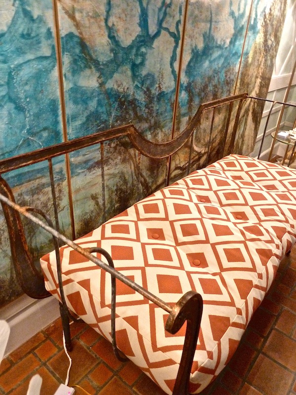
Our final peek at the first floor is the sun room by Bradshaw Orrell Interiors and Randy McManus Designs, who also designed the outdoor terrace, which got rained out on my visit to the show house. A gorgeous pale palette of aqua, blues and orange were just right for segueing to the outdoor living spaces.
A marvelous mix of textures and materials, from shiny and new to aged and vintage yielded a fresh scheme with interest and layered vitality.
Stop back tomorrow as we go upstairs to conclude our look at this Junior League show house.




Just incredible to see all the talent and collaborative efforts to create such a stunning show house. I love your images and tour. Thanks for taking me along!
pve
That framed wallpaper on image #1 is a “done deal!” Then that last photo…be still my heart! franki
What a great idea to inspire High Point visitors with a home displaying so many of the beautiful designs, not to mention the chance of seeing top designers translate their talent into a real setting. The Mad Cap breakfast room has so much character – would love to have our morning cup of coffee there! We hope you had a wonderful Mother’s Day, Q!
xxoo
C + C
Now, that’s an incredible JL Showhouse! What stellar talent to have designing each room….all of which were creative, detailed and inviting!
xoxo Elizabeth
Fab recap of the first floor Stacey! Thanks for the coverage! You have a way with words. Love the way you see things!
great coverage and several things I would like.