One of my favorite sections in House Beautiful is the Kitchen of the Month. So when I heard a project from designing friend Young Huh was going to be the November feature, I was extra excited that the magazine let me share a sneak peek.
We often discuss about how important it is to bring personality into a project to add authenticity and life to the decor. Well this client didn’t need any convincing. Her goal with her renovation was to recapture the feeling of her childhood home, a simple yet “real” kitchen that was utilitarian yet homey. And she wanted it to fit with the rest of her circa 1900 house in a seamless way.
You’d never know by looking at the result that this wasn’t the original space merely outfitted with modern appliances. Young summed it up, “There’s a humbleness to everything, but also an elegance in the attention to detail and the quality of the materials.” The client knew she wanted a farmhouse table instead of an island not only for the evocative period effect but because she loves to bake and the table height is easier for kneading.
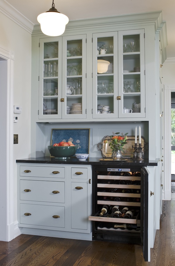
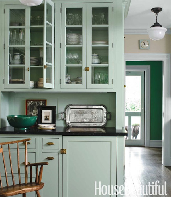 But as Young explains, it wasn’t easy getting everyone on board with the concept. “What was interesting about this project was the client’s determination to achieve a handcrafted, original quality to her kitchen even if it meant going against conventional kitchen design and construction practices.” Plain and Fancy, who produced the handsome shaker style cabinets, were a bit surprised Young and her client wanted to hand paint them instead of ordering their perfect factory finish. “The client and I spent a lot of time mixing colors ourselves to simulate the color of the cabinets in her childhood home. Finally we settled on Farrow and Ball’s Theresa’s Green,” a beautiful blue-green that “is at once retro and fresh.”
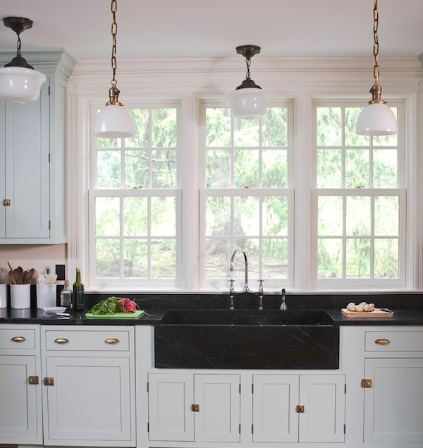 “And the contractor was taken aback when he learned that there would be no recessed lighting, but rather incandescent vintage pendants all of which required some rewiring.” Soapstone counters and sink, while a traditional material, offer a crisp clean contrast to the cabinetry. Warm brass pulls and latches from House of Antique Hardware complete the vintage look, even successfully concealing a below-counter subzero wine fridge below.
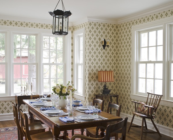
While not included in the article, Young was kind enough to send me this shot of the attached breakfast room to get a greater sense of the house. Papered with Farrow and Ball’s Ranelagh , the furniture is the client’s own and there are intentionally no window treatments so that she can see her children coming up the drive after school. It’s all these subtle touches that help evoke the client’s cherished childhood memories she wanted to replicate.
Young says that her firm’s first step is always “understanding our clients’ vision as well as their lifestyle.” Helping her “transform her vision into reality” involved going back in time to move forward, creating a stylish well functioning kitchen that feels as though it has always been there.
Young credits stylist Gregory Bissonette, whose love of old things was so perfect for this shoot as well as editor Samantha Emmerling and photographer John Hall, all of whom brought great creative yet focused energy. Clearly a good time was had by all as “afterwards, we all sat down and ate the styling props along with some short ribs that the client had made the night before.”

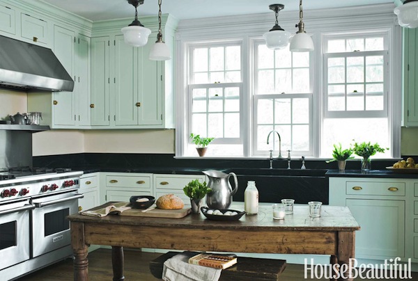

I love the vignettes on the counters, it makes such a difference when you decorate those spaces.
This will sound overly reductive but how lovely to see a home and not a showhouse! :) Right down to the pupper peaking in the back door…
Have a great day Stacey!
H
This kitchen reminds me so much of my grandmother’s kitchen–happy memories. I love workable “no-ego” kitchens where you can sit with a great cup of tea or coffee and simply “be”–thank you. Mary
WOW~love this. My favorite part is the lack of recessed lighting, gorgeous…
Real life I love it and I love this kitchen. I love the farm table in the kitchen and wanted that in mine but was talked out of it, I am now going to get rid of my island for what I really wanted. The only thing I don’t care for is there are to many lights hanging from the ceiling but I understand the owner not wanting pot lights.
XXX
Debra~
Lovely. Wonderful daylight in this kitchen. Love the cabinet color and hardware.
Thank you.
Delightful! The bowl and the adjoining room color…gorgeous…the puppy waiting to come in just made me smile. :) Now…I think that those brass handles are the frosting. franki
Wonderful! My first thought was that the color is perfect: a modern twist on a vintage color. (It’s also a nice compliment to the Wolf knobs.)
Although the lights over the island seem undersized, I offer a standing ovation for omitting the recessed lights.
Beautiful kitchen and what a wonderful story Stacey! It really brings the room to life, knowing the ins and outs of how and why a space was designed. I too love House Beautiful’s kitchen of the month. I will definitely be pinning these images!!
http://www.donnaviningblog.com
Absolutely beautiful! I love the color, and I love that she used a farmhouse table. Beautiful.
Happy Thursday, Stacey.
Teresa
xoxo
Thanks for the sneak peak Stacey! The dog peeking through the mudroom belongs to the stylist. Glad to see he made it into the shot!
So excited to see the early farm table. Claire new it was what she wanted the minute she saw it. Great seeing early country from our shop in such a beautiful setting. Well done!!!
So excited to see the early farm table. Claire knew it was what she wanted the minute she saw it. Great seeing early country from our shop in such a beautiful setting. Well done!!!
I’m not sure how we missed this one, Stacey! Simultaneously retro and fresh is the perfect way to describe Farrow & Ball’s Theresa Green. Coupled with Young Huh’s insistence on hand painted cabinetry, it is a stroke of genius, pun intended! It’s a lovely, stylish kitchen because of all of those “old fashioned” touches, like lack of recessed lighting and brass hardware with a healthy patina. Congrats to Young Huh!
Great kitchen! Did I miss in the article the countertops? What kind are they?