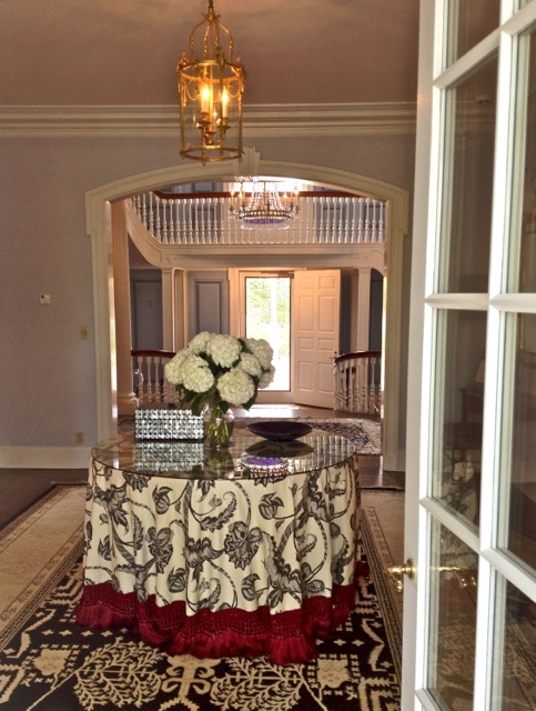
 Beyond the foyer, which I have shown before, is a reception area, linking both the front and back entrances and the living and dining rooms on either sides. Previously dark and unattended, it is now a cheerful graphic segue between the other spaces. Jamie Drake, in a somewhat toned down palette from his signature exuberance, achieves this successfully by combining the Vallier Vine table skirt from his collection for Schumacher with a Safavieh rug and elegant platinum walls.
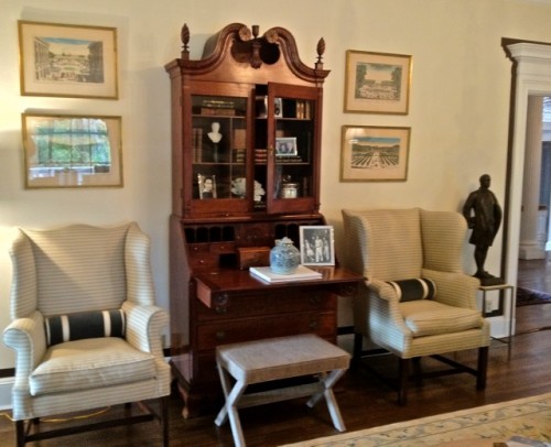
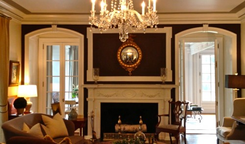 The living room is a classically elegant space and yet Susan Bednar Long has infused it with youthful touches reflecting the current residents. The fabulous brown accent wall, in Christopher Peacock Paint‘s Bitumen anchors the large room. Throughout the residence, an effort was made to use existing pieces and the secretary, now housing family pictures, is one of the most significant pieces in the home.
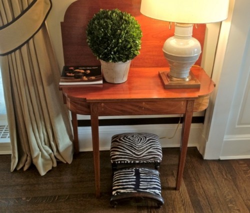
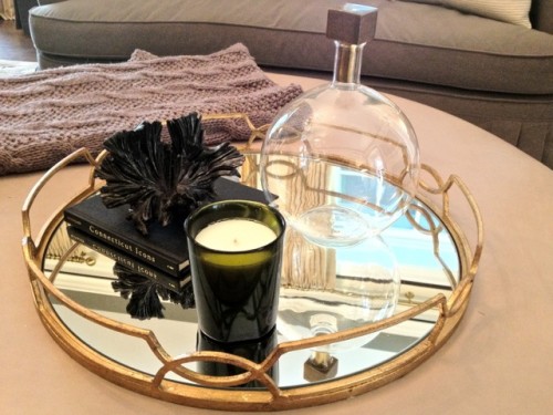
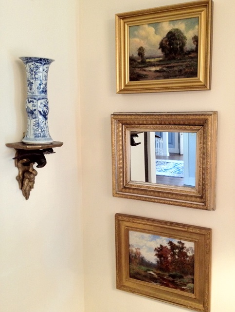
Thoughtful vignettes throughout the room add rich layering to the space.
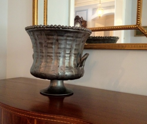
I love the unusual finish on this Frances Palmer pot and how the pearl edge plays off the beading on the mirror.
Across the reception area is the formal dining room. Designed by Sandra Morgan, the space is a delightful interplay of yellow and blue.
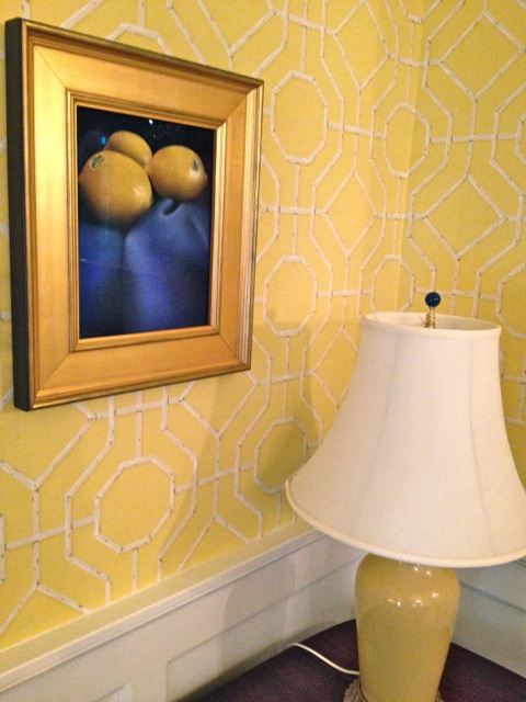
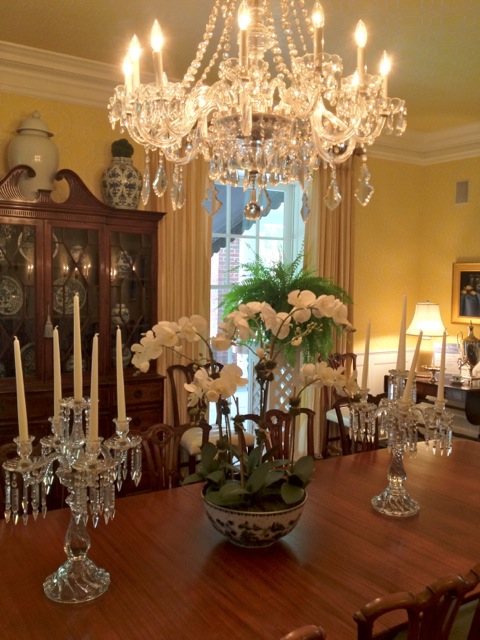 Sophisticated yet light hearted, no detail was overlooked. You can’t see above, but the Cowtan & Tout Bamboo wallpaper extends onto the ceiling lending it a subtle textural pattern. And see how the blue finial is the final touch in this coordinated colorscape?
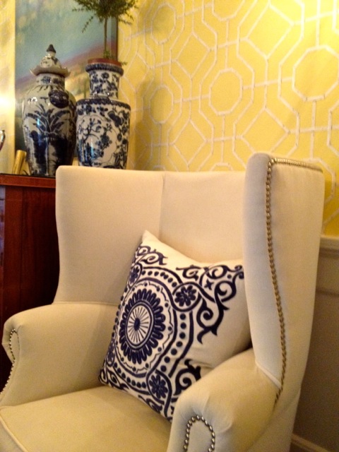 Nailhead trim was a trend spotted everywhere at the recent Highpoint Market.
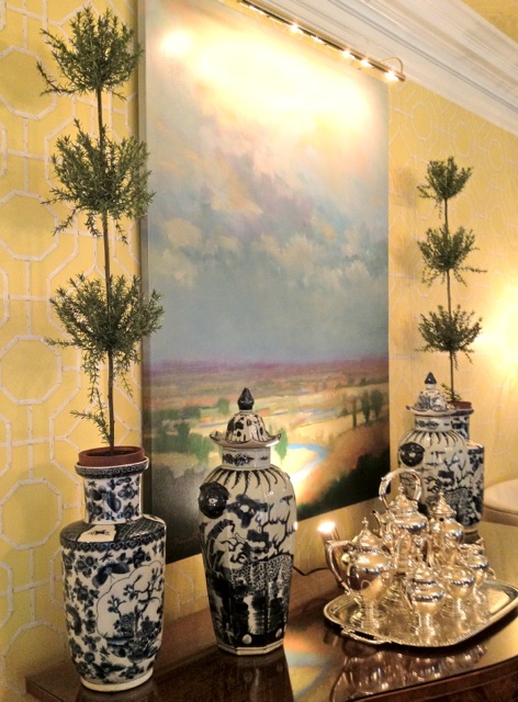
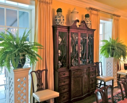 I love the pedestals Sandra designed for the space. They give it a fresh modern feel within a traditional context.
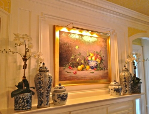 Beautiful Diane James floral arrangements grace the mantel, table and sideboard.
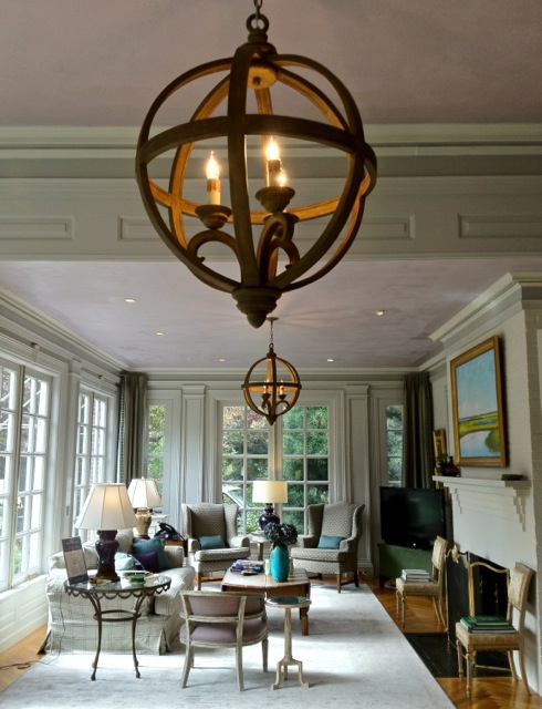
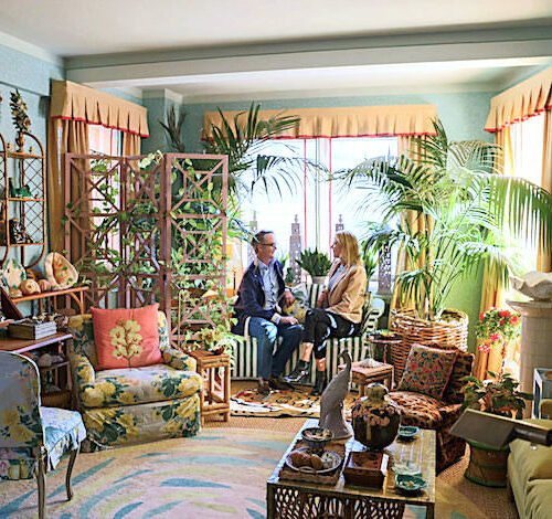
Philip Gorrivan‘s sunroom is an artful mix of comfort and casual chic. A large space, Gorrivan divided it into a comfortable seating arrangement and a family dining area. This room has visual interest everywhere.
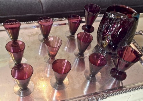
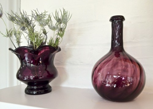
I adore the Currey & Co. Axel Orb chandeliers, one of many beautiful fixtures they supplied throughout the residence. Their celestial form complement perfectly the ethereal ceiling color – a mix of Benjamin Moore‘s Violet Petal under a glaze of Light Pewter. This hint of lavender is then echoed in the Lillian August ceramic lamps, Gorrivan’s Highland Court fabrics, and Mrs. Malloy’s own collection of amethyst glass.
Every effort was made throughout the residence to incorporate the Malloys’ own furnishings as well as repurposing and/or refinishing furniture already at the residence.
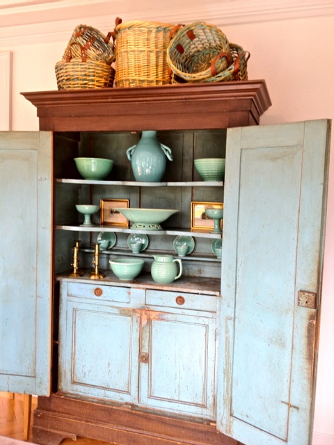
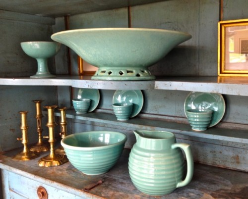
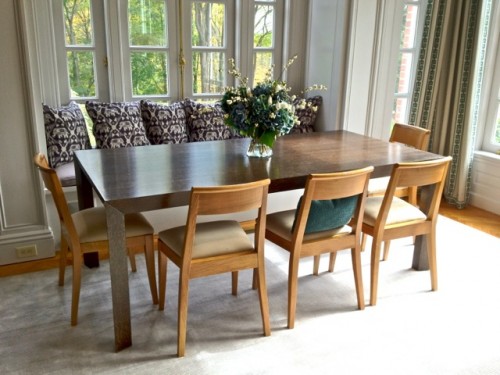 At the dining end of the sunroom, Gorrivan mixed the new Baker furniture above with the Malloys’ rustic cupboard include their collections of baskets and pottery. Somehow it all works, creating a real family space for the governor, his wife and three boys.
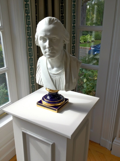
Gorrivan even managed to include some fun historical references.
The last of the public rooms in the main house is the library, which also serves as Governor Malloy’s office. Designed by Paula Perlini, the room was lightened dramatically, emphasizing the beautiful architectural detail and handsome fireplace with new hearth and tile by Artistic Tile.
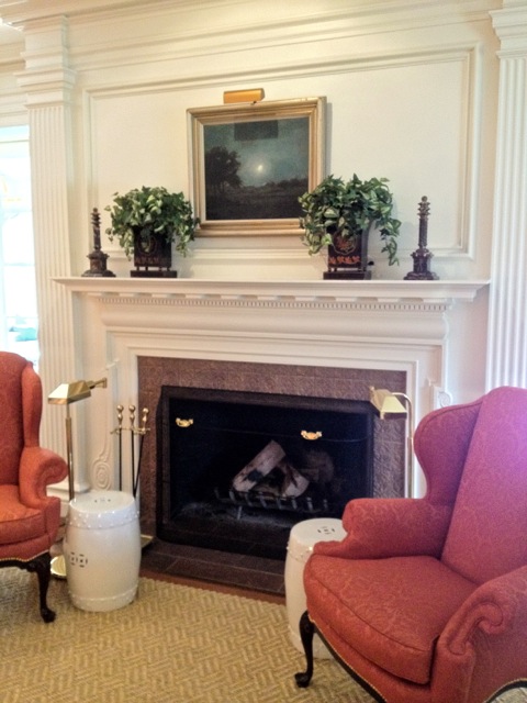 This stately elegant room features beautiful textures, including the handsome Galbraith & Paul paisley from Holland & Sherry on the wing chairs and Beauvais sisal rug. But the showstopper is the incredible work of decorative artist Julie Hardridge, whose Architexture Studio in Redding executed the spectacular Venetian plaster walls.
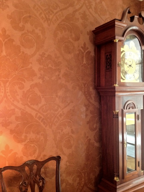 This photo just couldn’t capture the amazing tactile finish and luminosity of Hardridge’s work. The contrast of matte and sheen and beautiful pattern are just amazing. You can’t walk into this room without wanted to touch those walls.
Governor Malloy’s desk is a combination of personal and gubernatorial accessories.
In addition to the public rooms, both powder rooms, a men’s and a women’s, were redone by the Klaff’s design team of Nick Geragi, LouAnn Torres and Joe Passero in Norwalk, CT, who donated not only their time but all fixtures, tile work etc.
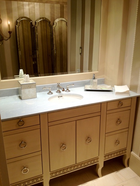
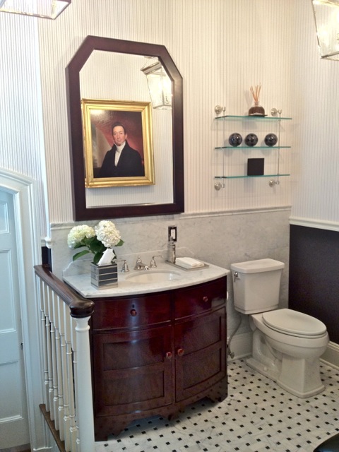 The men’s room is a charming nod to club life. In a nook-like space off of the governor’s office, the team cleverly combined wall coverings from Ralph Lauren to give it vintage male appeal. Above the chair rail is paper and below gray flannel. The play of color, texture and weight is very effective, as is the combination of the handsome carrera marble, wood vanity and mirror and nickel accessories, all from Michael Smith’s Kallista collection.
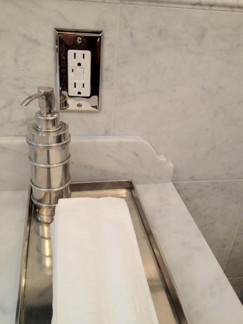 The many thoughtful details add to the elegant understated vision.
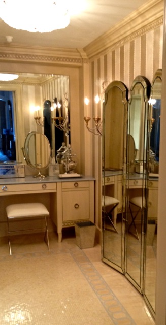
The women’s powder room evokes classic Hollywood glamour. With the full length freestanding mirror, torchere style sconces and a stunning New Ravenna mosaic floor, entering this space is like a step back in time.
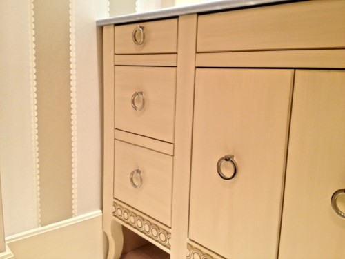
Note how the circle motif is repeated on the hardware, trim on the vanity and the beaded border on the GP&J Baker wallpaper, as well as in the border of the mosaic floor above. It’s such details that subtlety unify the space.
How lucky is our governor and his family to have such a comfortable elegant home in which to live and entertain! It’s truly Connecticut putting its best face forward! Come back tomorrow to see the renovated pool house kitchen and guest cottage, all part of this all-encompassing project.


Isn’t it wonderful when designers donate their time & talent and the companies contribute so much, creating the most amazing space into government offices and homes. I commend the entire group for such an endeavor, Stacey. Lovely reporting, I might add. Just brilliantly done. xx’s
How fabulous! I love the chcolate brown walls, the yellow wallpaper, and an overall very elegant and cohesive grouping of rooms. Very nicely done..thanks Stacy for sharing.
Spectacular! Each room’s personality is so unique and yet the rooms all compliment each other perfectly. Love all the attention to detail… I grew up with a grey dining room with white trim and a lavender ceiling (all Ben Moore, of course) and so this brought me back to a lovely nostalgic place as well!
Can’t wait to see the renovated pool house!
Wow love that foyer what I wouldn’t give for that kind of entrance. This post gave me an idea for above our fireplace love how it’s framed out, painted and then a mirror placed great idea! What a wonderful project and that so many talented people joined together donating their time to make such a warm and inviting home!
I will pore over this fabulous post over and over to study and savor all the creative details you’ve captured. Beautifully presented. Thank you.
This is fantastic. I really love the details in the rooms: the pillows, the table scapes, the fireplace, the Currey & Co. Axel Orb chandeliers, the Cowtan & Tout Bamboo wallpaper and the sweeping staircase! What a lovely Governor’s Mansion. Thanks for sharing.
Love the Frances Palmer pot, too. And the little vignette with the blue and white vase and the three paintings — it’s the little details that make a space, I think. A lovely Governors Mansion!
This is such a great example of teamwork! I think all the other states should take note and emulate the contributions of these talented designers.
Bravo to the good folks of CT!!!!
~ elizabeth
Your pictures are even better than CTC&G’s – your make the house sparkle! Thanks for the mention; it was such fun to be involved in this historic project.
xxoo
gorgeous space…
love the sunroom and the turquoise pottery…
best,
maureen
Lovely traditional home. I especially love the bathroom.
Thanks for such a wonderful tour, Stacey! I love the Violet Petal under a glaze of Light Pewter ceiling color! ox