With a breathtaking setting overlooking Beverly Hills, Greystone Mansion is the spectacular location for the 2015 Luxe Magazine Maison de Luxe Designer Showhouse. A magnificent example of gilded age architecture, the estate has weathered the years with distinction thanks to the efforts of the city of Beverly Hills and Friends of Greystone. This year’s designers have taken the opportunity to update the stately rooms with style.
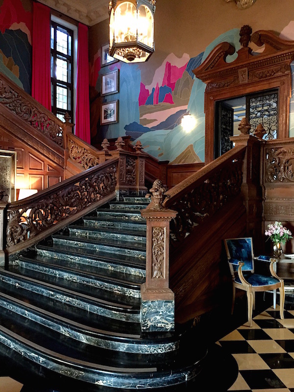 In the entry and upper landing, designer Timothy Corrigan has honored the legacy of the estate and the city with a dramatic and colorful mix of old and new. An original shot of the entry below for comparison.
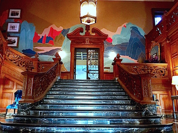
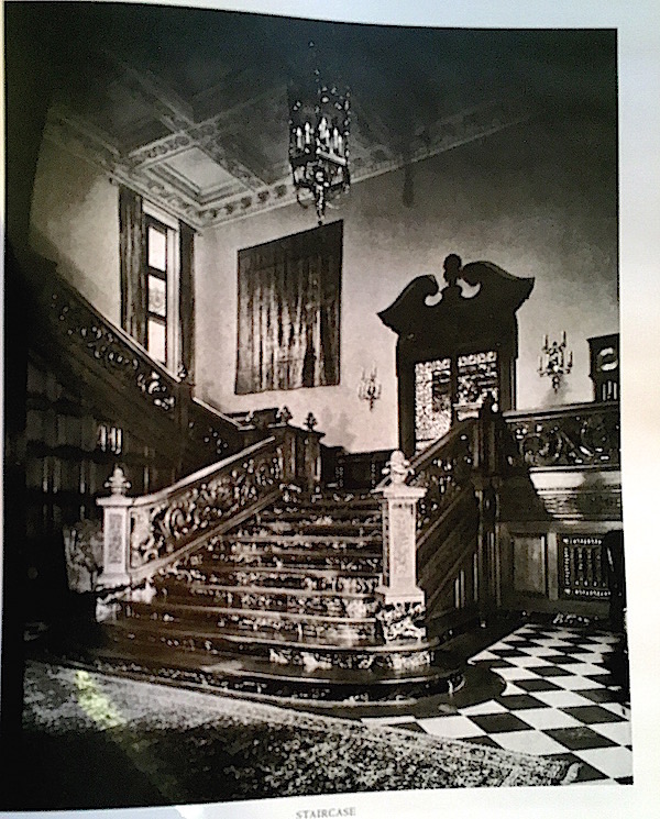 Grand Entry Hall at Greystone is one of the most architecturally impressive spaces in the house but rather dark with its extensive wood paneling and sparse windows – one on the stairs and one on the second floor landing.
 As Tim explained, “Our objective was to infuse the space with color and light while still respecting its majestic scope.” Inspired by the hills that serve as the setting for the mansion, he worked with British wallcovering company Fromental to create a custom coloration of their new “Rockface” pattern. With hues ranging from hot pink and tan to turquoise and blue, the wallpaper brightens the space, echoing the technicolor glamour of Los Angeles.
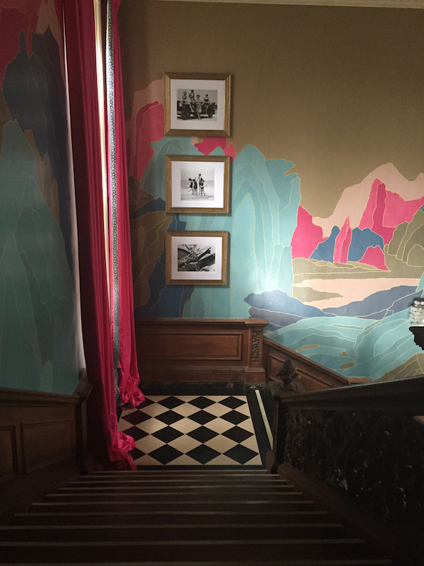
The color story is continued with bright pink curtains of a Manuel Canovas fabric, adding a sense of lightheartedness and modern mystique to an otherwise imposing space. Black and white photos from Trowbridge Gallery harken to the past, featuring the elegant and playful spirit of 1920’s Hollywood.
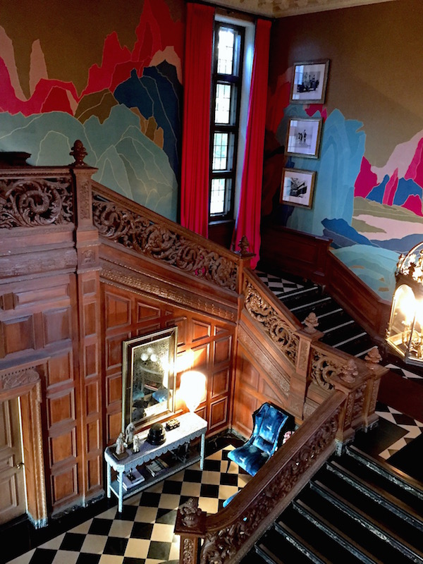
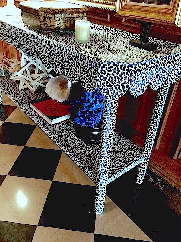
On either side of the stairs on the first floor, sitting areas feature a stylish mix of old and new. 1940s French Arm Chairs from Tim’s collection of antiques are upholstered in a contemporary Zoffany pattern and custom consoles, with whimsical scalloped edging, are covered in Tim’s leopard Madeline Velvet for Schumacher.
The colors from the entry hall are carried up to the second floor Upper Landing. Here a multi-colored Missoni rug anchors the space with movement and whimsy.
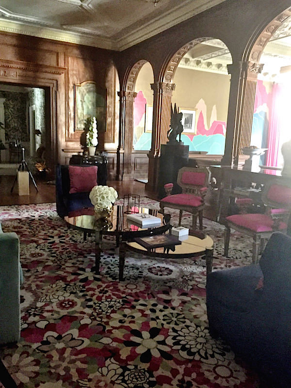 A turquoise velvet sofa, modern Fendi chairs and coffee tables are paired with Zuber panels, a Venetian Capriccio painting, 18th century Baltic Chairs from the Timothy Corrigan Antiques Collection, upholstered with a fun and fanciful twist.
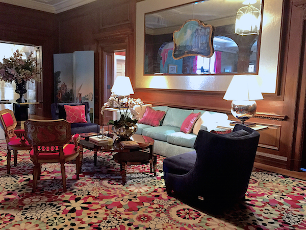
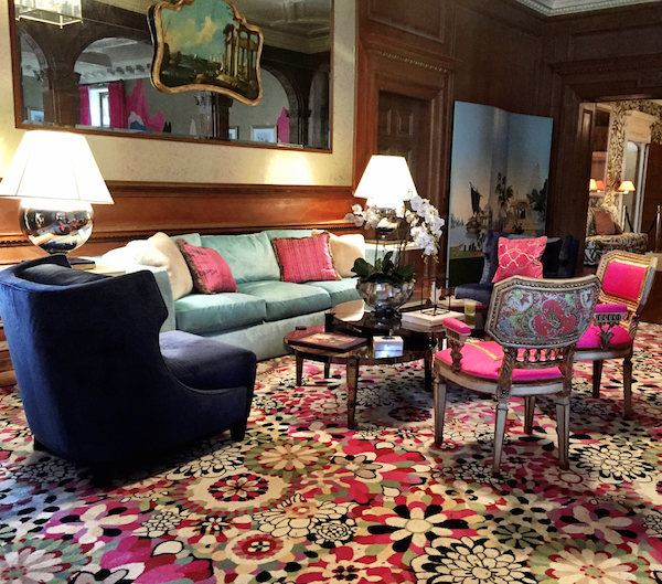
The seats are of the same fabric as the curtains while the backs feature Pickfair Paisley from Tim’s fabric collection for Schumacher.

The landing pays homage to the stature of the residence
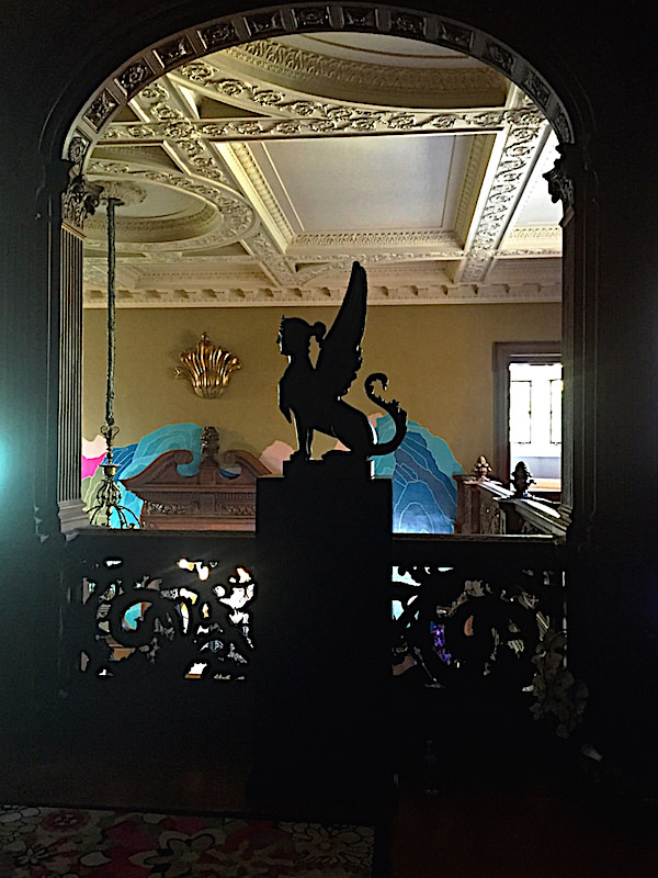
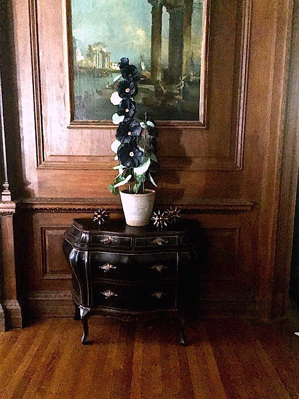
while creating an environment full of fun contrasts and visual delights. Below a paper Livia Cetti black hollyhock sits on a leather Italian commode. An entry sets the tone for the entire house and Timothy’s gracious yet lively space respectfully nods to the past while bringing the house into a new era for contemporary living.


Stacey, Timothy has created a wonder of a color palette to wake up this oh so traditional space at Greystone.
Very unique and delightful!!
xoxo
Karena
The Arts by Karena
Carrier and Company
I love a modern aesthetic in an old traditional building, the best of both worlds.
Pickfair Paisley!!! franki
Appreciate the concept behind the design but not sure about the color palette. Would rather have seen something that not only celebrated the surrounding grounds but also celebrated the incredible architecture and detail and history of this house while still adding that modern touch. But then again who am I to criticize someone with Mr. Corrigan’s credentials! Thanks for sharing.
Greystone is legendary for not only Gordon Kaufman’s architectural feat and the hill siting, but it’s back history of ‘the love unspoken’ of in those days ending in a sordid double suicide but by whose hands is the question unanswered. Veranda Magazine did a splendid designer tour a few years ago hosted by the inimitable style icon, Ann Getty and it was the most cohesive showcase house design I had ever been to…a little Lalanne here, an 18thC piece there and Warhols Jackie. I recall picnics on the esplanade under Copper gazebos long gone in the late 70s early 80s with now departed friends…a quiet place indeed then. I feel the entry walls appear as a veritable copied look of a stage backdrop Leon Bakst designed for the Ballet Russes…not in keeping with the Majesty of the Architecture and the Grandeur of the Entry…but then that’s my humble opinion. Love those Baltic chairs, verbatim copies of an 18thC chair used by Valerian Rybar for the Candib House in Miami Beach…which by the way were 20thC copies.
Stacey–thank you so much for your thoughtful review of the space. As you rightly point out, the space is so somber and the architecture so potentially overpowering that it truly was necessary to infuse the space with the ultra saturated colors. Without seeing the room in person it is difficult to sense the scale and majesty of the space and therefore the need to add a bit of whimsy and life to the area. When we did this room four years ago for the Maison de Luxe we did up the walls with a strong red grasscloth from Phillip Jeffries as a way of bringing life to the space. Entry halls set the town for any home and it is important that they don’t take themselves too seriously!
again, thank you for your lovely post! xo tc
Stacey, Wonderful infusion of color and whimsy by Timothy Corrigan with his paisleys and floral area rug creating a vibrant and new ambiance.
So ugly. It needed a grisaille style of painting.