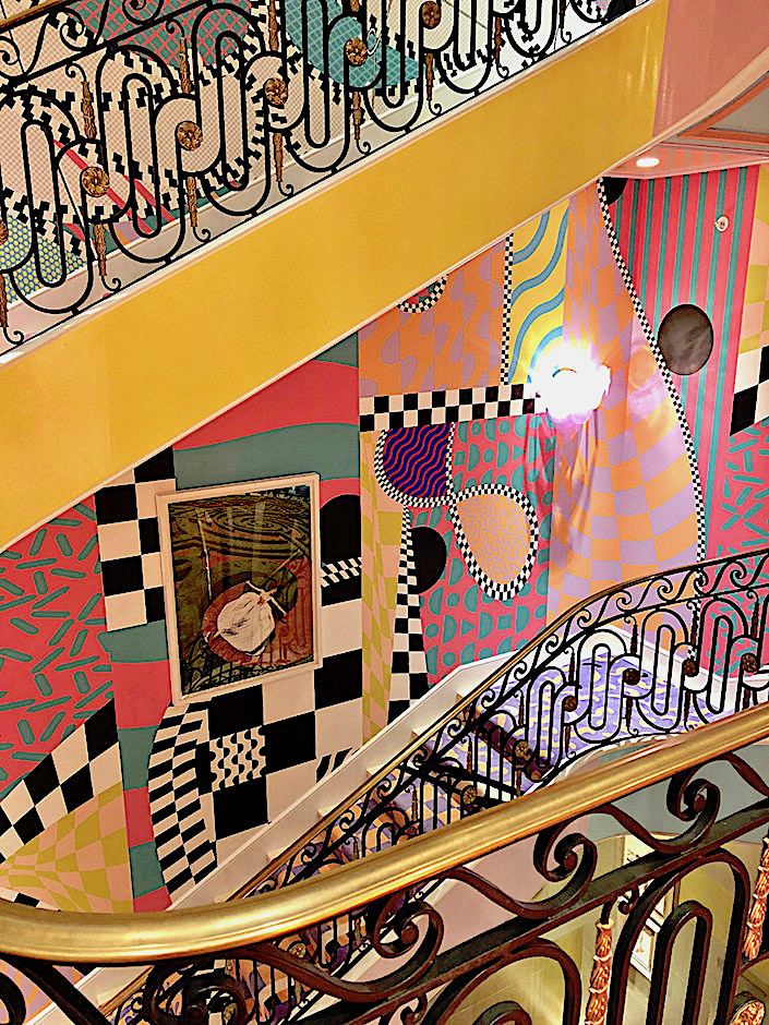
Walk up to the second floor of the Kips Bay Decorator Show House 2018 edition and you are met with designer Sasha Bikoff‘s smashingly ebullient staircase. With a color and pattern fantasy inspired by Ettore Sottsass’ Memphis movement, the combination of custom Rug Company carpets with friend George Venson’s Voutsa wallpapers is a mind boggling act of masterful coordination.
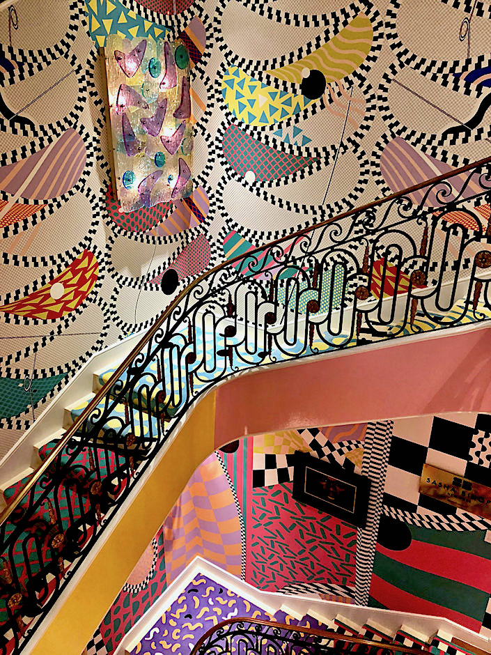
Not only did Sasha further prove her design chops by completing all her pattern picks in a single day, but dedicated her “technicolor dream” to the kids of the Kips Bay Boys & Girls Club who she hoped would appreciate the creative energy her space emanates. Looking back to move forward never looked so bright and optimistic!

Kips Bay Design Chair Bunny Williams and her design partner Elizabeth Swartz created a living room they titled the Gilded Knot.
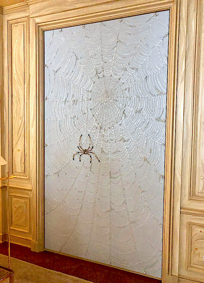
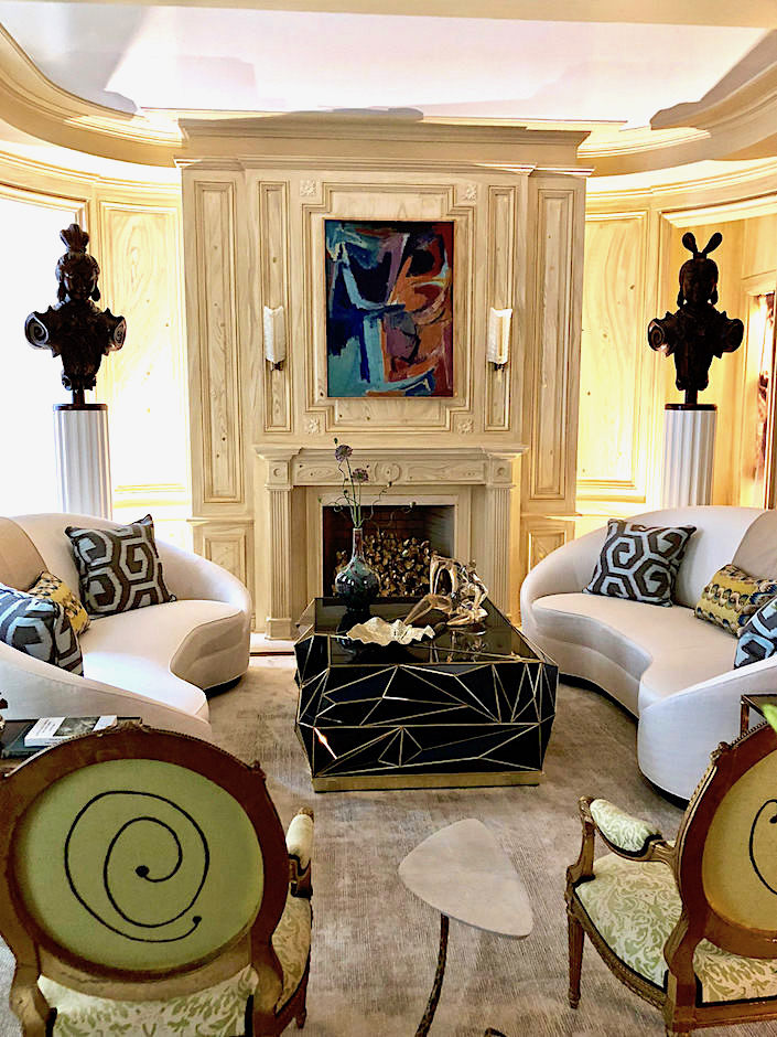 Starting with faux bois walls accented with gold knots by Bob Christian, the duo decided to continue the concept with a sophisticated living-room-in-a-tree-house theme including natural accents, from a spider web executed by Art Groove
to a wonderful leaf-like chandelier by Brooklyn based Rosie Li.
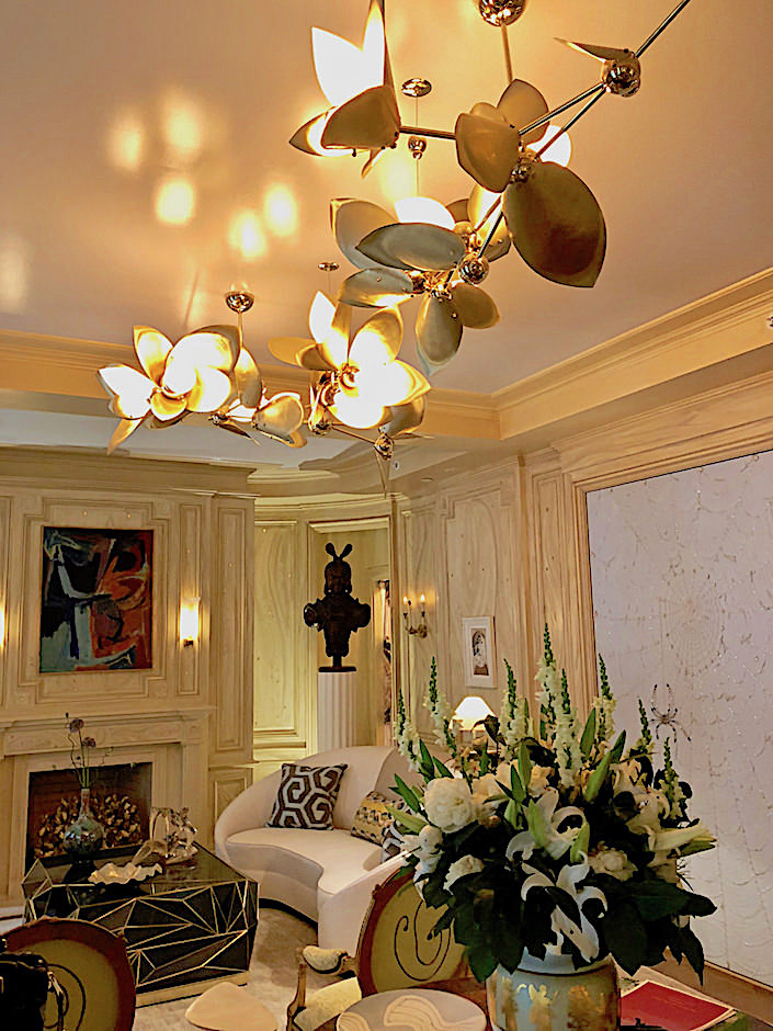
An eclectic group of new and antique pieces imbue the space with design gravitas yet timeless and fresh interest.

Wesley Moon gutted his original spaces to create three contiguous rooms (wet bar, butler’s pantry and elevator landing) that are tonally related yet function separately. The landing is a tiny jewel box highlighted by a fabulous mirror by late photographer Bill Cunningham (from Jonathan Burden) against custom de Gournay wallpaper.
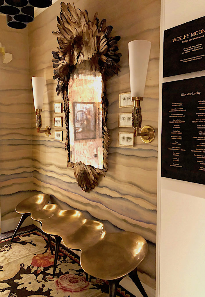
Moving into the pantry, Wesley included perfect tongue in cheek art for the space against against graphic Fayce wallpaper,
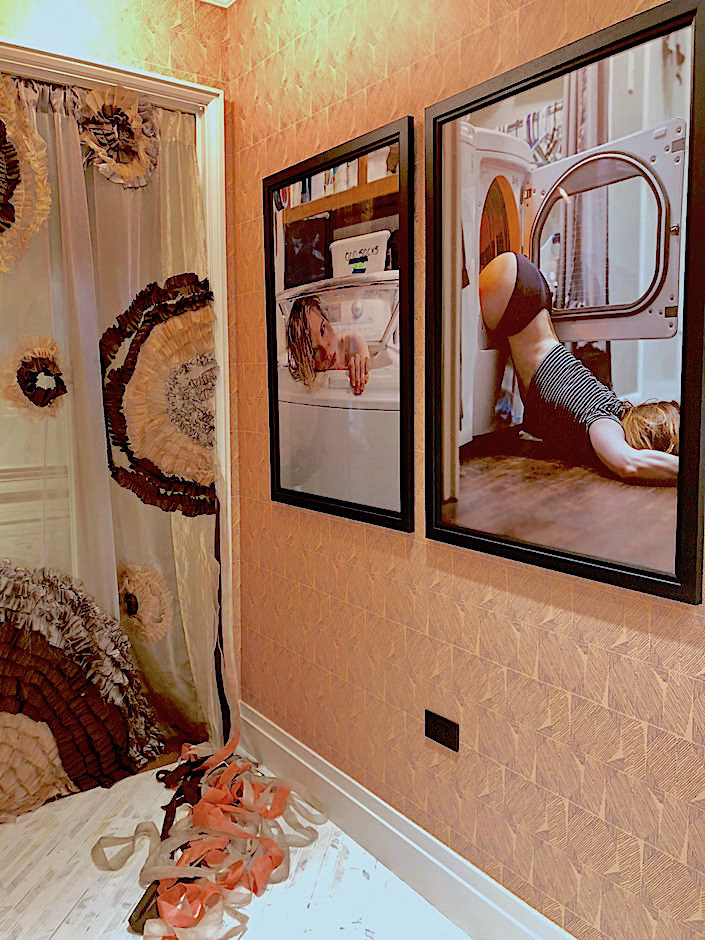
all new Clive Christian cabinetry showing off a collection of Daniel Levy porcelain,

a sleek, party ready wet bar
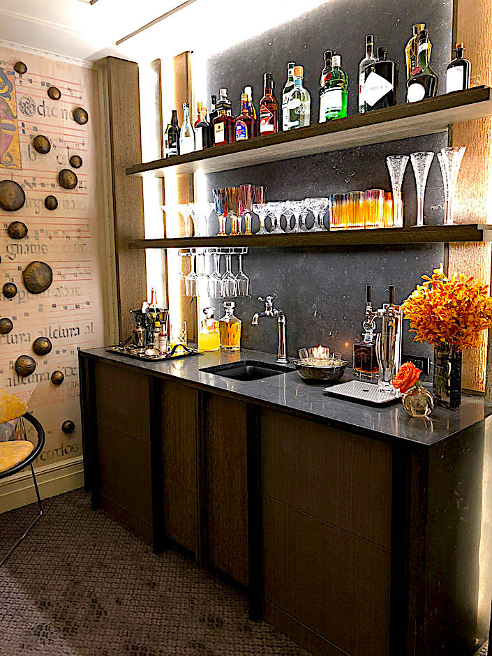
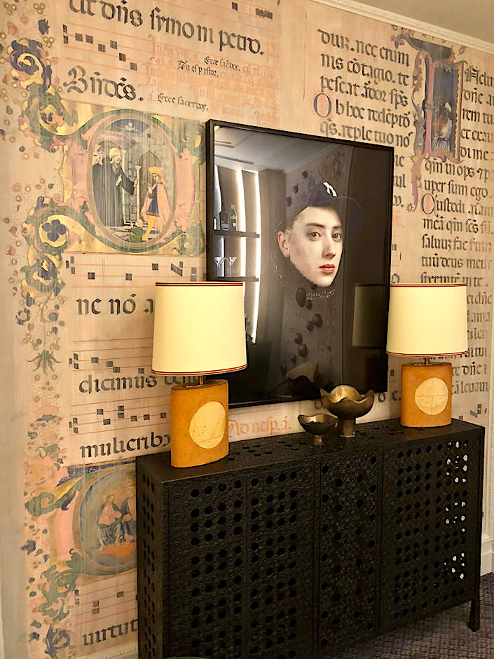
surrounded by statement-making walls Wesley brilliantly created from illuminated manuscript imagery found on the Metropolitan Museum site.
On the third floor, Drake Anderson designed a luxurious salon swathed in tones of rich ochres and saffron.
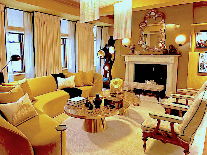
Combining Caleb’s classic sensibilities with Jamie’s more modernist moments made for a room bridging both worlds with a sexy sumptuous vibe

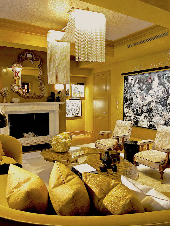 rich in textures and materials. The walls were an ode to opulence with Lelièvre velvet (available through Scalamandré in the US) that was sent by Ankasa to India for custom embroidery.

Their space also included a super glamorous bar. Mirrored in three different colors, this dark and dramatic room is anchored by a sparkling vintage Murano chandelier,

and accessorized with luxurious art and objets.

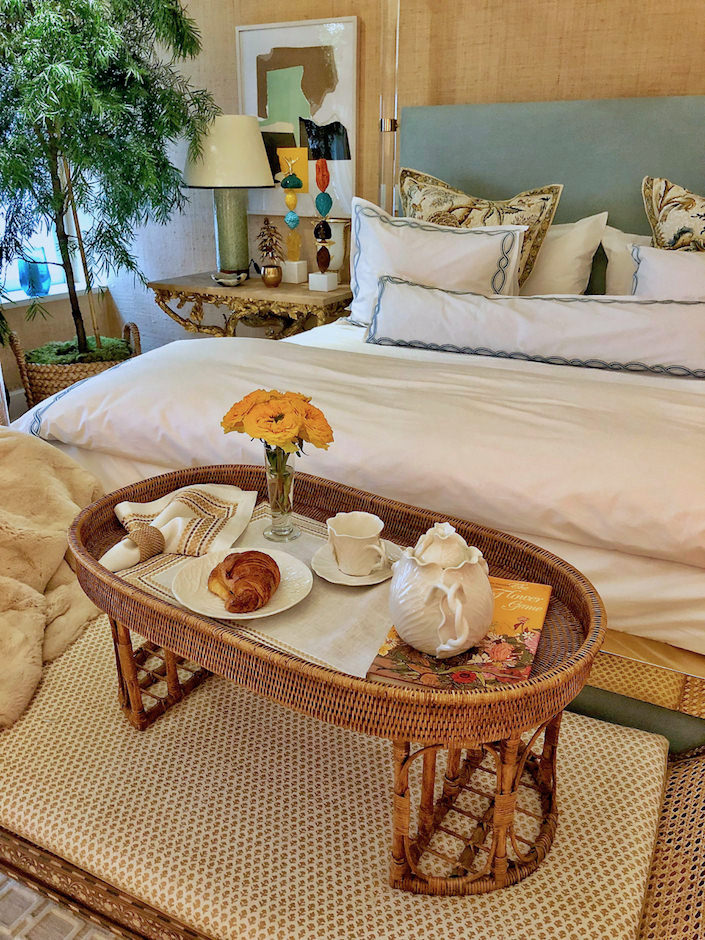
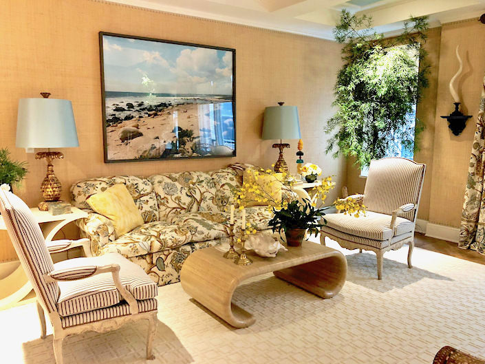
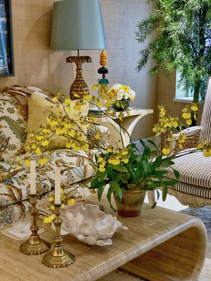
With a home she frequents in the tropics, Alessandra Branca was inspired by the light of such warmer climates. Using one of my all time favorite Branquenié patterns and a great mix of materials – from lucite and brass to rattan and wicker, Alessandra designed her space around its sunny blues and yellows.
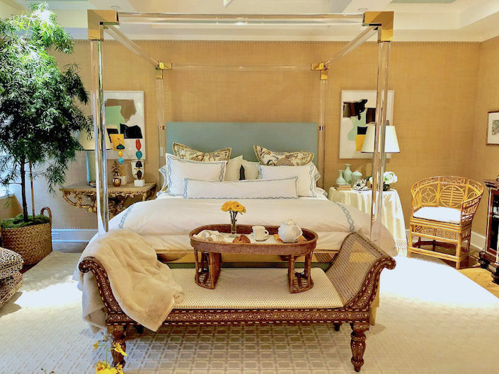
And while it is officially a bedroom, where breakfast in bed (with her new linens for SFERRA) would be an indulgent delight,
the room is big enough for a sitting area, where you could lounge all day!
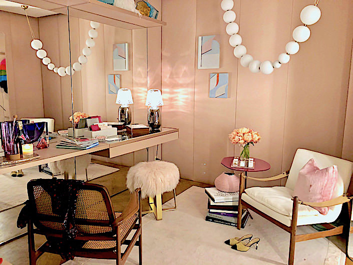
In the adjoining Dressing Room, designer Marcia Tucker envisioned a space for a modern day fashion lover to sit and collect her thoughts for the day as she plans her attire. Inspired by Barney’s Fashion Director Marina Larroude, Marcia worked with the store to include a mix of timeless and contemporary items.
 The pearl necklace light fixure by Semeur d’Etoiles lends the space a sense of whimsy and personality.
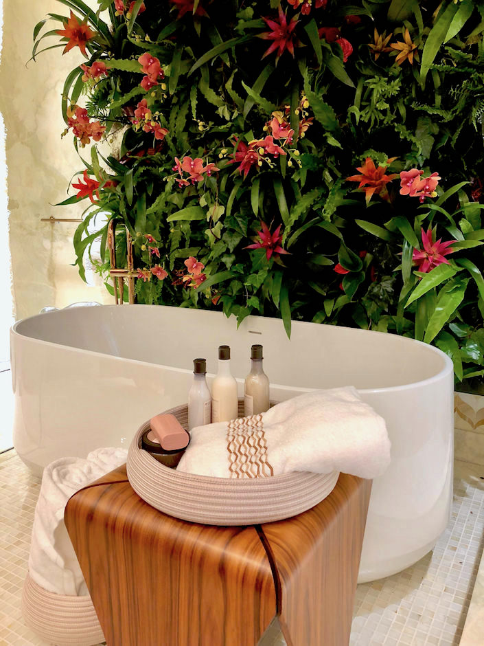
 In the master bath, Marcia created a soothing peaceful sanctuary with a rich mix of wood, new rose gold Kohler fixtures,
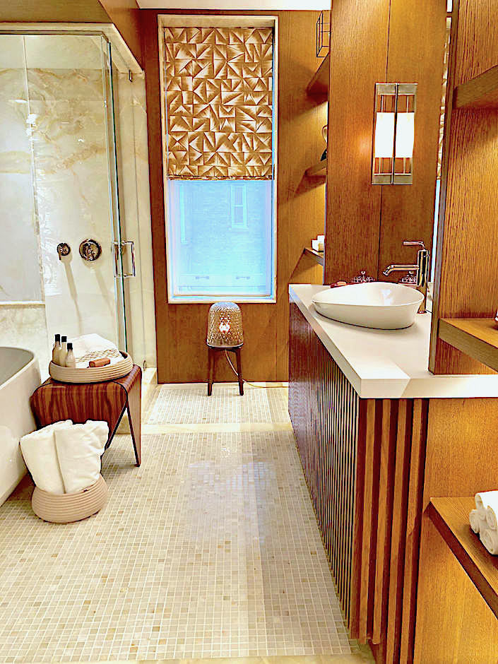 Hermès accessories and the pièce de résistance, a living wall of orchids and greenery, executed by Magnaflora, under which to bathe.
 all photos by Stacey Bewkes for Quintessence
Stay tuned for a final look at the Kips Bay Decorator Show House 2018 with the fourth and fifth floors.


 all photos by Stacey Bewkes for Quintessence


Loved the mirror designed by Bill Cunningham…nice surprise.
Isn’t it amazing? Who knew?
Thank you for sharing these wonderful pictures & background information. It’s great to see the variety of styles! And very inspiring as I am working with the Junior League of Pittsburgh on their Designer Show House which opens this week.
My pleasure Sara – good luck with the Show House!
Thank you Quintessence ! So many Beautiful Rooms to see !
Wish there were more nods to tradition here, but ah well still very fun. Alessandra’s room is my favorite here. But I love the drawing room (not pictured here) by Philip Mitchell.
It’s coming Jackie – stay tuned!!
Agreed, Jackie. Alessandra’s room was the one that I could be happy in.:-)
The bar!!! franki
The illuminated manuscript walls – fabulous!
I can’t believe Sasha pulled off that staircase!
Not easy…well done and fun.