OK, I confess, I have a bit of an obsession (the oxymoron is actually understatement) with the work of architect Gil Schafer. Ever since I first saw images of his weekend house, Middlefield, in Elle Decor almost ten years ago, I have routinely stalked his site, waiting for new projects to be published. Over the years, I somehow felt, erroneously of course, that I alone was the single anonymous member of his secret fan club. But since the Town & Country article in May and the announcement that he has won the Veranda Art of Design Award for Architecture, I fear there will be many others vying for his (illusory) attention.
A graduate of Yale Architecture School, Schafer worked almost a decade for the prestigious New York firm Ferguson, Shamamian, whose designs echo Schafer’s interest in a highly refined modern classicism. In designing Middlefield, Schafer assiduously consulted 19th century pattern books, noting appropriate details for historical accuracy and being careful to create the “mythology of a house growing over time.” Schafer also aligns himself with the best in related fields. He worked with Deborah Nevins on the siting and landscaping, Eve Ashcraft on colors and Miles Redd on the handsome interiors. In 2002, the house won a Palladio Award, an annual program which honors outstanding achievement in traditional design. for new design and construction.
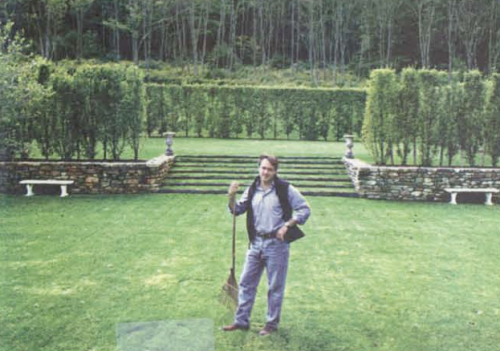
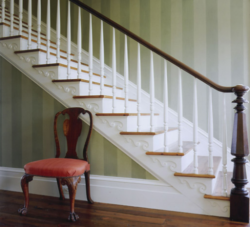
The details, as with all his projects, are incredible and one of the many features that distinguishes his work. For example, look at his recreation of a Greek Revival staircase done for the house. How fabulous is that newel post!
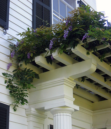
or the meticulously designed pergola
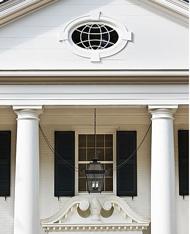
or the tympanum window in the pediment over the portico (how many times have we seen this mishandled in one mcmansion after another)
Or the mercury glass knobs used throughout, made by E.R. Butler, based on on 19th century patterns.
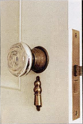 In fact, Schafer designed E.R. Butler’s Adamesque store in a historic Boston neighborhood.
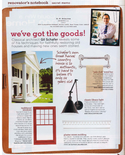
I’m sure many of you remember this spread from the May, 2006 Domino where Schafer revealed many of his other sources for the house.
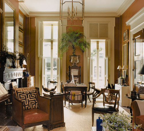
 His Greenwich Village townhouse in NYC, again decorated with Miles Redd, is equally handsome with its mostly period furniture, and fine finishing touches, such as
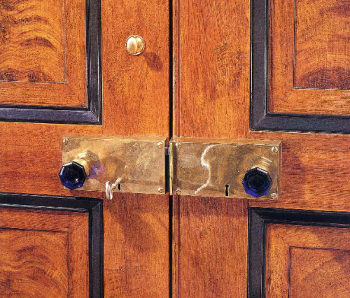
 these mahogany doors, faux finished by NYC decorative painter Jean Carrau, with brass rim lock and cobalt blue crystal knob, again by E.R. Butler.
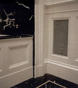
The renovation of the bathroom will give you a little insight into Schafer’s talents and skill with details.

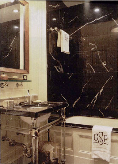
This detail below shows the millwork and an example of the grilles which hide exhaust fans and stereo speakers. Similar panels throughout the room hide storage cabinets. This project earned Schafer, in 2004, his second Palladio Award in the category of restoration and renovation.
My next favorite project is probably his most published and earned the firm its third Palladio Award for new construction last year. Willow Grace Farm, in Millbrook, NY, is a 194 acre equestrian farm built for director Jim Burrows and his family.
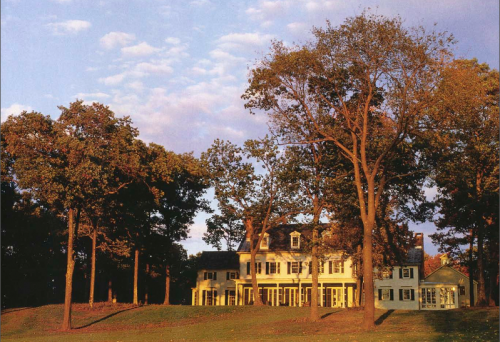
You may remember the wonderful article about it in Elle Decor. The landscaping, again by Deborah Nevins, is particularly spectacular
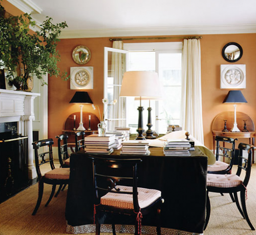
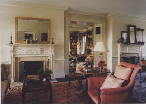
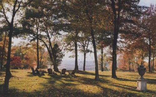 and Michael Smith did the beautiful interiors, incorporating many of the Burrows’ 18th and 19th century English and American antiques and paintings. In the living room, one of the mantels is an original 19th century Hudson Valley piece and the other is a copy – can you guess which is which? Just as I thought – neither can I.
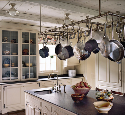
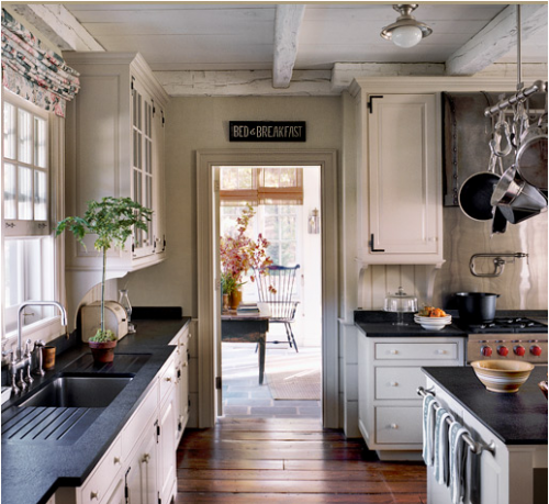
In addition, a local farmhouse, originally chosen with the intention of moving it to the site and renovating, was ultimately demolished for its building materials (floorboards, beams, doors mantels etc.) to give the new house its authentic feel. Schafer described the house as “elegant but unpretentious” which is so accurate and probably why so many of us have these tearsheets in our files. The house has of my all-time favorite kitchens, with acid-washed Belgian marble countertops and lime-washed salvaged antique timber beams and planks used on the ceiling.
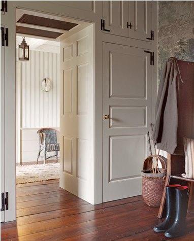
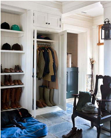
Who wouldn’t be in seventh heaven with a mud room like this
or this. Love the Dutch door in the back.
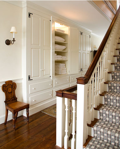
I think I could finally keep my linen closets neat and organized if they looked like this
The bedroom is beautiful with its antique four poster, dreamy De Gournay wallpaper , Nancy Koltes linens and pillow of Robert Kime silk.
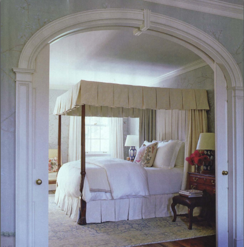
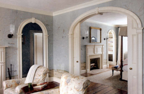
I just love the arched casings and pocket door of the sitting room – so elegant and gracious. And by the way, bedroom and sitting room each have their own wood burning fireplace.
Schafer’s firm worked with many companies who supply fittings appropriate for historic houses: Ball & Ball for hardware, Historic Housefitters for the custom iron hinges as seen on the kitchen cabinets or linen closets, Price Glover for interior lighting as above, Francis Purcell for mantels and Ann Morris for their many stylish reproductions such as the kitchen stools and pot rack.
And for those of you with a few extra million to burn, the property is now up for sale. You can go here to see the listing: http://www.millbrookrealestate.com/Willow-Grace-Farm-a168822.html

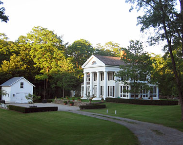


if only I had a few extra million —to burn.
quite the mud room.
pve
pve – exactly – but beautiful!
They say God is in the details and Schafer is an architectural god! Love Willow Grace with the Michael Smith interiors – so classic and elegant. Beautiful images to start one dreaming…
Yes, his details are amazing. Check back tomorrow for more!
WOW! Don’t you get a little satisfaction in knowing that you have LOVED his work for a long time, and now he is getting recognized?? Beautiful photos, and very inspirational. –Gretchen O.
Wow indeed. And since I think I found him in Elle Decor, I guess you could say he was already discovered. But yes, I guess I feel that I have been following his work more than most, but who knows, there could be many more clandestine stalkers like me out there!
Gil Shafer’s work comes across as exceptional on so many levels, but above all his attention to proportions strikes me as the most defining difference between his work and the so frequent examples of pseudo classical architecture. Classical architecture has taken a lot of criticism in the last hundred years for being exhausted, but his work is beautiful and functional at the same time, and serves to demonstrate in my opinion that no other form of architecture has managed to surpass classicism in terms of versatility and practical things like lighting, ventilation, and the logic of the floor plan, as well as beauty.
harrison – he is the real deal. and what a difference between his work and as you say the “pseudo classical architecture” that is so popular in mcmansions and builder’s houses. And you are right, proportion plays a huge role!
Perfectly stated!! I couldn’t agree with you more.
The attention to detail is unbelievable. I just can’t quit studying every image…stunning!!
mydesignchic – so imagine me – doing the same thing for almost 10 years!
WHAT beautiful architecture. I love everything about this – for me, it’s move in ready! The wisteria in the portico is so classic South.
-SF
sf – for me too – we’ll have to fight over who gets to move in! Love the wisteria also.
I am afraid that you are not alone in your adoration of his work. You don’t see that level of quality every day. It is deserving of every ounce of praise that we all bestow upon it. Thank you for sharing the photos of his creations, and I am glad that you credited the landscape designer and everyone else who had a hand in the projects, too. They all work together so well to make these homes what they are…true works of art.
I purchased Gil Shafer’s first book and cannot wait to receive his most recent one. He is a genius, and if I ever win the lottery, my first call will be to him, so that he could design my next home!! His designs are truly classic and elegant, and his designs actually include real, functional rooms. I am so very tired of the “giant great room” concept of so many homes today!! Gil is the rock-star of architects!!