Last Thursday evening I attended the Design on a Dime opening night party to benefit Housing Works. This was the seventh year for the event with all proceeds going towards the organization’s newest residence for New Yorkers living with HIV/AIDS: The Jefferson Avenue Housing Program in Brooklyn. I’ve known about Housing Works practically since they opened their doors in 1995, since it has always been my savvy sister’s favorite place to donate and thrift shop for stylish bargains.
 This has always been a very popular interior design benefit event but this year must have set all records. There were 56 designer vignettes. The opening evening was sold out and totally mobbed. Not only was it a great turn-out but everyone was so enthusiastic and upbeat. There was a really fabulous party vibe! It was very difficult to get pictures as it was so crowded (next year I must remember to be there when the doors open) but I made sure to get snaps of at least a few of my favorites.
 photo by Joe Standart
I knew I was going to love the Tilton Fenwick space. This young duo is on quite a roll. Named one of the TradHome‘s 20 “New Traditionals,” I just love their style. And that’s no surprise considering their design backgrounds. Here is partner Suysel dePedro Cunningham with (adorable) design mentor Markham Roberts. So sorry Anne (partner Anne Maxwell Foster) – I didn’t manage to get a shot of you!
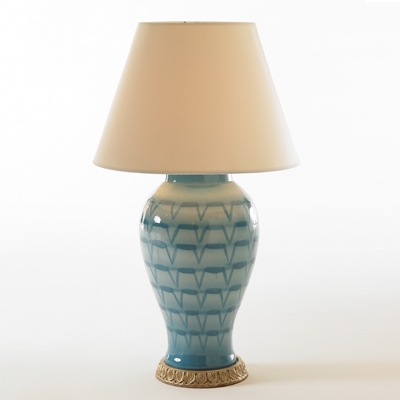
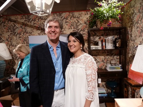 The vignette, created for Traditional Home, one of the event sponsors, was fashioned as a dream office for a female design blogger – and they so got it right. I would feel totally at home here! And I clearly wasn’t the only one – I had to ask Suysel and Anne for an official shot because it was so crowded (and already picked over) when I got there. The walls were covered with a beautiful Brunschwig documentary fabric, Seychelles, which they had paperbacked. It is just the right combination of tailored and feminine, and really anchored the space. The lovely salmon and blue accents were then brought out with the furnishings and accessories, such as Bunny Williams’ Beeline Home’s turquoise lamp at left in the shot and below.
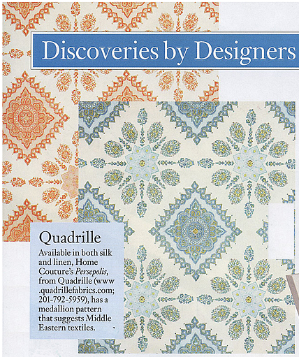
 It’s hard to see in the room photo, but the Hickory Chair Spool Ottoman is covered in Quadrille‘s new Persepolis pattern in the warm colorway, which I love. It added a modern touch of boho chic.
 courtesy of Architectural Digest
But the pièce de résistance was the fabulous desk donated by The New Traditionalists. I did my best to capture the incredible finish on it, which perfectly complemented the colorway of the vignette.
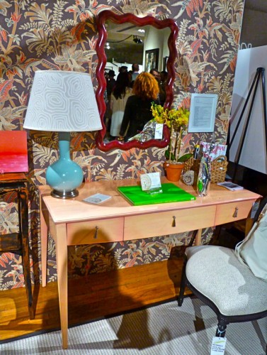 I spoke with partner Brady Wilcox later in the evening who explained that the color of the desk was created by applying multiple layers of paint hand sanded in between, then finished with a hand applied Classic Glaze in Pink and Firefly in a Gloss finish, giving it that incredible luminescence. I love what these guys are doing. They also had some great pieces in the Malcolm James Kutner for Sferra booth. The mission of this company, the merging of classic quality and manufacturing technique with cool attitude and style, fit perfectly with Tilton Fenwick’s vision for the space. These are two companies most definitely going places!
There were many other fun rooms as well. Not surprisingly, I loved Miles Redd‘s space, a fun exuberant eclectic mix.
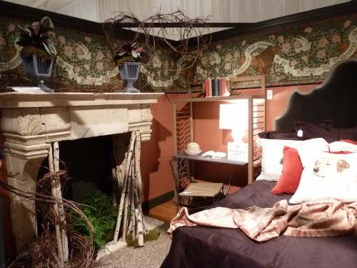
 Bradley Thiergartner‘s charming vignette was like an English country cottage.
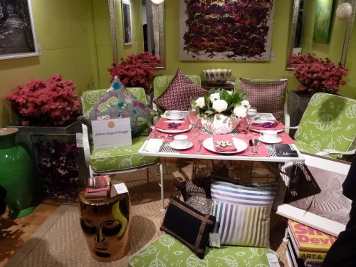
 While Arlene Angard‘s was like a wonderful vintage inspired picnic!
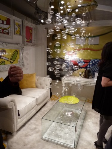
 You couldn’t help but smile at the fun filled Nickelodeon booth. What you can’t see from this angle is the GIANT yellow patent wing chair that shared the space.
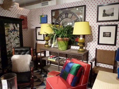
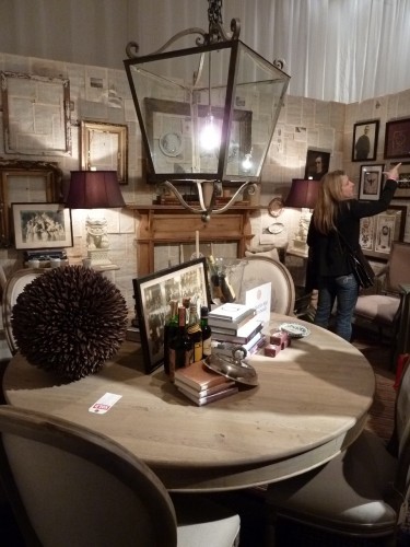
 Larry Ruhl for High Falls Mercantile was another room I loved. With a unique vintage appeal, it offered a terrific eclectic mix of art, antiques, accessories and furniture.
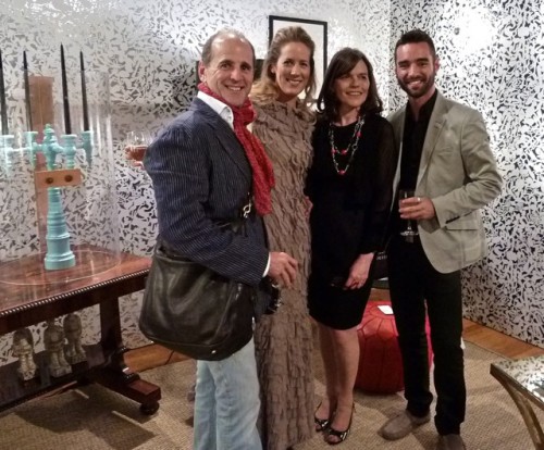
 And it was wonderful to see the Dunes and Duchess duo of stylist/editor extraordinaire Stacy Kunstel and partner/photographer Michael Partenio. Their fabulous lighting products were featured in Joshua Ingraham’s fun space. Here are from left, Michael, Stacy, Anne Maine, Editor-in-Chief of Traditional Home and the fabulous new TRADhome, and Joshua.
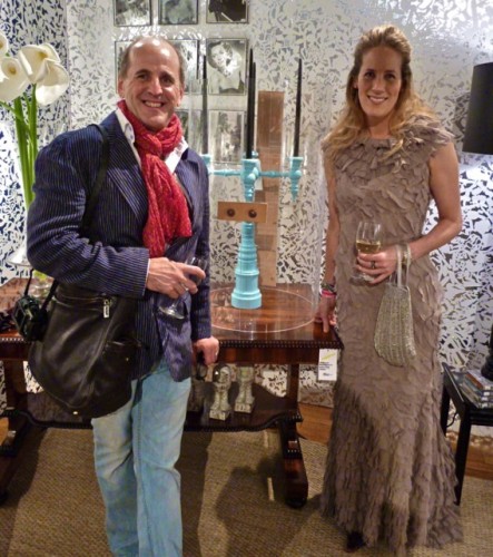
 And here are Stacy and Michael with their fantastic new candelabra hurricane. It’s a beautiful piece yet again combining artisanal craftsmanship with modern design. It shuts with a clever yet simple leather and wood dowel closure. And isn’t Stacy’s dress gorgeous? The back was even better with a bit of a mermaid inspired fishtail train – she always looks great!!
 What a marvelous evening for a wonderful cause. I didn’t even have a chance to get a drink I was so busy socializing with new and old friends alike, most of whom I have met through some form of social media. In fact Stacy and I were commenting how many people we knew by their twitter handles! Those companies who have not yet acknowledged the power of this medium are truly missing out. Our wonderful online community is a growing and powerful source of information and influence that I feel honored to be a part of!!

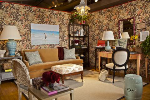
 courtesy of Architectural Digest


Great post, thank you! I really love the Larry Ruhl’s space. How wonderful to see the power of social media in bringing together so many people to benefit a cause. Sounds like you had a great time!
What a fun post – I feel like I got to go also, so thank you for the tour! :)
Oh what fun, the room in the fourth pic from the bottom us my favourite, glam but comfy too
I have adored Larry Ruhl’s sense of style for years. I love the look of his room and it truly captures what he does best. High Falls Mercantile, the shop that he runs with his partner Jeff, sits in a sweet little hamlet in the Catskills waiting to be discovered. Oh, it is a wonderful store full of great finds.
Good coverage on this wonderful event. Thanks!
Thank You so much for the mention. It was a privelege to have been included in such a fun event for so worthy a cause.
What a wonderful event! I love Brunschwig’s Seychelles in the small space {cheers to Anne + Suysel}… And, Stacy Kunstel does have really great style!!
Looks like a really great event! Thanks for sharing your night here.
good to hear about the big turn-out…I’m always so glad when people show up for a benefit that is to a worthy cause…and the designs had to be wonderful to see..
and it sounds like it was lot’s of fun…
maureen
I sooo wanted to go but just couldn’t make it. Thanks for sharing. Xo, Lynn
I am slow to change, but am so happy to know what I know just from blogging and the minor tweets. You ladies and gents are amazing and again, I just love living and seeing through your wonderful passion and world. XO, Kelly
lovely images, worthy cause and I so like Larry Ruhl for High Falls Mercantile. Happy new week!
Thank you for such a GREAT post and highlighting some of our amazing vendor friends who so generously donated to Design on a Dime! Honored to be included among these designers!
Fantastic event, great cause, gorgeous design. Sounds like the perfect evening. Thanks for giving us a peek! XX
Jeanne
q-
Looks like a fun time for everyone there.
Thank you for sharing this room and the cause.
Teresa
xoxo
It looks like a fun evening. I particularly like the Larry Ruhl space – and I just noticed the clever wallcovering!
What a great cause and way to celebrate design. Super Jealous! How fun to get to see all the various designers and their spaces. My favorite part of design school was when we were all given the same space and constraints and everyone came back with different designs. I would have loved to see this. Also, such a worthy cause.
Such a great event for such a great cause. I cannot believe all of those pieces were donated. WOW. And, yes, Stacy’s outfit if fab. xx’s
YELLOW PATENT WING CHAIR?!?! I am kicking myself right now, I just spent a fortune getting a wingback chair I bought on eBay years ago reupholstered and am having fabric choice regret. Wish I had gone for something more statement than the tone on tone Old World Weavers damasq. Have you been to the Stark Carpet Fabric Sale in Norwalk? Ah-mazing. Next chair, something crazy.
Love Dunes and Duchess! Classic style!
We had such fun helping Laura Kirar with her vignette last year and it’s great to see Stacy and Michael’s smiling faces!
xxoo
So many great things to look at there! And how fun to meet twitter/blogger friends!
xo Cathy
This party looks so fun! I love these kinds of events with great people, design, and for a good cause! Larry Ruhl’s room is my favorite!
xo Mary Jo
That sounds and looks like a great event and full of creative ideas…I totally adore that first wallpaper:) Have a lovely Monday afternoon, my dear
Kisses and hugs
How fun!! Oh how I wish I still lived in NYC :( xo Kelly
I’m with you on the New Traditionalists’ desk, but you know what I *really* liked? The red slipper chair in Miles Redd’s space, just a nicely understated piece that was very appealing.
It looks like it was a lot of fun., and for a good cause, always a nice blend to have. :)
tp
Thank heavens you attended the event so I could see all the amazing vignettes!!! I’m, of course, partial to Dunes & Duchess and that blogger’s dream office. Oh, if only….right?!
So happy we’ll see each other this time next week!
xo Elizabeth
How fun!! I need to get with the program and go to fun event like this. Life is not in my laptop!!! Great pictures!
How fun and I love the collection of styles from Miles Redd to Larry Ruhl. Ooh to see that giant yellow batwing chair!
xoxo,
Chic ‘n Cheap Living
You really do attend the best events. This looks like a party that i would be thrilled to attend! I love the variety of styles featured too. Social Media is certainly an invaluable source of gaining and sharing info, isn’t it?
PS. I so appreciate your warm comments on my announcement:-)
I’m sure this was a fun fun event. I yet have to visit it and see what can I buy.
What a great party! Looks like you had a wonderful time!
Love your blog. Very informative and love quadrille wallpaper!