Within the classic Charles Platt house of the 2017 Kips Bay Show House, not all the rooms are airy architectural gems. A dark, windowless basement space with a multitude of sprinkler pipes, odd angles and center column was the ultimate challenge for architecture and interior design firm Lichten Craig. But by infusing the dim space with the dark glamour of a bar and lounge area, they rose to the task in style.

Tactile walls of de Gournay silk became the perfect backdrop for vintage Charles Ramos chairs, with their sleek lines accentuated by Jim Thompson’s luxurious “Vesper” in Savory Cream silk velvet and pillows of a custom colored Dedar brocade. Mural artist Anne Harris, with whom Lichten Craig has frequently collaborated, created a contemporary version of a 17th century Dutch still life, echoing the element of chiaroscuro created by the lighting with objects emerging from the darkness.
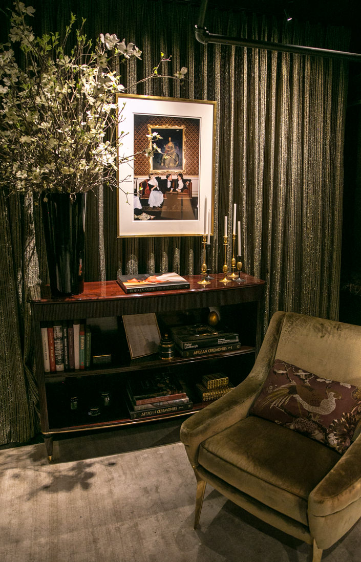
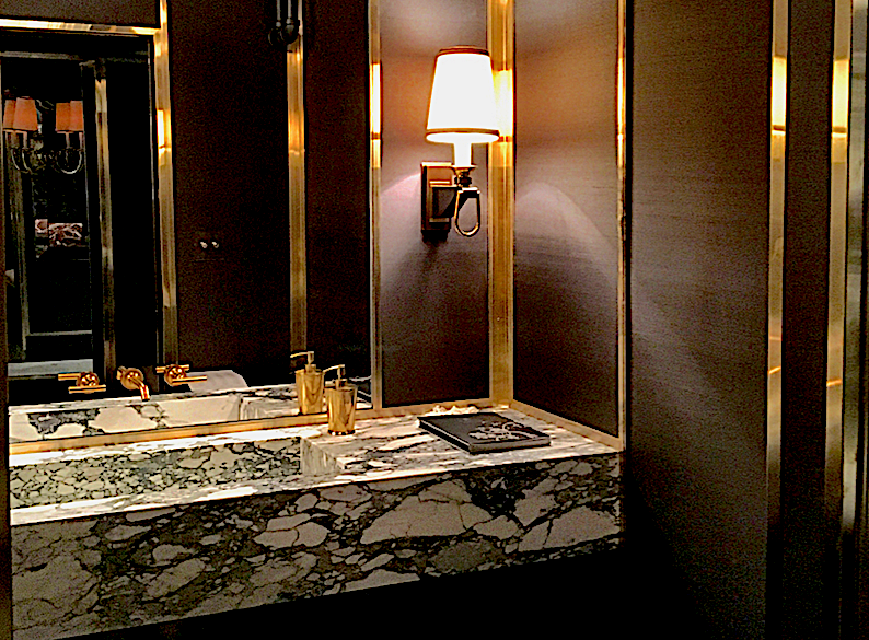
In thinking of how to add an element of luminosity to the room, they were inspired by Brooke Astor’s iconic library by Albert Hadley with its elegant brass detailing, beautiful against the wallcovering,
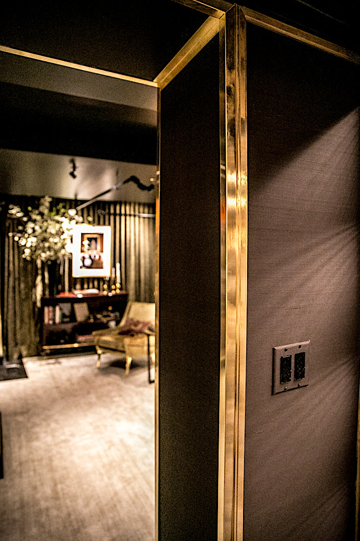
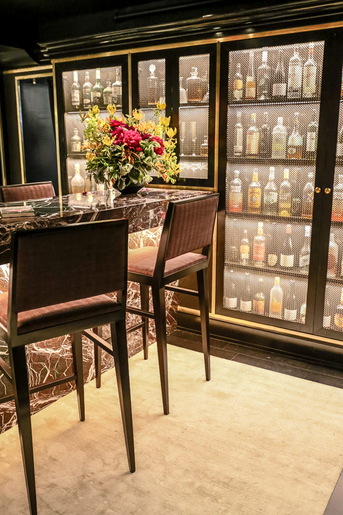
and accentuated in the bronze mesh of the cabinets. Richly veined Italian marble added subtle color and pattern in the bar area, which extended into the seductive, dark powder room as well.
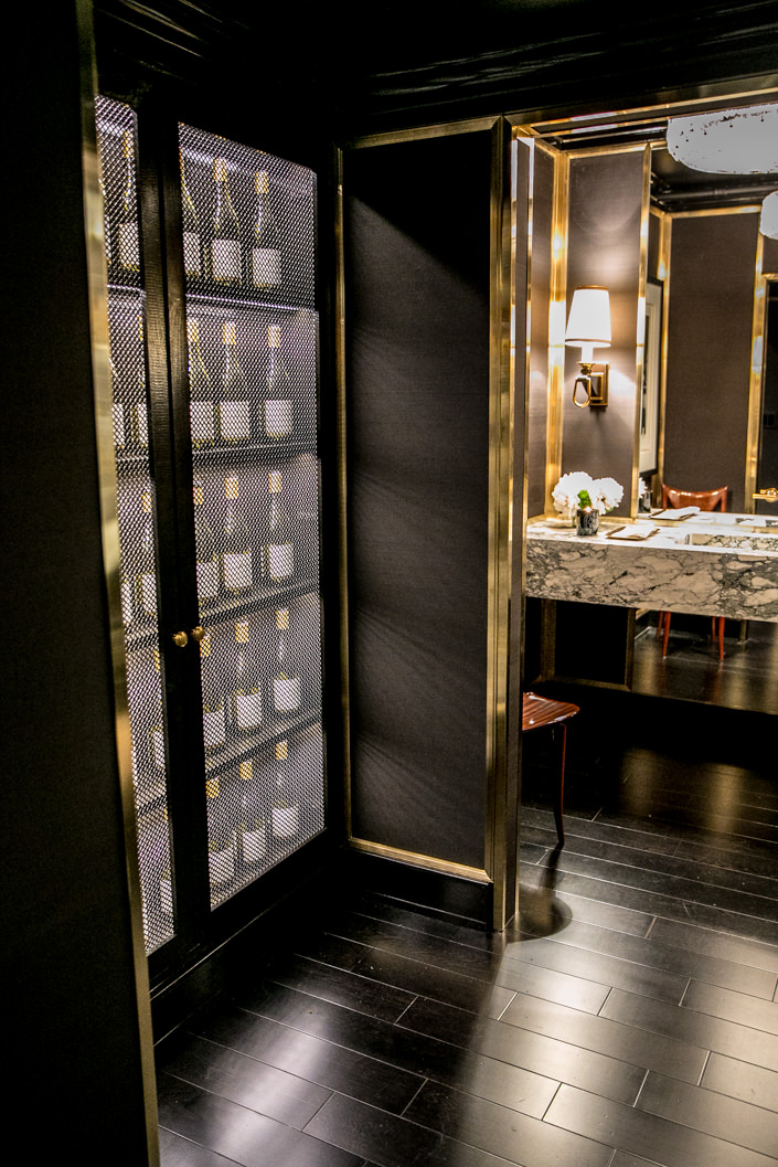
For the third year in a row, Kohler is the exclusive sponsor for the all the baths and powder rooms in the house and Lichten Craig used their resources effectively to create their sumptuous space.

With elegant details and fixtures, photographs from Staley-Wise of glamorous people having fun in dark spaces added to the sexy allure.

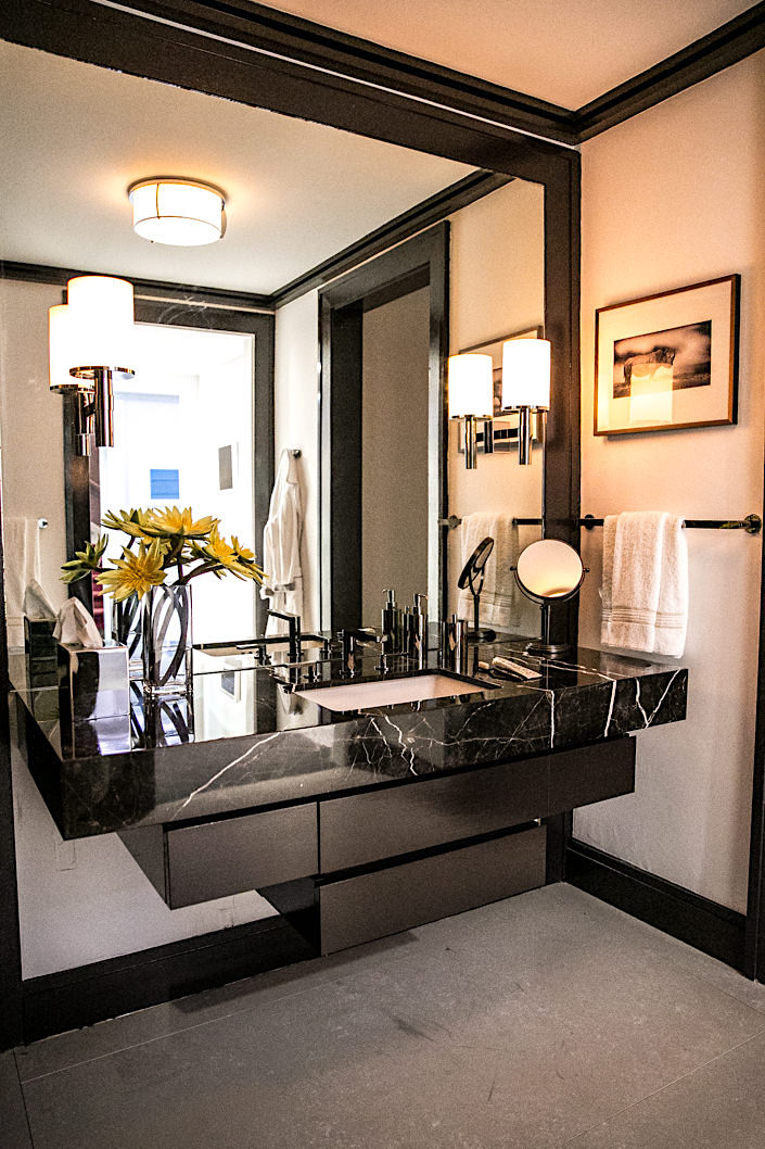
Also mastering a dark space in glamorous style, architect and designer Yorgos A. Scarpidis transformed the second floor staircase, adjoining gallery and “his” bath into a distinctive design.
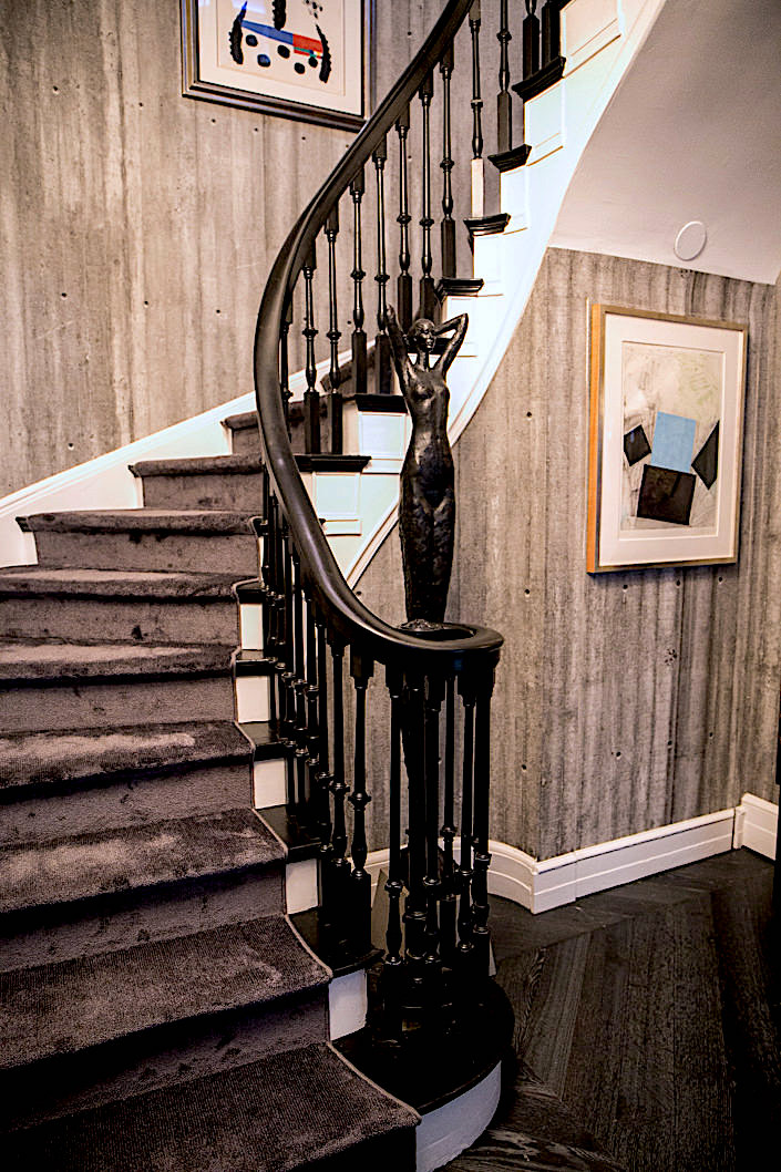
Always taking his cues from the architecture, Scarpidis juxtaposed the classic design of the stairway and banister with a modern wall treatment, as Tom Corbin‘s female bronze basks in the intersection of tradition and modernity. The faux concrete wallpaper is texturally convincing, adding a strong element of texture to the space as do the beautiful bespoke dark chevron wood floors with subtle brass inlays.
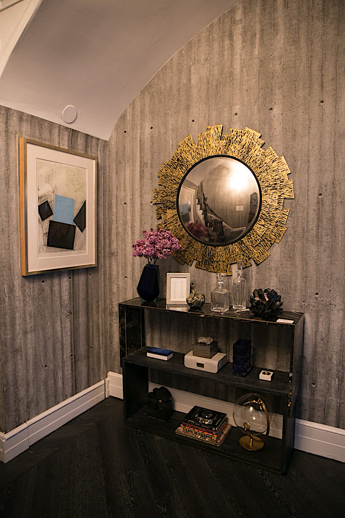
Elegant accoutrements accent the staircase corner and thoughtful moments gracefully segue from staircase to landing.
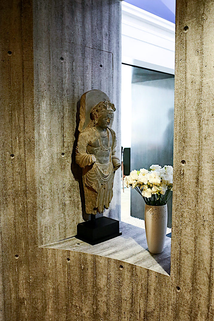
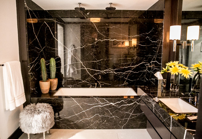
The bathroom is a refined and handsome architectonic statement.
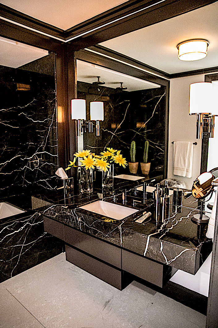
Bold shapes, elegant materials and sleek modern fixtures from Kohler contribute to another space oozing with dark glamour.
A mere hint of femininity, for the occasional female guest, is indulged with Marc Bankowsky’s iconic Pied de Bouc Stool offset by the more masculine tubside cactii.
all photos by Stacey Bewkes for Quintessence
As Scarpidis elaborates, “when the moment strikes, our bathtub features double showerheads for those more serendipitous moments.” A discreet and sophisticated space perfect for him and inviting enough for “us.”


They did a good job of hiding those hideous sprinkler pipes. A matte paint on the ceiling to make them blend in even more — now it shines a bit and shows them.
It’s an interesting mix, but the overall effect is simply sumptuous.
I love this dark theme! Absolutely fabulous that bronze mesh! Love it!
These spaces are the works of true masters. The sconces in the Lichten Craig space are perfection.
What Addison said!!!! franki
What a transformation for a basement!! I’d take that bar in any room in a house, especially with the elegant brass detailing. Beautifully curated!
Great post. Can’t wait to see the house in person.