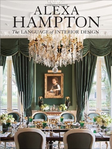
 With an Ivy League degree, graduate work completed at New York University’s Institute of Fine Arts in both Florence and New York, an apprenticeship under her father, Mark Hampton, one of our generations’s most accomplished and revered interior designers, and the title of president of his eponymous firm since 1998, Alexa Hampton has a lot going for her just on paper alone. But she hasn’t let those mere credentials define her. Consistently included by Architectural Digest as part of their AD100 directory and by House Beautiful in their annual “America’s Best 100 Designers”, she has proven herself time and again on her own terms. And that is shown with great aplomb in her new book Alexa Hampton | The Language of Interior Design.
Just seeing her work, shown through these 18 timeless projects, would be reason enough to own the book, but Hampton also presents, using these homes as examples, a primer on design principles. Intelligently written, with Jill Kirchner Simpson, and beautifully photographed by Scott Frances this book is bound to become a staple in your design library. Whether or not you are a fan of her style, the clear detailed explanations of the four elements she covers, contrast, proportion, color and balance and how she used them to meet her clients’ needs, makes for excellent reading and learning! And she isn’t so proprietary that she doesn’t mention specifics – I now know, for example, that her go-to dark brown (which I would love to use at some point) is Benjamin Moore HC-68; Middlebury Brown. Not to mention the glorious story boards. Well I could go on but I know you want to see the pictures so let’s get started!
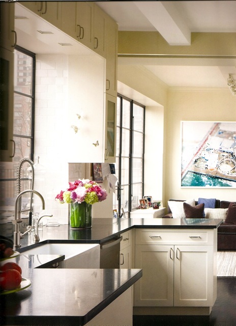
As Hampton explains in her introduction, “While there is no question that the best designers have innate talent and creativity, the language of interior design can be taught, and anyone can benefit from learning it. Training your eye is a life-long process.” The first design principle discussed is contrast, which she says “can be though of as a verb: It creates the tension and “action” that keep the eye engaged and moving around the room”. This project in that section, shows her versatility in incorporating a more modern aesthetic. Walls were removed to make the space more open and new metal windows and French doors added with a large scale to give a more industrial feel.
 The white kitchen with granite and stainless is open to the living space and picks up the black stone of the fireplace place surround, the TV and the metal of the windows. I love the art – it is an aerial view of an amusement park.
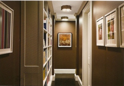
 And there’s that wonderful Benjamin Moore Middlebury Brown in the back hallway, contrasting with the graphic trim and bookcases.
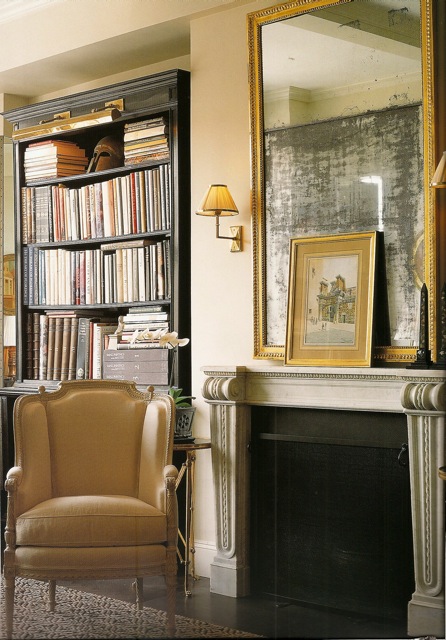
The next design element, proportion, Hampton explains “is the most concrete, physical, and tangible element of design…less dependent on personal taste…more a matter of good judgment one acrues over a lifetime of looking at the best examples”. Easier said than done I say. Within this paradigm is Hampton’s own handsome apartment, which is now the result of the combining it with one next door. Alexa Hampton’s love of architectonic elements, classical allusions and a neutral palate are clear. She made many changes to improve the proportions of the space, including this beautiful antique mantel, which Hampton says will be coming with her if she ever moves.
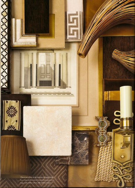
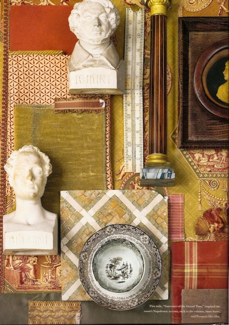
And here is the fabulous story board for the apartment, showing everything from the Greek key trim to the marble.
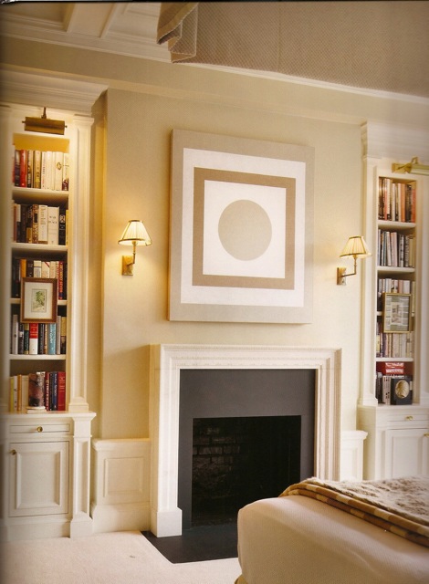
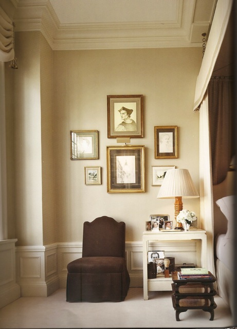
These two shots of the master bedroom show her love of tailored millwork and attention to detail.
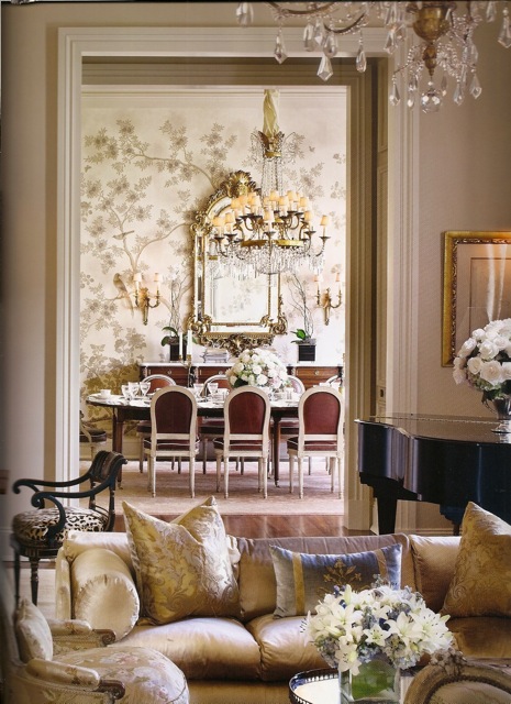
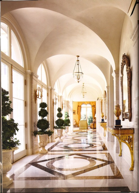
Color is what “helps bring a room to life”. I think we can all agree on that. It was hard to choose which projects to feature but within this section, there was one that stood out. This neoclassical New Orleans mansion was built for the owners by architect Peter Traplin. After the completion of the project, it was all but destroyed by Katrina. But they were devoted to the house and rebuilt it with these spectacular results. Now there is no debating that not many of us can relate to a home of this size and grandeur but I show it because it is a testament to Alexa Hampton’s abilities to tie together a project of this magnitude. The entry hall was kept neutral which allowed the use of more majestic colors in the surrounding rooms.
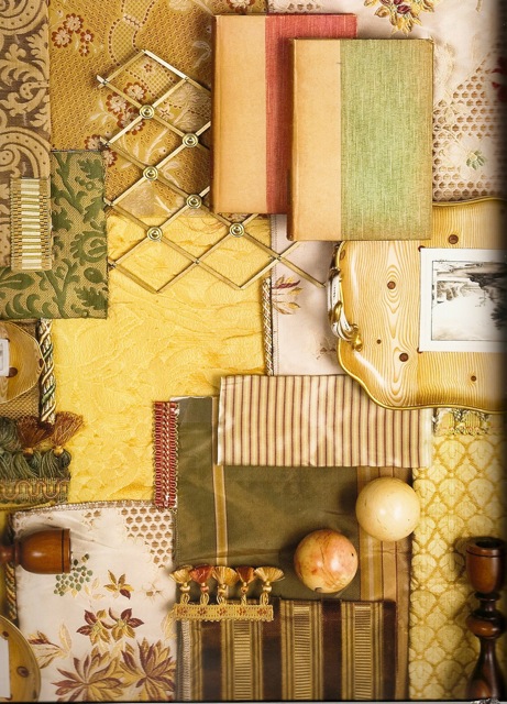
 Yellow is the predominant color of the living room. But as you can see, the addition of sage green and embroidered florals give it its depth.
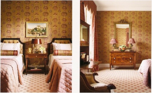
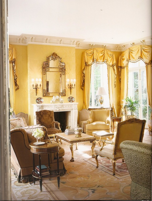 Off of this room, the secondary sage green segues to the magnificent green dining room which is shown on the jacket of the book. The guest bedroom uses a variation in the palate – the sage green is still present but is now paired with more delicate colors that are brought out in one of my favorite Bennison fabrics, used on the curtains and headboard.
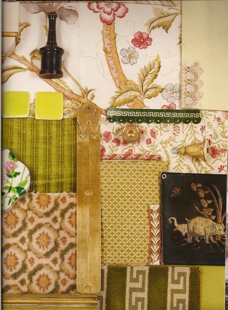
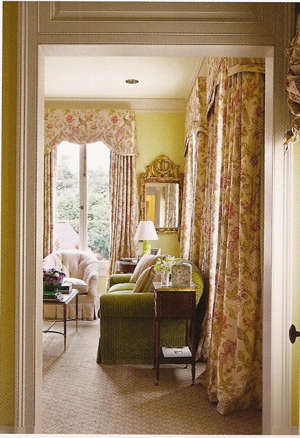
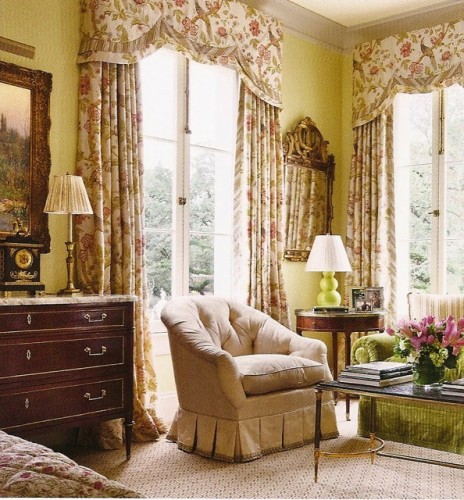 This second guest bedroom uses yet again a similar palate with very different results. I love this tailored toile. The details in this room are amazing.
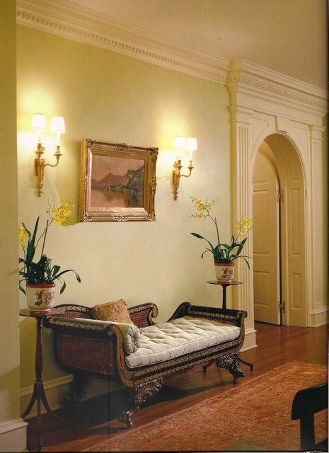
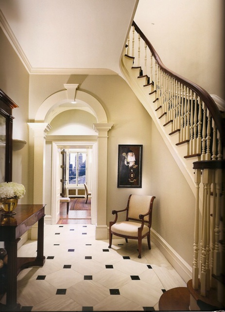
Lastly is balance. Balance is many things. In one aspect, it is what a successful project should have if everything else is done correctly. It also represents the result after having taken into consideration all the different needs of both the client and the home. And lastly balance “suggests timelessness – creating a room that is not so of-the-moment that it will feel obsolete within a year, but also not so period-perfect that it seems preserved in amber, more a museum than a home”. For this last section, I chose a home that especially appealed to me, as it did to Hampton. I couldn’t say it better – “it is the epitome of a classically rigorous, precisely composed, and carefully distilled apartment.” The owners had originally worked on this apartment with Mark Hampton, when it was completely gutted and rebuilt. After returning from a stint in England, they wanted to redesign it to reflect the same color scheme they had in their London home. This neoclassic front hall, with its architectonic enfilade, is elegant and restrained, a hallmark of much of the younger Hampton’s work.
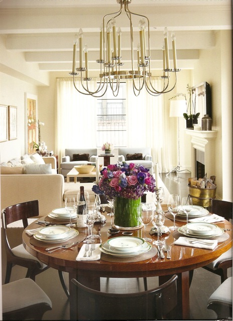
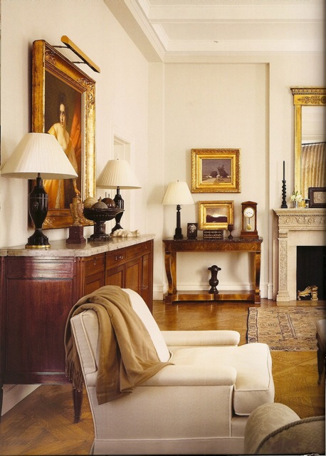
 The duplex is so bright, with constantly changing light, that they mixed the subtle taupe paint color on site. The living room reminds me of Bill Blass’ Connecticut house with its rigorous neutral palate. Although Blass once said, “Color is for the rich”, I don’t imagine that’s why this color scheme was selected here.
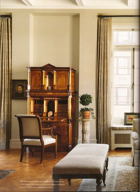
 The other view of the room shows the magnificent Biedermeier secretary, judiciously tucked into one of the room’s alcoves, its architectonic intricacies becoming the focus of an otherwise quiet scene.
There are many other projects and facets to this book, including discussions on selecting seating, furniture plans and various aspects of curtains. It is more than just your average picture book and I think you would find it a welcome addition to any design collection.




Thanks for sharing these images here…the Hampton family…what talent!