Tis now officially the season of giving and receiving which means I need to catch up on my book reviews! One tome that deserves a place in any design library is Interiors | Atelier AM. With 200 exquisite photographs by François Halard, beautifully printed on heavy stock, the book qualifies as art and design volume in one.
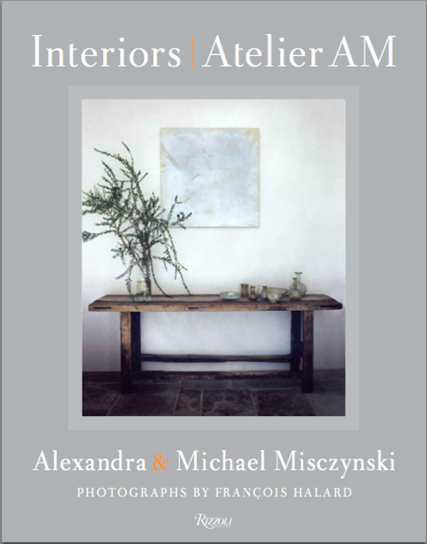
The work of Alexandra and Michael Misczynski is difficult to categorize. Although the book has little text, what there is, by Mayer Rus, design and culture editor of the LA Times Magazine, is insightful and articulate.
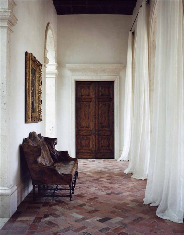
Walking the line somewhere between the aesthetic of 1930’s French modernism and the Belgian rusticity of Axel Vervoordt (who wrote the foreword) infused with a contemporary attitude, it’s too simplistic to say the team has merely mastered the mix. A look at the first project in the book illustrates their fresh approach. Above a 17th century Italian leather and walnut settee sits below a 19th century French Pre-Raphaelite painting across from diaphanous drapery.
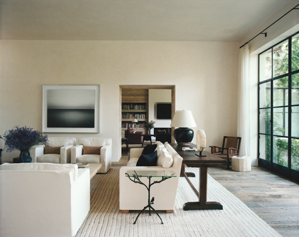
Their sublime melding of past and present is a seemingly effortless exercise resulting in sophisticated and serene interiors. In this Rancho Sante Fe living room, a modern Hiroshi Sugimoto photograph lives comfortably with a Giacometti side table and upholstery echoing Jean-Michel Frank forms. Vervoordt notes their sensitive use of negative space, resulting in elegant spaces with a zen like luxury.
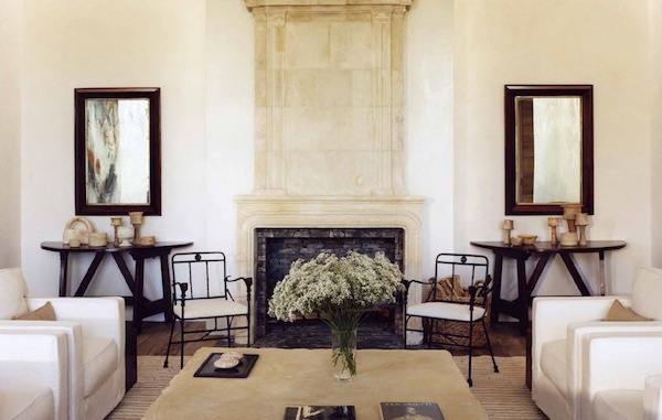
Rus includes a Mozart quote that aptly describes the effect, “The music is not in the notes, but in the silence between.” It gives the mind and eye time to absorb the artistic beauty in each object and the visual connections between them. In the same house, the grounding symmetry of the Louis XIV fireplace flanked by 18th century Italian walnut consoles lets the details of the lighter Giacometti chairs come alive.
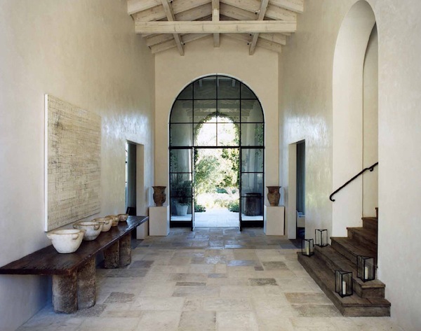
For Atelier AM, it all starts with the architecture which then informs the interiors. With a perfected sense of proportion, each space is crafted as a whole, emphasizing texture, finishes and materials. The minimal modernistic steel entry wall sets the stage for a pure and tranquil entry, mixing 19th century French limestone on the floor with Han dynasty Chinese vases.
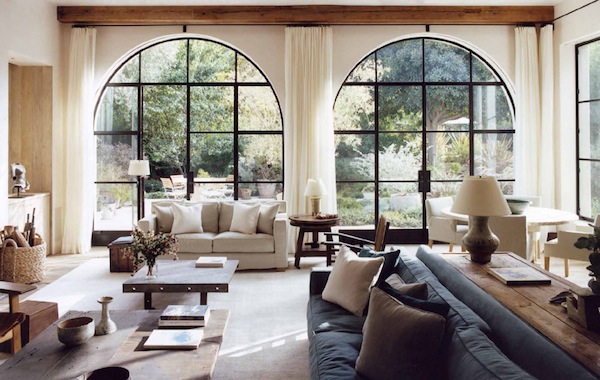
Similar steel arches frame the more casual family room, but it’s the same design vocabulary at work, giving the space its geometric bolt of black. And yet if you compare the spaces, there is a dramatic difference in tone – the entry with a more formal and cool reverential approach to the interior while the room above welcomes the outdoors in with a warm sunny tonality and easy to live with furnishings.
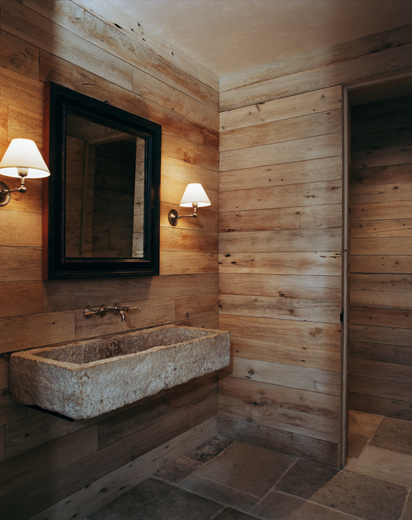
A marvelous mix of materials in a powder room off the library
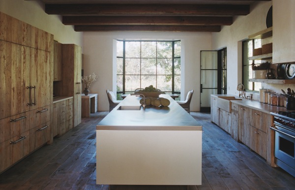
that is expanded in the kitchen. An enormous stainless island is a sleek contrast to the heavily textured antique floors and cabinetry.
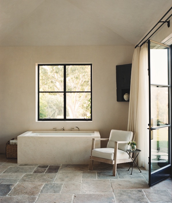 It is not just an eclectic assemblage of elements but a thoughtful and informed strategy of mixed provenance and placement of pieces that yields such pure and peaceful spaces. See how the angularity of the window, tub, chair and floor relate. The Réne Gabriel chair may be from 1948 but it is the perfect accompaniment to the contemporary limestone tub.
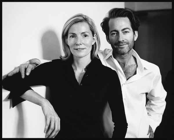 Not surprisingly, such sophisticated work comes with distinguished design pedigrees. Michael worked as an architect for Richard Meier and Alexandra trained under both Naomi Leff and Michael S. Smith, their combined experience yielding a wide base of knowledge.
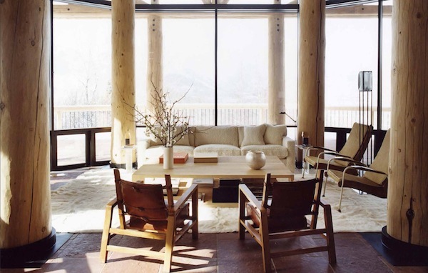 This is merely a taste of the treats you’ll find in Interiors | Atelier AM. From an urbane contemporary version of a log cabin in Aspen, above, to a spectacular modernist Palladian villa in Las Vegas to a refined Manhattan pied a terre, each interior incorporates the past with the present, the rustic with the refined and the humble with the historic in an understated meaningful manner.

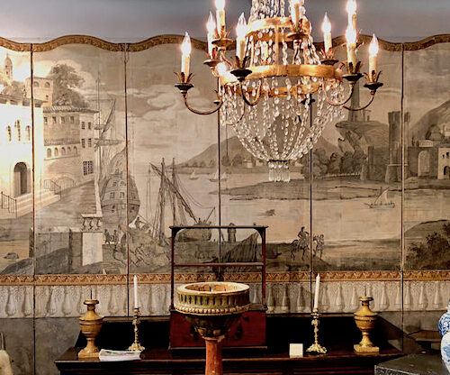


Beautiful interiors and wonderful photographs.
Thanks for sharing with us this work.
Looks like a gorgeous book filled with modern rustic elegance. Each room you pictured is inspiring! Hope you had a great holiday weekend filled with family.
xxoo
C + C
I have this book and absolutely love it the pictures are incredible I highly recommend it!
XXX
Debra~
I love their work. Have featured them a couple of times myself as I just can’t seem to get enough! Such clean simple lines, amazing combination of materials and perfect furniture selections. The book looks amazing and will be added to my wish list for sure! Thanks so much for sharing.
They are good. Very, very good.
Thanks.
Mary
They are amazing and I love François Halard’s work–did you know he also has a home in Arles? There is so much that speaks to me here, Stacy–thank you so much! Hope that you had a fantastic Thanksgiving… :)
The clean design of the windows and doors…NO curtains, draperies. LUV! franki
Stacey-
As always, you bring something fabulous to the table.
Happy Monday.
Teresa
xoxo
Wow, what a fantastic presentation of a design aesthetic I so admire. This book is definitely on my wish list. Thank you for sharing such a thoughtful review!
I’m such a huge admirer of theirs. This book is going to be a Christmas present to myself. Thanks for the great insight.
Wow, so much delicious texture. I love how spare, yet rich, every space is. A gorgeous book!
Beautiful photographs, but what I really love is your writing. You are great source of information and I always feel smarter after visiting!
Beautiful interiors!! Great inspiration here, will definitely put this on my books to add!
http://www.donnaviningblog.com
Great images..balanced and just plain cool!