While I won’t have time to cover all of the marvelous tables at this year’s Dining by Design, this second part includes a number of particularly noteworthy vignettes. The sister team of 2Michaels designed a serene Japanese inspired vignette for Beacon Hill, using the company’s new Floating World collection.
![]()
Depicting a tea ceremony on top of Mount Fuji, the designers cleverly constructed a simple bamboo enclosure giving the space an enveloped yet airy feel.
![]()
The 70s are definitely having a fashion moment and stylist guru Robert Verdi was thinking glamorous retro with his 70’s penthouse dining room for Essie.
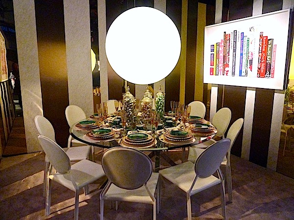
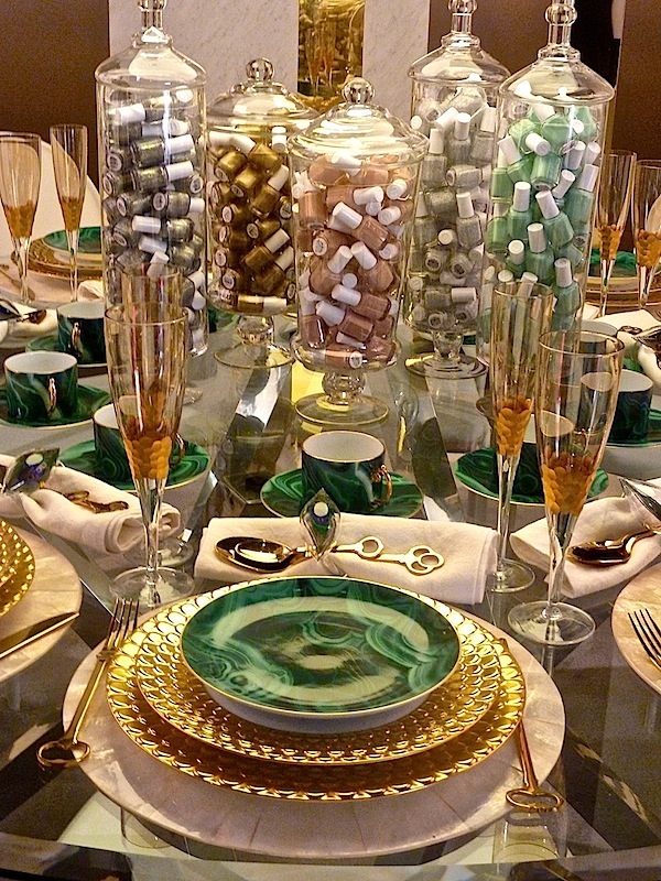
Rich gold and malachite from l’Objet set a fashionable table
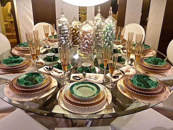
with fun polish-filled jars containing the latest shades from the brand.
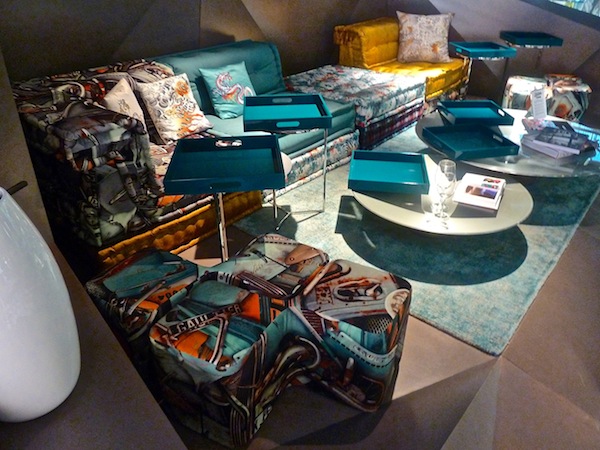
I was honored to sit at the Roche Bobois table where the talented Hariri sisters created a custom cave-like structure to house the dining space. Inspired by their interest in organic shapes and the faceted geometry of rocks and crystals, architects Gisue and Mojgan Hariri’s described their luxe lounge as a space where “lounging and dining is exotic, primal and sophisticated all at once.”
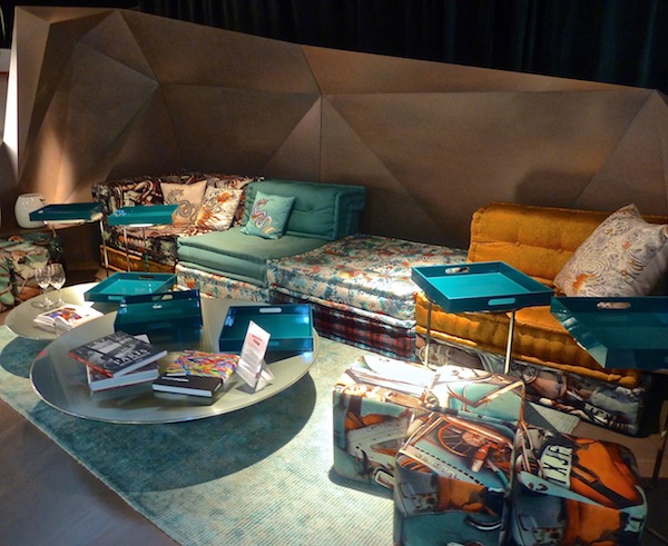
Featuring Roche Bobois’ iconic flexible Mah Jong Sofa, the vignette debuted the piece in a new version outfitted with fashion forward Jean Paul Gaultier fabric. Their Ovni cocktail tables and Majordome occasional tables made tray eating a breeze.
Architectural Digest’s table featured colorful wall art and tablecloth from the talented Donald Robertson. White Oly chandelier and benches let the art shine.
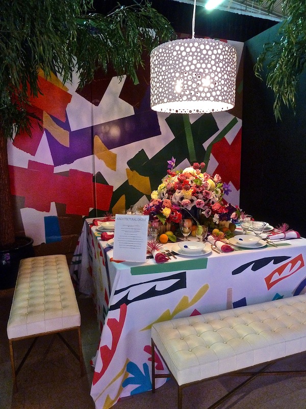
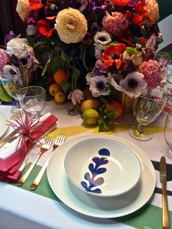
Matisse-like Bernardaud plates, Canvas flatware and stemware, Sferra napkins and Kim Seybert festive napkin rings add to the fresh graphic tablescape against the lush background of Carlos Mota‘s gorgeous floral arrangement.
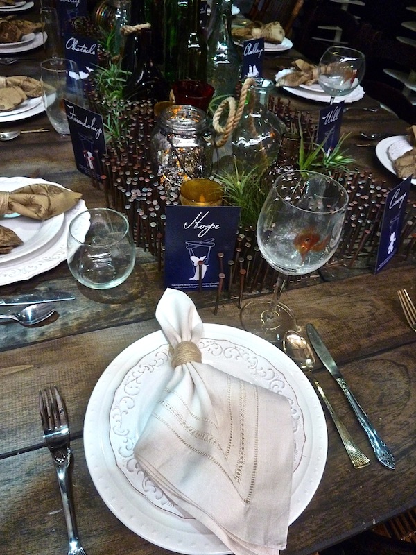
The design schools presented strong showings. I especially liked FIT’s vignette, mentored by Jes Gordon. Referencing Pinocchio, their clever table represented the scene when the young puppet/boy enters the belly of the whale, a metaphor for his being trapped inside his own battles. “Just like Pinocchio trapped inside the belly of the whale, the most challenging times of our lives can lead us to a more positive journey.
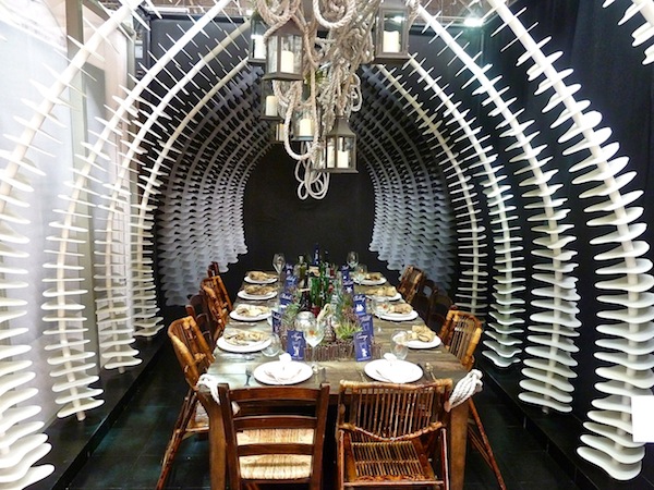
I liked the positive message paired with the charm of the nautical theme.
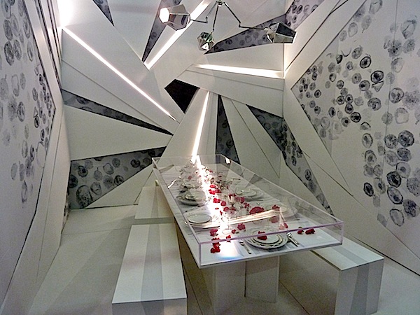
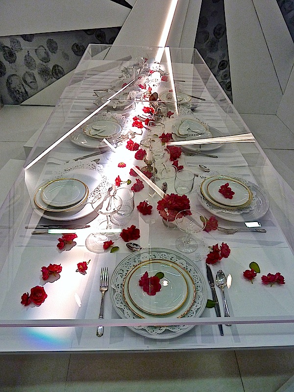
New York School of Interior Design with faculty advisor Rene Estacio and mentor Shawn Henderson created a futuristic table of angles and light, contrasting the constructivist architectonic angles with the amoebic forms on the walls
and the sentimental placesettings encased in the plexi form.
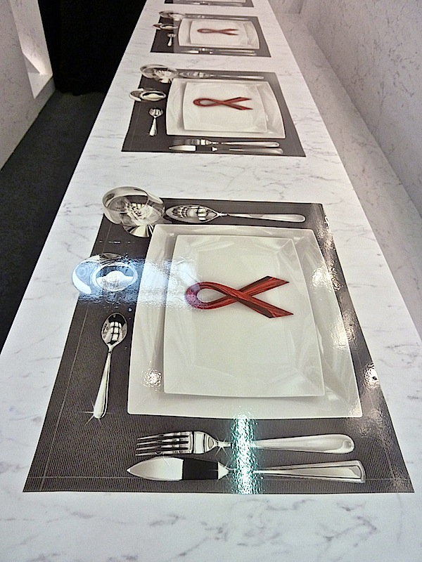
3M collaborated with Rottet Studio to design a space that emphasized the chasm between those with and those without HIV/AIDS – each in their own bubbles.
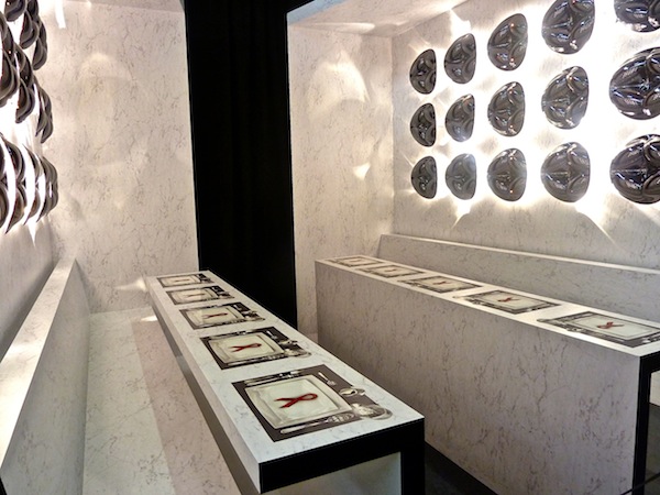
What appear to be marble tables and benches are actually a 3M product that is veneered to the surface as are the placemats.
Echo Design’s latest fabric collection, Heirloom India, inspired their exotic tented space.
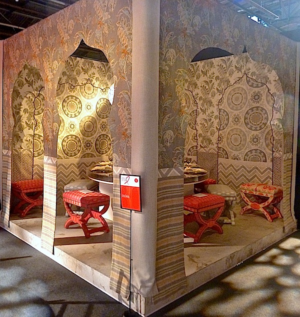
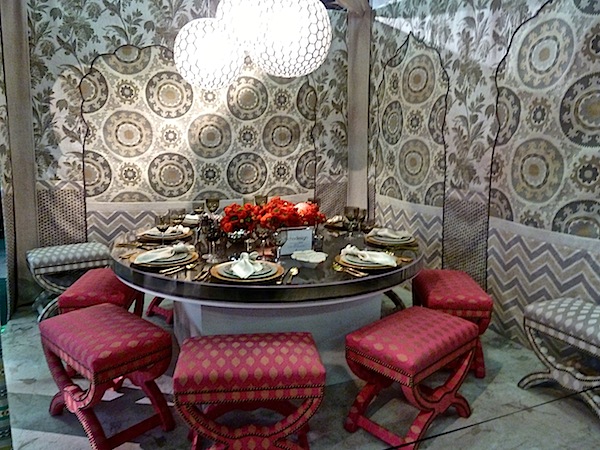
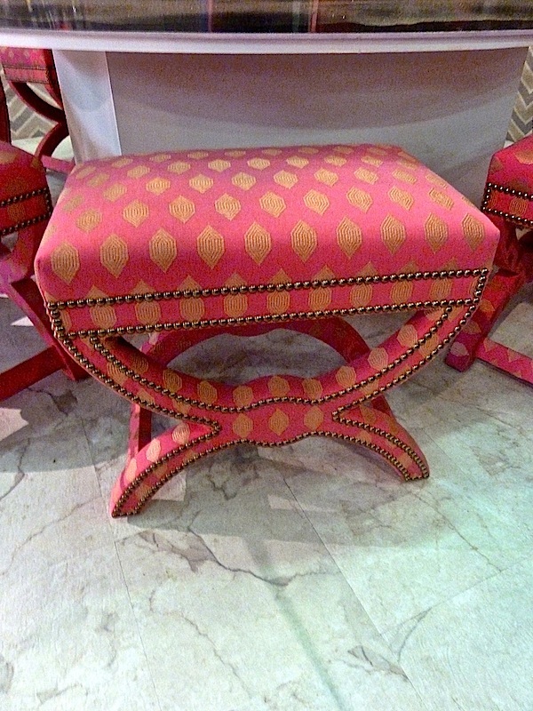
I loved the charming stools with a bit of Ottoman flair.
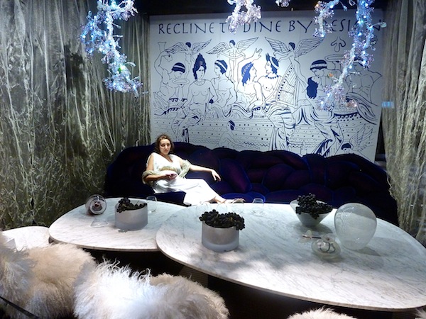
ddc partnered with architect David Ling for this “reclining while dining” space, whose theme is based on a book by Bernard Rudofsky. Referring to the Roman habits of dining while supining, it is also a social commentary on American dining habits, as less and less actually eat at the table. It was tempting to recline with them for a little bacchanalian festivities on the Campana brothers’ BOA amorphous “sofa.”
In contrast, Marc Blackwell‘s table was a totally self-contained unit, symbolizing and looking forward to a unified gathering to celebrate the end of AIDS.
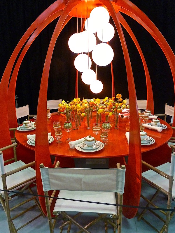
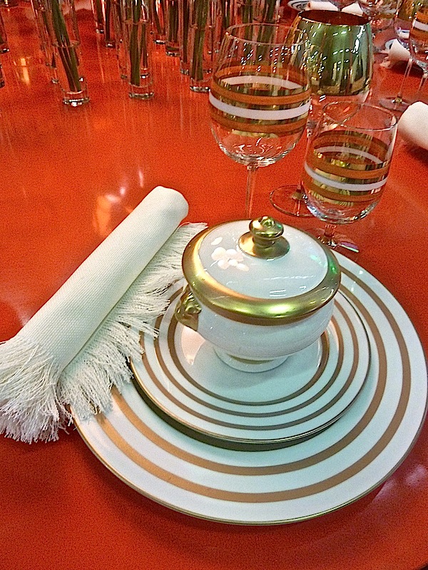
Marc’s tabletop designs echoed the circular theme of the encapsulated table.
While I thought I could squeeze everything in today, we’ll have to return for a very quick look at a few more of the glorious tables from this year’s Dining by Design. And don’t forget to stop back tomorrow for our new Stylish Shopping video with Mary McDonald!



love them all. especially, roche bobois and the new york school of interior design. ox
Today I am inspired to escape the belly of the whale. :)
So much to be inspired by here. Love all the over-the-top creativity! That India Heirloom tented space from Echo Design looks like a dream. Carlos Mota’s flowers are gorgeous. And I think my favorite might be the Essie table! I just did a spring luncheon with Essie polish that coordinated with the table colors as gifts for the girls, so love seeing them arrayed like candy centerpieces here.
Thanks for a wonderful round up!
Agree with Jeanne!! ” So much to be inspired by here”. Gorgeous tables and beautiful photos!! I can’t pick a favorite because they’re all so unique!! Seeing the DIFFA tables was THE highlight of the AD Home Design Show. Lovely!!
Jeanne McKay Hartmann…you “trumped me!” My exact thoughts!! franki