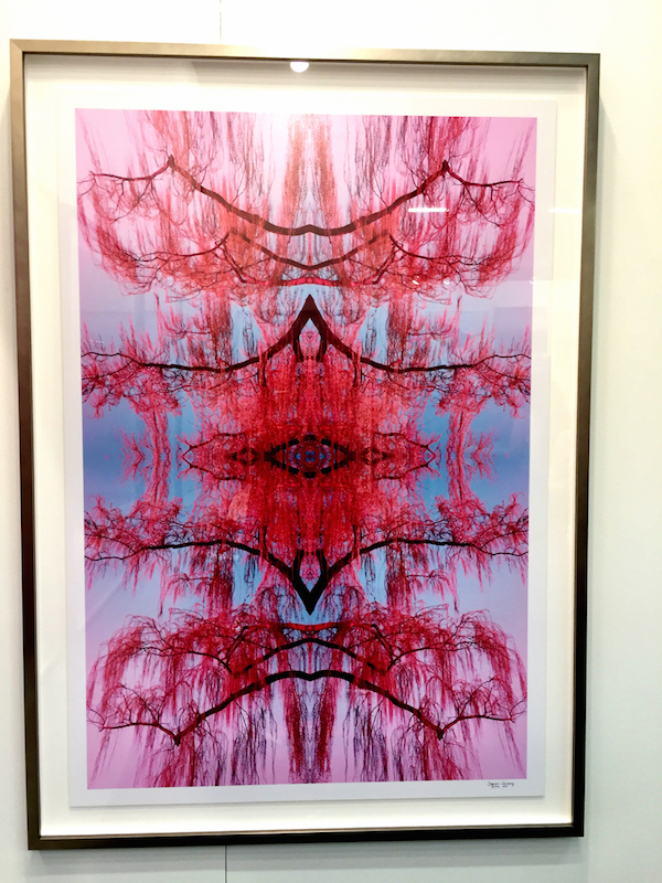
With such a wide and deep variety of categories, the AD Design Show makes picking just a few favorites a difficult task. Part two includes products across several sections. In art, a favorite from past shows, photographer Dagmara Weinberg, was again exhibiting. Her nature inspired photography translates into beautiful graphic imagery like the cheery blossoms print below.
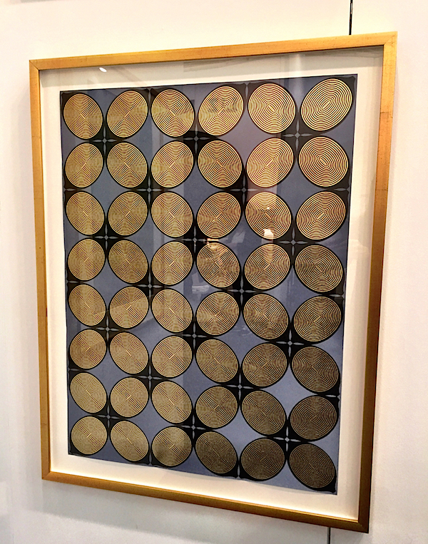
Former publishing creative director Lisa Hunt began her career as a graphic artist and her love of geometry and form is seen in her bold and decorative screen prints.
 In her Alchemy collection, above and below, the use of gold and gold leaf recalls the graphic era of Art Deco yet the repetitive forms find references in modern minimalism as well. Lisa’s work would clearly translate beautifully to wallpaper – perhaps we’ll see that in her future.
In a great showing of creative collaboration, long time favorite Tracy Hines of Black Crow Studio, worked with Neptune Glassworks and (wh)ORE HAüS Studios on a booth long on creative flair and sexy narrative. Tracy’s dramatic walls were the sensuous backdrop for LA based (wh)ORE HAüS’ marble Provocative Luxury headboard – “taking traditionally masculine materials and manipulating them with an unapologetic feminine hand.”
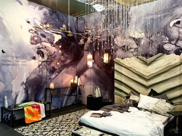
Neptune combines handmade craftsmanship with cutting edge technology and their Quadrature Rain Chandelier over the bed was a dazzling star, adding an element of sparkling artistic glamour.

Friends Stacy Kunstel and Michael Partenio at Dunes & Duchess introduced two new statement-making lighting fixtures – their Yachtsman Pendant, below

and large scale Ship’s Wheel Pendant, available in classic or faux bamboo tiki-style.

The new Porthole mirror has a fine mahogany and brass inline for a touch of nautical elegance.
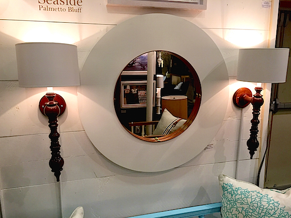
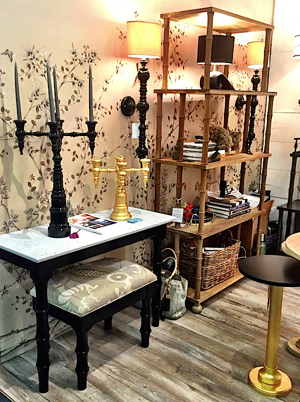
Set against a lush backdrop of Fromental wallpaper, the black lacquer, including the new large Reading Room sconce, below middle, added contrast.
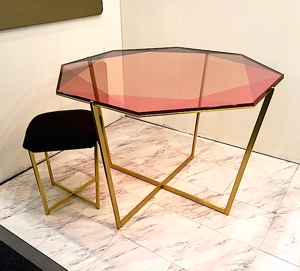
 I love the contemporary glamour of Debra Folz‘s collection. Handcrafted in her Providence, Rhode Island studio, her gem tables are destined to become modern classics. Inspired by the transparent reflection of gemstones, the feminine pastels of the faceted glass sit like jewels in settings of brass plated steel bases.
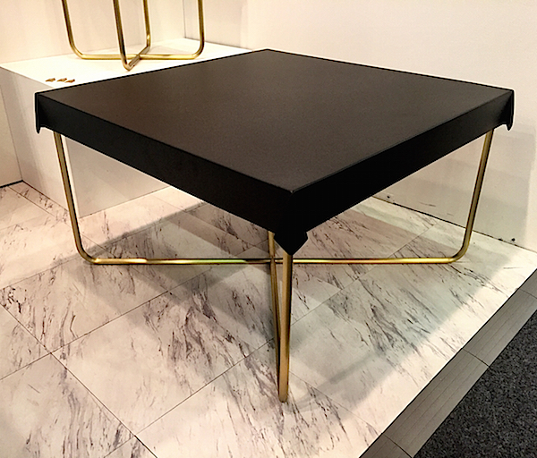
Her cheekily clever Drape Coffee Table captures the conversation between textile and furniture as the powder-coated steel top emulates the flow of fabric over the base. Also available as a side table, as above, and other sizes.
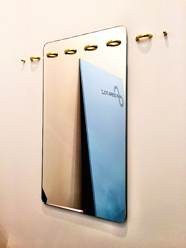
I love a product that is not only beautiful but makes you think. Folz’s new mirror is conceptually brilliant and equally elegant as the brass “staples” are jewel-like accoutrements that are seemingly structural. The pieces to either side are optional.
In my “going green” post, I cited a beautiful bench from KGBL. Their line of stools is comparably chic. The Walcott barstool, below, not only has a handsome topstitched leather seat but swivels in style and has the functional finesse of a brass base and footrest.
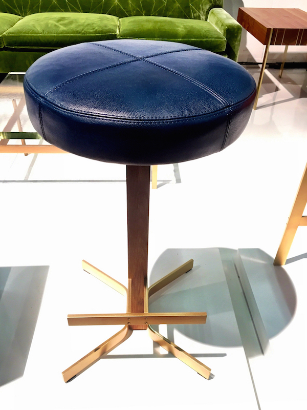 Their Gavilan barstool, in front, suited in jaunty tomato leather, is more direct in its design with a stable four legged frame and seat eager to edge up to the counter.

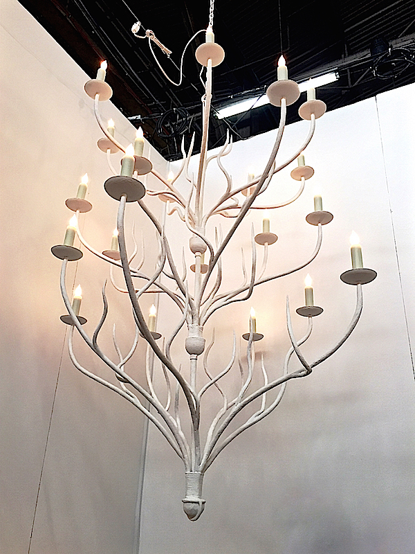
More organic forms were seen at Ironware International where owner Karin Eaton debuted her new Ondine Chandelier in plaster.
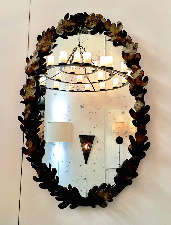
And it’s easy to bring the outdoors in with her charming Andrea mirror in her hand applied antiqued finish and glass.
Tucker Robbins is renowned for his collection from traditional artisans around the world. Although hard to tell from this angle, his Wire Wheel Pendant Lights, made by metal weavers in Honduras, were marvelous overhead as a unified grouping.

I have long admired the many Belgian artisans Greet Lefèvre has featured on her blog, Belgian Pearls, over the years. And then when Brooke and Steve Giannetti visited her, they also met with Peter van Cronenburg, whose gorgeous hardware I had already noted.
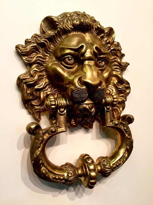 So I was thrilled to finally see van Cronenburg hardware in person at the AD Design Show last week and needless to say, it didn’t disappoint.
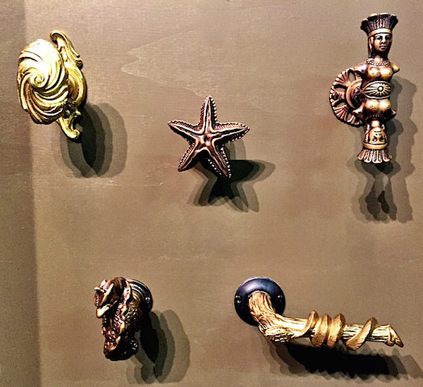 Like many companies, Peter van Cronenburg began his business when he couldn’t find the exact hardware he wanted. Now with his own foundry, he forges and casts his unique pieces.
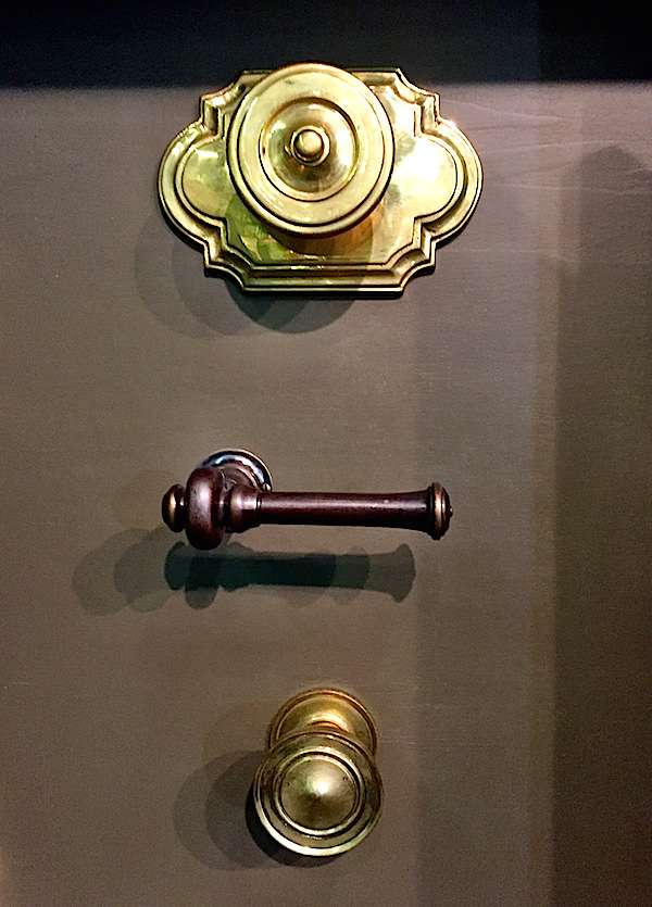
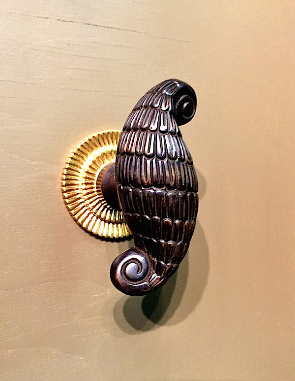
Using only living finishes (no lacquer), his architectural hardware is left to age gracefully, acquiring the patina that indicates use and authenticity.
A large portion of the AD Design Show is dedicated to the Refresh section, where all kitchen and bath related products reside.
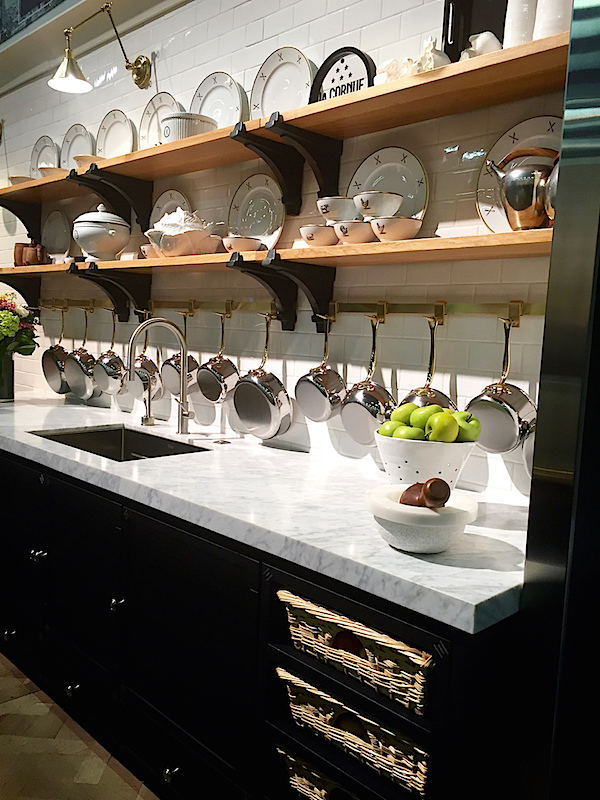
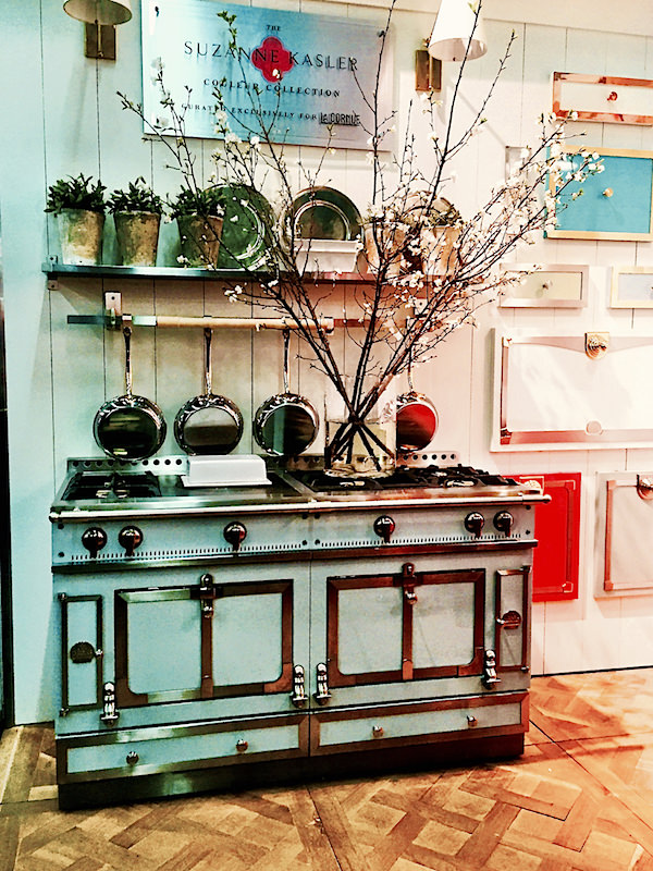 One of the most fashionable displays this year was that of La Cornue, thanks to the styling of Suzanne Kasler, whose Parisian inspired Couleur Collection for the brand was launched earlier this year.
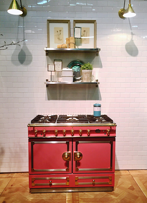
Still produced to order, they are hand-made in their atelier outside Paris, assembled by a single person who follows the production through from beginning to end. As they say, “food is our passion, but quality and craftsmanship are our livelihood and reputation.” In addition to the ranges, they produce stunning cabinetry, pot racks and shelves as well as free standing furniture, tableware and accoutrements for the kitchen.
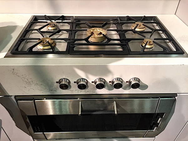
 2016 marks 333 years for the German kitchen appliance manufacture Gaggenau (you may remember the debut of their NYC showroom). Their products are always innovative, with cutting edge design of the highest quality. See how their cooktop, below, features the controls in the front of the counter for a clean look and practical usage.
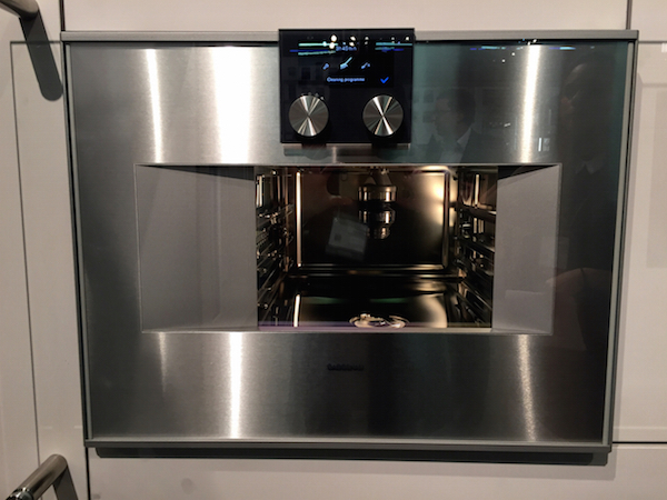
Their show introduction was the new 400 combi-steam oven series with fully automatic cleaning system (with water, not just heat) and sous-vide cooking, a sealed low temperature cooking method that has gained momentum for its health benefits and tender, juicy results. Hopefully we will be back to help the brand celebrate this landmark year.
We will come back separately to take a look at what’s new at Miele and a special event in their new NYC showroom.



THAT mirror!! Oh, I do so like the “caged” lights…hope that “sticks around!!” franki
Stunning design. Every picture tells a story.
Great post! so many wonderful products and finishes!!