It’s always takes time for me to work my way through sharing a show house, especially one like Kips Bay with so many stellar spaces. But today we will wrap up with a look at a final few rooms. On the top floor, it’s hard to imagine that Barbara Ostrom’s lovely sitting room was once a gym. She wisely tore out everything and started from scratch, installing beautiful paneling lacquered white.
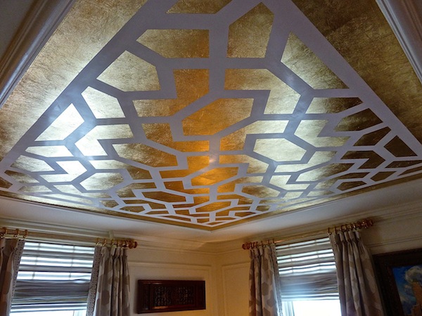
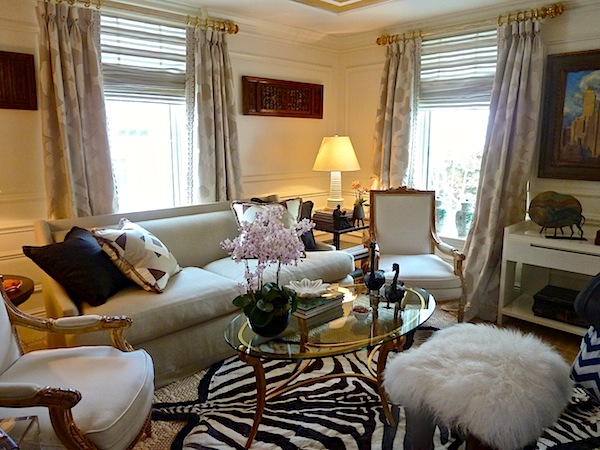 The room is an elegant tonal mix with glamorous glints of gold and bold strokes of black. Casually chic layers of sisal and zebra rug and the fun Fufu Noa stool that I instagrammed at the AD Home Show add a youthful appeal to the refinement of French antiques and silk drapery. But the seal-the-deal gesture is the ceiling with gold leaf venetian plaster painted with white fretwork.
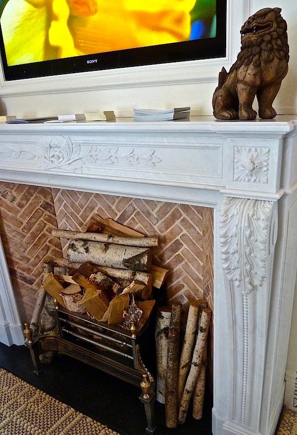
 A classic Chesney’s marble fireplace looks as though it was always there, as do many of the architectural features Ostrom added to the space.
It’s all in the detailsas can be seen in this vignette.
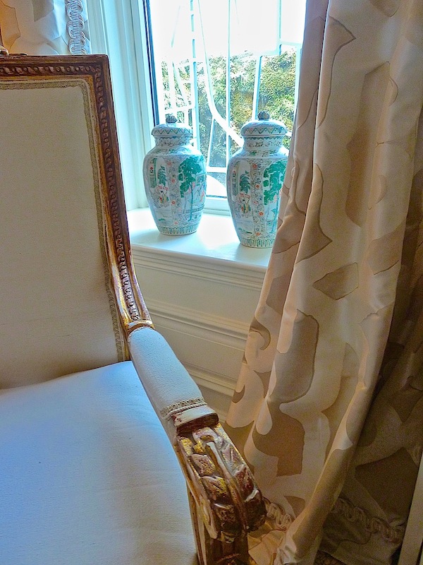
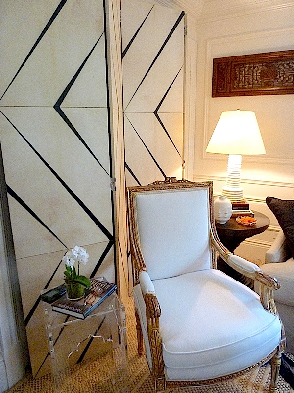
And even within such a monochromatic palette, the chic mix of old and new adds depth and sophistication. The elegant detail of the Louis XVI gold leaf armchairs from English Country Antiques contrasts confidently with the modern graphic punch of the wood folding screen from Niedermaier and the contemporary lines of Christopher Spitzmiller’s white ribbed lamp. And no further proof is need that a little lucite can live anywhere.
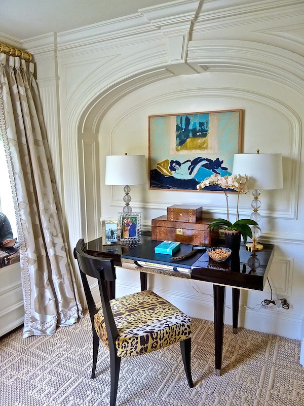
The adjacent office is a dream in the beautiful architectural niche Ostrom created with the super sleek and sexy desk from Dakota Jackson
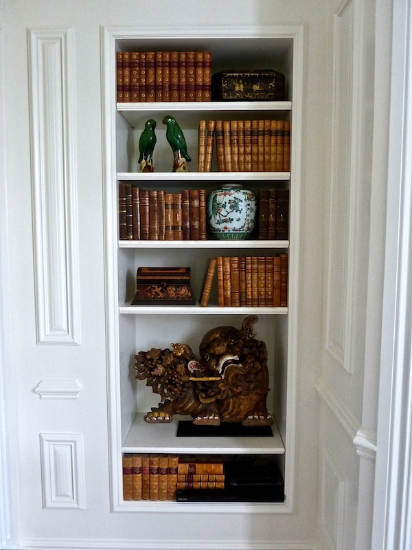
and elegantly styled bookcase. Note the clever millwork detail separating the skinny top and bottom panels.
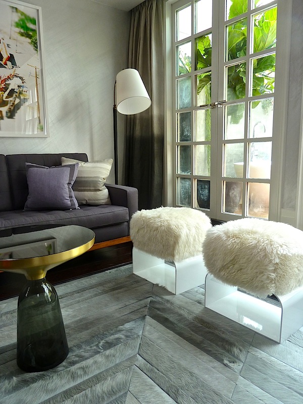
Eve Robinson’s family lounge is a casually chic inclusive space for the entire family. While stylish and sophisticated, it is a fun and comfortable room that offers multi-functional options for city living. Venetian plaster walls and fabulous lavender lacquered ceiling add a lush luminosity to the room.
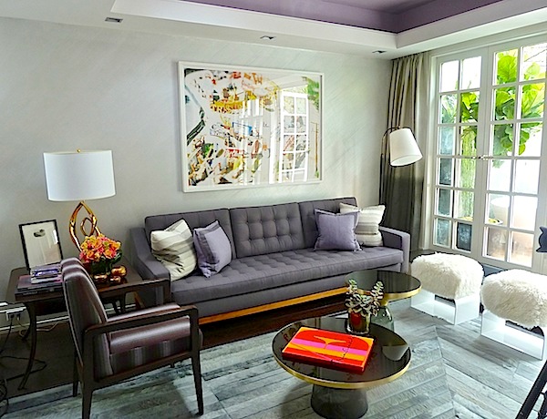
The gorgeous sculptural glass and brass Avenue Road Bell Table is on my wish list and I think everyone in the family would gravitate to the playful Jean de Merry Diva Stools.
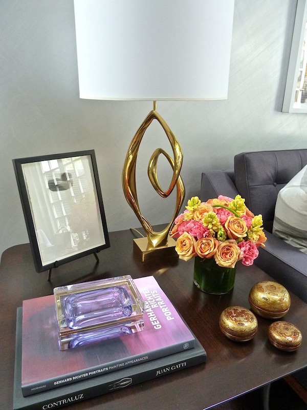
 I always love the detailed vignette styling at show houses and Robinson’s side table is a great example of a fashionable mix anchored by the stunning Willy Daro gilt brass table lamp from van den akker.
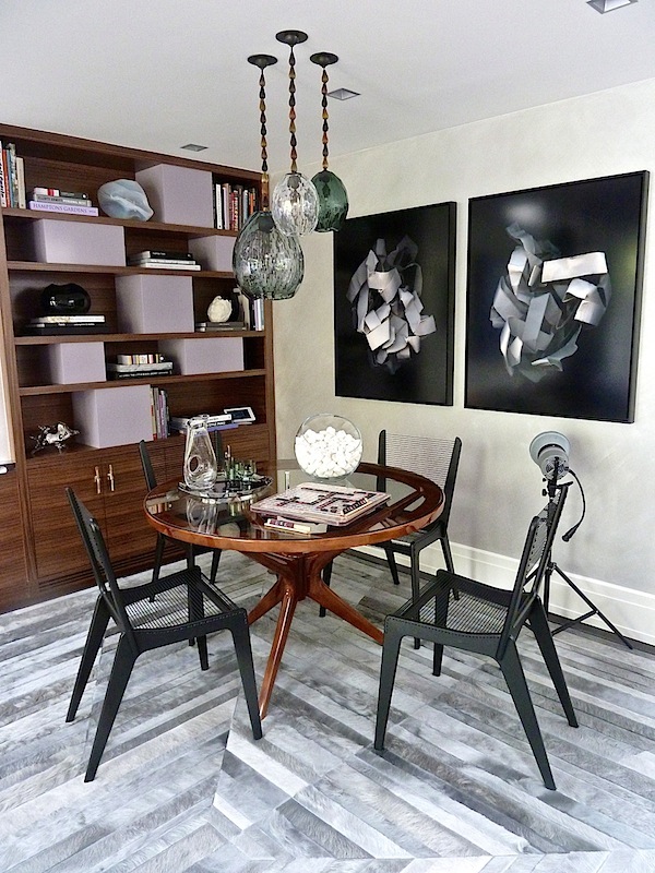
A vintage game table can also serve as casual dining made extra elegant with the addition of David Wiseman‘s exquisite hand blown glass pendants.
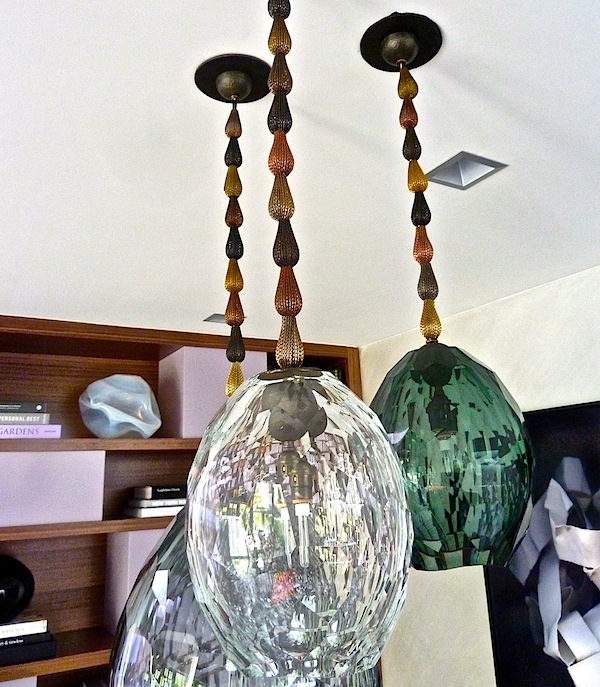
I loved that Robinson’s room included so many examples of functional art and I was particularly mesmerized by these jewel-like lights. When I went to Wiseman’s site to read more about them, I discovered an entire world of artistic expression and realized he must be the creator of the ceiling in Thomas Pheasant’s Hamptons dining room in Veranda I recently wrote about. Not surprisingly, there is a place holder for a jewelry collection – coming soon I hope!
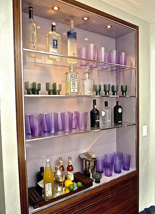
 Well I digress, but returning from the rabbit hole, kudos to Eve Robinson for discovering and incorporating such creative talent. Her bar area is so chic with the beautiful stainless trimmed walnut cabinetry carried through from the lounge, filled with elegant barware from Nouvel Studio.
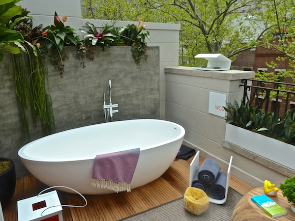
And outside Robinson’s lounge lies West Chin‘s serene spa-like terrace. I can only imagine having such a luxurious outdoor space in the city.
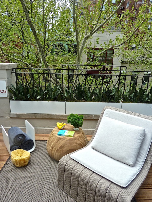 With a modern organic approach and judicious planting, this streamlined terrace is a mini urban oasis. Outdoor space is such a premium in the city and WCA really maximized the terrace for a relaxing retreat.
 That ends my coverage of the Kips Bay show house, but for any of you who were offline over the weekend, be sure to check the rooms posted yesterday to not miss any of the wonderful creative endeavors.



All of these rooms and their accessories are inspirational. That gold leafed ceiling — wow! Who makes the small lucite side table in the sitting room?
Hi Maria – I believe it’s by Donghia.
i am OBSESSED with this post. I have been studying each photo all day, reading your text and following the links. GREAT POST!
I have so enjoyed all of your posts on Kips bay. I toured it with Blogfest and it is so fun to get a different point of view. I personally was so inspired by so many things that it was a bit overwhelming. Your recap has allowed me to revisit and see things I never even spotted while there. Thanks!
Who is the decorative finisher that did the gold ceiling?
I’m afraid I don’t know Kathy – you would have to contact Barbara Ostrom, the designer.