Behind the Q
Bringing you the best in design and lifestyle from interiors, art and architecture, to antiques and decorative arts, jewelry, travel and more. With fresh original content and photos, Quintessence is a destination for those who want the story behind the style.
Never Miss A Post
Get insider access to the most inspiring and informative design stories straight to your inbox. Satisfy your style curiosity, quench your sophisticated shopping thirst and scratch your discerning need-to-know itch - sign up so you never miss a thing.

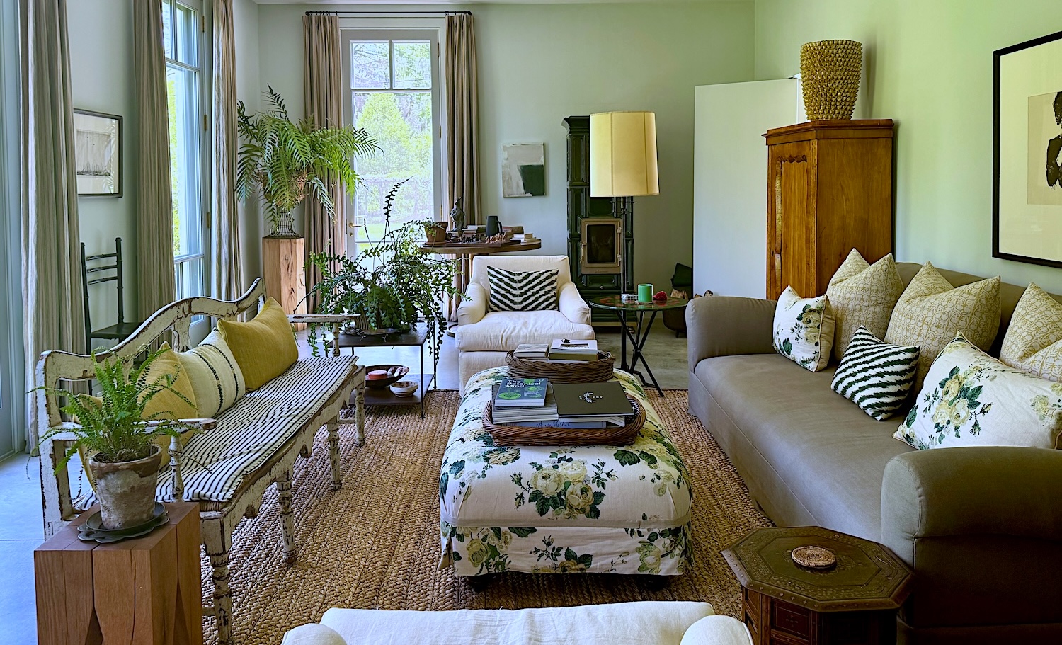
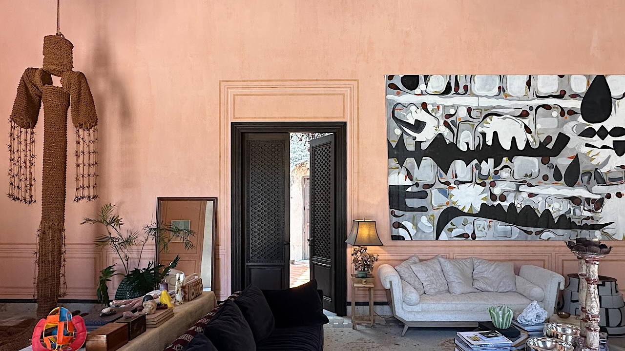
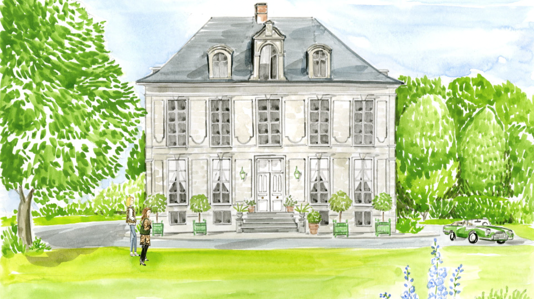
At Home with Dee Salomon in her artful Connecticut country haven
Join us at the bucolic Connecticut country home of Dee Salomon. Designed in collaboration with architect Bastien Halard, this riverside… Read More
The Winter Show 2026
As winter continues to unfurl on New York’s Upper East Side, The Winter Show 2026 returned to the hallowed halls of… Read More
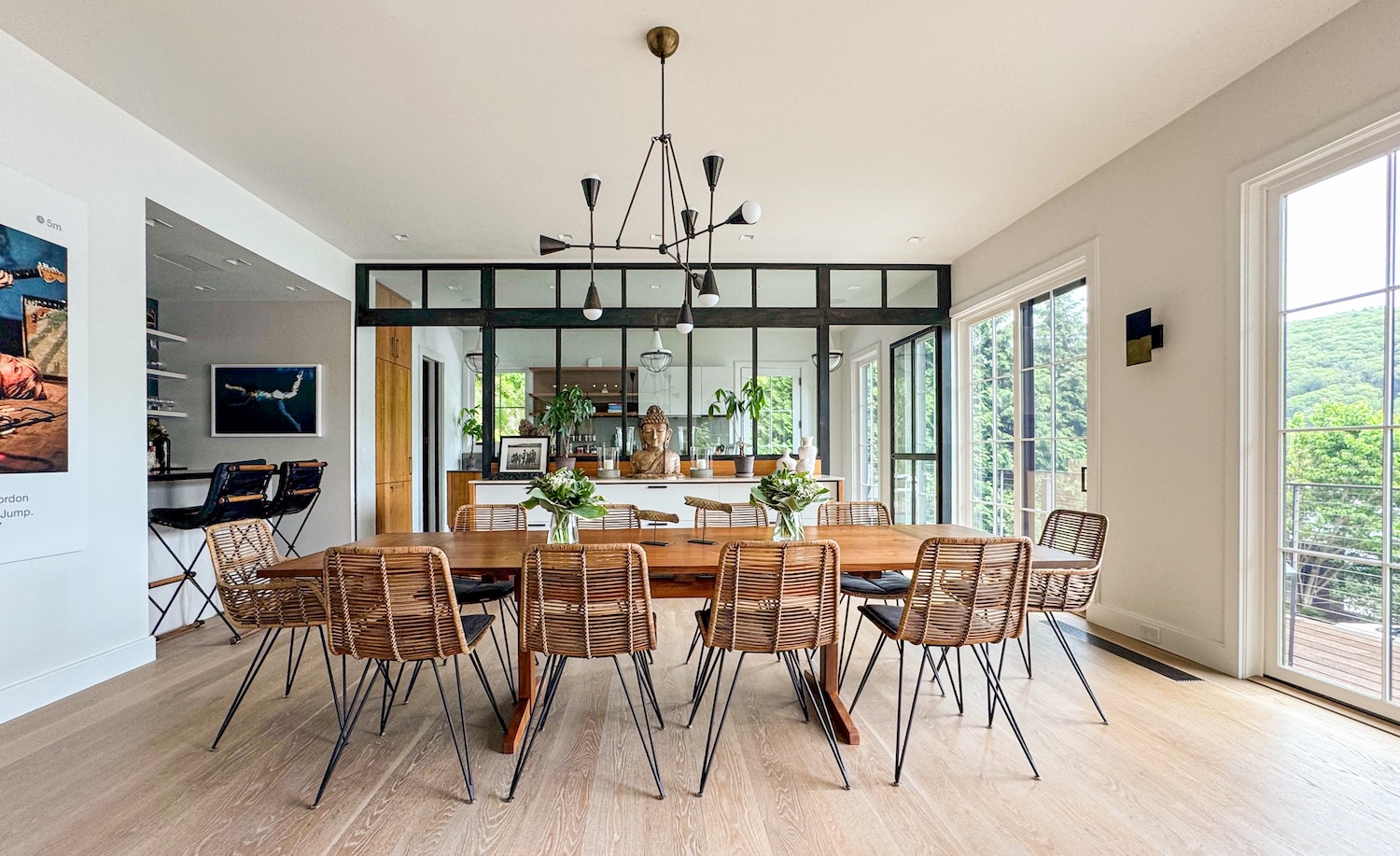
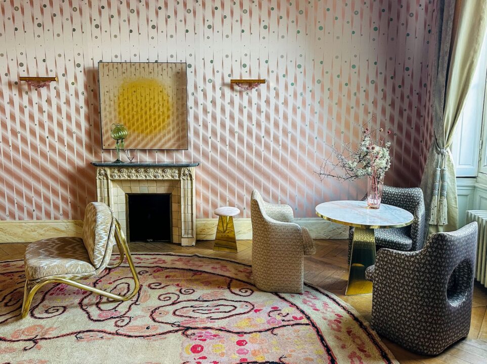
At Home with Tamara Meadow in Connecticut
Join us in bucolic Litchfield County, Connecticut for a behind the scenes visit with interior designer Tama Meadow at her… Read More
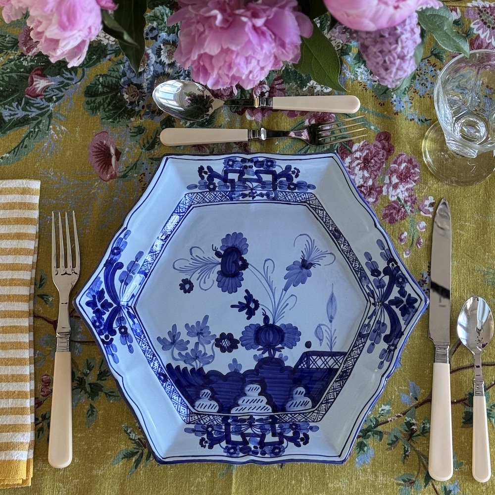
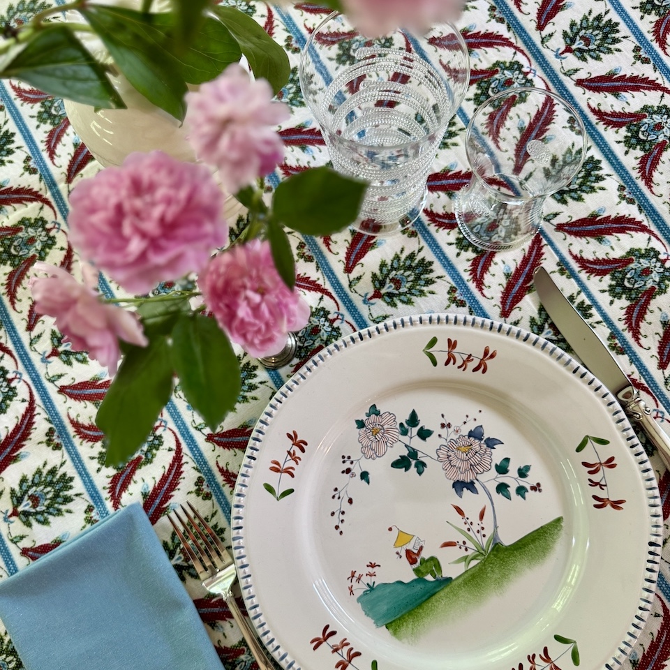
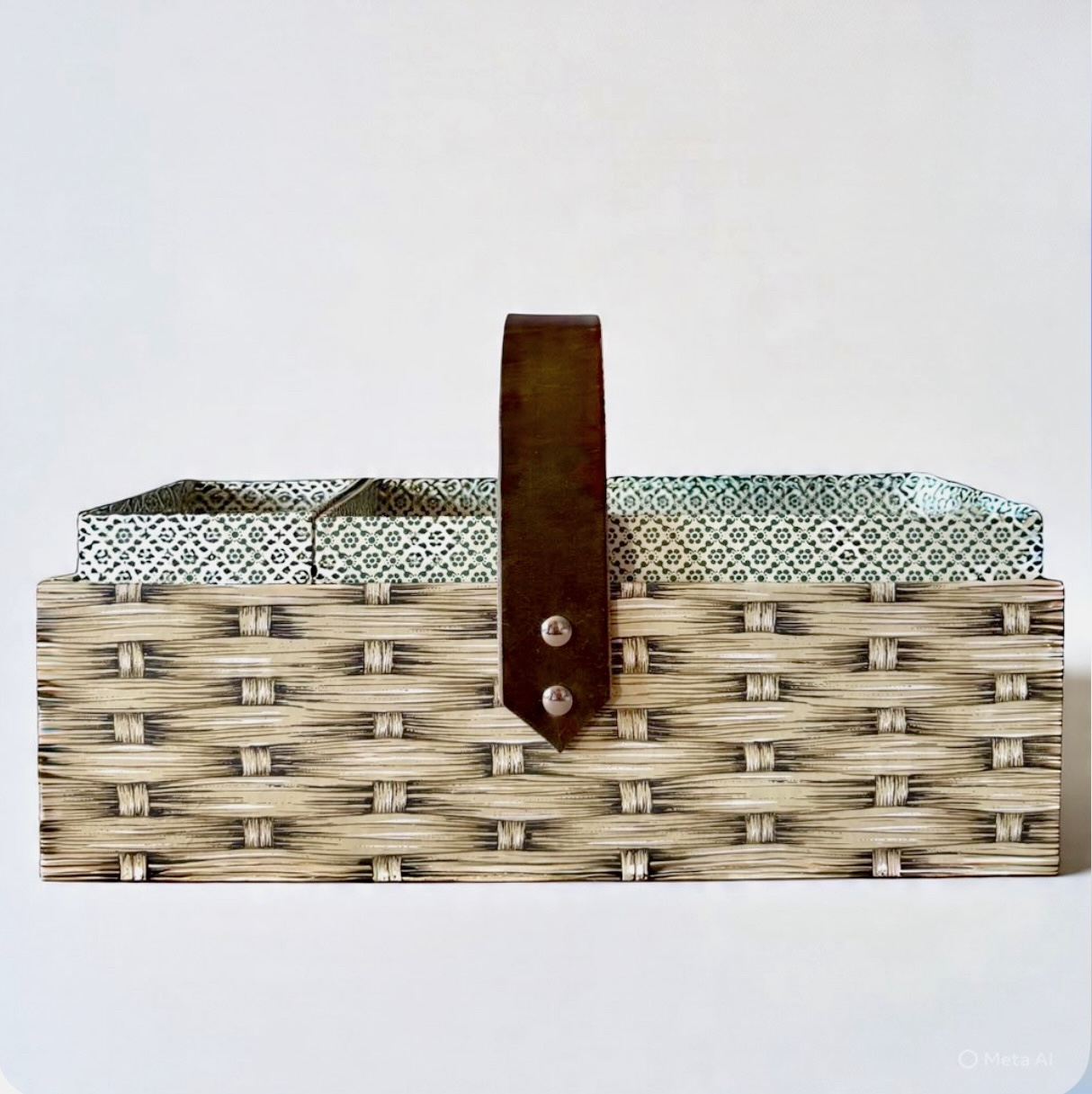
 Worthy
Championing timeless artistry and fine craftsmanship, Q Worthy presents a considered collection of luxury tableware and homeware, with select pieces created in exclusive collaboration with artists and independent makers around the world
Tips
Insider info on the people, places and things to know about

If You Missed It: Painters, Ports, and Profits at the Yale Center for British Art
There are exhibitions that come and go quietly, and then there are the ones you wish you’d made the trip… Read More
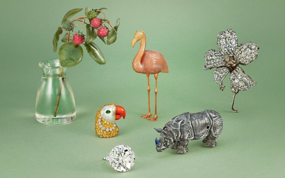
A Treasured History: The Stream Family Collection
Every great collection tells a story. Often, the most fascinating story is not that of the objects themselves, but of… Read More
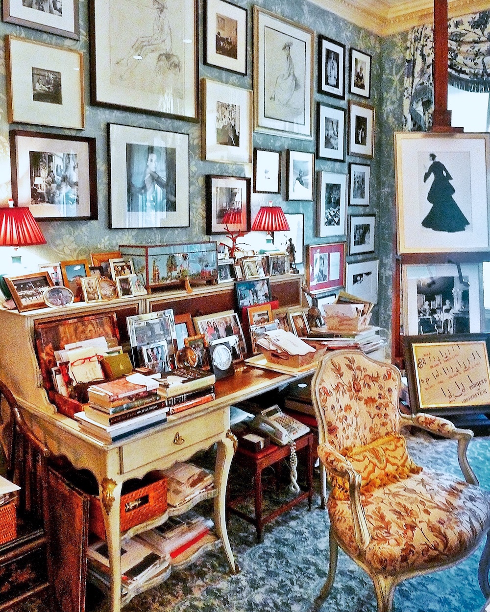
The Collection of Charlotte Moss at Stair Galleries
Charlotte Moss is one of the great tastemakers of our time. Her rooms are the stuff of legend: deeply layered,… Read More